


 探讨了如何在Web应用中实现键盘导航功能,增强辅助功能体验,文章来源于Medium的一篇讨论。
web调用键盘显示
This is the second article in a series about web accessibility that aims to provide designers, developers and product owners with an understanding of the common challenges, who they affect and what solutions are available.
这是有关网络可访问性的系列文章中的第二篇,旨在使设计师,开发人员和产品所有者了解共同的挑战,它们所影响的人以及可用的解决方案。
介绍 (Introduction)
The QWERTY keyboard is almost 150 years old and computer Keyboards have been around since the 1940s. As data input peripherals they might not be as in-vogue as touchscreens, voice interfaces or haptic gloves, they remain ubiquitous and are still essential for many user groups. Some of those groups are people with physical impairments, some are specialists (copy writers for example) and some people simply prefer it as a means of data entry — entering a search term with a TV remote control just isn’t fun is it?
QWERTY键盘已有近150年的历史,并且计算机键盘自1940年代就已经存在。 作为数据输入外围设备,它们可能不如触摸屏,语音界面或触觉手套那么流行,它们仍然无处不在,并且对于许多用户组仍然必不可少。 这些人群中有些是身体残障的人,有些是专家(例如,文案作者),有些人只是喜欢用它作为数据输入的手段-用电视遥控器输入搜索词不是很有趣吗?
Examples of the kinds of users who may not use a mouse or touchscreen at all are people with fine motor control restrictions (e.g. Parkinson’s disease or severe arthritis) and people with large motor control issues (e.g. Multiple Sclerosis). These are permanent conditions, but let’s not forget the temporary ones such as broken wrists or people, such as myself, with issues like repetitive strain injury (RSI).
完全不使用鼠标或触摸屏的用户的例子包括运动控制严格的人(例如帕金森氏病或严重的关节炎)和运动控制大的人(例如多发性硬化)。 这些是永久性的状况,但别忘了暂时性的状况,例如腕部折断或像我这样的人出现重复性劳损(RSI)等问题。
不良的导航体验 (Bad navigation experiences)
It would be cruel of me to single out a particular brand as an example of what bad looks like, however the sad truth is that you don’t have to look very far to find any such examples. Open some of your favourite travel, retail or banking sites and try to navigate purely using the keyboard and you will likely become lost quite early on in this process. What often happens is that it’s simply not clear where you are on the page. As you can imagine this is extremely frustrating for users who have little other choice.
挑出一个特定的品牌作为劣质外观的例子对我来说是残酷的,但是可悲的事实是,您不必走很远就能找到任何这样的例子。 打开一些您喜欢的旅行,零售或银行网站,然后尝试仅使用键盘进行导航,您可能会在此过程中很早就迷路。 通常会发生的情况是,您不清楚页面上的位置。 您可以想象,这对没有其他选择的用户而言非常令人沮丧。
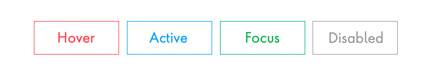
状态 (States)
In my experience, the most common missing accessibility feature from any website is a clear and obvious focus state for a link, button or form element. The focus state is what is invoked when you navigate to an interactive element using the keyboard tab key or other similar input. By default, most browsers will add a blue outline to a focussed element. However, in many cases this isn’t particularly clear, so I recommend making the state change more obvious, which could be achieved via a background colour change or a custom outline that has a high colour contrast ratio (see previous article for more info on that).
根据我的经验,任何网站上最常见的缺少可访问性的功能是链接,按钮或表单元素的清晰明确的焦点状态。 焦点状态是使用键盘Tab键或其他类似输入导航到交互式元素时调用的状态。 默认情况下,大多数浏览器都会在焦点所在的元素上添加蓝色轮廓。 但是,在很多情况下,这种情况并不是特别清楚,因此我建议使状态变化更加明显,这可以通过背景颜色变化或具有高色彩对比度的自定义轮廓来实现(有关详细信息,请参阅前一篇文章)那)。
What is often implemented on most websites is the hover state, which is invoked when the cursor moves over an interactive element. There are two other states that assist all user types on a website: active, which is when a link or button is being pressed and disabled, which is when a button should not be clickable.
什么是经常大多数网站上实行的是悬停状态,它被调用时在一个互动的元素光标移动。 还有其他两种状态可以帮助网站上的所有用户类型: active(活动) ,即按下链接或按钮时被禁用 , disabled(禁用) ,即按钮不应被单击时。
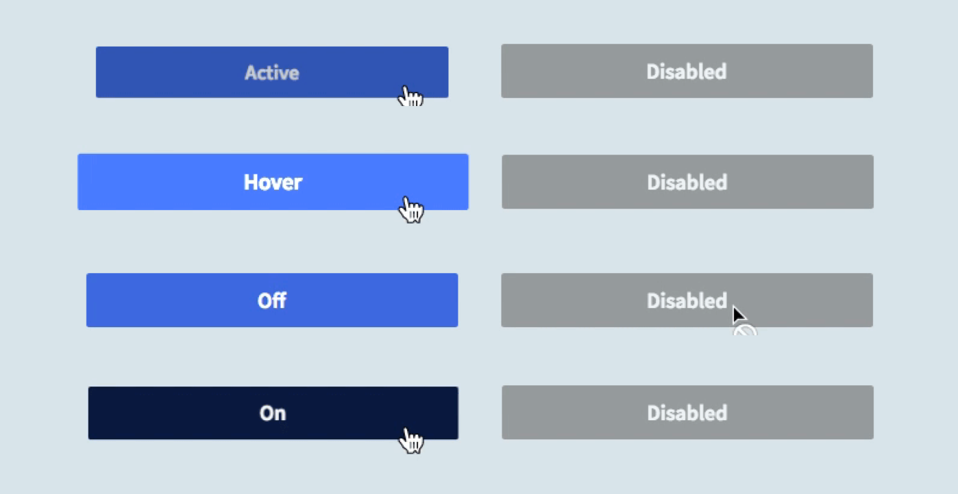
Good accessibility design is often about indicating a change in state in more than one way. In the case of links, buttons and other controls the importance of animation and cursor changes can really enhance the experience and make it clear to the user what they can and can’t do. See the example below:
良好的可访问性设计通常涉及以多种方式指示状态变化。 对于链接,按钮和其他控件,动画和光标更改的重要性可以真正增强体验,并向用户明确他们可以做什么和不能做什么。 请参阅以下示例:
制表符顺序 (Tab order)
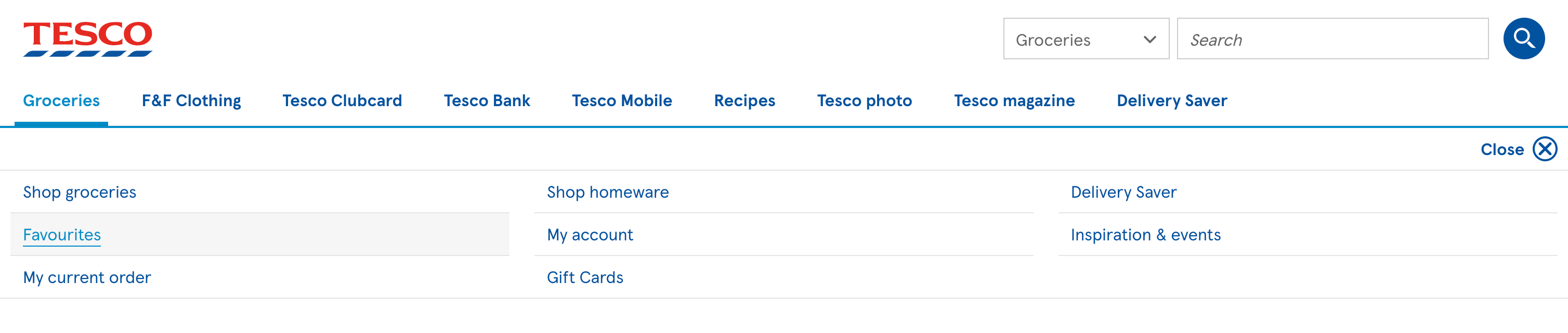
A fundamental rule of good navigation is that tab order should be logical. This is determined by the HTML, but do not think this is a developer-only problem. How a page is laid out and, in particular, how a complex menu is organised are key challenges that determine whether a site meets basic accessibility requirements. Typographic hierarchy also plays a part in how the logical order of a page’s content is understood by a user. The Tesco website’s main menu is an excellent example of clear and logical keyboard navigation:
良好导航的基本规则是,制表符顺序应合乎逻辑。 这是由HTML确定的,但不要认为这是开发人员专用的问题。 页面的布局方式,尤其是复杂菜单的组织方式,是决定网站是否满足基本可访问性要求的主要挑战。 印刷层次结构在用户如何理解页面内容的逻辑顺序方面也起着一定作用。 特易购网站的主菜单是清晰,逻辑的键盘导航的一个很好的例子:
When done well the benefits extend beyond accessibility and you will likely see improved SEO and conversion metrics.
如果做得好,好处将超出可访问性,您可能会发现SEO和转化指标得到了改善。
键盘陷阱 (Keyboard traps)
One particularly unfortunate issue you may have encountered is a keyboard trap, which is when a user moves into a content area but is unable to leave it again. Common examples of UI components that are notorious for creating keyboard traps are carousels and modals.
您可能遇到的一个特别不幸的问题是键盘陷阱,这是当用户进入内容区域但无法再次离开时。 众所周知,创建键盘陷阱的UI组件的常见示例是轮播和模式。

The example above is Bootstrap’s modal, which provides a close button as the first element you tab to, thus ensuring that user can exit the element at any time. Most of the leading UI libraries (such as Material UI and AntD) provide accessible components, but if you’re rolling your own, I strongly suggest you design, build and test to avoid keyboard traps.
上面的示例是Bootstrap的模态,它提供了一个关闭按钮作为您选择的第一个元素,从而确保用户可以随时退出该元素。 大多数领先的UI库(例如Material UI和AntD)都提供了可访问的组件,但是如果您要滚动使用自己的组件,我强烈建议您设计,构建和测试以避免键盘陷阱。
形式 (Forms)
Most interactive elements on a web page can be accessed using the tab key when navigating via a keyboard. However, some elements use different keyboard controls, a great example being radio buttons, which are accessed using the arrow keys.
通过键盘导航时,可以使用Tab键访问网页上的大多数交互式元素。 但是,某些元素使用不同的键盘控件,一个很好的例子是单选按钮,可以使用箭头键进行访问。
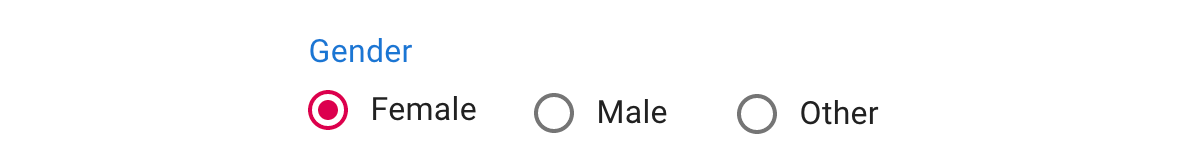
This will work out of the box provided valid HTML has been used to mark up the form. Semantic HTML is the root of good accessibility. If we heavily customise controls we may compromise the user’s ability to understand or operate them. Here’s an unusual example of a group of radio buttons.
如果已使用有效HTML来标记表单,这将立即可用。 语义HTML是良好可访问性的根源。 如果我们大量定制控件,则可能会损害用户理解或操作控件的能力。 这是一组单选按钮的不寻常示例。
If a user doesn’t recognise the element they will not know how to control it. This illustrates a wider point about the importance of semiotics in design and why common icons like the “hamburger” menu have been so controversial — it takes time for a new pattern to establish itself.
如果用户不认识该元素,他们将不知道如何控制它。 这说明了符号学在设计中的重要性的更广泛观点,以及为什么像“汉堡”菜单这样的常见图标如此具有争议性-建立新模式需要时间。
Web standards, languages and browsers are solid foundations to build an accessible website on but it’s up to the designers and developers to take advantage of that.
Web标准,语言和浏览器是在其上构建可访问网站的坚实基础,但要由设计师和开发人员来利用它。
图示 (Icons)
Iconography is incredibly useful in modern software design, but a very common issue is that the icon cannot be perceived by screen reader users because it’s a graphic element such as an SVG. Many screen reader users will use a keyboard (sometimes a specialised one such as a braille keyboard) to navigate and whilst they may be able to reach the element via a keyboard, the screen reader will not tell them what that link or button does. Consider the following elements:
图像技术在现代软件设计中非常有用,但一个非常普遍的问题是屏幕阅读器用户无法感知该图标,因为它是诸如SVG之类的图形元素。 许多屏幕阅读器用户将使用键盘(有时会使用盲文键盘等专用键盘)进行导航,尽管他们可能能够通过键盘到达元素,但屏幕阅读器不会告诉他们该链接或按钮的作用。 请考虑以下元素:

Let’s assume they are correctly marked-up as anchor tags on the basis that they link to a new page or section. To a sighted user it’s likely they will be able to infer the meaning of each link, but to a non-sighted user interacting with them will only tell them it’s a link and nothing more. Simply adding title: home to the Anchor tag will only benefit sighted users with a pointer device. What’s required in this case is simply the inclusion of text. To ensure the text is present, but not visible, the most common solution is to wrap the anchor’s text inside a span tag and move it out of the visible area of the page using position:absolute and left:-999em or similar technique.
让我们假设它们基于链接到新页面或部分而被正确地标记为锚标记。 对于有视力的用户来说,他们很可能能够推断出每个链接的含义,但是对于没有视力的用户,与他们进行交互只会告诉他们这是一个链接,仅此而已。 只需在Anchor标签上添加title:home即可,仅使使用指针设备的视障用户受益。 在这种情况下,只需要包含文本即可。 为确保该文本存在但不可见,最常见的解决方案是将锚文本包装在span标记内,然后使用position:absolute和left:-999em或类似技术将其移出页面的可见区域。
加倍努力 (Going the extra mile)
There are other small but important features that can enhance a website and make it quicker to navigate. One such feature is the “Skip to” shortcut, which you may have encountered on one of the better sites you have visited. Generally speaking, it is only shown when you navigate using a keyboard and will offer you the chance to skip to the main content or navigation.
还有其他一些小而重要的功能,它们可以增强网站并使其导航更快。 这样的功能之一就是“跳至”快捷方式,您可能在访问过的更好的网站之一上遇到过。 一般而言,仅当您使用键盘导航时才会显示该图标,这将使您有机会跳到主要内容或导航。
By adding these links many keyboard and screen reader users will be able to bypass irrelevant content that can be time consuming to tab through.
通过添加这些链接,许多键盘和屏幕阅读器用户将能够绕过无关的内容,而这些内容的浏览非常耗时。
屏幕阅读器支持 (Screen reader support)
Screen readers are sophisticated pieces of software that come with invaluable features and their own set of shortcuts. VoiceOver (on Apple devices), JAWS and TalkBack (Android) all come with a rotor, which is a context-sensitive menu of commands. Visually impaired mobile users can navigate through a site, often at impressive speed, using touchscreen gestures aided by the rotor, but it’s just as powerful for keyboard users.
屏幕阅读器是复杂的软件,具有宝贵的功能和自己的快捷键集。 VoiceOver(在Apple设备上),JAWS和TalkBack(安卓)都带有转子,这是上下文相关的命令菜单。 视力障碍的移动用户可以使用转子辅助的触摸屏手势,以惊人的速度浏览网站,但对于键盘用户而言,功能同样强大。
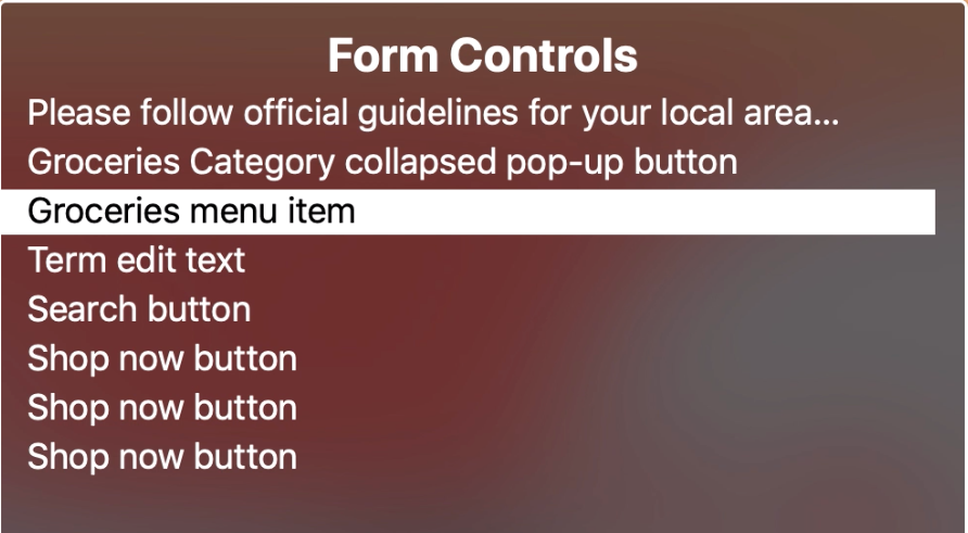
The rotor makes navigating a site with a keyboard quick and simple by grouping common elements in the page such as links, forms, headings and landmarks. The first three aforementioned groups will be correctly listed by implementing semantic HTML. Landmarks are made available by adding role attributes to significant elements on a page such as the main navigation, header, search form and footer. The effort for implementing landmark roles is low but the benefit to screen reader users is high.
转子通过将页面中的常见元素(例如链接,表单,标题和地标)分组,从而使使用键盘快速导航站点变得容易。 通过实现语义HTML,可以正确列出前面提到的前三个组。 通过将角色属性添加到页面上的重要元素(例如主导航,页眉,搜索表单和页脚),可以使用地标。 实施界标角色的工作量很小,但对屏幕阅读器用户的好处却很大。
摘要 (Summary)
The range of input methods is increasing all the time, but a significant percentage of users will still use a keyboard to navigate a website some or all of the time. Furthermore all of the areas I have described in this article make for a more perceivable, operable and robust web application for all user types. I urge you to test the site you are working on now using only your keyboard, share your experience with your colleagues and see what improvements you can make.
输入法的范围一直在增加,但是仍有相当一部分用户仍会在部分时间或全部时间内使用键盘来浏览网站。 此外,我在本文中描述的所有领域都为所有用户类型提供了一个更具可感知性,可操作性和健壮性的Web应用程序。 我敦促您仅使用键盘来测试您现在正在工作的站点,与同事分享您的经验,并查看可以做出哪些改进。
翻译自: https://medium.com/@rbultitudezone/web-accessibility-keyboard-navigation-da89e8413b6
web调用键盘显示


 扫一扫
扫一扫


 891
891

 被折叠的 条评论
为什么被折叠?
被折叠的 条评论
为什么被折叠?
 到【灌水乐园】发言


