


abap文本元素标点符号
This is the first in a series of articles that illustrate how basic design principles can improve information display. The next installment will apply some of these same principles to a visualization dashboard.
这是一系列文章的第一篇,这些文章说明了基本设计原理如何改善信息显示。 下一部分将把其中一些相同的原理应用于可视化仪表板。
“您如何使用空格?” (“How do you use whitespace?”)
This is one of the most frequent questions that I get as a designer, especially from people who need to create information-dense displays like a dashboard or interactive display. Whitespace is the blank area between items on the page, and it is very important in helping information feel clear, organized, and accessible.
这是我作为设计师遇到的最常见的问题之一,尤其是那些需要创建信息密集型显示器(如仪表板或交互式显示器)的人。 空格是页面上项目之间的空白区域,它对于帮助信息清晰,有条理和易于访问非常重要。
Whitespace is the punctuation between visual elements. In the same way that a pause between notes is sometimes most important part of a piece of music — allowing the listener to really hear, absorb, and respond to the notes — the space between visual elements can set the tone for how a user feels about an information display. Used well, white space gives readers the opportunity to pause and take a breath. It can help the information feel a lot less overwhelming.
空格是视觉元素之间的标点符号。 就像音符之间的停顿有时是乐曲中最重要的部分一样(使听众能够真正听到,吸收和响应音符),视觉元素之间的间隔可以为用户的感觉设定基调。信息显示。 如果使用得当,空白区域将使读者有机会停下来喘口气。 它可以帮助信息减少很多麻烦。
作为工具,空格可以创建: (As a tool, whitespace can create:)
- Clarity 明晰
- Sequence 序列
- Structure/hierarchy 结构/层次
- Relationships between elements 元素之间的关系
- Room to breathe 呼吸的空间
让我们以以下餐厅菜单为例: (Let’s take the following restaurant menu as an example:)
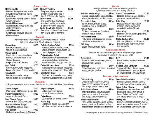
There are lots of things that make this menu feel crowded and unclear. Making just a few adjustments to the spacing and alignment can help things look a lot more organized.
有很多事情使此菜单感到拥挤和不清楚。 只需对间距和对齐方式进行一些调整,就可以使外观看起来更有条理。
让我们再仔细一点来了解正在发生的事情。 (Let’s look a bit closer to understand what’s going on.)
The original menu is divided up into six sections that are so close together that they almost overlap. The uneven shapes interlock like puzzle pieces on the page.
原始菜单分为六个部分,这些部分非常紧密,以至于几乎重叠。 不平坦的形状像拼图块一样在页面上互锁。
Each section has a heading centered in the column. These establish a vertical flow through the document.
每个部分的标题在列中居中。 这些在文档中建立垂直流。
还有很多其他事情正在发生。 (There are also a lot of other things going on.)
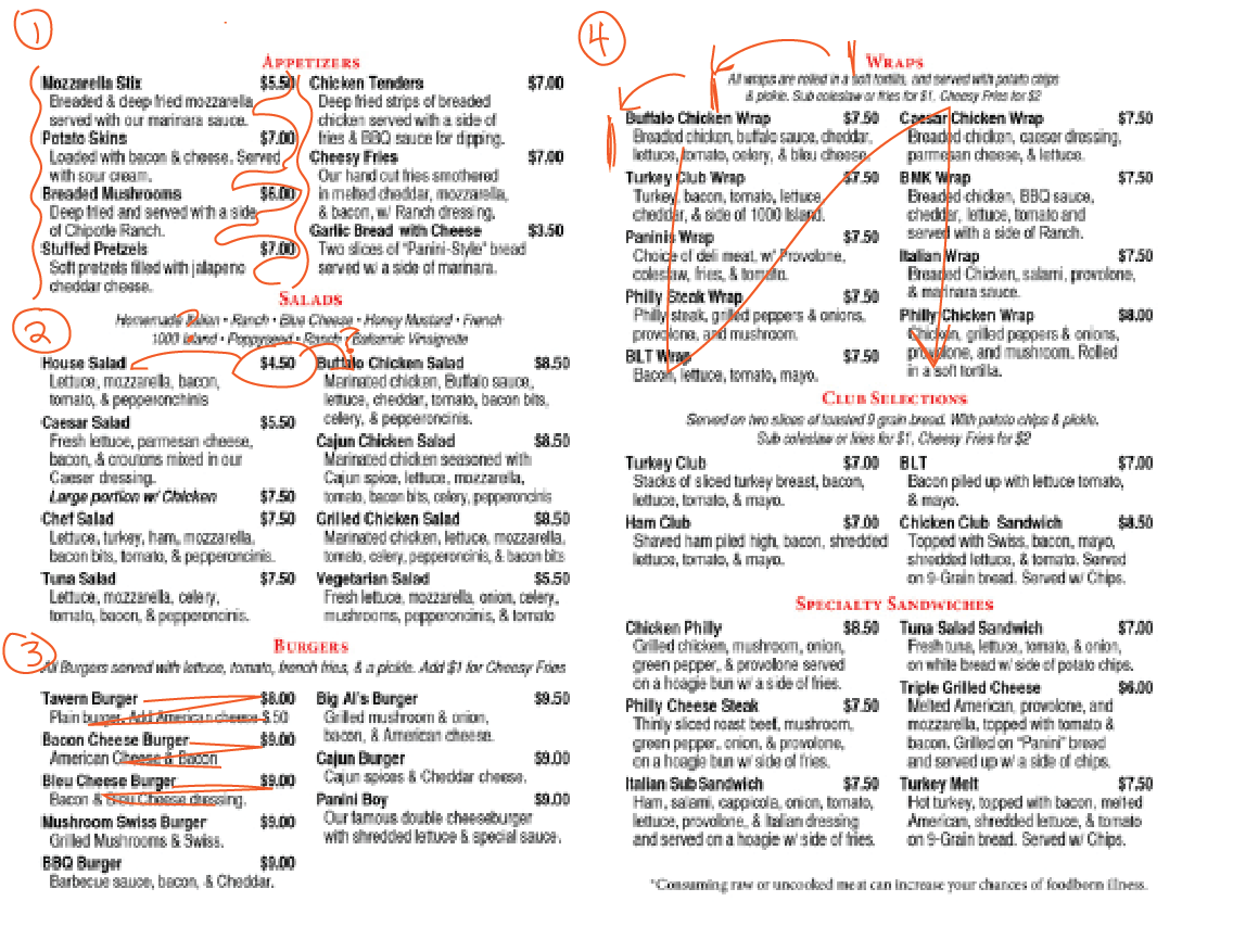
- The indented text creates wobbly margins. This makes it hard to separate two columns, especially when they are so close to each other, and leaves oddly-shaped white space in between. 缩进的文本会产生摆动边距。 这使得很难分开两列,尤其是当它们彼此非常靠近时,并且在它们之间留下了奇怪形状的白色空间。
- The bold text helps to separate the menu item name from its description and connects it to the price, but the way the prices are positioned makes it hard to tell which column and menu item they belong to. 粗体文本有助于将菜单项名称与其描述分开,并将其与价格联系起来,但是价格的定位方式很难区分它们属于哪个列和菜单项。
- The individual menu items don’t feel very separate, due to a combination of items 1 and 2 and narrow spacing between lines. As a result, it’s hard to follow the zigzag reading pattern and actually understand the information. 由于项目1和2的组合以及行之间的狭窄间距,各个菜单项的感觉并不十分分离。 结果,很难按照锯齿形的阅读模式来真正理解信息。
- The center-justified text creates a waterfall of information, forcing you to start in the center of the column and read from left to right. This feels unnatural, and results in a weaker connection between heading, subheading and menu items. Once you’ve gotten through the waterfall, you then have to zigzag up and down two separate columns (and back and forth across each individual item) to scan the list and find the things you want. With all of that running around, it’s no wonder that it feels exhausting to read! 居中对齐的文本创建信息瀑布,迫使您从列的中心开始并从左到右阅读。 这感觉很不自然,并导致标题,副标题和菜单项之间的连接减弱。 穿过瀑布后,您必须上下曲折两列(在每个项目之间来回移动)以扫描列表并找到所需的东西。 所有这些都四处奔波,难怪阅读会让人筋疲力尽!
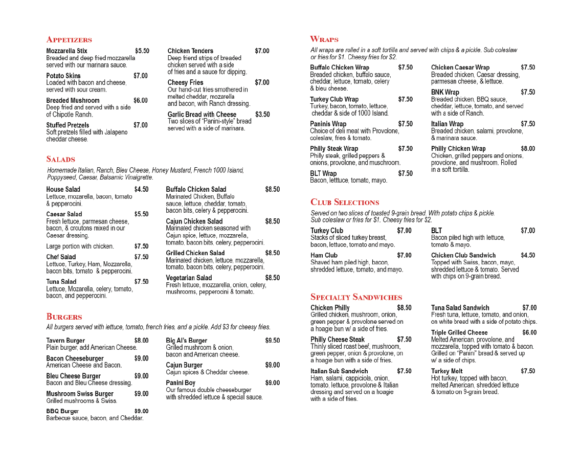
更新后的版本进行了以下更改: (The updated version makes the following changes:)
- Headings justify left rather than center to create common anchor points. 标题说明左对齐而不是居中对齐以创建公共锚点。
- Subheads justify left to match the heading. 副标题左对齐以匹配标题。
- Increase space before paragraph to separate menu items. 在段落前增加空间以分隔菜单项。
- Remove hanging indent to make a solid, left-justified column. 除去悬挂凹痕,以形成一个实心的,左对齐的列。
- Decrease font size by 1 pt. 将字体大小减小1点。
- Increase line spacing to make it easier to see the shape of the words. 增加行距,以便更容易看到单词的形状。
- Move section headers further apart to give them room to breathe. 将节头移到更远的地方,以便为它们留出呼吸的空间。
Now, let’s look at how these changes affect the page.
现在,让我们看看这些更改如何影响页面。

Headers, subheads, and menu items are all aligned, creating a hierarchy of nested boxes that can be easily read in order. Once you know how the order works, you can skip the headings altogether and just get right into the list of items instead.
标题,副标题和菜单项都对齐,从而创建了嵌套框的层次结构,可以按顺序轻松阅读它们。 知道订单的工作原理后,您可以完全跳过标题,而直接进入项目列表。
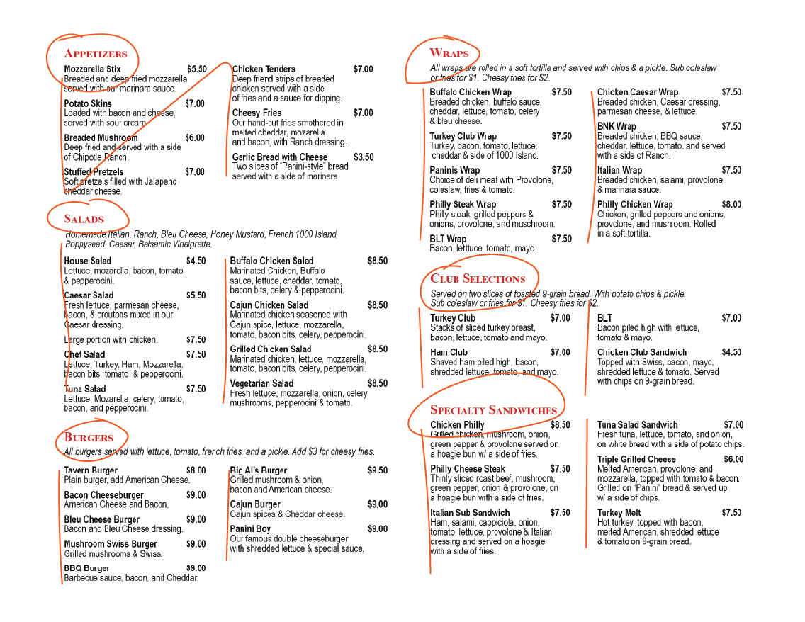
More space between the individual menu items makes it easier to tell what information goes together, and the smaller text with larger line spacing feels less crowded and (counter-intuitively) more legible.
各个菜单项之间的空间较大,可以更轻松地分辨哪些信息一起显示,行距较大的较小文本感觉较不拥挤,并且(反直觉)更清晰。
The uniform left alignment makes the columns feel more continuous, giving them a more natural reading order, and the section headers better match the document flow. This creates an informal information grid that helps users to scan the information quickly and identify the information that they need. Adding more padding between columns and sections also helps to separate the information and makes it easier to see the document structure at a glance.
统一的左对齐使列感觉更连续,使它们具有更自然的阅读顺序,并且节标题与文档流更好地匹配。 这将创建一个非正式的信息网格,可帮助用户快速扫描信息并识别所需的信息。 在列和节之间添加更多的填充还有助于分隔信息,并使一目了然地更容易看到文档结构。
再次,这是最终结果: (And again, here’s the final result:)
I didn’t change any design elements here besides the whitespace. Even a few subtle tweaks make a big improvement in how the menu reads. In the same way that editing can clean up a run-on sentence, proper visual punctuation can help your documents to be clearer, cleaner, and more pleasant to read.
除了空白,我在这里没有更改任何设计元素。 甚至一些细微的调整也极大地改善了菜单的读取方式。 与编辑可以清除连续句子的方式一样,适当的视觉标点符号可以帮助您的文档更清晰,更整洁,并且阅读起来更愉悦。
Stay tuned for the next installment in this series, where we will apply these same principles to information dashboard design.
请继续关注本系列的下一部分,我们将在信息仪表板设计中应用这些相同的原理。

Erica Gunn is a data visualization designer at one of the largest clinical trial data companies in the world. She creates create information ecosystems that help clients to understand their data better and to access it in more intuitive and useful ways. She received her MFA in information design from Northeastern University in 2017. In a previous life, Erica was a research scientist and college chemistry professor. You can connect with her on Twitter @EricaGunn.
Erica Gunn是世界上最大的临床试验数据公司之一的数据可视化设计师。 她创建了一个创建的信息生态系统,可帮助客户更好地理解其数据并以更直观和有用的方式访问它们。 她于2017年从东北大学获得信息设计硕士学位。在前世,埃里卡(Erica)是一名研究科学家和大学化学教授。 您可以通过Twitter @EricaGunn 与她 联系 。
Originally published at http://ericagunn.com on February 1, 2020.
最初于 2020年2月1日 发布在 http://ericagunn.com 上。
abap文本元素标点符号


 扫一扫
扫一扫
 2046
2046

 被折叠的 条评论
为什么被折叠?
被折叠的 条评论
为什么被折叠?
 到【灌水乐园】发言


