


python 维基百科爬虫
Last month, The Intercept published an article claiming that, “In recent presidential cycles, the velocity of edits made to a Wikipedia page have correlated with the choice of vice presidential running mate.” The article focuses on Kamala Harris, and the increasing number of edits that took place on her Wikipedia page in June.
上个月, 《拦截》杂志发表了一篇文章,声称:“在最近的总统选举周期中,对维基百科页面的编辑速度与副总统竞选伙伴的选择有关。” 本文着重介绍卡玛拉·哈里斯(Kamala Harris),以及6月份在她的维基百科页面上进行的编辑工作的增加。
The article argues that the pace of edits can be interpreted as signaling the strength of her potential to be named as VP candidate. Interesting. But is it valid?
文章认为,编辑的速度可以解释为表明她被提名为VP候选人的潜力的力量。 有趣。 但这有效吗?
Well, now that a month has passed and a selection has still not been made, I decided to take a look at these changes for myself. I wanted to see how her rate of edits stacked up against other potential candidates. I was also curious to see if there were any other correlations we could draw with the results, to deepen our understanding of their meaning. So, to Python I turned.
好吧,既然已经过去了一个月,但仍然没有做出选择,我决定亲自看看这些变化。 我想看看她与其他潜在候选人相比的编辑率如何。 我也很想知道我们是否可以将其他与结果相关的信息,以加深对它们含义的理解。 因此,我转向了Python。
There is no single definitive list of 2020 potential Democratic VP candidates, so since we’re working with Wikipedia, I’ll stay to stay true to the source by collecting a list of from the Wikipedia article, “2020 Democratic Party vice presidential candidate selection.” Here are the nominees.
没有一个确定的2020年潜在民主党副总统候选人名单,因此,由于我们正在与Wikipedia合作,因此我将通过从Wikipedia文章中收集“ 2020年民主党副总统候选人候选人名单 ”来保持真实。 。” 这是提名人。

获取修订时间戳 (Getting Revision Timestamps)
To achieve my goal, I’ll need to retrieve data from Wikipedia about each potential candidate. For this we can use the MediaWiki action API. Let’s get to it!
为了实现我的目标,我需要从Wikipedia检索有关每个潜在候选人的数据。 为此,我们可以使用MediaWiki action API 。 让我们开始吧!
取些名字 (Take some names)
I’ll start by preparing a list of names. We’ll use this list of names to look up timestamps of revisions for their respective Wikipedia articles:
我将从准备名称列表开始。 我们将使用此名称列表来查找各自维基百科文章的修订时间戳记:
nominees = ['Karen Bass', 'Keisha Lance Bottoms', 'Val Demings', 'Tammy Duckworth', 'Kamala Harris', 'Michelle Lujan Grisham', 'Susan Rice', 'Elizabeth Warren', 'Gretchen Whitmer']获取一些时间戳 (Get some timestamps)
Now I’ll deploy a function that allows us to make an API call to Wikipedia, and returns a list of revision timestamps for a given article. We’ll use the requests library for this:
现在,我将部署一个函数,该函数使我们能够对Wikipedia进行API调用,并返回给定文章的修订时间戳列表。 我们将为此使用请求库:
So, if I run this function on the Wikipedia article for Tammy Duckworth, its usage would look like this:
因此,如果我在针对Tammy Duckworth的Wikipedia文章上运行此功能,其用法将如下所示:
get_revision_timestamps('Tammy Duckworth')And it would return a list that looks like this:
它会返回一个看起来像这样的列表:
print(get_revision_timestamps('Tammy Duckworth'))['2020-08-06T18:19:43Z', '2020-08-06T18:18:43Z', '2020-08-06T18:16:01Z', '2020-08-06T18:15:00Z', '2020-08-06T18:13:51Z', ...]As you can see, we have returned a list of timestamps, ordered newest-to-oldest, stored as strings. This is only a partial view of the full list, which contains 2484 timestamps at time of writing. That’s a lot of revisions!
如您所见,我们返回了一个时间戳列表,以最新到旧的顺序排列,并存储为字符串。 这只是整个列表的部分视图,该列表在编写时包含2484个时间戳。 有很多修订!
绘制时间戳 (Graphing the Timestamps)
Now that we know how to get timestamps, we can do this for our full list of nominees. But before we do, let’s figure out how to convert them into a graph. For this, we will turn to matplotlib’s pyplot module. While pyplot can handily manage dates, we first have to prepare our data in a way such that Python can interpret it correctly.
既然我们知道如何获取时间戳,那么我们就可以为我们的全部被提名者做到这一点。 但是在做之前,让我们弄清楚如何将它们转换为图形。 为此,我们将转向matplotlib的pyplot模块。 尽管pyplot可以方便地管理日期,但我们首先必须以某种方式准备数据,以便Python可以正确解释它。
颠倒我们的时间戳列表 (Reverse our list of timestamps)
Because our list of revision timestamps was generated newest-to-oldest, we also should reverse it, in order to plot forward in time.
因为我们的修订时间戳列表是最新到最旧的,所以我们也应该颠倒它,以便及时绘制。
timestamps = get_revision_timestamps('Tammy Duckworth')
timestamps.reverse()print(timestamps)['2006-01-11T23:50:14Z', '2006-01-11T23:50:48Z', '2006-01-12T00:04:03Z', '2006-01-12T00:04:45Z', '2006-01-12T00:06:14Z', ...]
Now they are in chronological order. Great!
现在,它们按时间顺序排列。 大!
将时间戳列表从字符串转换为日期时间对象 (Convert list of timestamps from strings into datetime objects)
Unfortunately, our timestamps are still just strings. To turn them into an interpretable date format, we must convert them into datetime objects. For this, we can use Python’s built-in datetime library. Note that I’m using the datetime module inside the datetime library.
不幸的是,我们的时间戳仍然只是字符串。 为了将它们转换为可解释的日期格式,我们必须将它们转换为datetime对象 。 为此,我们可以使用Python的内置datetime库。 请注意,我使用的日期时间库中 datetime模块。
from datetime import datetimedates = []
for stamp in timestamps:
    d = datetime.strptime(stamp, '%Y-%m-%dT%H:%M:%SZ')
    dates.append(d)
Okay! We have successfully converted our timestamps into datetime objects:
好的! 我们已经成功地将时间戳转换为日期时间对象:
print(dates)[datetime.datetime(2006, 1, 11, 23, 50, 14), datetime.datetime(2006, 1, 11, 23, 50, 48), datetime.datetime(2006, 1, 12, 0, 4, 3), ...]绘制日期时间对象 (Plotting datetime objects)
Now that our dates can be interpreted by Python, we can go ahead and plot them. For this step, we will use pyplot’s “plot_date” function. This function takes two arguments: x values and y values. For x values, we are using the list of datetime objects. For y values, I am using a range of numbers the same length as my list of datetime objects. This will allow me to increment the count (y-axis) by 1 for each date that is plotted (along the x-axis).
现在我们的日期可以用Python解释,我们可以继续绘制它们。 对于这一步,我们将使用pyplot的“ plot_date”函数。 该函数采用两个参数:x值和y值。 对于x值,我们使用的是datetime对象列表。 对于y值,我使用的数字范围与日期时间对象列表的长度相同。 这将使我可以将绘制的每个日期(沿x轴)的计数(y轴)增加1。
import matplotlib.pyplot as pltplt.plot_date(dates, range(len(dates)))The “plot_date” function looks at our list of dates, and finds the max and min. Then, it creates an evenly spaced sequence of dates to use as our x-axis, and plots the dates accordingly. It also senses whether our x or y value contains dates, and forces those values along the x-axis.
“ plot_date”函数查看我们的日期列表,并找到最大值和最小值。 然后,它创建均匀间隔的日期序列以用作我们的x轴,并相应地绘制日期。 它还可以检测我们的x或y值是否包含日期,并沿x轴强制这些值。
As with any matplotlib figure, we can adjust the labels and formatting. I’m going to keep it minimal here so that we can cut to some results. I’ve added a title, and put labels on the axes:
与任何matplotlib图一样,我们可以调整标签和格式。 我将在这里将其最小化,以便我们可以得到一些结果。 我添加了一个标题,并在轴上放置了标签:
plt.title('Tammy Duckworth Wikipedia Revisions')
plt.xlabel('Time')
plt.ylabel('Revisions count')
plt.show()
And the result:
结果:

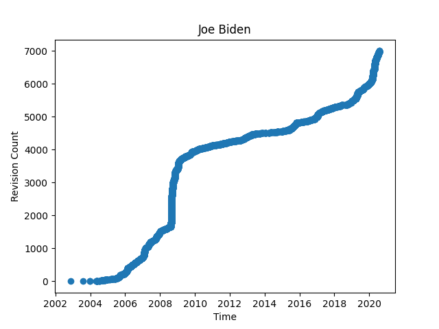
Voila! For fun, here’s the same graph, but for Joe Biden’s Wikipedia page. I think it’s a nice example of this plotting method’s narrative capacity:
瞧! 为了好玩,这里是相同的图表,但是是乔·拜登的Wikipedia页面。 我认为这是该绘图方法叙述能力的一个很好的例子:
比较页面修订 (Comparing Page Revisions)
So, for the matter at hand. Now that we can get timestamps, convert them to datetime objects, and plot them, let’s do it for our full list of potential Democratic VP nominees. Notice that I start by importing “GetRevisionTimestamps,” which is the module that contains my timestamp retrieval function, “get_revision_timestamps.” If you want to avoid this import, just copy/paste the defined function somewhere above this block.
因此,就目前而言。 现在我们可以获取时间戳,将其转换为日期时间对象,并进行绘制,让我们为潜在的民主党副总统候选人的完整列表进行准备。 请注意,我首先导入“ GetRevisionTimestamps”,这是包含时间戳检索功能“ get_revision_timestamps”的模块。 如果要避免这种导入,只需将定义的函数复制/粘贴到此块上方的某个位置。
结果: (Results:)
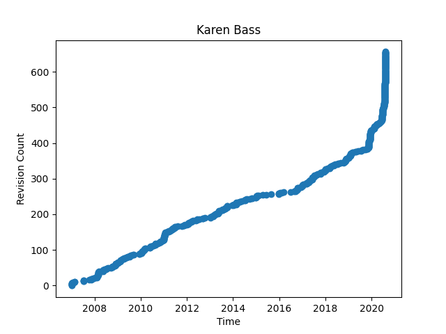
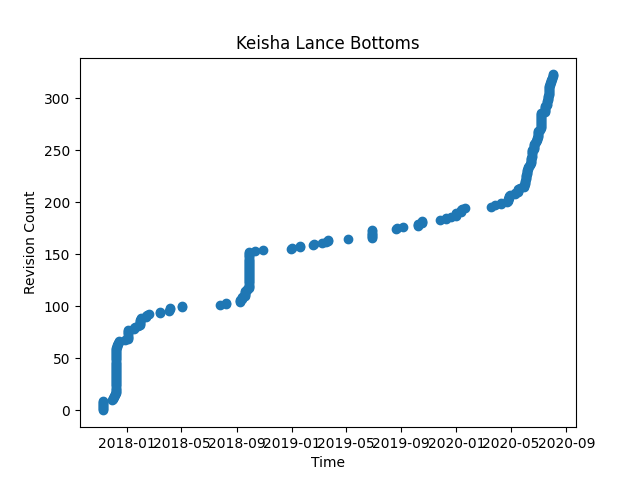
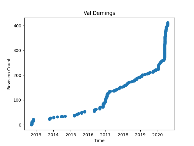
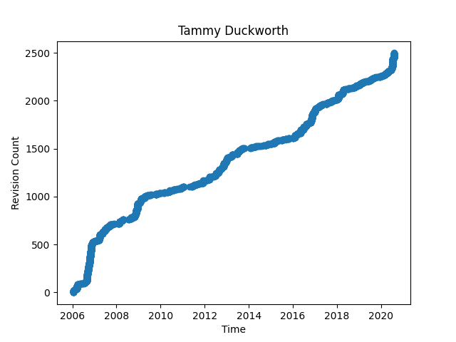
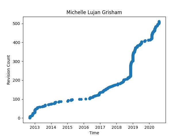
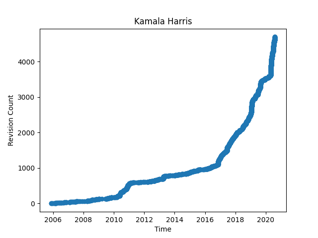
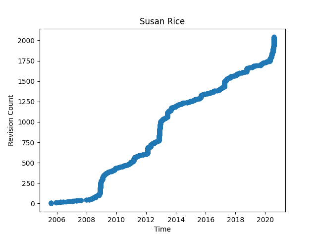
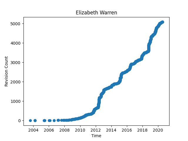
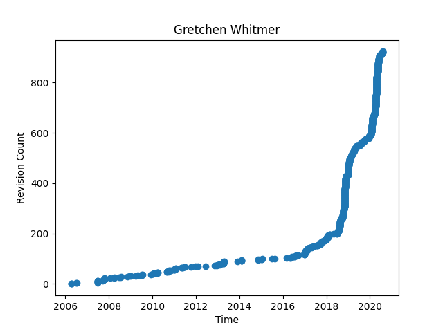
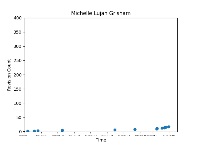
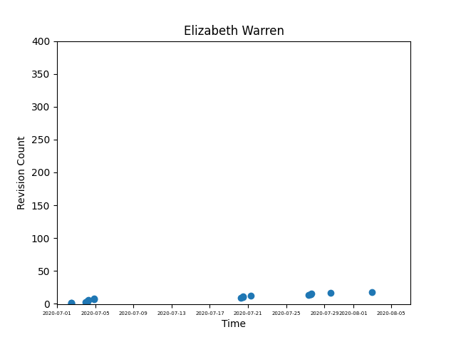
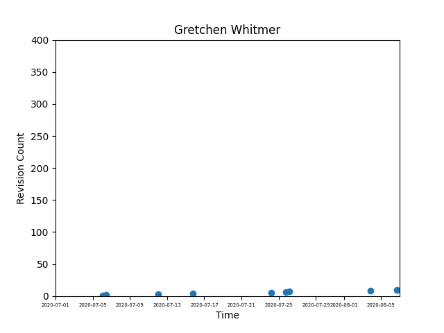
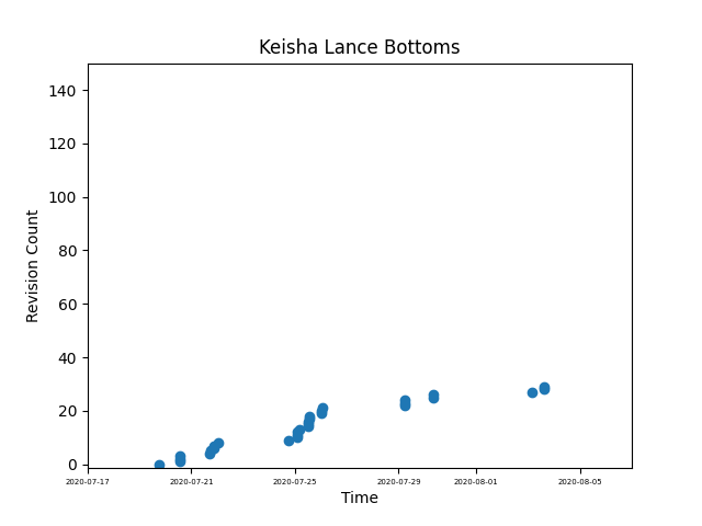
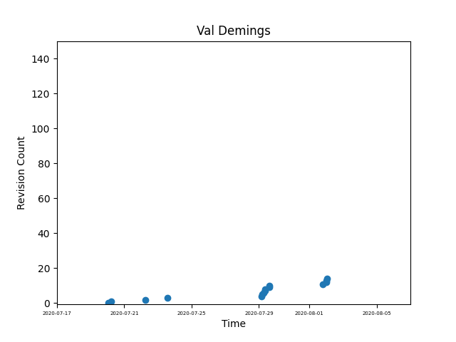
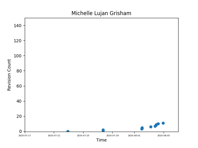
As we can see, not all curves are created equal. These curves vary in the amount of data represented, as well as scale. They also vary in span of time.
如我们所见,并非所有曲线都相等。 这些曲线在表示的数据量和比例上有所不同。 它们的时间跨度也不同。
Still, we can see some interesting trends already. Some plots appear linear, some stepped, some nearly quadratic. Some have moments of each. Where we see breaks in some plots, we can infer that no revisions were submitted. And yet, we can still chart the upward trajectory through time.
尽管如此,我们已经看到了一些有趣的趋势。 有些图呈线性,有些呈阶梯状,有些接近二次。 每个都有一些时刻。 在某些图中看到中断的地方,可以推断出没有提交修订。 但是,我们仍然可以绘制出随时间推移的上升轨迹。
Now, the image above represents all of the revisions for each article. But, what if I want to filter all of the plots to reflect just a specific date range, like in The Intercept’s piece? I could write a function that takes start and end dates as optional arguments, and only plots dates within said range:
现在,上面的图像代表了每篇文章的所有修订。 但是,如果我想过滤所有图表以仅反映特定的日期范围(如The Intercept的文章), 该怎么办? 我可以编写一个将开始日期和结束日期作为可选参数的函数,并且仅绘制该范围内的日期:
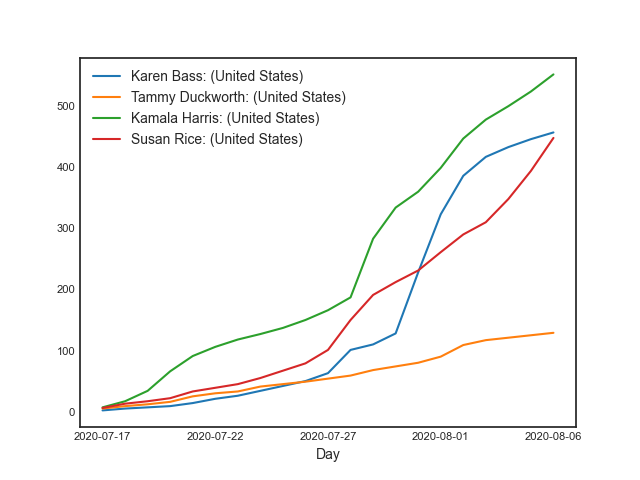
过滤和缩放结果: (Results, filtered and scaled:)
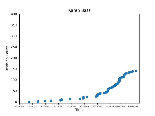
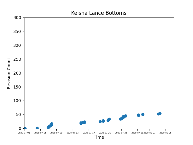
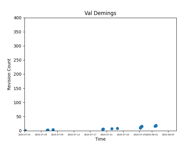
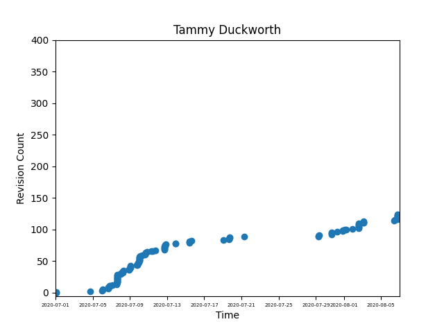
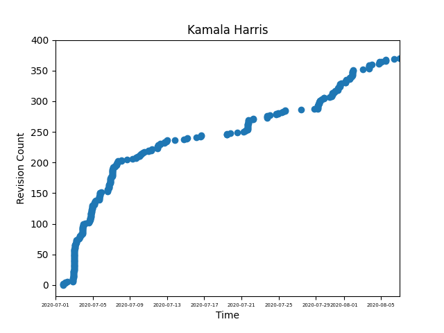
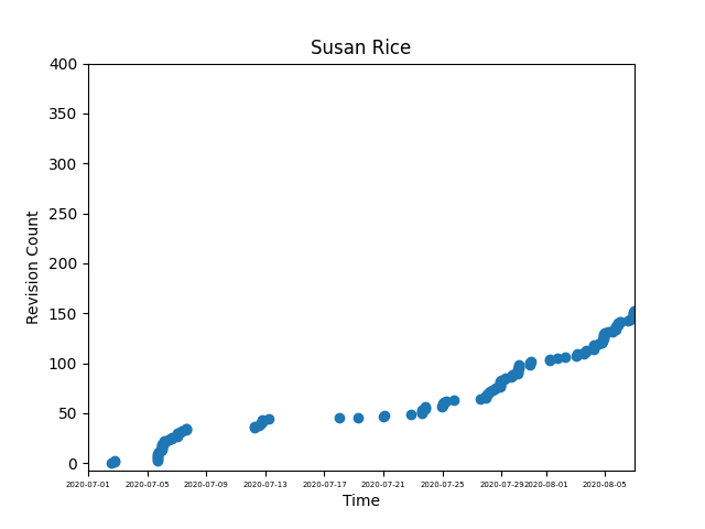
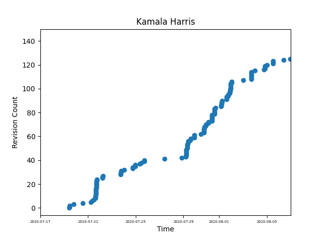
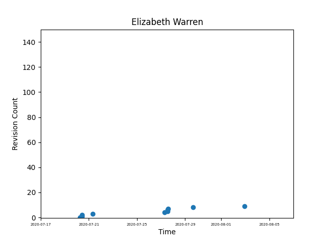
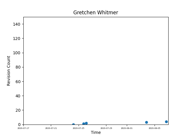
Now some results are starting to show. We can see that the trend identified in The Intercept’s article indeed does still hold true for Kamala Harris. While it’s not yet so easy to say what this means, we can also notice some emerging increases for Karen Bass, Tammy Duckworth, and Susan Rice as well. Let’s zoom in a little more; I’ll look at the last three weeks only, just like The Intercept’s article did:
现在一些结果开始显示。 我们可以看到, 《拦截》文章中确定的趋势确实对卡玛拉·哈里斯(Kamala Harris)仍然适用。 尽管这还不是很容易说出这是什么意思,但我们也可以注意到Karen Bass,Tammy Duckworth和Susan Rice也出现了一些新的增长。 让我们再放大一点; 我只会看最后三周,就像《拦截》的文章一样:
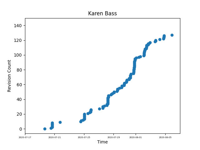
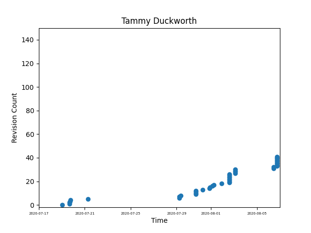
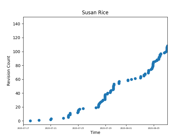
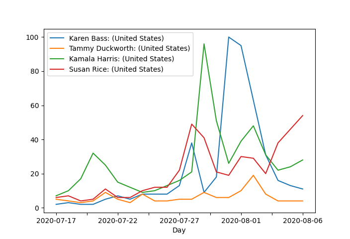
Okay. Now a pattern emerges. Let’s focus on the four candidates with the largest number of recent edits:
好的。 现在出现了一种模式。 让我们关注最近编辑最多的四个候选者:
Well. This certainly complicates the story. If this measure is to be trusted, it looks like Kamala Harris has some new competition. But, now we should ask ourselves, how much can we trust this measure?
好。 这肯定使故事复杂化。 如果这项措施值得信赖,那么卡玛拉·哈里斯(Kamala Harris)似乎有了一些新的竞争。 但是,现在我们应该问自己,我们可以信任这个措施多少?
The Intercept article goes into detail about the nature of revisions made to Harris’ Wikipedia page, which certainly makes a convincing argument for a motivated attempt to control her public image on the platform. However, this criticism is fairly distinct from the initial claim made. The original claim states that the selection of a VP nominee correlates with the velocity of revisions to their Wikipedia page. While it may be worthwhile to consider the nature of the revisions made, for now I want to focus on this original claim. If the claim were true, it would suggest that measuring revisions could provide a useful indicator for understanding the Biden campaign’s strategy. But, at least for now, this measure provides an indecisive result.
拦截文章详细介绍了对Harris的Wikipedia页面进行的修改的性质,该页面无疑提出了令人信服的论据,表明有动机地尝试控制其在平台上的公共形象。 但是,这种批评与最初提出的主张完全不同。 原始声明指出,VP提名人的选择与其Wikipedia页面的修订速度有关。 虽然可能值得考虑所做修订的性质,但现在我想着重于原始要求。 如果这一说法属实,则表明对修订进行衡量可以为了解拜登竞选战略提供有用的指标。 但是,至少就目前而言,这种措施不能带来决定性的结果。
与Google趋势相反 (Contrasting with Google Trends)
For fun, and out of curiosity, I went ahead and grabbed some data from Google Trends, to see how they report interest in the same four candidates over the same three week period. Then I plotted the data with pyplot:
为了好玩,出于好奇,我继续从Google趋势中获取了一些数据,以了解他们如何报告在相同的三周内对相同的四个候选人的兴趣。 然后我用pyplot绘制了数据:
The results are similar to what we see from looking at Wikipedia revisions. Keeping in mind that the Wikipedia results are cumulative, and therefore display acceleration differently, we have to be careful about drawing immediate comparisons. Let’s go ahead and correct the Google results to reflect a cumulative measure:
结果类似于我们从Wikipedia修订版中看到的结果。 请记住,维基百科的结果是累积的,因此显示的加速度有所不同,因此在进行即时比较时必须谨慎。 让我们继续进行更正,以更正Google的结果,以反映出一种累积量度:
We begin to see a familiar picture again. It appears that, for these candidates at least, the number of Wikipedia revisions made seems to track with overall interest level. So, is it really an indicator of a likely selection?
我们开始再次看到熟悉的图片。 看来,至少对于这些候选人来说,对Wikipedia进行修订的次数似乎与总体兴趣水平相符。 那么,这真的是一个可能选择的指标吗?
补充笔记 (Additional Notes)
改进空间 (Room for Improvement)
This plot comparison could certainly be improved. As an example, I’ll mention that while The Intercept piece’s claim dealt with the velocity of edits, the content of their analysis really only dealt with the raw number of edits. If we actually wanted to explore changes to the velocity of edits, one possible method would be to normalize the average number of edits per day recently, to the average number of edits per day typically seen over the article’s lifetime.
此地块比较当然可以改善。 举例来说,我要提到的是,虽然Intercept作品的主张涉及编辑的速度,但其分析内容实际上仅涉及原始的编辑数量。 如果我们实际上是想探索编辑速度的变化,则一种可能的方法是将最近每天的平均编辑数量标准化为文章生命周期内通常每天的平均编辑数量。
I didn’t carry this analysis all the way through, but perhaps somebody else will! So here is a series of functions will return the average number of edits for a given article over a provided unit of time:
我并没有完全进行这种分析,但是也许其他人会这样做! 因此,这里有一系列函数将返回给定文章在指定时间内的平均编辑次数:
For some quick results, I wrote a script that modifies the “avg_wiki_edits” function to generate average recent edits for a given time period and unit of time, then uses “avg_wiki_edits” to generate average lifetime edits for a given time unit. With these two results, it calculates a ratio, and then spits the results out in sentence form:
为了获得一些快速的结果,我编写了一个脚本,该脚本修改了“ avg_wiki_edits”功能,以生成给定时间段和时间单位的平均最近编辑,然后使用“ avg_wiki_edits”生成给定时间单位的平均寿命编辑。 利用这两个结果,它计算出一个比率,然后以句子形式吐出结果:
归一化结果: (Normalized Results:)
Karen Bass:
卡伦·巴斯(Karen Bass):
Average number of edits per day over article lifetime:    1.94
Average number of edits per day between 2020-07-17 and 2020-08-07:     8.53
Between 2020-07-17 and 2020-08-07, Karen Bass's Wikipedia page has received 4.396907216494845 times more edits per day than average.
Tammy Duckworth:
塔米·达克沃思(Tammy Duckworth):
Average number of edits per day over article lifetime:    2.96
Average number of edits per day between 2020-07-17 and 2020-08-07:     4.67
Between 2020-07-17 and 2020-08-07, Tammy Duckworth's Wikipedia page has received 1.5777027027027026 times more edits per day than average.
Kamala Harris:
卡玛拉·哈里斯(Kamala Harris):
Average number of edits per day over article lifetime:    3.81
Average number of edits per day between 2020-07-17 and 2020-08-07:     7.0
Between 2020-07-17 and 2020-08-07, Kamala Harris's Wikipedia page has received 1.837270341207349 times more edits per day than average.
Susan Rice:
苏珊·赖斯:
Average number of edits per day over article lifetime:    2.79
Average number of edits per day between 2020-07-17 and 2020-08-07:     6.06
Between 2020-07-17 and 2020-08-07, Susan Rice's Wikipedia page has received 2.172043010752688 times more edits per day than average.
When we normalize the activity, Karen Bass moves to the top of the pack. Interesting. But will it translate into a VP pick? Only time will tell.
当我们对活动进行标准化时,Karen Bass移至最上方。 有趣。 但这会转化为副总裁选择吗? 只有时间证明一切。
Do you have any ideas on how these graphs could be refined? Did you glean any insights from the results? Have ideas to make the process better, or push the analysis further? If so, please share them in the comments!
您对如何完善这些图表有任何想法吗? 您是否从结果中收集到任何见解? 是否有想法来改进流程或进一步推动分析? 如果是这样,请在评论中分享它们!
翻译自: https://towardsdatascience.com/liberating-knowledge-from-the-free-encyclopedia-af8c8dbdb751
python 维基百科爬虫


 313
313

 被折叠的 条评论
为什么被折叠?
被折叠的 条评论
为什么被折叠?
 到【灌水乐园】发言


