


android 创建按钮
In this tutorial, we’ll learn how to create complex buttons in Android by turning any complex layout into a button.
在本教程中,我们将学习如何通过将任何复杂的布局变成按钮来在Android中创建复杂的按钮。
“But I can attach an OnClickListener to any view. What is there to learn?” Well, we’ll be creating complex buttons that not only function as buttons but also behave visually like buttons. By this, I mean two things:
“但是我可以将OnClickListener附加到任何视图。 有什么要学习的?” 好吧,我们将创建复杂的按钮,这些按钮不仅可以充当按钮,而且在外观上也像按钮一样。 我的意思是两件事:
The layout will change elevation as you’re tapping it, just like the Material Design Guidelines instruct.
就像“ 材料设计指南”中的说明一样,当您点击布局时,布局将改变高程。

- The layout will display a ripple effect as you’re tapping it, just like a normal button would. 轻触布局时,布局将显示波纹效果,就像普通按钮一样。

Before we dive into it, I’ll just quickly acknowledge that the default button is slightly customizable. You can add an image to it or change its background, but it becomes more difficult as you want to customize it more.
在我们深入研究它之前,我将快速地承认默认按钮是可以自定义的。 您可以向其添加图像或更改其背景,但是由于要对其进行更多自定义,因此变得更加困难。

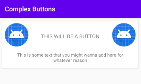
To start off, we need a layout. I’ll leave that to you. Any layout you have will be fine. For me, I’ll be going with a ConstraintLayout with two ImageViews in the corners and a couple of TextViews in the middle. I’ll name the XML layout resource file custom_button.
首先,我们需要一个布局。 我留给你。 您拥有的任何布局都可以。 对我来说,我将使用ConstraintLayout其中的两个角落有两个ImageViews ,中间有两个TextViews 。 我将XML布局资源文件custom_button 。

For simplicity’s sake, I’ll include this directly into the activity’s layout. Of course, you can use it as a RecyclerView item or however you please.
为简单起见,我将直接将其包含在活动的布局中。 当然,您也可以将其用作RecyclerView项目。

For now, make sure you set the background of custom_button so that it won’t be transparent. Otherwise, you won’t be able to see the changes as we’re doing them. We will change the background attribute again later on, but for now, set it to any color. I’ll choose white.
现在,请确保将custom_button的背景设置为透明。 否则,您将无法在进行更改时看到更改。 稍后我们将再次更改background属性,但现在将其设置为任何颜色。 我会选择白色。
Now that we’ve set that up, let’s deal with elevation and the ripple effect.
现在我们已经设置好了,让我们处理仰角和波纹效果。
海拔 (Elevation)
The first thing you want to do is add some properties to custom_button that will let Android know it’s a clickable item and has a default 2dp of elevation, as per the Material Design Guidelines. To do that, we set the properties clickable and focusable to true and elevation to 2dp.
根据材料设计指南,您要做的第一件事是向custom_button添加一些属性,该属性将使Android知道它是可单击的项目,并且默认具有2dp的高程。 要做到这一点,我们设置的属性clickable和focusable于true和elevation到2dp 。
Our custom_button is now starting to look more like a button, but it won’t visually change when tapped.
我们的custom_button现在开始看起来更像一个按钮,但是在点击时不会在视觉上发生变化。
To apply an elevation animation based on the state of the layout (e.g. pressed or not), we need to utilize the stateListAnimator property on the layout itself. Before we do that, though, we need to add an animator in which we will define the animations first.
要基于布局的状态(例如,是否按下)来应用高程动画,我们需要在布局本身上利用stateListAnimator属性。 但是,在此之前,我们需要添加一个动画器,在该动画器中我们将首先定义动画。
To do that, go to your res section. If you can’t find an animator resource directory, add it by right-clicking on res -> New -> Android Resource Directory.
为此,请转到您的res部分。 如果找不到动画师资源目录,请右键单击res-> New-> Android Resource Directory来添加它。
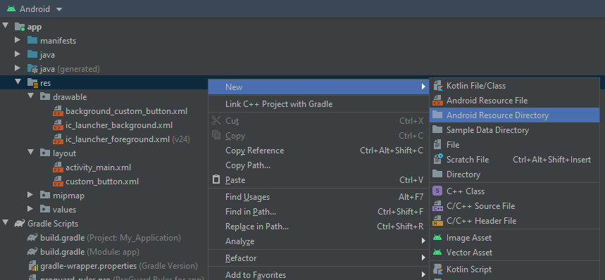
Then in the New Resource directory pop-up, choose animator in the Resource Type and click OK.
然后在“新资源”目录弹出窗口中,在“资源类型”中选择动画器,然后单击“确定”。

You should now have an animator resource directory. It’s time to add an animator. Right-click on animator -> New -> Animator Resource File.
您现在应该有一个动画师资源目录。 现在是时候添加一个动画师了。 右键单击动画器->新建->动画器资源文件。
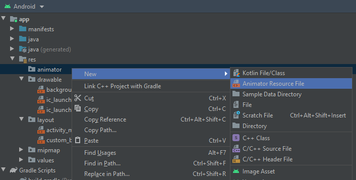
Name the file button_elevation_animator, pick selector as the root element, then click OK.
将文件命名为button_elevation_animator ,选择选择器作为根元素,然后单击“确定”。

The animator will have items. Each item will define the state in which it’ll apply some animations. Each item will also have an objectAnimator that will define the duration of the animation, the property it’ll animate, and the value change it’ll apply to that property.
动画师将拥有物品。 每个项目都将定义将应用某些动画的状态。 每个项目还将有一个objectAnimator ,它将定义动画的持续时间,将为其设置动画的属性以及将应用于该属性的值更改。
The property we care about when it comes to elevation is translationZ. We want to increase it by 6dp (additional to original elevation) so that the elevation is 8dp total, as per the Material Design Guidelines. We also want that animation to happen when the layout is enabled and pressed. Otherwise, set the elevation value change back to 0dp (original elevation).
当涉及到高程时,我们关心的属性是translationZ 。 根据材料设计指南,我们希望将其增加6dp(除原始高程之外),以使总高程为8dp。 我们还希望该动画在启用并按下布局时发生。 否则,将高程值更改设置回0dp(原始高程)。
Feel free to change the duration of the animation. However, I chose a predefined shortAnimTime, which is 200 milliseconds.
随时更改动画的持续时间。 但是,我选择了一个预定义的shortAnimTime ,它是200毫秒。
To apply this state animation, we set it as the stateListAnimator of the custom_button we made earlier.
要应用此状态动画,我们将其设置为我们先前制作的stateListAnimator的custom_button 。
Voila! Now custom_button will increase and decrease elevation (as can be seen by its shadow) depending on its state.
瞧! 现在custom_button将根据其状态增加和减少高度(如其阴影所示)。

连锁React (Ripple Effect)
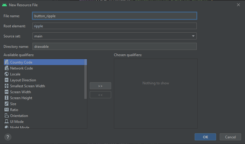
Adding the ripple effect is as simple as creating a ripple effect drawable that can be applied to the background of custom_button. Right-click on drawable -> New -> Drawable Resource File.
添加波纹效果就像创建可应用于custom_button的背景的可绘制波纹效果一样简单。 右键单击drawable-> New-> Drawable资源文件。

Choose ripple as the root element, name it button_ripple, then click OK.
选择波纹作为根元素,将其命名为button_ripple ,然后单击确定。
The ripple root element will need to have a color (the color of the ripple), and it’ll have one item that has a shape (the shape of the view it’ll add the ripple effect to). We’ll also set the color of the shape (the background color of the shape) to white here since we’ll be replacing the background property that we previously set directly to white.
ripple根元素将需要具有颜色(波纹的颜色),并且将具有一个具有形状的项(将为其添加波纹效果的视图的形状)。 我们还将在此处将形状的颜色(形状的背景色)设置为白色,因为我们将替换之前直接设置为白色的background属性。
Now we can go back to custom_button.xml and set the background to button_ripple.
现在,我们可以返回custom_button.xml并将背景设置为button_ripple 。
That’s it! Now you have a layout that behaves like a button visually when tapped! You can simply add an OnClickListener to it and it’ll function and behave like a button!
而已! 现在您有了一个布局,当点击它时,其外观就像按钮一样! 您可以简单地向其中添加一个OnClickListener ,它将起作用并表现得像一个按钮!

结论 (Conclusion)
Thanks for reading. I hope this was useful to you. Until next time, this is Dev Bites signing out!
谢谢阅读。 我希望这对您有用。 直到下次,这是Dev Bites退出!
资源资源 (Resource)
翻译自: https://medium.com/better-programming/recreating-a-button-in-android-97e5eac067bc
android 创建按钮


 888
888


 被折叠的 条评论
为什么被折叠?
被折叠的 条评论
为什么被折叠?
 到【灌水乐园】发言


