


log mdc
This post is going to build upon that to see how we can adapt our apps to support dark themes.
这篇文章将以此为基础,了解我们如何调整应用程序以支持深色主题。
User selectable dark themes were added to the Android platform in Android 10, but that does not mean they’re new to app developers. The default theme for Android devices was dark up until Android 5.0 (Lollipop)!
用户可选的深色主题已添加到Android 10的Android平台中,但这并不意味着它们对应用程序开发人员来说并不新鲜。 直到Android 5.0( Lollipop )为止,Android设备的默认主题都变黑了!
The difference last year was that the platform added a device-wide setting. Meaning that the user has additional control over the theme of the device, but also of apps.
去年的区别是该平台添加了设备范围的设置。 这意味着用户可以控制设备主题以及应用程序主题。
Alongside the recent device-wide setting, we now also have comprehensive design guidance on material.io, which we will talk about later in this blog post.
除了最近在整个设备范围内进行的设置之外,我们现在还具有针对material.io的全面设计指南 ,我们将在本博客文章的后面部分进行讨论。
为什么支持深色主题? (Why support dark theme?)
First up, why support a dark theme at all? The Material.io page on Dark Theme has a good summary on some of the technical benefits (emphasis mine):
首先,为什么要完全支持深色主题? Dark Theme上的Material.io页面对一些技术优势(重点是我的)进行了很好的总结:
Dark themes reduce the luminance emitted by device screens […]. They help improve visual ergonomics by reducing eye strain, adjusting brightness to current lighting conditions, and facilitating screen use in dark environments — all while conserving battery power [for OLED displays].
深色主题会降低设备屏幕[...]发出的亮度。 它们可通过减少眼睛疲劳,在当前照明条件下调节亮度并促进在黑暗环境中的屏幕使用来改善视觉人体工程学 ,同时节省电池电量 (用于OLED显示器)。
The most important reason though is that your users want it. The Android team added the system-wide dark theme setting because it consistently came up as a top requested feature by users.
不过,最重要的原因是您的用户想要它。 Android团队添加了系统范围内的深色主题设置,因为它始终是用户最需要的功能。
Now that I’ve convinced you to support dark themes in your app, let’s look at how you add one…
现在,我已经说服您在您的应用程序中支持深色主题,让我们看看如何添加一个主题...
快速开始 (Quick start)
To add a dark theme to your app, use Material Design Components (MDC) for Android’s support:
要将深色主题添加到您的应用中,请使用Material Design Components (MDC)以获得Android支持:
#1:更改主题 (#1: Change your theme)
You need to change your theme to extend from one of the Theme.MaterialComponents.DayNight themes:
您需要更改主题以从Theme.MaterialComponents. DayNight之一扩展Theme.MaterialComponents. DayNight Theme.MaterialComponents. DayNight主题:
<style name="Theme.MyApp"
       parent="Theme.MaterialComponents.DayNight">    <!-- Other theme attributes --></style>
#2:选择要使用的模式(可选) (#2: Choose what mode to be in (optional))
This step is optional, but allows you to support devices running versions of Android before Android 10. Since most devices before Android 10 do not have a system-level dark theme setting*, apps can provide their own in-app setting to allow users to choose what theme to use per-app.
此步骤是可选步骤,但可让您支持运行Android 10之前的Android版本的设备。由于Android 10之前的大多数设备没有系统级深色主题设置* ,因此应用程序可以提供自己的应用程序内设置,以允许用户选择每个应用使用的主题。
This is also still useful on Android 10+, as it allows users to override the system setting as they wish. As an example, imagine that the user sets their device theme to be controlled on a time schedule, but they know that they always want their social apps to use a dark theme.
这在Android 10+上也仍然有用,因为它允许用户根据需要覆盖系统设置。 例如,假设用户将其设备主题设置为按时间表进行控制,但是他们知道他们始终希望其社交应用使用深色主题。
To help with this, AppCompat (which MDC uses) provides an API to set the chosen mode: AppCompatDelegate.setDefaultNightMode(). Commonly this would be called whenever a preference changes.
为解决此问题, AppCompat (MDC使用)提供了一个API来设置所选模式: AppCompatDelegate. setDefaultNightMode() AppCompatDelegate. setDefaultNightMode() 。 通常,每当首选项发生更改时,都会调用它。
* Not strictly true. Some device manufacturers have added a system-level dark theme to their devices which are running Android 9 (and below). Unfortunately there’s no way to determine this at runtime.
*并非完全正确。 一些设备制造商已在运行Android 9(及更低版本)的设备中添加了系统级深色主题。 不幸的是,无法在运行时确定这一点。
If you would like to read more about how the night mode feature in AppCompat works, have a look at this blog post:
如果您想了解有关AppCompat中夜间模式功能如何工作的更多信息,请查看此博客文章:
#3:测试! (#3: Test!)
And there we have the basis of a dark theme! It’s time to test it out by checking each part of the app in both light and dark themes. Look out for any dark text on dark backgrounds, and hardcoded colors which do not have enough contrast against the dark backgrounds (typically, greys).
在那里,我们有了黑暗主题的基础! 现在是时候通过检查浅色和深色主题的应用程序的每个部分来对其进行测试。 请注意深色背景上是否有深色文字,以及与深色背景(通常为灰色)对比度不足的硬编码颜色。
If you are using hard coded color values in your app, I recommend reading this blog post by Nick Butcher, which talks about preferring theme attributes:
如果您在应用中使用硬编码的颜色值,建议阅读Nick Butcher的这篇博客文章,该文章讨论了首选主题属性:
We also cover this in our ‘Theming with Style’ talk at Android Dev Summit ‘19:
我们还在Android Dev Summit '19的“ 主题风格化 ”演讲中对此进行了介绍:
物质黑暗主题 (Material Dark Theme)
Now let’s take a look at the design characteristics of dark theme which are described on Material.io.
现在让我们看一下Material.io中描述的深色主题的设计特征。
灰色vs黑色 (Grey vs black)
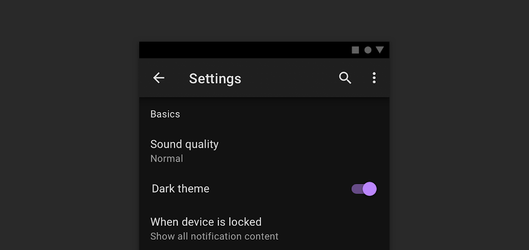
The first thing you might notice is that the default background for apps in dark theme is not black, but instead a dark grey: #121212.
您可能会注意到的第一件事是,深色主题的应用程序的默认背景不是黑色,而是深灰色: #121212 。
There’s lots of discussions about why we chose grey vs black, especially since the platform in Android 10 uses a black background. This is largely a trade-off between usability vs power savings.
关于为什么我们选择灰色还是黑色的讨论很多,特别是因为Android 10中的平台使用黑色背景。 这很大程度上是可用性与节能之间的权衡。
Using a pure black #000000 color as the background in the platform, allows the system apps and surfaces to use as little power as possible when they’re open on OLED displays. These system surfaces tend to be quite simple, typically just text and simple icons, so to battle contrast issues we can adjust the text and icon colors to suit.
在平台上使用纯黑色#000000颜色作为背景,允许系统应用程序和表面在OLED显示器上打开时使用尽可能少的电源。 这些系统表面往往非常简单,通常只是文本和简单的图标,因此要解决对比度问题,我们可以调整文本和图标的颜色以适合。
In apps though, your surfaces can contain anything: complex colorful vector animations, bright imagery, contrasting branded surfaces and lots more. Placing these against a pure black background means that the resulting contrast is much higher, which can increase eye strain. Unlike text and icons we mentioned above, it is often difficult or unwanted to tint/re-color these types of content to reduce the contrast, meaning that a lighter background is the solution.
不过,在应用程序中,您的表面可以包含任何内容:复杂的炫彩矢量动画,明亮的图像,对比鲜明的品牌表面等等。 将它们放在纯黑色背景上意味着得到的对比度要高得多,这会增加眼睛疲劳。 与我们上面提到的文本和图标不同,通常很难或不希望对这些类型的内容进行着色/重新着色以降低对比度,这意味着可以使用较浅的背景。
色彩调色板 (Color palette)
Next up, let’s look at your app’s color palette. It’s likely that your app’s color palette has been chosen based on the assumption of a light/white background, so we likely need to make some tweaks to the color palette when the app is running in a dark theme.
接下来,让我们看一下应用程序的调色板。 您的应用程序的调色板很可能是基于浅色/白色背景的假设选择的,因此当应用程序在黑暗主题下运行时,我们可能需要对调色板进行一些调整。
回顾材料色彩系统 (Recap on Material color system)
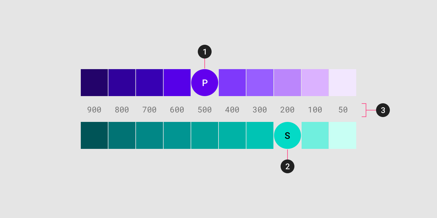
We’re going to be talking about color tones a lot below, so here’s a quick recap on the Material color system. It defines colors as a series of tones within each color. The tones are numbered from 50 (lightest, least saturated tone), to 900 (darkest, most saturated tone). Here’s the baseline teal and indigo color tones:
我们将在下面大量讨论色调,因此这里是对材质颜色系统的快速回顾。 它将颜色定义为每种颜色内的一系列色调。 音调的编号从50 (最浅,最不饱和的音调)到900 (最暗,最不饱和的音调)。 这是基线蓝绿色和靛蓝色调:
You can also play around in the Material color tool to get an idea of how the tones for different colors vary. Nick Rout also wrote up a deep-dive on the color system here.
您还可以在“ 材质颜色”工具中进行操作,以了解不同颜色的色调如何变化。 尼克·罗特 ( Nick Rout )在这里还对色彩系统进行了深入探讨。
colorPrimary (colorPrimary)
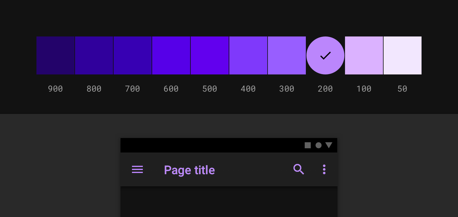
Your app’s primary color is the most displayed color (other than background and surface colors), so we need to make sure that it is legible in dark themes. Typically in a light theme, your light theme would be a 500 tone of a color, whereas in a dark theme we recommend a less saturated and more luminous tone, typically 200, but can be up to 50 depending on the hue.
您应用的原色是显示最多的颜色(背景和表面颜色除外),因此我们需要确保它在深色主题中清晰可见。 通常,在浅色主题中,您的浅色主题将是一种颜色的500色调,而在深色主题中,我们建议您使用饱和度较低且发光度更高的色调,通常为200 ,但根据色相最多可以达到50 。
For your colorPrimaryVariant, we recommend using the colorPrimary from your light theme. As a rough guide:
对于您的colorPrimaryVariant ,我们建议您使用浅色主题中的colorPrimary 。 作为大致指导:
These values are just a starting point though. You should ensure that the chosen colors have a WCAG AA contrast ratio of at least 4.5:1 against the background/surface color at all used elevation levels (more on that later).
这些值只是一个起点。 您应确保在所有使用的海拔高度下,所选颜色与背景/表面颜色的WCAG AA对比度至少为4.5 : 1(稍后会详细介绍)。
The Material Color Tool is handy for experimenting with colors.
“ 材质颜色工具”非常适合尝试颜色。
colorSecondary (colorSecondary)
For your secondary color, it’s the same process as colorPrimary, by using a less saturated and more luminous tone of the same color.
对于您的辅助颜色,它与colorPrimary处理过程相同, colorPrimary使用相同颜色的饱和度较低且发光度更高的色调。
The baseline Material dark theme treats the colorSecondaryVariant a little differently to colorPrimaryVariant, using the same tone for both colorSecondary and colorSecondaryVariant.
基线深色主题对待colorSecondaryVariant不同的一点colorPrimaryVariant ,使用两个相同的色调colorSecondary和colorSecondaryVariant 。
Again, as a rough guide:
再次,作为一个粗略的指导:
表面颜色 (Surface colors)
Bold colored surfaces can be a great way to express your brand in commonly used components, such as cards. While vivid and bold colors work great against a white background, their legibility against a dark background isn’t so great.
加粗的彩色表面可能是在常用组件(例如卡片)中表达品牌的好方法。 虽然鲜艳大胆的颜色在白色背景下效果很好,但在深色背景下的可读性却不太好。
If the device and/or app has been set to use a dark theme, the app should read this as an intention from the user that they want a muted, less vivid color scheme at that moment.
如果设备和/或应用程序已设置为使用深色主题,则该应用程序应从用户那里读取此内容,以表示他们当时希望使用柔和的,较不鲜艳的配色方案。
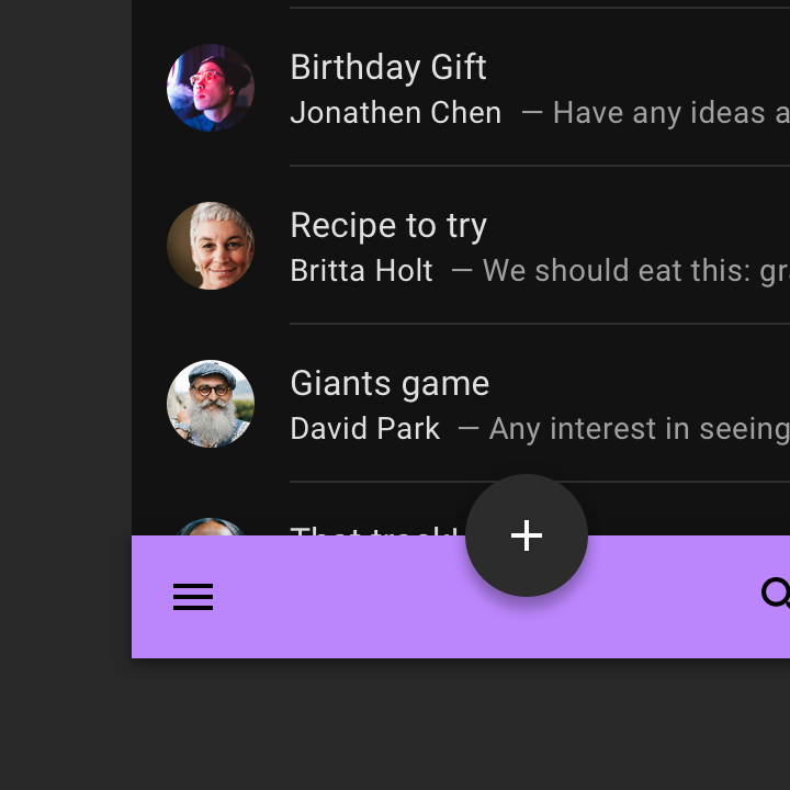
With that intention in mind, even if we use muted 50–200 color tones for branded surfaces, it can still be too bold and emit too much light for a dark theme:
怀着这种意图,即使我们使用静音50 - 200色调为品牌的表面,它仍然是过于大胆,并发出光线太强了黑暗的主题:
So what should you do? There’s two options, which can be used together:
那你该怎么办? 有两个选项可以一起使用:
使用主表面 (Use primary surface)
The first step is the obvious one of not using bright, colorful surfaces when in dark theme. Material Design Components for Android makes this simple with its PrimarySurface styles, which switch between the Primary color in light theme and Surface color in dark theme.
第一步显然是在黑暗主题下不使用明亮,彩色的表面。 Android的Material Design组件使用PrimarySurface样式简化了这一过程,可以在浅色主题的Primary色和深色主题的Surface色之间切换。
Let’s look at an example. Say we have a BottomAppBar like the above example, we can use the Widget.MaterialComponents.BottomAppBar.PrimarySurface style:
让我们来看一个例子。 像上面的示例一样,我们有一个BottomAppBar ,我们可以使用Widget.MaterialComponents.BottomAppBar.PrimarySurface样式:
<com.google.android.material.bottomappbar.BottomAppBar
   style="Widget.MaterialComponents.BottomAppBar.PrimarySurface" />
If you have a non-MDC view which you would like to be treated similarly, you can use the ?attr/colorPrimarySurface theme attribute:
如果您有一个非MDC视图,您希望对其进行类似处理,则可以使用?attr/colorPrimarySurface主题属性:
<FrameLayout
    android:background="?attr/colorPrimarySurface" />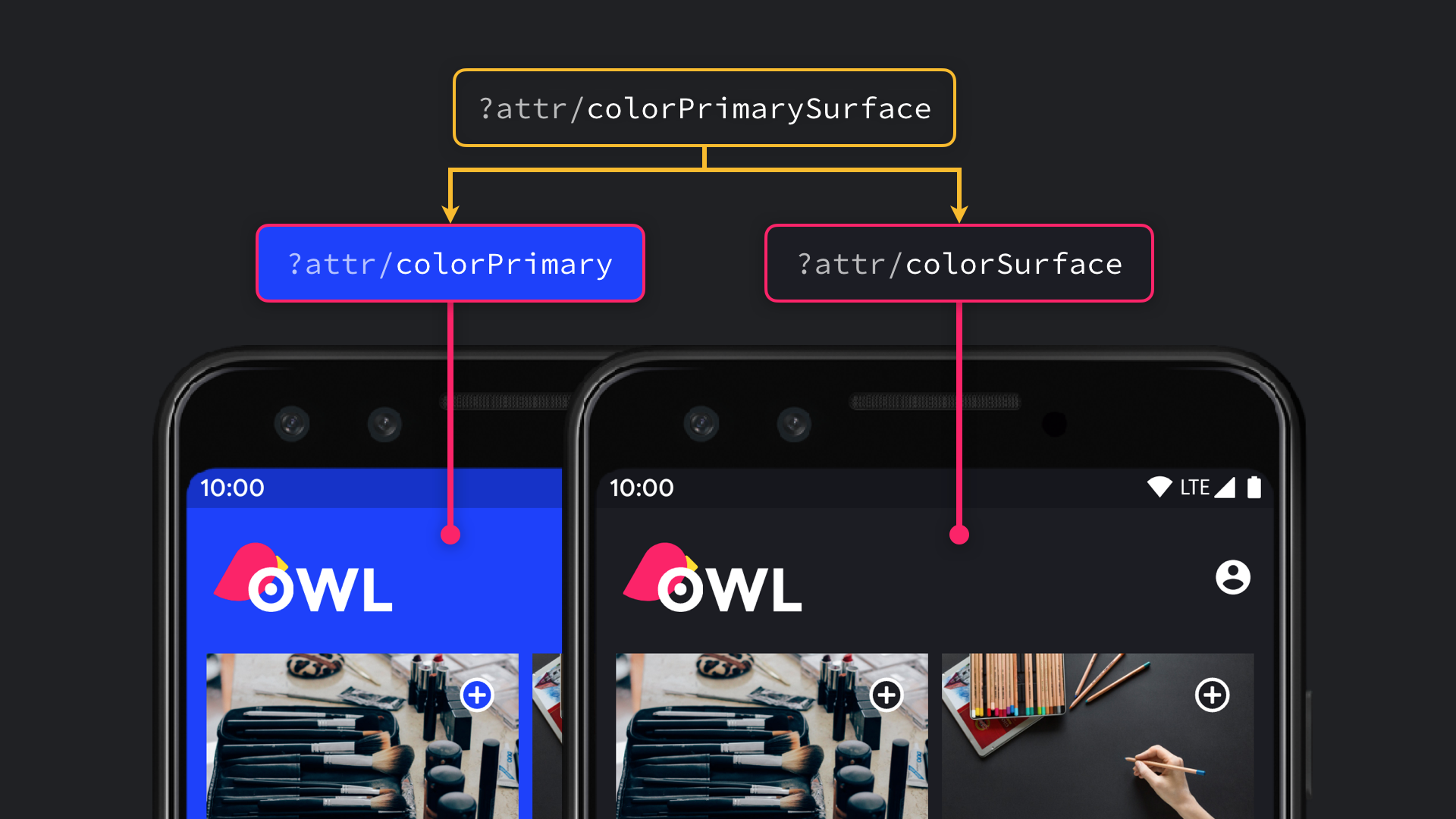
In fact, the components which use a bright surface color in light themes (such as MaterialToolbar), default to the same behavior. You may find that you don’t need to do any work here.
实际上,在浅色主题中使用亮表面颜色的组件(例如MaterialToolbar )默认具有相同的行为。 您可能会发现您不需要在这里做任何工作。
品牌表面颜色 (Branded surface color)
To subtly express your brand color on all of your app’s surface, you can set your colorSurface to be a calculated color of colorPrimary with 8% opacity, composited over colorSurface, when in dark theme.
要在应用程序的所有表面上巧妙地表达品牌色彩,可以将colorSurface设置为深色主题中与colorSurface合成的8%不透明度的colorPrimary的计算颜色。
For an example using the baseline theme’s values:
有关使用基准主题值的示例:
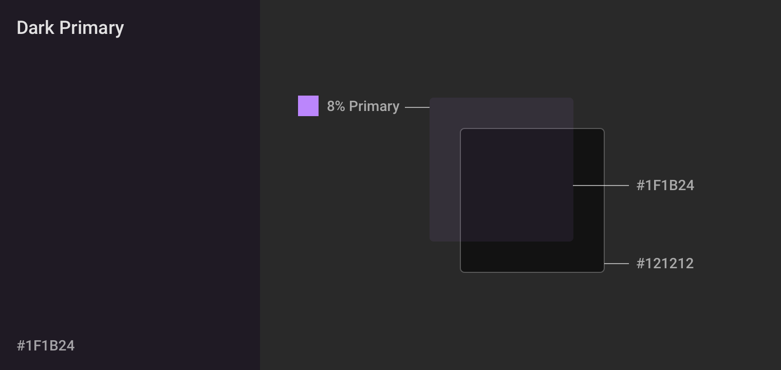
This allows your brand to subtly be applied across the app, while still keeping the intention of a muted, low light color palette.
这样一来,您的品牌就可以巧妙地应用到整个应用程序中,同时仍然可以保持柔和的低光调色板的意图。
制作深色主题示例 (Crafting dark theme example)
If you’d like to see an example of taking a light-themed app and adding a dark theme, watch Liam Spradlin’s video here, where he crafts a dark theme for the Reply Material Study app:
如果您想查看一个以浅色主题的应用程序并添加深色主题的示例,请在此处观看Liam Spradlin的视频,他在其中为“ 回复材料研究”应用程序制作深色主题:
We’ve just gone through a lot of information about choosing colors, but how should you set these in your Android app?
我们刚刚介绍了许多有关选择颜色的信息,但是如何在Android应用程序中进行设置呢?
We’re going to rely on some organisation of our themes. We’re going to use a theme structure like this:
我们将依靠我们主题的某种组织。 我们将使用这样的主题结构:
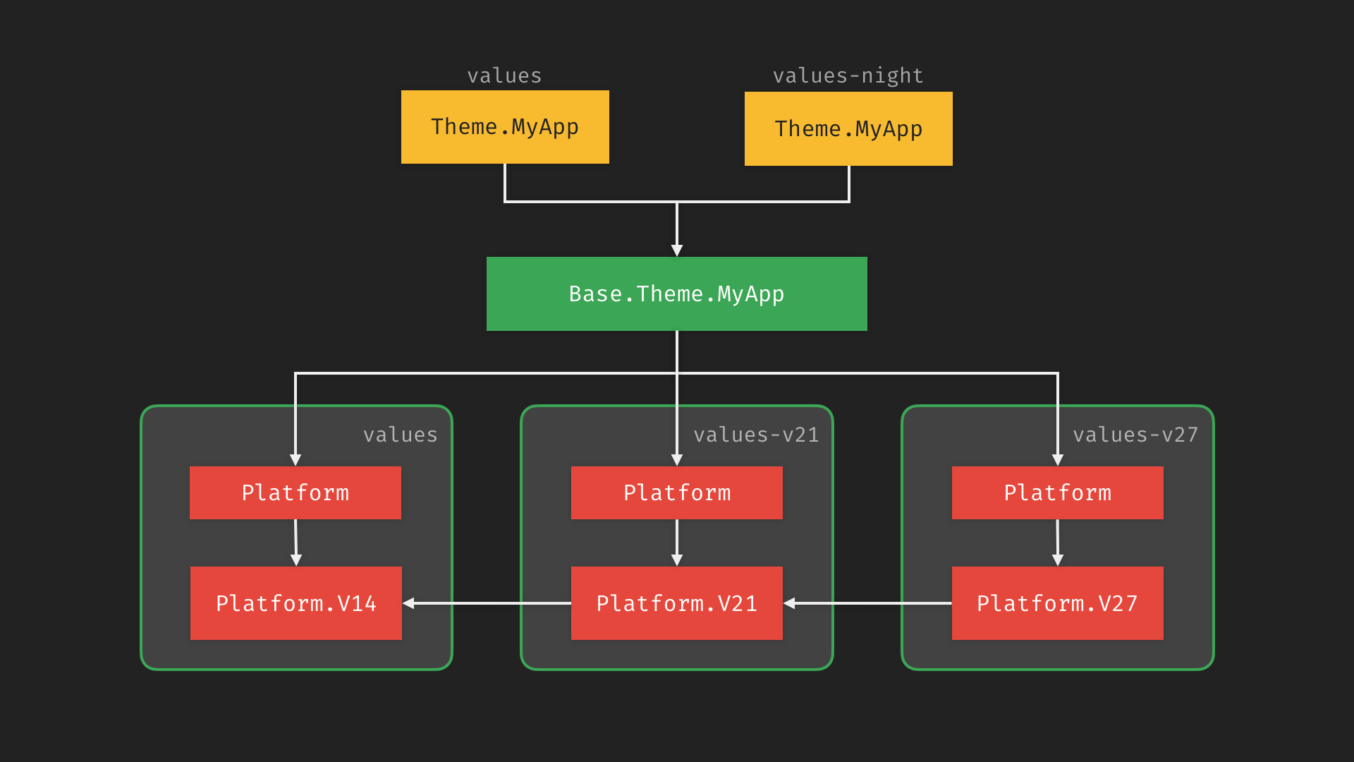
This structure enables us to easily vary the theme in light and dark themes, while also allowing us to re-use common content in the base theme.
这种结构使我们可以轻松地在浅色和深色主题中改变主题,同时还允许我们重用基本主题中的通用内容。
If you’d like to know more about this structure, I recommend watching the Developing Themes with Style talk which Nick Butcher and I gave last year.
如果您想了解更多有关此结构的信息,我建议您观看我和尼克·巴彻 ( Nick Butcher )去年发表的关于“ 用样式开发主题”的演讲。
高程叠加层 (Elevation overlays)
Earlier in this post, we mentioned in a few places about testing contrast against all elevation levels. You might have been wondering why that is, when elevation is about lifting surfaces to cast shadows, right? Well yes, elevation is about lifting surfaces, but it’s not just about casting shadows.
在本文的前面,我们在一些地方提到了在所有海拔高度下进行对比测试。 您可能想知道为什么,当高程是关于提升曲面以投射阴影时,对吗? 好吧,高程是关于提升曲面,但不仅仅是投射阴影。
Shadows in the Material system are cast by numerous light sources, and as we lift surfaces (using elevation property), we are lifting them towards the light sources. Just like the world around us, shadows occur when those light sources are blocked by surfaces. Similarly, the closer that a surface is to a light source the more that the surface is lit, changing its perceived color.
材质系统中的阴影是由许多光源投射的,并且当我们提升曲面(使用高程属性)时,我们会将其朝光源提升。 就像我们周围的世界一样,当这些光源被表面遮挡时,就会出现阴影。 类似地,表面离光源越近,该表面被照亮的程度就越大,从而改变其感知的颜色。
For light surface colors, such as white, that change is imperceptible since it is already light. For dark surfaces though, it can have a large effect:
对于浅色的表面颜色(例如白色),因为它已经是浅色的,所以看不到这种变化。 但是对于深色表面,它会产生很大的影响:
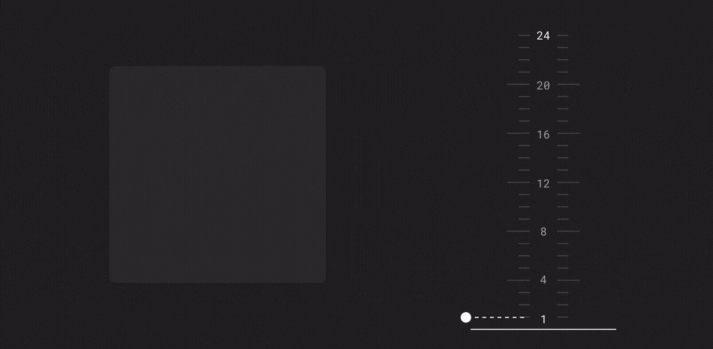
This is where elevation overlays come into play. The behavior of lightening the surface color is expressed as compositing a translucent white overlay of onSurface, over the surface color. The greater the elevation, the more opaque the overlay.
这是高程叠加层起作用的地方。 减轻表面颜色的行为表示为在表面颜色上合成onSurface的半透明白色覆盖层。 高程越大,覆盖图越不透明。
Going back to address the earlier points, this is why you need to test at the different elevations. As the visual surface changes based on the elevation, you need to make sure that any foreground colors provide enough contrast. Ideally you set a single onSurface color which works for all of the elevation values used in your app.
回到先前的观点,这就是为什么您需要在不同的海拔高度进行测试的原因。 当视觉表面根据高程变化时,您需要确保任何前景色都能提供足够的对比度。 理想情况下,您可以设置一个onSurface颜色,该颜色适用于应用中使用的所有海拔高度值。
小部件支持 (Widget support)
All of the components in Material Design Components support elevation overlays automatically, including: Top App Bar, Bottom App Bar, Bottom Navigation, Tabs, Card, Dialog, Menu, Bottom Sheet, Navigation Drawer & Switch.
“材料设计组件”中的所有组件都自动支持高程叠加,包括: 顶部应用程序栏 , 底部应用程序栏 , 底部导航 , 选项卡 , 卡片 , 对话框 , 菜单 , 底部工作表 , 导航抽屉和开关 。
This means that using the standard elevation APIs will automatically apply an elevation overlay, as long as the background is set to ?attr/colorSurface (either explicitly or using a surface style variant). Going back to our earlier example:
这意味着只要背景设置为?attr/colorSurface (显式或使用表面样式变体),使用标准高程API就会自动应用高程叠加层。 回到我们前面的例子:
There are some theme attributes which you can set to change the behavior of elevation overlays:
您可以设置一些主题属性来更改高程叠加层的行为:
?attr/elevationOverlayEnabledallows you to turn on/off elevation overlays for your theme. This defaults to true in dark theme, false in light theme.?attr/ elevationOverlayEnabled允许您打开/关闭主题的高程叠加层。 深色主题默认为true,浅色主题默认为false。?attr/elevationOverlayColorallows you to change the color of any elevation overlays. This defaults to?attr/colorOnSurface.?attr/ elevationOverlayColor允许您更改任何高程叠加层的颜色。 默认为?attr/colorOnSurface。
You shouldn’t really need to change these values though.
不过,您实际上不需要更改这些值。
自定义视图 (Custom views)
So that’s great, but what if you’ve got a custom view which needs to support elevation overlay? Well you’re in luck. All of the elevation overlay support is built into MaterialShapeDrawable, with a bit of plumbing in your view:
太好了,但是如果您有需要支持海拔叠加的自定义视图怎么办? 好吧,你很幸运。 所有的高程覆盖支持都内置于MaterialShapeDrawable ,在您的视图中有一些管道:
OK Google,晚安good (OK Google, goodnight 🌚)
Hopefully by the end of the blog post you’ve gained a understanding of what you need to do to add a dark theme to your app. If there’s anything you found difficult when implementing a dark theme, leave a comment below or reach out to us on Twitter @MaterialDesign and @AndroidDev.
希望到博客文章结束时,您已经了解了向应用程序添加深色主题所需的操作。 如果在实施深色主题时发现有任何困难,请在下面发表评论,或通过Twitter @MaterialDesign和@AndroidDev与我们联系 。
翻译自: https://medium.com/androiddevelopers/dark-theme-with-mdc-4c6fc357d956
log mdc


 1078
1078


 被折叠的 条评论
为什么被折叠?
被折叠的 条评论
为什么被折叠?
 到【灌水乐园】发言


