


pandas数据处理 代码
We have been talking about using the Pandas pipe function to improve code readability. In this article, let’s have a look at Pandas Method Chaining.
我们一直在讨论使用Pandas管道函数来提高代码的可读性 。 在本文中,我们来看看Pandas 方法链接 。
In Data Processing, it is often necessary to perform operations on a certain row or column to obtain new data. Instead of writing
在数据处理中,通常需要对特定的行或列执行操作以获得新数据。 而不是写
df = pd.read_csv('data.csv')
df = df.fillna(...)
df = df.query('some_condition')
df['new_column'] = df.cut(...)
df = df.pivot_table(...)
df = df.rename(...)
We can do
我们可以做的
(pd.read_csv('data.csv')
   .fillna(...)
   .query('some_condition')
   .assign(new_column = df.cut(...))
   .pivot_table(...)
   .rename(...)
)
Method Chaining has always been available in Pandas, but support for chaining has increased through the addition of new “chain-able” methods. For example, query(), assign(), pivot_table(), and in particular pipe() for allowing user-defined methods in method chaining.
方法链接在Pandas中一直可用,但是通过添加新的“可链接”方法, 对链接的支持得到了增加 。 例如query() , assign() , pivot_table() ,特别是pipe() 用于允许用户定义的方法链接到方法中 。
Method chaining is a programmatic style of invoking multiple method calls sequentially with each call performing an action on the same object and returning it.
方法链接是一种程序设计风格,可以依次调用多个方法调用,每个调用对同一个对象执行一个动作并返回它。
It eliminates the cognitive burden of naming variables at each intermediate step. Fluent Interface, a method of creating object-oriented API relies on method cascading (aka method chaining). This is akin to piping in Unix systems.
它消除了在每个中间步骤中命名变量的认知负担。 Fluent Interface是一种创建面向对象API的方法,它依赖于方法级联(也称为方法链)。 这类似于Unix系统中的管道传输。
Method chaining substantially increases the readability of the code. Let’s dive into a tutorial to see how it improves our code readability.
方法链接大大提高了代码的可读性。 让我们深入研究一个教程,看看它如何提高我们的代码可读性。
For source code, please visit my Github notebook.
有关源代码,请访问我的Github笔记本 。
数据准备 (Dataset preparation)
For this tutorial, we will be working on the Titanic Dataset from Kaggle. This is a very famous dataset and very often is a student’s first step in data science. Let’s import some libraries and load data to get started.
对于本教程,我们将使用Kaggle的Titanic Dataset 。 这是一个非常著名的数据集,通常是学生在数据科学中的第一步。 让我们导入一些库并加载数据以开始使用。
import pandas as pd
import sys
import seaborn as sns
import matplotlib.pyplot as plt
%matplotlib inline
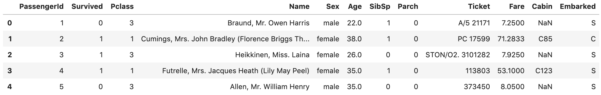
%config InlineBackend.figure_format = 'svg'df = pd.read_csv('data/train.csv')
df.head()We load train.csv file into Pandas DataFrame
我们将train.csv文件加载到Pandas DataFrame中
Let’s start by checking out missing values. We can use seaborn to create a simple heatmap to see where are missing values
让我们从检查缺失值开始。 我们可以使用seaborn来创建一个简单的热图,以查看缺少的值
sns.heatmap(df.isnull(),
            yticklabels=False,
            cbar=False,
            cmap='viridis')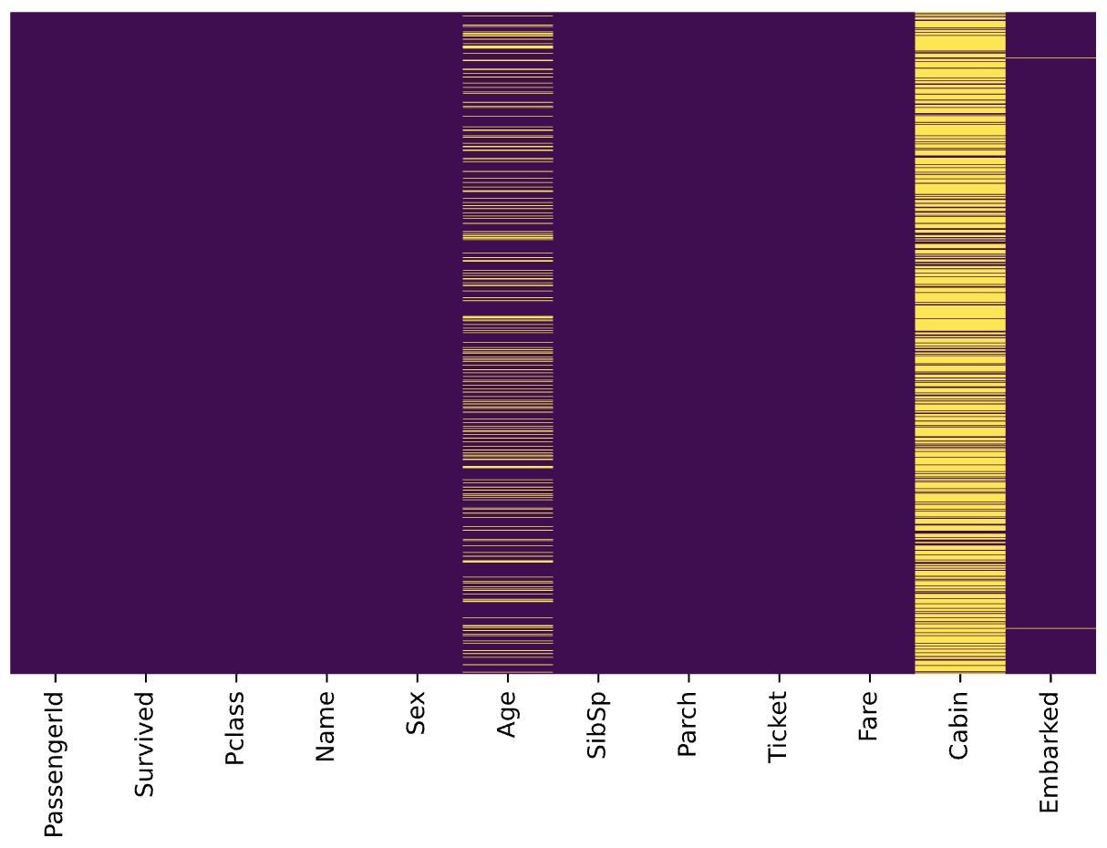
Age, Cabin, and Embarked have missing values. The proportion of Age missing is likely small enough for reasonable replacement with some form of imputation. Looking at the Cabin column, it looks like a lot of missing values. The proportion of Embarked missing is very small.
年龄 , 机舱和登机缺少值。 年龄缺失的比例可能很小,不足以用某种形式的估算合理地替代。 查看“ 机舱”列,看起来好像有很多缺失值。 登机失踪的比例很小。
任务 (Task)
Suppose we have been asked to take a look at passengers departed from Southampton, and work out the survival rate for different age groups and Pclass.
假设我们被要求看一下从南安普敦出发的乘客,并计算出不同年龄段和Pclass的生存率 。
Let’s split this task into several steps and accomplish them step by step.
让我们将该任务分为几个步骤,并逐步完成它们。
Data cleaning: replace the missing Age with some form of imputation
数据清理:用某种形式的插补代替缺失的年龄
- Select passengers departed from Southampton 选择南安普敦出发的乘客
- Convert ages to groups of age ranges: ≤12, Teen (≤ 18), Adult (≤ 60) and Older (>60) 将年龄转换为年龄组:≤12,青少年(≤18),成人(≤60)和年龄较大(> 60)
Create a pivot table to display the survival rate for different age groups and Pclass
创建数据透视表以显示不同年龄组和Pclass的生存率
- Improve the display of pivot table by renaming axis labels and formatting values. 通过重命名轴标签和格式化值来改进数据透视表的显示。
Cool, let’s go ahead and use Pandas Method Chaining to accomplish them.
太酷了,让我们继续使用Pandas 方法链接来完成它们。
1.用某种形式的插补代替失落的时代 (1. Replacing the missing Age with some form of imputation)
As mentioned in the Data preparation, we would like to replace the missing Age with some form of imputation. One way to do this is by filling in the mean age of all the passengers. However, we can be smarter about this and check the average age by passenger class. For example:
如数据准备中所述,我们想用某种形式的估算代替缺失的年龄 。 一种方法是填写所有乘客的平均年龄。 但是,我们可以对此有所了解,并按旅客等级检查平均年龄。 例如:
sns.boxplot(x='Pclass',
            y='Age',
            data=df,
            palette='winter')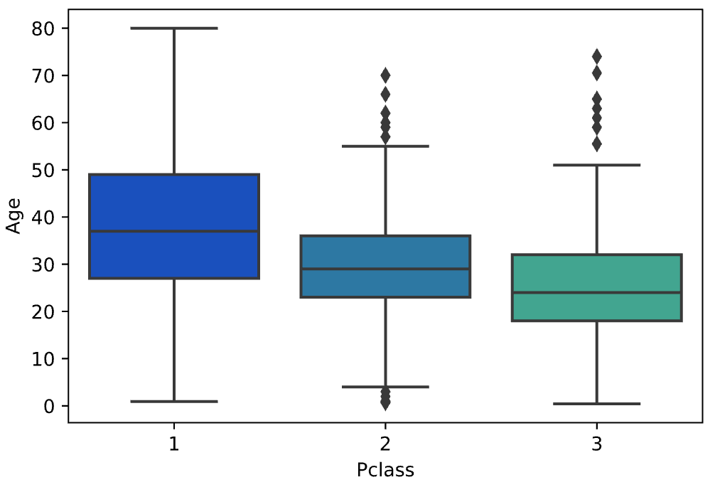
We can see the wealthier passengers in the higher classes tend to be older, which makes sense. We’ll use these average age values to impute based on Pclass for Age.
我们可以看到,较高阶层的较富裕乘客往往年龄较大,这是有道理的。 我们将使用这些平均年龄值根据年龄的Pclass进行估算。
pclass_age_map = {
  1: 37,
  2: 29,
  3: 24,
}def replace_age_na(x_df, fill_map):
    cond=x_df['Age'].isna()
    res=x_df.loc[cond,'Pclass'].map(fill_map)
    x_df.loc[cond,'Age']=res    return x_df
x_df['Age'].isna() selects the Age column and detects the missing values. Then, x_df.loc[cond, 'Pclass'] is used to access Pclass values conditionally and call Pandas map() for substituting each value with another value. Finally, x_df.loc[cond, 'Age']=res conditionally replace all missing Age values with res.
x_df['Age'].isna()选择“ 年龄”列并检测缺少的值。 然后,使用x_df.loc[cond, 'Pclass']有条件地访问Pclass值,并调用Pandas map()将每个值替换为另一个值。 最后, x_df.loc[cond, 'Age']=res条件与替换所有失踪年龄值res 。
Running the following code
运行以下代码
res = (
  pd.read_csv('data/train.csv')
    .pipe(replace_age_na, pclass_age_map)
)res.head()
All missing ages should be replaced based on Pclass for Age. Let’s check this by running the heatmap on res.
所有缺少的年龄都应根据年龄的Pclass进行替换。 让我们通过在res上运行热图进行检查。
sns.heatmap(res.isnull(),
            yticklabels=False,
            cbar=False,
            cmap='viridis')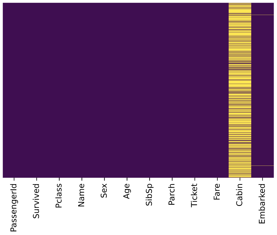
Great, it works!
太好了!
2.选择从南安普敦出发的乘客 (2. Select passengers departed from Southampton)
According to Titanic Data Dictionary, passengers departed from Southampton should have Embarked with value S . Let’s query that using the Pandas query() function.
根据《泰坦尼克号数据词典》,从南安普敦出发的乘客应该登上价值S 让我们使用Pandas query()函数进行query() 。
res = (
  pd.read_csv('data/train.csv')
    .pipe(replace_age_na, pclass_age_map)
    .query('Embarked == "S"')
)res.head()
To evaluate the query result, we can check it with value_counts()
要评估查询结果,我们可以使用value_counts()检查
res.Embarked.value_counts()S    644
Name: Embarked, dtype: int64
3.将年龄转换为年龄组:≤12,青少年(≤18),成人(≤60)和年龄较大(> 60) (3. Convert ages to groups of age ranges: ≤12, Teen (≤ 18), Adult (≤ 60) and Older (>60))
We did this with a custom function in the Pandas pipe function article. Alternatively, we can use Pandas built-in function assign() to add new columns to a DataFrame. Let’s go ahead withassign().
我们在Pandas管道函数文章中使用了自定义函数来完成此操作。 另外,我们可以使用Pandas内置函数Assign assign()将新列添加到DataFrame中。 让我们继续进行assign() 。
bins=[0, 13, 19, 61, sys.maxsize]
labels=['<12', 'Teen', 'Adult', 'Older']res = (
pd.read_csv('data/train.csv')
.pipe(replace_age_na, pclass_age_map)
.query('Embarked == "S"')
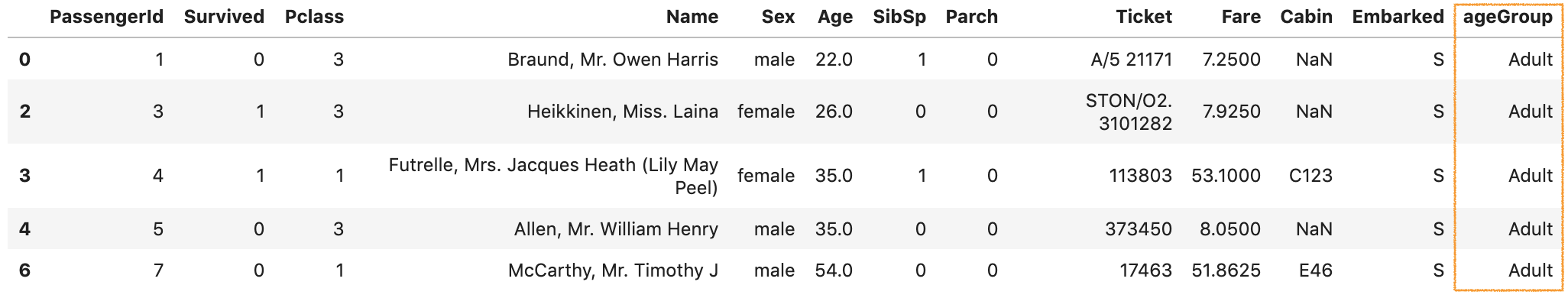
.assign(ageGroup = lambda df: pd.cut(df['Age'], bins=bins, labels=labels))
)res.head()Pandas assign() is used to create a new column ageGroup. The new column is created with a lambda function together with Pandas cut() to convert ages to groups of ranges.
熊猫assign()用于创建新列ageGroup 。 将使用lambda函数以及Pandas cut()创建新列,以将年龄转换为范围组。
By running the code, we should get an output like below:
通过运行代码,我们应该得到如下输出:
4.创建一个数据透视表以显示不同年龄组和Pclass的生存率 (4. Create a pivot table to display the survival rate for different age groups and Pclass)
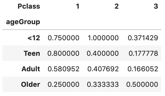
A pivot table allows us to insights into our data. Let’s figure out the survival rate with it.
数据透视表使我们能够洞察数据。 让我们用它算出生存率。
bins=[0, 13, 19, 61, sys.maxsize]
labels=['<12', 'Teen', 'Adult', 'Older'](
  pd.read_csv('data/train.csv')
    .pipe(replace_age_na, pclass_age_map)
    .query('Embarked == "S"')
    .assign(ageGroup = lambda df: pd.cut(df['Age'], bins=bins, labels=labels))
    .pivot_table(
        values='Survived',
        columns='Pclass',
        index='ageGroup',
        aggfunc='mean')
)
The first parameter values='Survived' specifies the column Survived to aggregate. Since the value of Survived is 1 or 0, we can use the aggregation function mean to calculate the survival rate and therefore aggfunc='mean' is used. index='ageGroup' and columns='Pclass' will display ageGroup as rows and Pclass as columns in the output table.
第一个参数values='Survived'指定要汇总的Survived列。 由于Survived的值为1或0 ,我们可以使用聚合函数mean来计算生存率,因此使用aggfunc='mean' 。 index='ageGroup'和columns='Pclass'将在输出表中将ageGroup显示为行,将Pclass显示为列。
By running the code, we should get an output like below:
通过运行代码,我们应该得到如下输出:
5.通过重命名轴标签和格式化值来改进数据透视表的显示。 (5. Improve the display of pivot table by renaming axis labels and formatting values.)
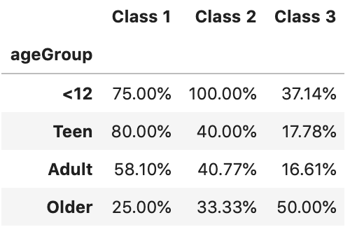
The output we have got so far is not very self-explanatory. Let’s go ahead and improve the display.
到目前为止,我们得到的输出不是很容易解释。 让我们继续改进显示效果。
bins=[0, 13, 19, 61, sys.maxsize]
labels=['<12', 'Teen', 'Adult', 'Older'](
  pd.read_csv('data/train.csv')
    .pipe(replace_age_na, pclass_age_map)
    .query('Embarked == "S"')
    .assign(ageGroup = lambda df: pd.cut(df['Age'], bins=bins, labels=labels))
    .pivot_table(
        values='Survived',
        columns='Pclass',
        index='ageGroup',
        aggfunc='mean')
    .rename_axis('', axis='columns')
    .rename('Class {}'.format, axis='columns')
    .style.format('{:.2%}')
)
rename_axis() is used to clear the columns label. After that, rename('Class {}'.format, axis='columns') is used to format the columns label. Finally,style.format('{:.2%}') is used to format values into percentages with 2 decimal places.
rename_axis()用于清除列标签。 之后,使用rename('Class {}'.format, axis='columns')设置列标签的格式。 最后,使用style.format('{:.2%}')将值格式化为百分比,并style.format('{:.2%}')两位小数。
By running the code, we should get an output like below
通过运行代码,我们应该得到如下输出
性能与缺点 (Performance and drawback)
In terms of performance, according to DataSchool [2], the method chain tells pandas everything ahead of time, so pandas can plan its operations more efficiently, and thus it should have better performance than conventional ways.
在性能方面,根据DataSchool [2],方法链可以提前告知熊猫所有信息,因此熊猫可以更有效地计划其操作,因此它应该比常规方法具有更好的性能。
Method Chainings are more readable. However, a very long method chaining could be less readable, especially when other functions get called inside the chain, for example, the cut() is used inside the assign() method in our tutorial.
方法链接更具可读性。 但是,很长的方法链接可能不太容易理解,特别是当在链内调用其他函数时,例如,在本教程的assign()方法内使用了cut() 。
In addition, a major drawback of using Method Chaining is that debugging can be harder, especially in a very long chain. If something looks wrong at the end, you don’t have intermediate values to inspect.
此外,使用方法链接的主要缺点是调试可能会更困难,尤其是在很长的链中。 如果最后看起来有问题,则没有要检查的中间值。
For a longer discussion of this topic, see Tom Augspurger’s Method Chaining post [1].
有关该主题的详细讨论,请参见Tom Augspurger的“ 方法链接”一文 [1]。
而已 (That’s it)
Thanks for reading.
谢谢阅读。
Please checkout the notebook on my Github for the source code.
请在我的Github上查看笔记本中的源代码。
Stay tuned if you are interested in the practical aspect of machine learning.
如果您对机器学习的实用方面感兴趣,请继续关注。
Lastly, here are 2 related articles you may be interested in
最后,这是您可能感兴趣的2条相关文章
翻译自: https://towardsdatascience.com/using-pandas-method-chaining-to-improve-code-readability-d8517c5626ac
pandas数据处理 代码


 1196
1196

 被折叠的 条评论
为什么被折叠?
被折叠的 条评论
为什么被折叠?
 到【灌水乐园】发言


