


本文主要记录关于简单的线性回归的学习内容。学习的要点:搞清楚什么是相关关系,协方差和相关系数的算法由来,了解最佳拟合线,决定系数R平方的概念,以及相关关系与因果关系间的区别。剩下的就是熟悉sklearn包,将线性回归通过代码的实现,并初步练习使用matplotlib画图。
使用英文注释能让我更加理解代码的同时提高我的英语能力。这是一举两得的提升学习效率方法,建议大家也可以尝试。
内容大纲:
set up dataset
from collections import  OrderedDict
import pandas as pd
#dataset
examDict = {
     '学习时间':[0.50,0.75,1.00,1.25,1.50,1.75,1.75,2.00,2.25,
            2.50,2.75,3.00,3.25,3.50,4.00,4.25,4.50,4.75,5.00,5.50],
    '分数':    [10,  22,  13,  43,  20,  22,  33,  50,  62,
              48,  55,  75,  62,  73,  81,  76,  64,  82,  90,  93]
}
#
examOrderDic = OrderedDict(examDict)
examDf=pd.DataFrame(examOrderDic)
examDf.head(5)
学习时间 分数 0 0.50 10 1 0.75 22 2 1.00 13 3 1.25 43 4 1.50 20
Correlation coefficient:the degree of correlation per unit of two variables
#Extract features and labels
#features
exam_X = examDf.loc[:,'学习时间']
#labels
exam_Y = examDf.loc[:,'分数']
#Draw a scatter plot
import matplotlib.pyplot as plt
#scatter plot
plt.scatter(exam_X,exam_Y,color = 'b',label = 'exam data')
#Add icon label
plt.legend(loc=2)
plt.xlabel('Hours')
plt.ylabel('score')
#show image
plt.show()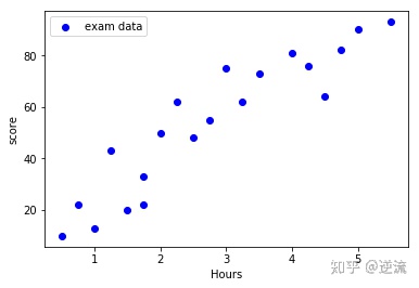
#correlation coeffient:'corr' returns a DataFrame ,containing the correlation matrix
rDf = examDf.corr()
print('相关系数矩阵:')
rDf
相关系数矩阵:
学习时间 分数 学习时间 1.000000 0.923985 分数 0.923985 1.000000
Guess the relevance of the game,please do a small test : http://istics.net/Correlations/
The realization of linear regression
1.Extract features and labels
#features
exam_X = examDf.loc[:,'学习时间']
#labels
exam_Y = examDf.loc[:,'分数']
2.Establish training data and test data
'''
'train_test_split'is a common function in cross validation
Function:the training data and test data were randomly selected from the samples in proportion
First parameter:sample features
Second parameter:sample labels
train_size:the training data proportion,if it's an integer then this is the number of samples
'''
from sklearn.model_selection import train_test_split
#Establish traning data and test data
X_train , X_test , Y_train , Y_test = train_test_split(exam_X ,
                                                       exam_Y ,
                                                       train_size = 0.8,
                                                       test_size = 0.2)
#Output data size
print('原始数据特征:',exam_X.shape ,
      '训练数据特征:',X_train.shape ,
      '测试数据特征:',X_test.shape)

print('原始数据标签:',exam_Y.shape ,
      '训练数据标签:', Y_train.shape ,
      '测试数据标签:' ,Y_test.shape)
原始数据特征: (20,) 训练数据特征: (16,) 测试数据特征: (4,)
原始数据标签: (20,) 训练数据标签: (16,) 测试数据标签: (4,)
#Darw a scatter plot
import matplotlib.pyplot as plt
# scatter plot
plt.scatter(X_train,Y_train,color = 'blue',label = 'train data')
plt.scatter(X_test,Y_test,color = 'red',label = 'test data')
#Add icon label
plt.legend(loc=2)
plt.xlabel('Hours')
plt.ylabel('score')
#show image
plt.show()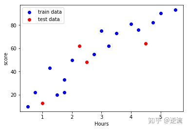
3.Training model(using training data)
#'sklearn'requires that the features of the input must be a two-dimensional array type,
# otherwise an error will be reported
#convert the training data features into a two-dimensional array XX rows * 1 column
X_train = X_train.reshape(-1,1)
#convert the training data features into a two-dimensional array XX rows * 1 column
X_test = X_test.reshape(-1,1)

#step1: imported linear regression
from sklearn.linear_model import LinearRegression
#step2:create the model:linear regression
model = LinearRegression()
#step3:training model
model.fit(X_train , Y_train)
LinearRegression(copy_X=True, fit_intercept=True, n_jobs=1, normalize=False)
'''
Best fitting line:z= + x
Intercept:a
Regression coefficient:b
'''
#intercept
a = model.intercept_
#regression coefficient
b = model.coef_
print('最佳拟合线:截距a =',a,'回归系数b =',b)
最佳拟合线:截距a = 8.02710200598 回归系数b = [ 16.67178831]
#drawing
import matplotlib.pyplot as plt
#training data scatter chart
plt.scatter(X_train,Y_train,color = 'blue',label = 'train data')
#predicted value of training data
Y_train_pred = model.predict(X_train)
#draw the best fitting line
plt.plot(X_train,Y_train_pred,color = 'black',linewidth=3,label = 'best line')
#add icon label
plt.legend(loc=2)
plt.xlabel('Hours')
plt.ylabel('score')
#show image
plt.show()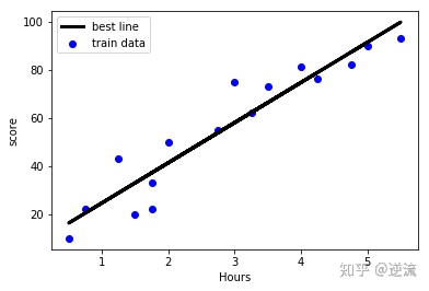
4.Model evaluation(using test data)
#the 'score'method of linear regression get the determinant R squared
model.score(X_test,Y_test)
0.53693762643025278
#drawing
import matplotlib.pyplot as plt
#step1 training data scatter chart
plt.scatter(X_train,Y_train,color = 'blue',label = "train data")
#step2 training data best line
Y_train_pred = model.predict(X_train)
plt.plot(X_train,Y_train_pred,color = 'black',linewidth=3,label = 'best line')
#step3 test data scatter chart
plt.scatter(X_test,Y_test,color = 'red',label = "test data")
#add icon label
plt.legend(loc=2)
plt.xlabel("Hours")
plt.ylabel("Score")
#show image
plt.show()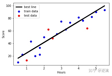


 1736
1736

 被折叠的 条评论
为什么被折叠?
被折叠的 条评论
为什么被折叠?
 到【灌水乐园】发言


