


今天,让我们利用python这个数据分析与数据挖掘的利器对金融数据i进行分析与建模吧!
喜欢的小伙伴记得关注哦,个人还有数据挖掘及机器学习算法相关讨论,也组建了一个机器学习算法原理专栏,喜欢的可以点个赞。

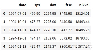
先来看看我们的数据:
(熟悉金融数据的就不需要介绍这个特征了吧,数据从1994年到2018年,共6000多条)
- 读取数据进行数据探索
缺失值
重复值
初步可视化探索
+ 分布图
+ 时间序列图
引用相应的库:
import numpy as np
import pandas as pd
import matplotlib.pyplot as plt
%matplotlib inline
import warnings
warnings.filterwarnings("ignore")
进行数据探索:
# 读取数据,使用pandas工具库
index_2018 = pd.read_csv("Index2018.csv",encoding="utf8")
index_2018['date'] = pd.to_datetime(index_2018['date'])  #转换为时间序列数据
print(index_2018.dtypes)
print(index_2018.shape)
index_2018.head()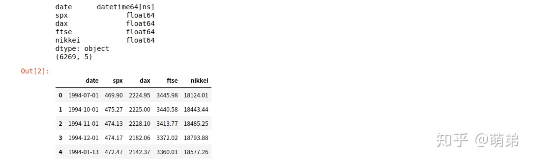
# 总体查看数据
index_2018.describe()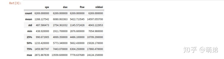
# 查看是否存在缺失值,并分析缺失值
missing_values_counts = index_2018.isna().sum()
missing_values_counts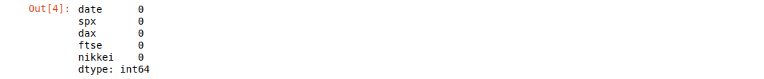
# 查看是否存在重复值
is_duplicated = index_2018.duplicated().sum()
is_duplicated
0
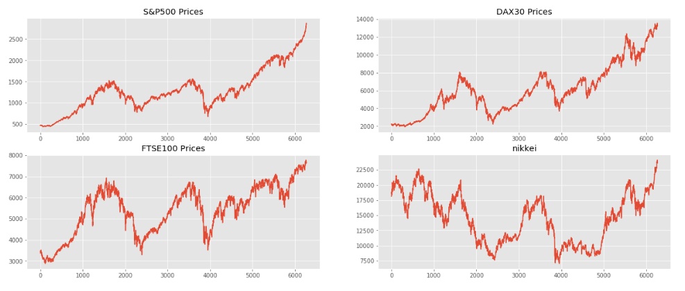
# 数据可视化探索之趋势图
## 从以下图可以看出,除了nikkei外总体都是递增的,但是递增的过程存在曲折
plt.style.use('ggplot')  # 设置图表主题,使用R语言的ggplot风格
plt.figure(figsize=(20, 8))
plt.subplot(2,2,1)
plt.plot(index_2018["spx"])
plt.title("S&P500 Prices")
plt.subplot(2,2,2)
plt.plot(index_2018["dax"])
plt.title("DAX30 Prices")
plt.subplot(2,2,3)
plt.plot(index_2018["ftse"])
plt.title("FTSE100 Prices")
plt.subplot(2,2,4)
plt.plot(index_2018["nikkei"])
plt.title("nikkei")
plt.show()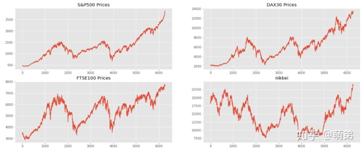
2. 时间序列预测,以spx为例
# 我们先切分预测集合和训练集合,我们使用2018年的数据进行预测
test_index_2018 = index_2018.loc[index_2018['date'].dt.year==2018,].sort_values("date")
train_index_2018 = index_2018.loc[index_2018['date'].dt.year!=2018,].sort_values("date")
train_index_2018.head()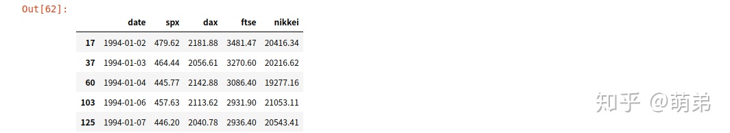
# (1)时间序列差分
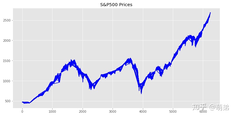
plt.figure(figsize=(12, 6))
plt.plot(train_index_2018["spx"],color="blue") # 画出原来的时间序列图
plt.title("S&P500 Prices")
## 我们使用单位根检验,判断是否不平稳(看图大概率不平稳)
from statsmodels.tsa.stattools import adfuller as ADF
print(ADF(train_index_2018['spx'])) # 元组第二个值为p值为0.98647,p>0.05,接受原假设,存在单位根
## 由于存在不平稳,我们先进行一阶差分
train_index_diff1 = train_index_2018.diff(1).dropna()
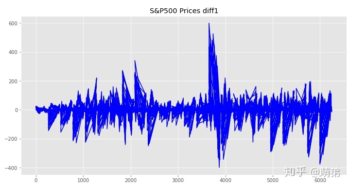
plt.figure(figsize=(12, 6))
plt.plot(train_index_diff1["spx"],color="blue") # 画出原来的时间序列图
plt.title("S&P500 Prices diff1")
## 再次单位根检验
print(ADF(train_index_diff1['spx'])) # 元组第二个值为p值<0.05,拒绝原假设,不存在单位跟,因此差分项d=1# 元组第二个值为p值为0.98647,p>0.05,接受原假设,存在单位根
# 元组第二个值为p值<0.05,拒绝原假设,不存在单位跟,因此差分项d=1

##(2) 随机性检验(白噪声检验)
from statsmodels.stats.diagnostic import acorr_ljungbox
acorr_ljungbox(train_index_diff1["spx"],lags =1) #p=3.7672789e-33<0.05,拒绝原假设,所以一阶差分后的序列不是随机的,有研究的必要。
#p=3.7672789e-33<0.05,拒绝原假设,所以一阶差分后的序列不是随机的,有研究的必要。
(array([143.88365598]), array([3.7672789e-33]))

## 方法一:目测法
from statsmodels.graphics.tsaplots import plot_acf
from statsmodels.graphics.tsaplots import plot_pacf
plot_acf(train_index_diff1['spx'])
plot_pacf(train_index_diff1['spx']) ## 我们发现这个图的可取p和q有点多,那么我们就使用统计量AIC或BIC判断吧
plt.show()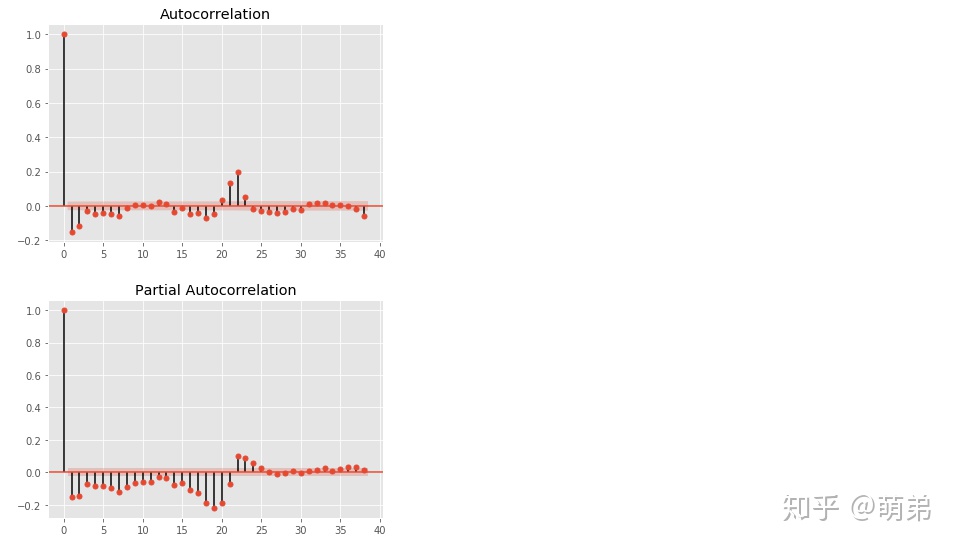
## 方法二:根据bic遍历p,q值,取bic最小时对应的p,q
from statsmodels.tsa.arima_model import ARIMA

tmp = []
for p in range(5):
    for q in range(5):
        try:
            tmp.append([ARIMA(train_index_diff1['spx'],(p,1,q)).fit().bic,p,q])
        except:
            tmp.append([None,p,q])

tmp = pd.DataFrame(tmp,columns = ['bic','p','q'])
tmp[tmp['bic'] ==tmp['bic'].min()]   # 我们最终选定p=0,q=4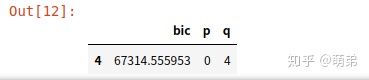
## (4) 建立模型:ARIMA(0,1,4)

model = ARIMA(train_index_diff1['spx'],(0,1,4)).fit()
model.summary()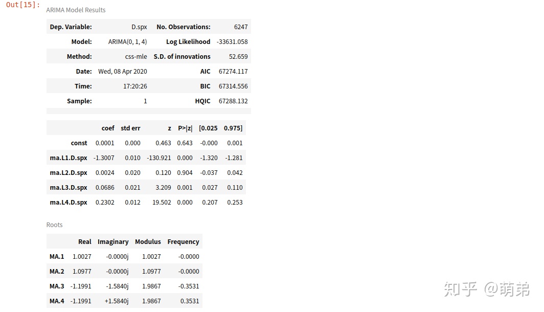
## (5) 预测
pred_diff = model.forecast(test_index_2018.shape[0])#预测测试集
pred_diff[0]
## (6) 将差分后的数据还原为真实数据
last = train_index_2018.loc[train_index_2018.shape[0]-1,]['spx']
pred = []
for i in pred_diff[0]:
    pred.append(last+i)
    last = last+i
test_index_2018['pred'] = pred
test_index_2018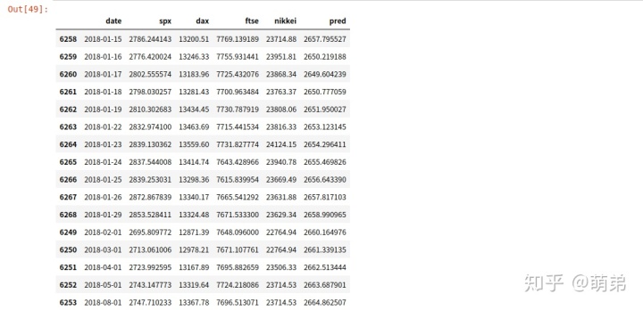
## (7) 画图,看看预测的效果是怎么样的
plt.figure(figsize=(12, 6))
plt.plot(index_2018["spx"],color="blue") # 画出原来的时间序列图
plt.plot(test_index_2018['pred'],color='red',linestyle='--')# 画出预测的时间序列
plt.title("S&P500 Prices")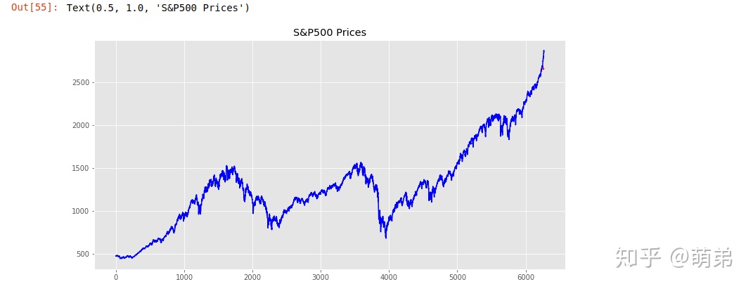
3.模型总结:
- 从上图的预测序列图与原序列图还是基本在一起,证明我们的模型预测效果还是不错的,因为做到只有一个变量就有这个效果不容易,但是有很大改进空间。


 6243
6243


 被折叠的 条评论
为什么被折叠?
被折叠的 条评论
为什么被折叠?
 到【灌水乐园】发言


