


文章目录
Github 源码获取
https://github.com/datamonday/HSI-Analysis
高光谱图像(Hyperspectral Image,HSI) 分析是人工智能(AI)研究中的前沿领域,因为它在从农业到监视的各个领域中都得到了应用。
这篇文章旨在帮助初学者使用Python从以下部分进行HSI分析:(1)数据收集;(2)数据预处理;(3)数据可视化以及探索性数据分析。
Introduction
在遥感(Remote Sensing)中,高光谱遥感器广泛用于以高光谱分辨率监视地球表面。HSI数据通常包含同一空间区域上的数百个光谱带,这些光谱带提供了识别各种材料的有价值的信息。 在HSI中,每个像素(pixel)都可以视为一个高维向量,像素的数值对应于从可见光到红外的光谱反射率(spectral reflectance)。
高光谱数据的采集和收集变得越来越容易,这使得高光谱图像分析成为许多应用中的有前途的技术之一,包括精准农业,环境分析,军事监视,矿物勘探,城市调查等。
高光谱图像分类(Classification of Hyperspectral Images)是对图像中每个像素的类标签进行分类的任务。
困难之处在于,没有流行的HSI数据源,这使得初学者很难开始进行HSI分析。以下是HSI的一些数据源。
以下是高光谱图像的伪彩色合成(false-color composites):
(a)ROSIS image of University of Pavia, Italy; (b) ROSIS image of part of the city of Pavia, Italy; (c) ProSpecTIR image of part of Reno, NV, USA;(d) HyMAP image of Dedelow, Germany; and (e) HYDICE image of part of Washington DC, USA.

Data Preprocessing
高光谱图像(HSI)数据主要以.mat文件的格式提供。可以使用 Scipy.io中的loadmat函数进行读取,返回字典格式,通过选择相应的键得到对应的numpy.ndarray数组。
提取HSI像素是重要的预处理任务之一。这样可以更轻松地处理数据并实现机器学习算法,例如分类,聚类等。
使用Pavia大学数据集进行演示,该数据集使用ROSIS传感器在意大利北部帕维亚(Pavia)上空获得了HSI影像。 光谱带的数量为103,HSI的大小为 610 * 340 像素,包含9个类别。 图像中的某些像素不包含任何信息,必须在分析之前将其丢弃。几何分辨率为1.3米。
1)Download Dataset
http://www.ehu.eus/ccwintco/uploads/e/ee/PaviaU.mat
http://www.ehu.eus/ccwintco/uploads/5/50/PaviaU_gt.mat
2)Loading Dataset
使用 Scientific Python(SciPy) python 库读取数据。
from scipy.io import loadmat

def read_HSI():
  X = loadmat('PaviaU.mat')['paviaU']
  y = loadmat('PaviaU_gt.mat')['paviaU_gt']
  print(f"X shape: {X.shape}\ny shape: {y.shape}")
  return X, y

X, y = read_HSI()
输出:
X shape: (610, 340, 103)
y shape: (610, 340)
以上的尺寸说明,当前的高光谱图像(单张),尺寸为610 × 340像素,共有103不同的波长下的图片。
其中每个像素代表一类,那么一类像素的shape就是每张图片中相同位置的像素×103不同波长下的像素:即1(行)×103(列)。
3)Extracting Pixels
像素是高光谱图像(HSI)中的各个元素,HSI是长度等于HSI波段数的向量。下图是Pavia大学HSI的一些样本波段。
import seaborn as sns
sns.axes_style('whitegrid')
fig = plt.figure(figsize=(12, 6))

for i in range(1, 1+6):
    fig.add_subplot(2, 3, i)
    q = np.random.randint(X.shape[2])
    plt.imshow(X[:, :, q], cmap='jet')
    plt.axis('off')
    plt.title(f'band - {q}')

4)Save to CSV
下面的代码用于从HSI提取像素并将其保存到CSV文件中,并返回Pandas数据帧。
import pandas as pd
import numpy as np
def extract_pixels(X, y):
  q = X.reshape(-1, X.shape[2])
  df = pd.DataFrame(data = q)
  df = pd.concat([df, pd.DataFrame(data = y.ravel())], axis=1)
  df.columns= [f'band{i}' for i in range(1, 1+X.shape[2])]+['class']
  df.to_csv('Dataset.csv')
  return df
df = extract_pixels(X, y)
df.info()
输出:
<class 'pandas.core.frame.DataFrame'>
RangeIndex: 207400 entries, 0 to 207399
Columns: 104 entries, band1 to class
dtypes: uint16(103), uint8(1)
memory usage: 40.9 MB
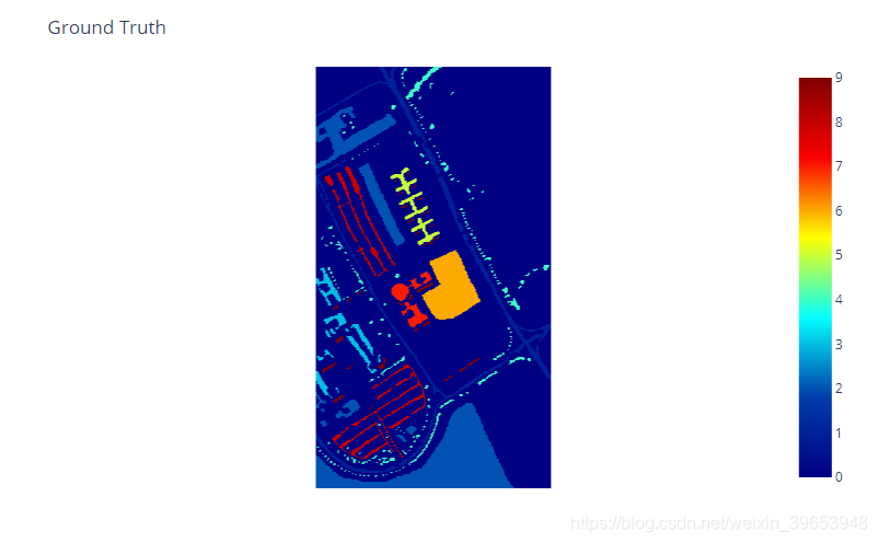
5)查看图像的真实标注
!pip install plotly
import plotly.express as px

cls = px.imshow(y, color_continuous_scale='jet')

cls.update_layout(title='Ground Truth', coloraxis_showscale=True)
cls.update_xaxes(showticklabels=False)
cls.update_yaxes(showticklabels=False)
cls.show()
Exploratory Data Analysis
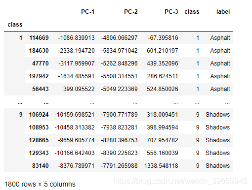
由于Pavia University数据集具有较高的维度,因此难以处理庞大的数据。 因此,使用主成分分析(PCA)将数据的维数缩减为3维,这是一种流行且广泛使用的降维技术。
PCA降维以便可视化
from sklearn.decomposition import PCA
pca = PCA(n_components = 3)
data = df.iloc[:, :-1].values
dt = pca.fit_transform(data)
q = pd.concat([pd.DataFrame(dt), pd.DataFrame(y.ravel())], axis=1)
q.columns = [f'PC-{i}' for i in range(1, 4)] + ['class']
q.head()
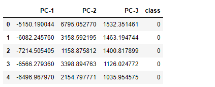
q.to_csv('dataset/paviaU_pca3.csv', index=False)
# Removing class - 0 as it is not need.
q2 = q[q['class'] != 0]
q2.head()
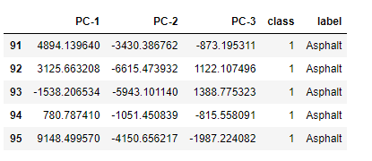
该数据集共九类,具体代表的真实含义如下:
class_labels = {'1':'Asphalt',
                '2':'Meadows',
                '3':'Gravel',
                '4':'Trees',
                '5':'Painted metal sheets',
                '6':'Bare Soil',
                '7':'Bitumen',
                '8':'Self Blocking Bricks',
                '9':'Shadows'
               }
# 添加真实标签列:将数值标签映射到对应的真实标签
q2['label'] = q2.loc[:, 'class'].apply(lambda x: class_labels[str(x)])
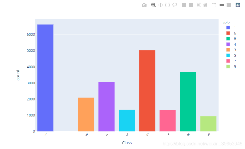
q2['label'].value_counts()
统计类别数量:
Meadows                 18649
Asphalt                  6631
Bare Soil                5029
Self Blocking Bricks     3682
Trees                    3064
Gravel                   2099
Painted metal sheets     1345
Bitumen                  1330
Shadows                   947
Name: label, dtype: int64
q2.head()
Plot use Plotly
Plotly是交互式绘图的Python工具,将代码复制到notebook运行即可实现,通过扩展包chart_studio可以生成html格式的交互式图表,可以嵌入到博客中,但是我这边运行提示HTTPError,没法写在博客里了,懂的都懂。代码自己运行吧。
1)Bar plot
类别统计柱状图
import plotly.express as px
count = q2['class'].value_counts()
bar_fig = px.bar(x=count.index[1:], y=count[1:], labels=class_labels, color=count.index[1:])
bar_fig.update_layout(xaxis = dict(title='Class',
                                   tickmode='array',
                                   tickvals=count.index[1:].tolist(),
                                   tickangle = 45,
                                  ),
                      yaxis = dict(title='count',),
                      showlegend=True
                     )
bar_fig.show()
2)Pair plot
配对图:这是一种可视化每个变量之间关系的方法。它提供了数据中每个变量之间的关系矩阵。下图显示了主成分(PC1,PC2和PC3)之间的关系。
# sampling dataset
sample_size = 200
sample = q2.groupby('class').apply(lambda x: x.sample(sample_size))
sample
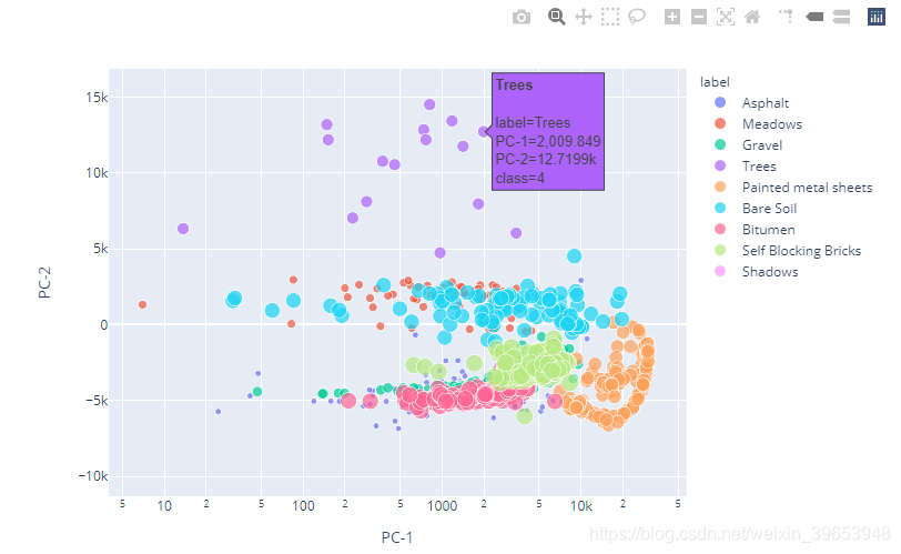
3)2D Scatter Plot
fig = px.scatter(sample, x="PC-1", y="PC-2", size="class", color="label",
                 hover_name="label", log_x=True, size_max=12)
fig.show()
4)2D Violin Plot
# Box Plot
fig = px.violin(sample, y="PC-1", x="PC-2", color="label",
                      box=True, points="all", hover_data=['PC-1', 'PC-2', 'PC-3','label'])
fig.show()
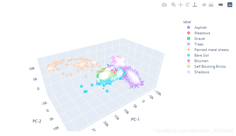
5)3D Scatter Plot
3D散点图:将数据点绘制在三维轴上,以显示三个变量之间的关系。下图以3D散点图的形式表示主成分(PC1,PC2和PC3)之间的关系。
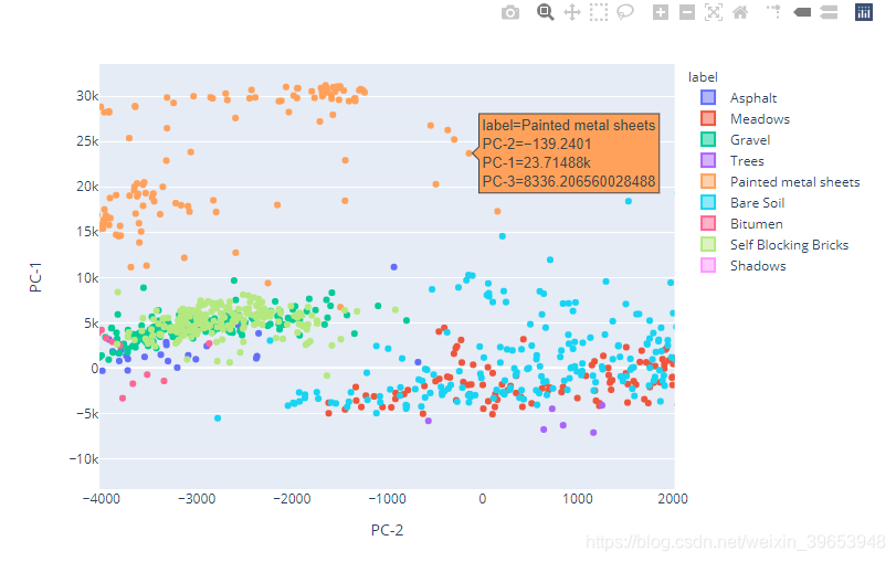
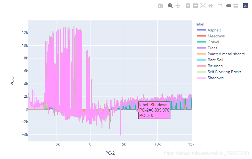
6)Area Plot
面积图:表示一个变量相对于将数据点与线段相连的另一个变量的变化。 主成分(PC1,PC2和PC3)的可视化如下所示:
area_plt1 = px.area(sample, x="PC-1", y="PC-2", color="label", line_group="label")
area_plt1.show()
# py.plot(area_plt1, filename = 'area_plt1', auto_open=True)
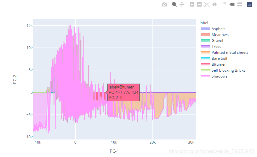
area_plt2 = px.area(sample, x="PC-1", y="PC-3", color="label", line_group="label")
area_plt2.show()
# py.plot(area_plt2, filename = 'area_plt2', auto_open=True)
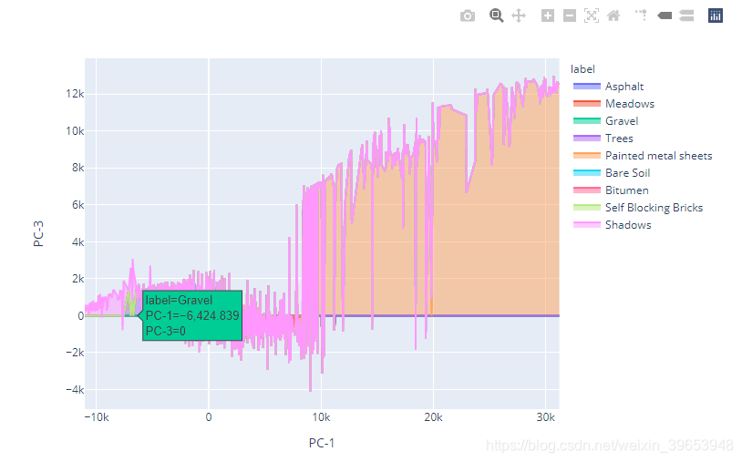
area_plt3 = px.area(sample, x="PC-2", y="PC-3", color="label", line_group="label")
area_plt3.show()
# py.plot(area_plt3, filename = 'area_plt2', auto_open=True)
Reference
Hyperspectral Image Analysis — Getting Started
什么是面积图?一篇文章带你了解层叠面积图!
“面积图”就是折线图吗?


 1005
1005

 被折叠的 条评论
为什么被折叠?
被折叠的 条评论
为什么被折叠?
 到【灌水乐园】发言


