


收到某个小伙伴的私信,想了解如何用 D3 绘制双 Y 轴图表,现在小羊给安排上。

掐指一算,双 Y 轴最常用的场景应该是柱状折线图这种组合图表了。现在给俺一首歌的时间,带你用D3画个柱状折线图。
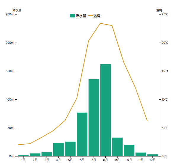
图表分析
老规矩,先来解构分析这张图表。
•三个坐标轴,一个 X 轴 ,两个 Y 轴。•柱状图,使用矩形元素•折线图,使用 path 元素•图例,矩形、线、文本三个元素
规划数据
绘制这个柱状折线图,需要三组数据,x 轴月份数据,y1 轴全年降水量数据,y2 轴全年温度数据。
const xData = ['1月', '2月', '3月', '4月', '5月', '6月', '7月', '8月', '9月', '10月', '11月', '12月'];
const y1Data = [2.0, 4.9, 7.0, 23.2, 25.6, 76.7, 135.6, 162.2, 32.6, 20.0, 6.4, 3.3];
const y2Data = [2.0, 2.2, 3.3, 4.5, 6.3, 10.2, 20.3, 23.4, 23.0, 16.5, 12.0, 6.2];
除此之外,还需要提前定义一些配置。比如画布大小,图表与画布上下左右的间距,柱状图、折线图颜色。
// 画布宽高
const height = 600,
      width = 600;
// 图表与画布四周的间距
const margin = {
      top: 60,
      right: 60,
      bottom: 60,
      left: 60
 }
// 柱状图、折线图颜色
const y1Color = '#16A37E'
const y2Color = '#DE9111'
上手作图
添加画布
//画布
let svg = d3.select('body')
      .append('svg')
      .attr('height', height)
      .attr('width', width);
比例尺
离开比例尺的坐标轴都是耍流氓。—— 小羊
你品,你细品。
//比例尺-x轴,y1轴,y2轴
let xScale = d3.scaleBand()
             .domain(xData)
             .range([margin.left, width - margin.right])
             .padding(0.1);
let y1Scale = d3.scaleLinear()
             .domain([0, 250])
             .range([height - margin.bottom, margin.top]);
let y2Scale = d3.scaleLinear()
             .domain([0, 25])
             .range([height - margin.bottom, margin.top]);
坐标轴
定义添加坐标轴,带上数据单位以及坐标轴标题。
//定义坐标轴
let xAxis = d3.axisBottom(xScale);
let y1Axis = d3.axisLeft(y1Scale).ticks(5).tickFormat(d => d + "ml")
let y2Axis = d3.axisRight(y2Scale).ticks(5).tickFormat(d => d + "°C");

//添加坐标轴
svg.append('g')
.classed('xAxis', true)
.attr('transform', `translate(0,${height - margin.bottom})`)
.call(xAxis)

svg.append('g')
.classed('yAxis', true)
.attr('transform', `translate(${margin.left},0)`)
.call(y1Axis)
.call(g => g.append("text")
     .attr("x",0)
     .attr("y", margin.top-10)
     .attr("text-anchor", "middle")
     .attr('fill','#000')
     .text('降水量'))

svg.append('g')
.classed('yAxis', true)
.attr('transform', `translate(${width- margin.right},0)`)
.call(y2Axis)
.call(g => g.append("text")
      .attr("x",0)
      .attr("y", margin.top-10)
      .attr("text-anchor", "middle")
      .attr('fill','#000')
      .text('温度'))
柱形图
//柱状图
svg.append('g')
  .classed('bar',true)
  .selectAll('rect')
  .data(y1Data)
  .join('rect')
  .attr('height',d=>height-margin.bottom-y1Scale(d))
  .attr('width',d=>xScale.bandwidth())
  .attr('x',(d,i)=>xScale(xData[i]))
  .attr('y',d=>y1Scale(d))
  .attr('fill',y1Color)
这里有个地方稍微不好理解,柱形图的高度等于画布高度-下间距-y轴坐标数据,因为 svg 画布上 y 轴的实际方向是向下的,细品一品。
折线图
//折线图
svg.append('g')
.classed('line',true)
.datum(y2Data)
.join('g')
.append('path')
.attr("d",d3.line()
            .x((d,i)=>xScale(xData[i]))
            .y(d=>y2Scale(d)))
.attr('fill','none')
.attr('stroke',y2Color)
.attr('stroke-width',2)
图例
图例主要是添加矩形元素、line 元素以及文本元素,难点是需要调试图例的位置。
//图例
let legend = svg.append('g')
              .classed('legend',true)
              .attr('transform',
                   `translate(${(width-margin.left-margin.right)/2},
                    ${margin.top})`)
              .attr('width',200)
              .attr('height',20);

let water = legend.append('g')
                  .classed('water',true)
water.append("rect")
     .attr("stroke-width", 2)
     .attr("fill", y1Color)
     .attr("stroke", y1Color)
     .attr("width", 16)
     .attr("height", 10)
     .attr('rx',2)
     .attr('ry',2)

water.append("text")
        .attr("font-size", "0.75em")
        .attr("text-anchor", "start")
        .attr("dy", 10)
        .attr("dx", 18)
        .text("降水量");

let temperature = legend.append('g').classed('temperature',true)
                      .attr('transform',`translate(60,0)`)
    temperature.append('line')
        .attr('x1',0)
        .attr('y1',0)
        .attr('x2',16)
        .attr('y2',0)
        .attr('transform',`translate(0,5)`)
        .attr('stroke',y2Color)
        .attr('stroke-width',2)
    temperature.append("text")
        .attr("font-size", "0.75em")
        .attr("text-anchor", "start")
        .attr("dy", 10)
        .attr("dx", 18)
        .text("温度");
整完,收工!
Bye!
源码地址:
https://xuxiaoyang.github.io/d3/barLine/index.html


点个赞,证明你还爱我


 2328
2328


 被折叠的 条评论
为什么被折叠?
被折叠的 条评论
为什么被折叠?
 到【灌水乐园】发言


