


延续上一篇pandas的文章,我们继续来探讨python中的Seaborn,能画出多么高级和漂亮的图标。
漂亮:Seaborn的高级绘图Seaborn使用绘图默认值。 为了确保您的结果与我的匹配,请运行以下命令。
sns.reset_defaults() sns.set( rc={'figure.figsize':(7,5)}, style="white" # nicer layout )绘制单变量分布如前所述,我非常喜欢分布。 直方图和核密度分布都是可视化特定变量的关键特征的有效方法。 让我们看看如何在一个图表中为单个变量或多个变量分配生成分布。

Left chart: Histogram and kernel density estimation of “Life Ladder” for Asian countries in 2018; Ri
绘制双变量分布每当我想直观地探索两个或多个变量之间的关系时,通常都会归结为某种形式的散点图和分布评估。 概念上相似的图有三种变体。 在每个图中,中心图(散点图,双变量KDE和hexbin)有助于理解两个变量之间的联合频率分布。 此外,在中心图的右边界和上边界,描绘了各个变量的边际单变量分布(作为KDE或直方图)。
sns.jointplot( x='Log GDP per capita', y='Life Ladder', data=data, kind='scatter' # or 'kde' or 'hex' )

Seaborn jointplot with scatter, bivariate kde, and hexbin in the center graph and marginal distribut
散点图散点图是一种可视化两个变量的联合密度分布的方法。 我们可以通过添加色相来添加第三个变量,并通过添加size参数来可视化第四个变量。
sns.scatterplot( x='Log GDP per capita', y='Life Ladder', data=data[data['Year'] == 2018], hue='Continent', size='Gapminder Population' ) # both, hue and size are optionalsns.despine() # prettier layout
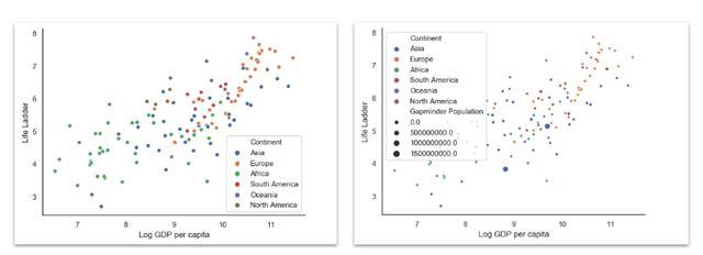
Log GDP per capita against Life Ladder, colors based on the continent and size on population
小提琴图小提琴图是箱形图和籽粒密度估计值的组合。 它起着箱形图的作用。 它显示了跨类别变量的定量数据分布,以便可以比较那些分布。
sns.set( rc={'figure.figsize':(18,6)}, style="white" ) sns.violinplot( x='Continent', y='Life Ladder', hue='Mean Log GDP per capita', data=data ) sns.despine()
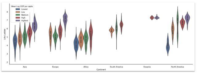
Violin plot where we plot continents against Life Ladder, we use the Mean Log GDP per capita to grou
配对图Seaborn对图在一个大网格中绘制了两个变量散点图的所有组合。 我通常感觉这有点信息过载,但是它可以帮助发现模式。
sns.set( style="white", palette="muted", color_codes=True ) sns.pairplot( data[data.Year == 2018][[ 'Life Ladder','Log GDP per capita', 'Social support','Healthy life expectancy at birth', 'Freedom to make life choices','Generosity', 'Perceptions of corruption', 'Positive affect', 'Negative affect','Confidence in national government', 'Mean Log GDP per capita' ]].dropna(), hue='Mean Log GDP per capita' )

Seaborn scatterplot grid where all selected variables a scattered against every other variable in th
FacetGrid对我而言,Seaborn的FacetGrid是使用Seaborn的最令人信服的论点之一,因为它使创建多图变得轻而易举。 通过对图,我们已经看到了FacetGrid的示例。 FacetGrid允许创建按变量分段的多个图表。 例如,行可以是一个变量(人均GDP类别),列可以是另一个变量(大陆)。
它确实比我个人需要更多的自定义(即使用matplotlib),但这仍然很吸引人。
FacetGrid —折线图
g = sns.FacetGrid( data.groupby(['Mean Log GDP per capita','Year','Continent'])['Life Ladder'].mean().reset_index(), row='Mean Log GDP per capita', col='Continent', margin_titles=True ) g = (g.map(plt.plot, 'Year','Life Ladder'))
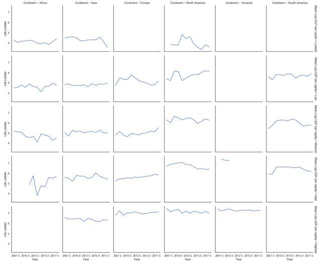
Life Ladder on the Y-axis, Year on the X-axis. The grid’s columns are the continent, and the grid’s rows are the different levels of Mean Log GDP per capita. Overall things seem to be getting better for the countries with a Low Mean Log GDP per Capita in North America and the countries with a Medium or High Mean Log GDP per Capita in EuropeFacetGrid —直方图
g = sns.FacetGrid(data, col="Continent", col_wrap=3,height=4) g = (g.map(plt.hist, "Life Ladder",bins=np.arange(2,9,0.5)))
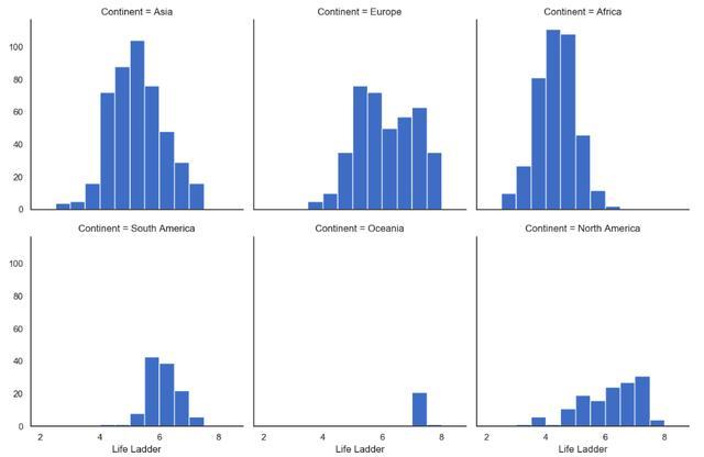
FacetGrid with a histogram of LifeLadder by continent
FacetGrid —带注释的KDE图
也可以向网格中的每个图表添加构面特定的符号。 在下面的示例中,我们添加平均值和标准偏差,并在该平均值处绘制一条垂直线(下面的代码)。
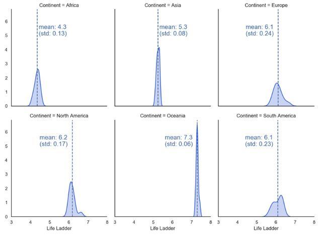
Life Ladder kernel density estimation based on the continent, annotated with a mean and standard deviationdef vertical_mean_line(x, **kwargs): plt.axvline(x.mean(), linestyle ="--", color = kwargs.get("color", "r")) txkw = dict(size=15, color = kwargs.get("color", "r")) label_x_pos_adjustment = 0.08 # this needs customization based on your data label_y_pos_adjustment = 5 # this needs customization based on your data if x.mean() < 6: # this needs customization based on your data tx = "mean: {:.2f}\n(std: {:.2f})".format(x.mean(),x.std()) plt.text(x.mean() + label_x_pos_adjustment, label_y_pos_adjustment, tx, **txkw) else: tx = "mean: {:.2f}\n (std: {:.2f})".format(x.mean(),x.std()) plt.text(x.mean() -1.4, label_y_pos_adjustment, tx, **txkw)_ = data.groupby(['Continent','Year'])['Life Ladder'].mean().reset_index()g = sns.FacetGrid(_, col="Continent", height=4, aspect=0.9, col_wrap=3, margin_titles=True)g.map(sns.kdeplot, "Life Ladder", shade=True, color='royalblue')g.map(vertical_mean_line, "Life Ladder")FacetGrid —热图
我最喜欢的绘图类型之一是热图FacetGrid,即网格每个面中的热图。 这种类型的绘图对于在一个绘图中可视化四个维度和一个度量很有用。 该代码有点麻烦,但可以根据需要快速进行调整。 值得注意的是,这种图表需要相对大量的数据或适当的细分,因为它不能很好地处理缺失值。

Facet heatmap, visualizing on the outer rows a year range, outer columns the GDP per Capita, on the inner rows the level of perceived corruption and the inner columns the continents. We see that happiness increases towards the top right (i.e., high GDP per Capita and low perceived corruption). The effect of time is not definite, and some continents (Europe and North America) seem to be happier than others (Africa).def draw_heatmap(data,inner_row, inner_col, outer_row, outer_col, values, vmin,vmax): sns.set(font_scale=1) fg = sns.FacetGrid( data, row=outer_row, col=outer_col, margin_titles=True ) position = left, bottom, width, height = 1.4, .2, .1, .6 cbar_ax = fg.fig.add_axes(position) fg.map_dataframe( draw_heatmap_facet, x_col=inner_col, y_col=inner_row, values=values, cbar_ax=cbar_ax, vmin=vmin, vmax=vmax ) fg.fig.subplots_adjust(right=1.3) plt.show()def draw_heatmap_facet(*args, **kwargs): data = kwargs.pop('data') x_col = kwargs.pop('x_col') y_col = kwargs.pop('y_col') values = kwargs.pop('values') d = data.pivot(index=y_col, columns=x_col, values=values) annot = round(d,4).values cmap = sns.color_palette("Blues",30) + sns.color_palette("Blues",30)[0::2] #cmap = sns.color_palette("Blues",30) sns.heatmap( d, **kwargs, annot=annot, center=0, cmap=cmap, linewidth=.5 )# Data preparation_ = data.copy()_['Year'] = pd.cut(_['Year'],bins=[2006,2008,2012,2018])_['GDP per Capita'] = _.groupby(['Continent','Year'])['Log GDP per capita'].transform( pd.qcut, q=3, labels=(['Low','Medium','High'])).fillna('Low')_['Corruption'] = _.groupby(['Continent','GDP per Capita'])['Perceptions of corruption'].transform( pd.qcut, q=3, labels=(['Low','Medium','High']))_ = _[_['Continent'] != 'Oceania'].groupby(['Year','Continent','GDP per Capita','Corruption'])['Life Ladder'].mean().reset_index()_['Life Ladder'] = _['Life Ladder'].fillna(-10)draw_heatmap( data=_, outer_row='Corruption', outer_col='GDP per Capita', inner_row='Year', inner_col='Continent', values='Life Ladder', vmin=3, vmax=8,)本文翻译自Fabian Bosler的文章《Learn how to create beautiful and insightful charts with Python — the Quick, the Pretty, and the Awesome》 参考https://towardsdatascience.com/plotting-with-python-c2561b8c0f1f)


 3429
3429


 被折叠的 条评论
为什么被折叠?
被折叠的 条评论
为什么被折叠?
 到【灌水乐园】发言


