


我为嵌入式平台编写应用程序。我的一个应用程序部署在一个网络中,它从几个网络节点接收数据并处理它们。我的应用程序应该能够在指定的时间内处理来自所有节点的数据。这是一个严格的约束。我依靠matplotlib和pandas来可视化/分析收到的每个网络数据包的时间分析信息。
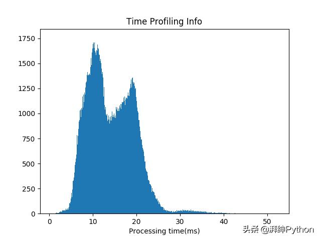
上图是每个接收到的数据包的处理时间的直方图。这是使用matplotlib生成的。这个实验有近20万个数据点。这张图告诉我一些重要的事情。它告诉我,大多数情况下,网络数据包在到达后的30毫秒内得到处理。它还告诉我有两个峰值,一个在10毫秒,另一个在大约20毫秒。您可以看到可视化在这里非常重要,matplotlib可以很好地完成工作。
matplotlib是庞大的。这是一个非常有用的绘图工具,但有时它可能会令人困惑。我第一次使用它时感到很困惑。matplotlib为绘图提供了两个不同的接口,我们可以使用这两个接口中的任何一个来实现结果。这是我困惑的主要原因。每当我在网上搜索任何帮助时,我发现至少有两种不同的方式。那时我决定深入挖掘它的接口,本教程就是这样的结果。
本教程的重点是狭义的 - 理解“面向对象的接口”。我们不会从大型数据集开始。这样做会将焦点转移到数据集本身而不是matplotlib对象。大多数时候,我们将处理非常简单的数据,就像数字列表一样简单。最后,我们将研究更大的数据集,以了解matplotlib如何用于分析更大的数据集。
Matplotlib接口
matplotlib提供两个用于绘图的接口
- 使用pyplot进行MATLAB样式绘图
- 面向对象的接口
在我研究matplotlib之后,我决定使用它的“面向对象的接口”。我发现它更容易使用。每个图形都分为一些对象,对象层次结构清晰。我们通过研究对象来获得结果。所以我将在本教程中重点介绍面向对象的接口。在方便使用它们的任何地方也会使用一些pyplot函数。
Matplotlib面向对象的接口
matplotlib中的图分为两个不同的对象。
- 图对象
- 坐标轴对象
图对象可以包含一个或多个轴的对象。一个轴代表图中的一个图。在本教程中,我们将直接使用axis对象进行各种绘图。
图对象
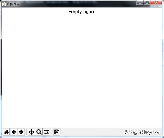
import matplotlib.pyplot as pltfig = plt.figure()print(type(fig))上面代码片段的输出是matplotlib.figure.Figure。plt.figure()返回一个Figure对象。python中的type()方法用于查找对象的类型。所以我们此时有一个空的Figure对象。让我们尝试绘制它。
# Give the figure a titlefig.suptitle("Empty figure")plt.show()执行上面的代码返回一个空图。如下:
坐标轴对象
我们需要一个或多个轴对象来开始绘图。可以通过多种方式获得坐标轴轴对象。我们将从add_subplot()方法开始,稍后将探索其他方法。
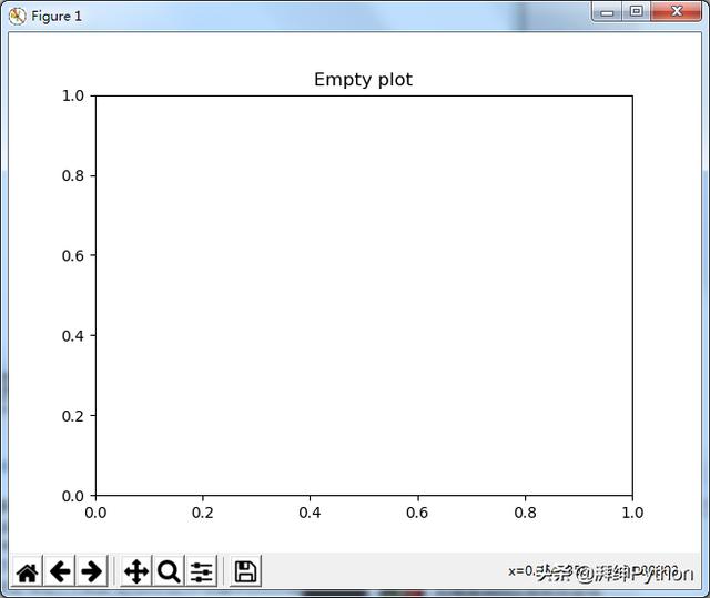
ax = fig.add_subplot(1,1,1)# Set the title of plotax.set_title("Empty plot")plt.show()add_subplot(num_rows,num_cols,subplot_location)方法创建一个大小为(num_rows x num_cols)的子图的网格,并在subplot_location返回子图的坐标轴对象。子图以下列方式编号:
- 第一个子图位于(第一行,第一列)位置。从这个位置开始并继续编号直到第一行的最后一列
- 从第二行的最左侧位置开始并继续编号
- 例:2x2子图的网格中的第3个子图位于=(第2行,第1列)
因此add_subplot(1,1,1)返回1x1子图中网格中第一个位置的轴对象。换句话说,在图中仅生成一个图。执行上面的代码给出了一个带有xy轴的空图,如下所示。
让我们再举一个例子。我们将图形划分为2x2子图的网格,并获得所有子图的轴对象。
import matplotlib.pyplot as pltfig = plt.figure()# Generate a grid of 2x2 subplots and get# axes object for 1st locationax1 = fig.add_subplot(2,2,1)ax1.set_title('First Location')# Get the axes object for subplot at 2nd # locationax2 = fig.add_subplot(2,2,2)ax2.set_title('Second Location')# Get the axes object for subplot at 3rd # locationax3 = fig.add_subplot(2,2,3)ax3.set_xlabel('Third Location')# Get the axes object for subplot at 4th # locationax4 = fig.add_subplot(2,2,4)ax4.set_xlabel('Fourth Location')# Displayplt.show()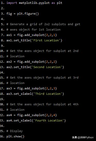
上面代码的输出得到:
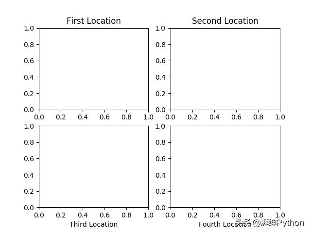
2x2子图的网格
一旦我们得到的坐标轴对象,我们可以调用坐标轴对象的方法生成图形。我们将在示例中使用以下坐标轴对象方法:
- plot(x,y):生成y-x图
- set_xlabel():X轴的标签
- set_ylabel():Y轴的标签
- set_title():图的标题
- legend():为图形生成图例
- hist():生成直方图
- scatter():生成散点图
有关坐标轴类的更多详细信息,请参阅matplotlib axes类页面。https://matplotlib.org/api/axes_api.html
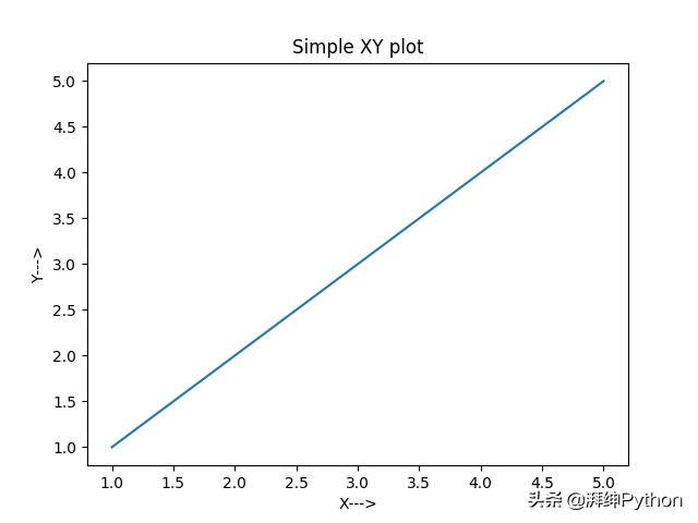
例1:简单的XY图
我们可以使用坐标轴对象的plot()方法绘制数据。这在以下示例中进行了演示。
import matplotlib.pyplot as plt# Generate data for plots x = [1, 2, 3, 4, 5]y = x# Get an empty figurefig1 = plt.figure()# Get the axes instance at 1st location in 1x1 gridax = fig1.add_subplot(1,1,1)# Generate the plotax.plot(x, y)# Set labels for x and y axisax.set_xlabel('X--->')ax.set_ylabel('Y--->')# Set title for the plotax.set_title('Simple XY plot')# Display the figureplt.show()
执行上面的代码将生成y = x plot,如下所示
例2:同一图中的多个图
让我们尝试在单个绘图窗口中生成2个图形。一个是y = x而另一个是z =x²
import matplotlib.pyplot as plt# Function to get the square of each element in the listdef list_square(a_list): return [element**2 for element in a_list]# Multiple plot in same subplot window# plot y = x and z = x^2 in the same subplot windowfig2 = plt.figure()x = [1, 2, 3, 4, 5]y = xz = list_square(x)# Get the axes instanceax = fig2.add_subplot(1,1,1)# Plot y vs x as well as z vs x. label will be used by ax.legend() method to generate a legend automaticallyax.plot(x, y, label='y')ax.plot(x, z, label='z')ax.set_xlabel("X------>")# Generate legendax.legend()# Set titleax.set_title('Two plots one axes')# Displayplt.show()
这次使用一个额外的参数 - label来调用ax.plot()。这是为图表设置标签。ax.legend()方法使用此标签生成绘图的图例。上面代码的输出如下所示:
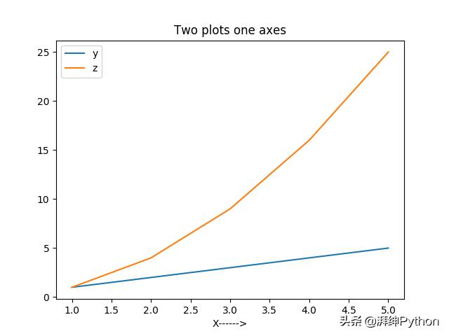
如您所见,在一个绘图窗口中生成了两个图形。在左上角生成了另一个图例。
例3:图中的两个图
我们现在将在图中生成多个图
import matplotlib.pyplot as plt# Function to get the square of each element in the listdef list_square(a_list): return [element**2 for element in a_list]# Multiple subplots in same figurefig3 = plt.figure()x = [1, 2, 3, 4, 5]y = xz = list_square(x)# Divide the figure into 1 row 2 column grid and get the# axes object for the first columnax1 = fig3.add_subplot(1,2,1)# plot y = x on axes instance 1ax1.plot(x, y)# set x and y axis labelsax1.set_xlabel('X------>')ax1.set_ylabel('Y------>')ax1.set_title('y=x plot')# Get second axes instance in the second column of the 1x2 gridax2 = fig3.add_subplot(1,2,2)# plot z = x^2ax2.plot(x, z)ax2.set_xlabel('X---------->')ax2.set_ylabel('z=X^2--------->')ax2.set_title('z=x^2 plot')# Generate the title for the Figure. Note that this is different then the title for individual plotsplt.suptitle("Two plots in a figure")plt.show()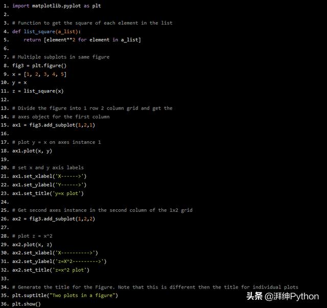
执行上面的代码会生成下图:
Ex3:直方图
直方图可用于可视化数据的基础分布。以下是直方图的示例。使用numpy生成此示例的数据。从高斯分布产生1000个样本,平均值为10,标准偏差为0.5。
# coding: utf-8import matplotlib.pyplot as pltimport numpy as np# Generate 1000 numbers from gaussian samplemean = 10std = 0.5num_samples = 1000samples = np.random.normal(mean, std, num_samples)# Get an instance of Figure objectfig = plt.figure()ax = fig.add_subplot(1,1,1)# Generate histogram plotax.hist(samples)ax.set_xlabel('Sample values')ax.set_ylabel('Frequency')ax.set_title('Histogram plot')plt.show()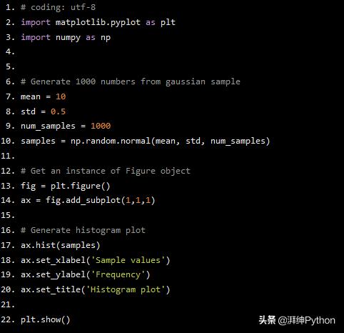
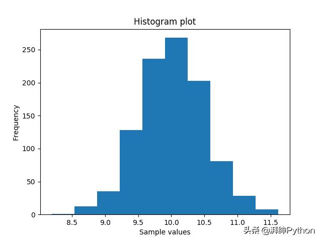
上图中的x轴为样本值,y轴是每个样本的频率。我们可以在10处观察到值一个峰值。
根据3 sigma规则,99.7%的高斯分布样本位于均值的三个标准偏差范围内。对于本例,此范围为[8.5,11.5]。这也可以从上面的图中验证。
在更大的数据集上绘图
在这个例子中,我们将使用“California Housing Price Dataset”。
数据集中的每一行都包含一个块的数据。块可以被认为是小的区域。数据集包含以下列:
- 经度 - 经度
- 纬度 - 纬度(以度为单位)
- housing_median_age - 街区内房屋的平均年龄
- total_rooms - 街区的房间总数
- total_bedrooms - 街区的卧室总数
- population - 街区的人口
- households - 住户的总数,住在一个住宅单元内的一组住户
- median_income - 一个街区家庭的平均收入
- median_house_value - 街区内住户的平均房屋价值
- ocean_proximity - 海景房屋的位置
让我们生成一些图来学习有关数据集的某些内容。
- “median_house_value”的分布
- 分配“median_income”
- 我的常识告诉我,在收入高的地方,房屋应该是昂贵的,反之亦然。在人口较多的地方,一个街区的房间数量应该更多。让我们试着通过生成一些图来弄清楚这一点。
Pyplot subplots()方法 - 我们将在此示例中使用pyplot子图方法来获取坐标轴对象。 我们已经看到add_subplot()方法一次只返回一个坐标轴对象。因此需要为图中的每个子图调用add_subplot()方法。pyplot subplots () API解决了这个问题。它返回一个numpy nd数组的轴对象。使用坐标轴对象生成绘图与前面示例中解释的相同。
import matplotlib.pyplot as plt import pandas as pd import numpy as np# Read the csv file into a pandas dataframe# A dataframe is basically a table of data.df_housing = pd.read_csv("housing.csv")# Get figure object and an array of axes objectsfig, arr_ax = plt.subplots(2, 2)# Histogram - median_house_valuearr_ax[0,0].hist(df_housing['median_house_value'])arr_ax[0,0].set_title('median_house_value')# Histogram - median_incomearr_ax[0,1].hist(df_housing['median_income'])arr_ax[0,1].set_title('median_income')# Scatter - population vs total_roomsarr_ax[1,0].scatter(df_housing['population'], df_housing['total_rooms'])arr_ax[1,0].set_xlabel('population')arr_ax[1,0].set_ylabel('total_rooms')# scatter - median_income vs median_house_valuearr_ax[1,1].scatter(df_housing['median_income'], df_housing['median_house_value'])arr_ax[1,1].set_xlabel('median_income')arr_ax[1,1].set_ylabel('median_house_value')plt.show()print('DONE : Matplotlib california housing dataset plotting')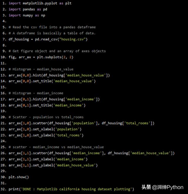
我使用python pandas库来读取数据集中的数据。数据集是名为“housing.csv”的csv文件。
plt.subplots(2,2)返回一个图形对象和一个大小为2x2的坐标轴对象的2D数组。可以通过对坐标轴对象的二维数组建立索引来访问各个子图的坐标轴对象。
第一个图有一个很好的高斯分布,除了最后。该图告诉我们,“median_house_value”的平均值介于1,00,000到2,00,000美元之间。上限为5,00,000美元。还有惊人的大量房屋售价约为5,00,000美元。
第二个图也有很好的分布。它告诉我们,平均收入介于20,000到40,000美元之间。收入超过80,000美元的人也很少。
第三个图证实了,在人口较多的地方,房间数量更多。
第四个图证实了我们的常识,即“median_house_value”应该更多地位于“median_income”更多的地方,反之亦然。
这只是一个例子。可以对此数据集进行更多分析,但这超出了本教程的范围。
结论
我已经提供了matplotlib的面向对象接口的介绍。本教程的重点是解释图和坐标轴对象及其关系。


 1万+
1万+


 被折叠的 条评论
为什么被折叠?
被折叠的 条评论
为什么被折叠?
 到【灌水乐园】发言


