


一、flex弹性布局
1.什么是flex布局?
flex(flex Box)弹性布局
2.什么是flex容器(flex container)
采用flex布局的元素,成为flex容器
3.什么是flex项目(flex item)
flex容器的所有子元素自动成为容器成员,成为flex项目,孙子元素不会成为容器成员
二、flex容器的属性
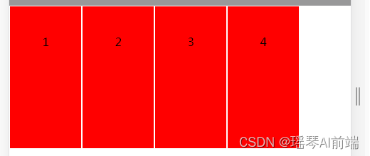
1.display属性:flex和inline-flex
flex:将对象作为弹性伸缩盒显示
inline-flex:将对象作为内联块级弹性伸缩盒来显示
<style type="text/css">
    *{
        margin: 0;padding: 0;
    }
    p{
        height: 40px;line-height: 40px;background-color: #989899;
    }
    /*1.display:flex属性*/
    .box-1{
        display: flex; /*默认的沿主轴方向上来排列了,如没有这个属性,会以块级元素向下排列*/
        /*由父元素撑开,具有block属性,也有flex属性*/
        background-color: #888908;
        /*width: 100%;*/
    }
    /*2.display:inline-flex属性*/
    /*由里面的内容撑开,具有inline-block属性,也有flex属性*/
    .box-2{
        display: inline-flex;
        background-color: #888908;
    }
    .box{
        width: 200px;
        height: 200px;
        background: red;
        border:1px solid white;
        text-align: center;
    }
</style>
<body>
    <p>display: flex;的使用</p>
    <div class="box-1">
        <div class="box">1</div>
        <div class="box">2</div>
        <div class="box">3</div>
        <div class="box">4</div>
    </div>
    <p>display: inline-flex;的使用</p>
    <div class="box-2">
        <div class="box">1</div>
        <div class="box">2</div>
        <div class="box">3</div>
        <div class="box">4</div>
    </div>
</body>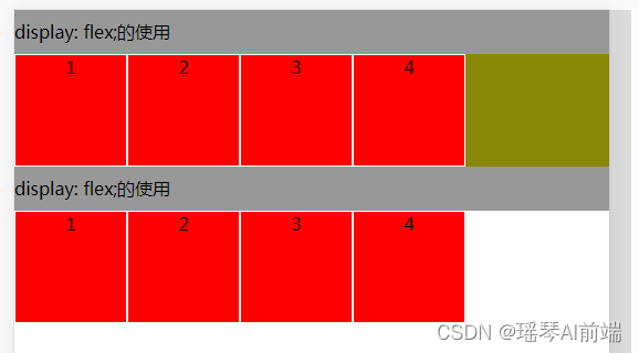
2.flex-direction属性:决定主轴的方向(即项目的排列方向)
row(默认值):主轴为水平方向,起点在左端
row-reverse:主轴为水平方向,起点在右端
column:主轴为垂直方向,起点在上沿
column-reverse:主轴为垂直方向,起点在下沿
.box-1{
    display: flex;
    background-color: #888908;
    /*width: 100%;*/
    flex-direction: column-reverse;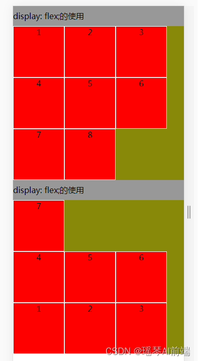
}3.flex-wrap属性:如果一条轴线排不下,如何换行
默认情况下,项目都排在一条线(又称轴线)上
.box{ flex-wrap: nowrap | wrap | wrap-reverse;}
nowrap :不换行
wrap :换行,第一行在上面
wrap-reverse:换行,第一行在下面
/*1.display:flex属性*/
.box-1{
    display: flex;
    background-color: #888908;
    flex-wrap: wrap;
}
/*2.display:inline-flex属性*/
.box-2{
    display: inline-flex;
    background-color: #888908;
    flex-wrap: wrap-reverse;
}
4.flex-flow属性:是flex-direction属性和flex-wrap属性的简写形式,默认值为row nowrap
.box{ flex-flow:<flex-direction> || <flex-wrap>; }
5.justify-content属性:定义了项目在主轴上的对齐方式
.box{ justify-content:flex-start | flex-end |center|space-between | space-around; }
flex-start(默认值):左对齐
flex-end:右对齐
center:居中
space-between:两端对齐,项目之间的间隔都相等
space-around:每个项目两侧的间隔相等。所以,项目之间的间隔比项目与边框的间隔大一倍
<style type="text/css">
    *{
        margin: 0;padding: 0;
    }
    p{
        height: 40px;line-height: 40px;background-color: #989899;
    }
    /*1.display:flex属性*/
    .box-1{
        display: flex;
        background-color: #888908;
        flex-wrap: wrap;
        justify-content: center; /*里面的内容是居中的*/
    }
    /*2.display:inline-flex属性*/
    .box-2{
        display: inline-flex;
        background-color: #888908;
        flex-wrap: wrap-reverse;
        justify-content: center; /*里面的内容是居中的*/
    }
    .box{
        width: 100px;
        height: 100px;
        background: red;
        border:1px solid white;
        text-align: center;

    }
</style>
<body>
    <p>display: flex;的使用</p>
    <div class="box-1">
        <div class="box">1</div>
        <div class="box">2</div>
        <div class="box">3</div>
        <div class="box">4</div>
        <div class="box">5</div>
        <div class="box">6</div>
        <div class="box">7</div>
        <div class="box">8</div>
    </div>
    <p>display: flex;的使用</p>
    <div class="box-2">
        <div class="box">1</div>
        <div class="box">2</div>
        <div class="box">3</div>
        <div class="box">4</div>
        <div class="box">5</div>
        <div class="box">6</div>
        <div class="box">7</div>
    </div>
</body>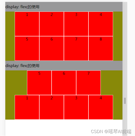
6.align-items属性:定义项目在交叉轴上如何对齐
.box{ align-item : flex-start | flex-end | center | baseline | stretch }
flex-start:交叉轴的起点对齐
flex-end:交叉轴的终点对齐
center:交叉轴的中线对齐
baseline :项目的第一行文字的基线对齐
stretch (默认值):如果项目未设置高度或设为auto,将占满整个容器的高度
/*1.display:flex属性*/
.box-1{
    display: flex;
    background-color: #888908;
    /*align-items: flex-start;*/
    align-items: flex-end;
}
/*2.display:inline-flex属性*/
.box-2{
    display: inline-flex;
    background-color: #888908;
    flex-wrap: wrap-reverse;
    align-items: center;
}
.box{
    width: 100px;
    height: 100px;
    line-height: 100px;
    background: red;
    border:1px solid white;
    text-align: center;

}
<body>
    <p>display: flex;的使用</p>
    <div class="box-1">
        <div class="box">1</div>
        <div class="box" style="height: 200px;">2</div>
        <div class="box">3</div>
        <div class="box" style="height: 200px;">4</div>

    </div>
    <p>display: inline-flex;的使用</p>
    <div class="box-2">
        <div class="box">1</div>
        <div class="box" style="height: 200px;">2</div>
        <div class="box">3</div>
        <div class="box" style="height: 200px;">4</div>
    </div>
</body>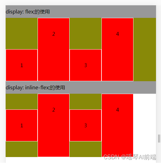
.box-2{
  display: inline-flex;
  background-color: #888908;
  flex-wrap: wrap-reverse;
  align-items: stretch ;
}
.box{
  width: 100px;
  height: auto;
  line-height: 100px;
  background: red;
  border:1px solid white;
  text-align: center;

}
7.align-content属性定义了多根轴线(多行)在交叉轴上的对齐方式
如果项目只有一根轴线(一行),该轴线不起作用
.box{ align-content : flex-start | flex-end | center |space-between | space-around | stretch;}
flex-start:交叉轴的起点对齐(整体与上端对齐)
flex-end:与交叉轴的终点对齐(整体与底端对齐)
center:与交叉轴的中点对齐(整体与中线对齐)
space-between:与交叉轴两端对齐,轴线之间的间隔平均分布
space-around:每根轴线两侧的间隔都相等
stretch(默认值):轴线占满整个交叉轴
.box-1{
    height: 400px;
    display: flex;
    background-color: #888908;
    /*align-items: flex-start;*/
    flex-wrap: wrap; /*先设置换行*/
    align-content: center;
    /*align-content:space-between;*/
}
/*2.display:inline-flex属性*/
.box-2{
    height: 400px;
    display: inline-flex;
    background-color: #888908;
    flex-wrap: wrap-reverse; /*反向换行*/
    align-content: flex-start;
}
.box{
    width: 100px;
    height: 100px;
    line-height: 100px;
    background: red;
    border:1px solid white;
    text-align: center;
}
<p>display: flex;的使用</p>
<div class="box-1">
    <div class="box">1</div>
    <div class="box">2</div>
    <div class="box">3</div>
    <div class="box">4</div>
    <div class="box">5</div>
    <div class="box">6</div>
    <div class="box">7</div>
    <div class="box">8</div>

</div>
<p>display: inline-flex;的使用</p>
<div class="box-2">
    <div class="box">1</div>
    <div class="box">2</div>
    <div class="box">3</div>
    <div class="box" >4</div>
    <div class="box">5</div>
    <div class="box">6</div>
    <div class="box">7</div>
    <div class="box">8</div>
</div>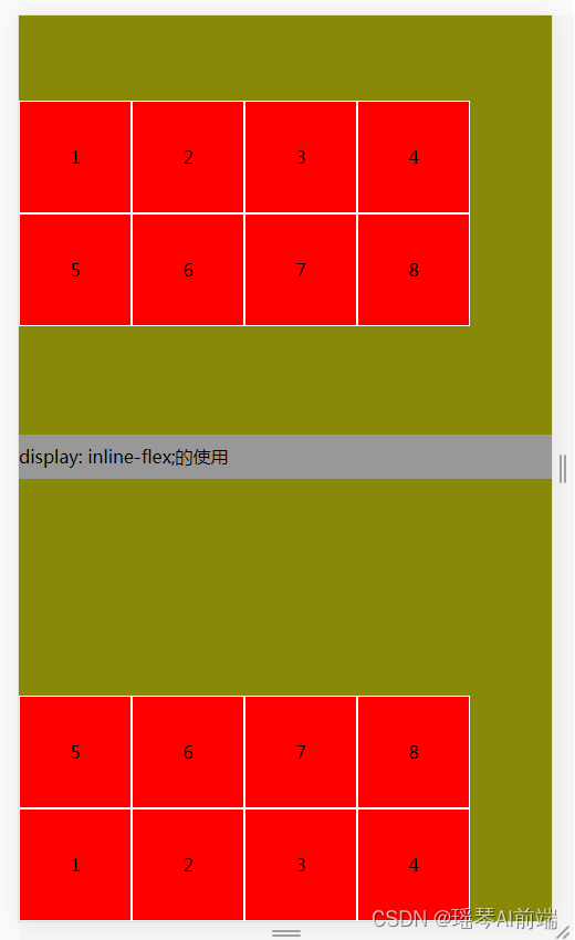
三、flex项目的属性
1.order属性:定义项目的排列顺序;数值越小,排列越靠前,默认为0;支持负数
.item{order:<integer>;}
 <style>
          *{
              margin: 0;
              padding: 0;
          }
          .box-1{
              background-color: #989898;
              display: flex;
          }
          .box{
              box-sizing: border-box;
              width: 150px;
              height: 150px;
              background-color: yellow;
              border:5px solid orange;
              font-size: 20px;
          }
          .box5{
              order:-1;  //这样第5个就排在了前面
          }
    </style>
</head>

<body>
    <div class="box-1">
        <div class="box">1</div>
        <div class="box">2</div>
        <div class="box">3</div>
        <div class="box">4</div>
        <div class="box box5">5</div>
    </div>
</body>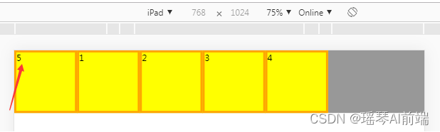
2.flex-grow属性:定义项目的放大比例,默认为0,即如果存在剩余空间,也不放大;值不可以是百分比或其他非数字
如果所有项目的flex-grow属性都为1,则它们将等分剩余空间(如果有的话)
如果一个项目的flex-grow为2,其他项目都为1,则前者占据的剩余空间将比其他项多一倍
.item{flex-grow:<number>;/*default:0*/}
          .box-1{
              background-color: #989898;
              display: flex;
          }
          .box{
              box-sizing: border-box;
              width: 150px;
              height: 150px;
              background-color: yellow;
              border:5px solid orange;
              font-size: 20px;
              flex-grow: 1; /*即使项目的宽度不够,也会等分*/
          }
          .box5{
              order:-1;
          }
<div class="box-1">
    <div class="box">1</div>
    <div class="box">2</div>
    <div class="box">3</div>
    <div class="box">4</div>
    <div class="box box5">5</div>
</div>
如果有的项目有flex-grow属性,有的项目有width属性;那么有flex-grow属性的项目将等分剩余空间
          .box-1{
              background-color: #989898;
              display: flex;
          }
          .box{
              box-sizing: border-box;
              width: 150px;
              height: 150px;
              background-color: yellow;
              border:5px solid orange;
              font-size: 20px;
              flex-grow: 1; /*即使项目的宽度不够,也会等分*/
          }
          .box4{
              width: 200px;  /*这个占200,其他等分空间*/
          }
<div class="box-1">
    <div class="box">1</div>
    <div class="box">2</div>
    <div class="box">3</div>
    <div class="box box4">4</div>
    <div class="box box5">5</div>
</div>
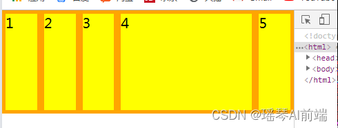
3.flex-shrink属性:定义了项目的缩小比例,默认为1,即如果空间不足,该项目将缩小
如果所有项目的flex-shrink属性都为1,当空间不足时,都将等比例缩小
如果一个项目的flex-shrink属性都为0,其他项目都为1,则空间不足时,前者不缩小
负值对该属性无效
.item{flex-shrink:<number>;/*default:1*/}
          .box{
              box-sizing: border-box;
              width: 150px;
              height: 150px;
              background-color: yellow;
              border:5px solid orange;
              font-size: 20px;
              flex-shrink: 1;
          }
          .box4{
              width: 200px;
          }
如下,空间不足了,宽度缩小时,会等比例缩小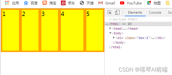
 .box4{
    width: 200px;
    flex-shrink: 0; /*空间不足时,第4块也不会缩小*/
  }
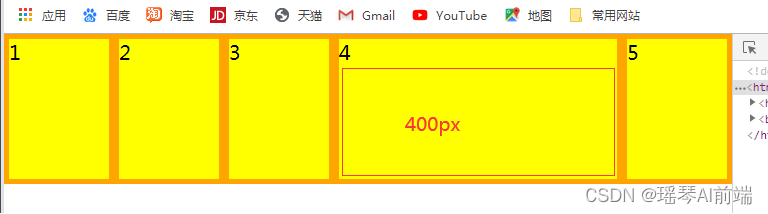
4.flex-basis属性定义了在分配多余空间之前,项目占据的主轴空间(main size)
浏览器根据这个属性,计算主轴是否有多余空间
它的默认值为auto,即项目的本来大小
.item{flex-basis:<length>; | auto; /*default auto*/}
          .box-1{
              background-color: #989898;
              display: flex;
              /*flex-direction: column;*/
          }
          .box{
              box-sizing: border-box;
              width: 150px;
              height: 150px;
              background-color: yellow;
              border:5px solid orange;
              font-size: 20px;
          }
          .box4{
              width: 200px;
              /*height: 200px; */
              flex-basis: 400px;  /*相当于width优先级比width高;跟随主轴的方向,如果主轴是交叉轴,那么它显示的就是height为400px;*/
          }
5.flex属性:是flex-grow,flex-shrink和flex-basis的简写,默认值为 0 1 auto,后两个属性可选
该属性有两个快捷键:auto(1 1 auto)和none(0 0 auto)
.item{ flex : none | [<flex-grow> <flex-shrink>|<flex-basis>]}
.box{
  box-sizing: border-box;
  width: 150px;
  height: 150px;
  background-color: yellow;
  border:5px solid orange;
  font-size: 20px;
  flex: 1; /*表示flex:1 1 0%;平分剩余空间*/
}6.align-self属性:允许单个项目有与其他项目不一样的对齐方式,可覆盖align-items属性,默认值为auto,表示继承父元素的align-items属性,如果没有父元素,则等同于stretch
(表示脱离父元素的align-items属性,项目单独设置对齐方式)
.Item{ align-self:auto | flex-start | flex-end | center | baseline | stretch}
.box-1{
              height: 300px;
              background-color: #989898;
              display: flex;
              align-items: center;  /*父元素设置垂直居中*/
          }
          .box{
              box-sizing: border-box;
              width: 150px;
              height: 150px;
              background-color: yellow;
              border:5px solid orange;
              font-size: 20px;
              flex: 1; /*表示flex:1 1 0%;平分空间*/
          }
          .box1{
              align-self: flex-end;
          }
          .box4{
              align-self: flex-start;
          }
<div class="box-1">
    <div class="box box1">1</div>
    <div class="box">2</div>
    <div class="box">3</div>
    <div class="box box4">4</div>
    <div class="box box5">5</div>
</div>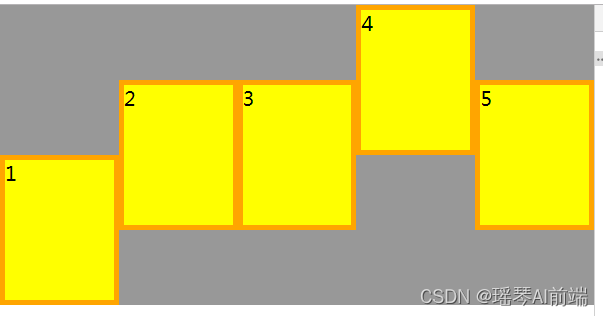


 1001
1001


 被折叠的 条评论
为什么被折叠?
被折叠的 条评论
为什么被折叠?
 到【灌水乐园】发言


