


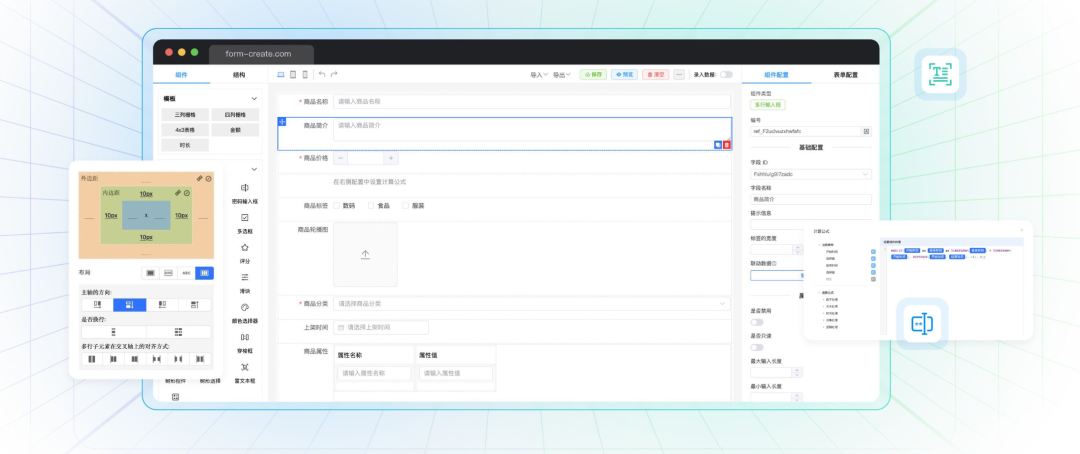
低代码表单FormCreate 支持在表单中生成并使用任何 Vue 组件。无论是简单的 UI 组件,还是复杂的自定义逻辑,都可以通过以下方式轻松集成到表单中。
注意事项
- 挂载与注册: 在自定义组件渲染之前,必须通过全局或局部的方式挂载或注册自定义组件,详见挂载或注册
- 获取组件规则: 只要在生成规则中定义
name属性,就可以通过fApi.component(name)方法获取组件规则,方便在表单中动态操作该组件。
组件挂载方式
通过 FormCreate 生成的自定义组件需要先进行挂载。挂载方式有两种:全局挂载和局部挂载。
全局挂载
全局挂载适用于整个 Vue 应用。通过这种方式,组件在应用的任何地方都可以使用。
app.component('TestComponent', TestComponent);
局部挂载
局部挂载适用于特定的表单实例。这种方法使得组件只在特定表单中可用,使用 formCreate.component() 方法进行挂载。
formCreate.component('TestComponent', TestComponent);
通过标签生成自定义组件
以下是通过标签生成 el-button 组件的示例:
{
   type: 'el-button',
   name: 'btn',
   props: {
     type: 'primary',
     loading: true
   },
   children: ['加载中']
}
使用 component 配置项直接生成组件
如果不想提前挂载组件,可以通过 component 配置项在生成规则中直接指定组件。这样无需显式挂载,组件即可在表单中使用。
const rule = {
   type: 'test',
   component: TestComponent
};
动态修改规则
可以使用 fApi.getRule() 方法获取生成规则,并动态修改组件属性:
fApi.getRule('btn').props.loading = false
这种方式非常灵活,适合在运行时根据业务逻辑调整组件行为。
参数自动注入
FormCreate 在生成自定义组件时,会自动向组件注入一些有用的参数。这些参数可以帮助你更好地管理组件与表单的交互。
formCreateInjectformCreateInject.api表单 API 对象,用于操作表单。formCreateInject.options表单组件的全局配置。formCreateInject.rule生成规则对象,定义了组件的所有配置。formCreateInject.field字段名称,与表单数据绑定。
扩展表单组件教程
在 FormCreate 中,您可以轻松地将自定义的 Vue 组件转换为表单组件,甚至可以与内置表单组件一样使用。以下指南将帮助您理解如何生成自定义表单组件,并展示实际业务场景中的用法。
预定义组件属性和事件
要让您的自定义组件在 FormCreate 中充当表单组件,您需要确保组件实现了 v-model 的基本功能。这意味着组件需要接收和管理 modelValue 以及 disabled 状态,并在值变化时触发 update:modelValue 事件。
Props 接收 在自定义组件内部,确保通过 props 接收以下属性:
// vue 组件示例
{
  props: {
    modelValue: String, // 绑定的表单值
    disabled: Boolean   // 组件的禁用状态
  }
}
触发事件 当组件内部的值发生变化时,通过 update:modelValue 事件通知外部值的更新:
this.$emit('update:modelValue', newValue);
挂载表单组件
在生成表单之前,您需要确保自定义组件已通过全局或局部方式挂载。
全局挂载
全局挂载适用于整个 Vue 应用。通过这种方式,组件在应用的任何地方都可以使用。
app.component('TestComponent', TestComponent);
局部挂载
局部挂载适用于特定的表单实例。这种方法使得组件只在特定表单中可用,使用 formCreate.component() 方法进行挂载。
formCreate.component('TestComponent', TestComponent);
生成表单组件
要在表单中生成自定义表单组件,您需要在生成规则中定义 field 属性,这是表单组件的必需属性。
{
    type:'TestComponent',
    value:'test',
    field:'testField',
    title:'自定义组件'
}
参数自动注入
FormCreate 在生成自定义组件时,会自动向组件注入一些有用的参数。这些参数可以帮助你更好地管理组件与表单的交互。
formCreateInjectformCreateInject.api表单 API 对象,用于操作表单。formCreateInject.options表单组件的全局配置。formCreateInject.rule生成规则对象,定义了组件的所有配置。formCreateInject.field字段名称,与表单数据绑定。
示例
简单输入框组件
这是一个基本的自定义输入框组件。
<template>
  <input :value="modelValue" @input="updateValue" :disabled="disabled" />
</template>

<script setup>
import { defineProps, defineEmits } from 'vue';
const props = defineProps({
  modelValue: String,
  disabled: Boolean
});
const emit = defineEmits(['update:modelValue']);
const updateValue = (event) => {
  emit('update:modelValue', event.target.value);
};
</script>
自定义选择器组件
这是一个自定义选择器组件,允许用户从给定的选项中选择一个值。
<template>
    <select :value="modelValue" @change="onChange" :disabled="disabled">
        <option v-for="option in options" :key="option.value" :value="option.value">
            {{ option.label }}
        </option>
    </select>
</template>

<script setup>
    import { defineProps, defineEmits } from 'vue';
    const props = defineProps({
        modelValue: [String, Number],
        disabled: Boolean,
        options: {
            type: Array,
            required: true,
        },
    });
    const emit = defineEmits(['update:modelValue']);
    const onChange = (event) => {
        emit('update:modelValue', event.target.value);
    };
</script>
带前缀和后缀的输入框组件
这个组件展示了如何在输入框中添加前缀和后缀。
<template>
    <div>
        <span>{{ prefix }}</span>
        <input :value="modelValue" @input="onInput" :disabled="disabled" />
        <span>{{ suffix }}</span>
    </div>
</template>

<script setup>
    import { defineProps, defineEmits } from 'vue';
    const props = defineProps({
        modelValue: String,
        disabled: Boolean,
        prefix: String,
        suffix: String,
    });
    const emit = defineEmits(['update:modelValue']);
    const onInput = (event) => {
        emit('update:modelValue', event.target.value);
    };
</script>
自定义复合输入组件
这是一个复合组件,结合了输入框和选择器,适用于如选择国家和输入电话号码的场景。
<template>
    <div>
        <select :value="selectedCountry" @change="onCountryChange" :disabled="disabled">
            <option v-for="country in countries" :key="country.value" :value="country.value">
                {{ country.label }}
            </option>
        </select>
        <input :value="modelValue" @input="onInput" :disabled="disabled" placeholder="请输入电话号码" />
    </div>
</template>

<script setup>
    import { defineProps, defineEmits, ref } from 'vue';
    const props = defineProps({
        modelValue: String,
        disabled: Boolean,
        countries: {
            type: Array,
            required: true,
        },
    });
    const emit = defineEmits(['update:modelValue']);
    const selectedCountry = ref(props.countries[0].value);
    const onCountryChange = (event) => {
        selectedCountry.value = event.target.value;
        emit('update:modelValue', ''); // 选择国家后,清空电话号码
    };
    const onInput = (event) => {
        emit('update:modelValue', event.target.value);
    };
</script>
依赖于外部数据源的选择器
这个组件会从远程 API 获取数据并填充到下拉选择框中,用户可以选择一个选项,选择的结果将会影响表单的其他部分。
<template>
    <div>
        <label>
            请选择国家:
            <select :value="selectedCountry" @change="onCountryChange">
                <option v-for="country in countries" :key="country.id" :value="country.id">{{ country.name }}</option>
            </select>
        </label>

        <label v-if="cities.length > 0">
            请选择城市:
            <select :value="selectedCity" @change="onCityChange">
                <option v-for="city in cities" :key="city.id" :value="city.id">{{ city.name }}</option>
            </select>
        </label>
    </div>
</template>

<script setup>
    import { ref, onMounted, watch } from 'vue';
    import axios from 'axios';
    // 接收 props 并定义 emits
    const props = defineProps({
        modelValue: {
            type: Object,
            default: () => ({ country: '', city: '' }),
        },
    });
    const emit = defineEmits(['update:modelValue']);
    // 定义状态
    const countries = ref([]);
    const cities = ref([]);
    const selectedCountry = ref(props.modelValue.country);
    const selectedCity = ref(props.modelValue.city);
    // 监听 selectedCountry 的变化
    watch(selectedCountry, async (newCountry) => {
        // 当国家变化时,触发获取城市列表的操作
        await fetchCities(newCountry);
        // 当国家变化时,重置城市选择
        selectedCity.value = '';
        emit('update:modelValue', { country: newCountry, city: '' });
    });
    // 监听 selectedCity 的变化
    watch(selectedCity, (newCity) => {
        emit('update:modelValue', { country: selectedCountry.value, city: newCity });
    });
    // 获取国家列表
    onMounted(async () => {
        const response = await axios.get('/api/countries');
        countries.value = response.data;
        if (selectedCountry.value) {
            await fetchCities(selectedCountry.value);
        }
    });
    // 获取城市列表
    const fetchCities = async (countryId) => {
        const response = await axios.get(`/api/countries/${countryId}/cities`);
        cities.value = response.data;
    };
    // 国家选择事件处理
    const onCountryChange = (event) => {
        selectedCountry.value = event.target.value;
    };
    // 城市选择事件处理
    const onCityChange = (event) => {
        selectedCity.value = event.target.value;
    };
</script>
通过掌握以上自定义组件的生成和操作方法,您可以在 FormCreate 中实现几乎任何复杂的表单需求。无论是简单的按钮,还是复杂的动态表单项。


 1770
1770

 被折叠的 条评论
为什么被折叠?
被折叠的 条评论
为什么被折叠?
 到【灌水乐园】发言


