


(一)模拟掷骰子,并实现结果可视化
1、点值平方的散点图
可视化1-1000的平方,定义坐标的title,label,scale,and fontsize。 颜色修改为c,点的大小为s.颜色渐变需要颜色映射为cmap。
#!/usr/bin/env python
# -*- coding:utf-8 -*-
# author: Christal date: 2021/11/29

import matplotlib.pyplot as plt
x_values = list(range(1,1001,10))
y_values = [x**2 for x in x_values]

#散点图默认的是蓝色的原点,黑色的边框,语句 edgecolor='none',表示去掉黑色边框
#plt.scatter(x_values, y_values, c='red', edgecolor='none', s=3)

#RGB定义点的颜色,变量用c回报错,用color
#plt.scatter(x_values, y_values, color=(0, 0.8, 0.8), edgecolor='none', s=3)

#使用颜色映射,y值较小的点设置为浅蓝色,y值较大的点设置为深蓝色
plt.scatter(x_values, y_values, c=y_values, cmap=plt.cm.Blues, edgecolor='none', s=3 )

# 设置图表标题并给坐标轴加上标签
plt.title("Square Numbers", fontsize=10)
plt.xlabel("Value", fontsize=14)
plt.ylabel("Square of Value", fontsize=14)
# 设置刻度标记的大小
plt.tick_params(axis='both', which='major', labelsize=25)
#设置每个坐标的取值范围
plt.axis([0, 1100, 0, 1100000])

#程序实现图表的自动保存,
plt.savefig('squares_scatter.png', dpi=600, bbox_inches='tight')
plt.show()
2、骰子实验
假设骰子是六面的,实验中有一个骰子,投掷多次,记录每次点数并用动态直方图表示。首先创建了个筛子类,初始化面数,并可以模拟投掷过程。保存为die.py
from random import randint

class Die():
    """表示一个骰子的类"""
    def __init__(self, num_sides=6):
        """骰子默认为6面"""
        self.num_sides = num_sides
    def roll(self):
        """"返回一个位于1和骰子面数之间的随机值"""
        return randint(1, self.num_sides)
实验过程和数据可视化程序如下:
试验次数为1000次,每个点数出现的次数记录在列表frequencies中,
import pygal
from die import Die
#创建一个6面的筛子D6
die = Die()

#掷几次骰子,并将结果存储在一个列表中
results = []
for roll_num in range(1000):
    result = die.roll()
    results.append(result)

#分析结构
frequencies = []
for value in range (1, die.num_sides+1):
    frequency = results.count(value)
    frequencies.append(frequency)

# 对结果进行可视化
hist = pygal.Bar()
hist.title = "Results of rolling one D6 1000 times."
hist.x_labels = ['1', '2', '3', '4', '5', '6']
hist.x_title = "Result"
hist.y_title = "Frequency of Result"
hist.add('D6', frequencies)
hist.render_to_file('die_visual.svg')
结果显示图如下:
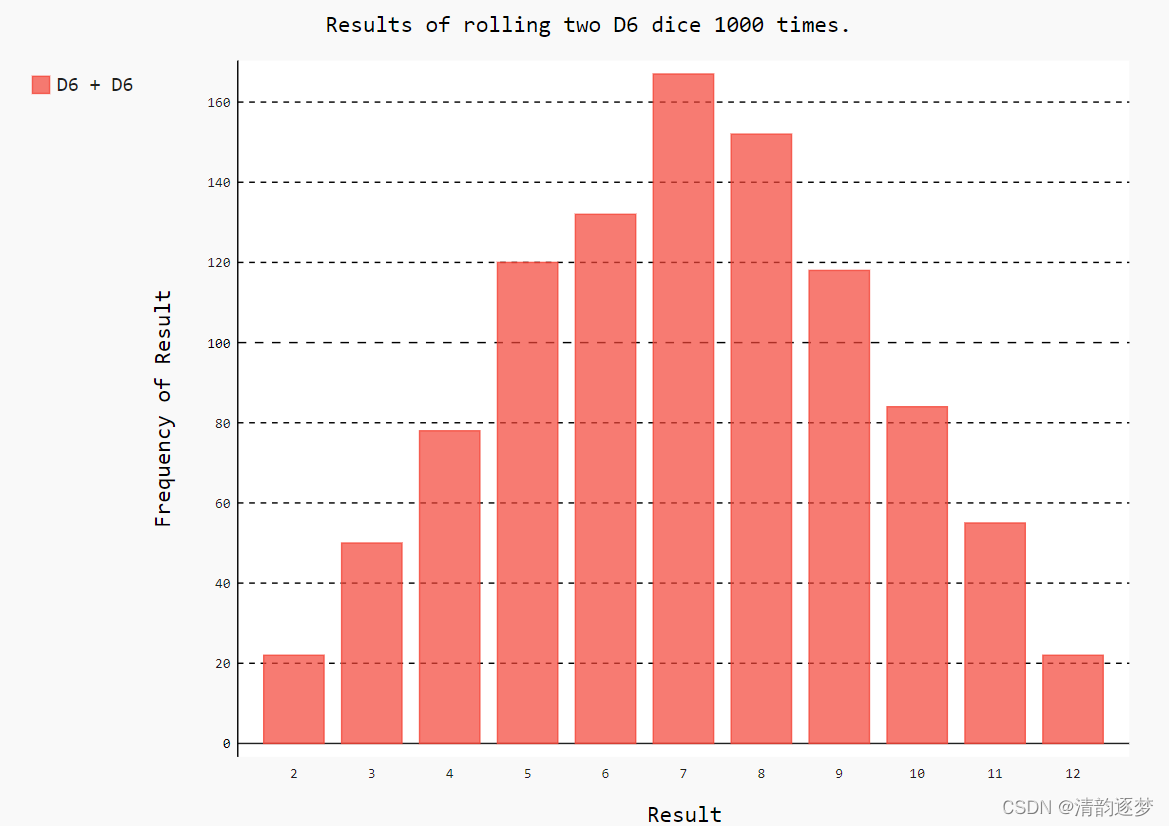
如果头掷骰子的个数为2,且为6面和10面骰子,则程序改写为:
import pygal
from die import Die

#创建一个6面的筛子D6,和一个10面的筛子D10
die_1 = Die()
die_2 = Die(10)

#掷几次骰子,并将结果存储在一个列表中
results = []
for roll_num in range(50000):
    result = die_1.roll()+ die_2.roll()
    results.append(result)

#分析结果
frequencies = []
max_result = die_1.num_sides + die_2.num_sides
for value in range (2, max_result+1):
    frequency = results.count(value)
    frequencies.append(frequency)

# 对结果进行可视化
hist = pygal.Bar()
hist.title = "Results of rolling a D6 and a D10 50000 times."
hist.x_labels = ['2', '3', '4', '5', '6','7','8','9','10','11','12','13','14','15','16']
hist.x_title = "Result"
hist.y_title = "Frequency of Result"
hist.add('D6 + D10', frequencies)
hist.render_to_file('dif_dice_visual.svg')
die()类默认骰子为6面,但是创建实例时可以自行传入参数进行修改。投掷次数为50,000次,形成的.svg文件,用浏览器打开。
(二)随机漫步实验并可视化
首先定义一个类RandomWalk(),初始化步数5000,起点(0,0),定义方法fill_walk()模拟漫步,定义4个方向:上下左右,并设置步:0-4.
#!/usr/bin/env python
# -*- coding:utf-8 -*-
# author: Christal date: 2021/11/30

from random import choice

class RandomWalk():
    """生成一个随机漫步数据的类"""
    def __init__(self, num_points=5000):
        """初始化随机漫步的属性"""
        self.num_points = num_points

        #所有的随机漫步都始于(0,0)
        self.x_values = [0]
        self.y_values = [0]

    def fill_walk(self):
        """计算随机漫步包含的所有点"""
        # 不断漫步,直到列表达到指定的长度
        while len(self.x_values) < self.num_points:
            #决定前进方向以及沿这个方向前进的距离
            x_direction = choice([1, -1])
            x_distance = choice([0, 1, 2, 3, 4])
            x_step = x_direction * x_distance

            y_direction = choice([1, -1])
            y_distance = choice([0, 1, 2, 3, 4])
            y_step = y_direction * y_distance

            # 拒绝原地踏步
            if x_step == 0 and y_step == 0:
                continue

            # 计算下一个点的x和y值
            next_x = self.x_values[-1] + x_step
            next_y = self.y_values[-1] + y_step

            self.x_values.append(next_x)
            self.y_values.append(next_y)
程序中拒绝原地踏步。
import matplotlib.pyplot as plt

from random_walk import RandomWalk

while True:
    #创建一个RandomWalke实例,并将其包含的点都绘制出来
    rw = RandomWalk(50000) # 创建实例的过程中修改点数
    rw.fill_walk()

    #设置图片窗口的大小
    plt.figure(dpi=600, figsize=(10, 6))

    point_numbers = list(range(rw.num_points))
    plt.scatter(rw.x_values, rw.y_values, c=point_numbers,
                cmap=plt.cm.Greens, edgecolor='none',s=1)

    #突出起点和终点
    plt.scatter(0, 0, c='blue', edgecolors='none', s=100)
    plt.scatter(rw.x_values[-1], rw.y_values[-1],
                c='red', edgecolors='none', s=100)
    #隐藏坐标轴,这种方法是书商介绍的,但是无法实现
    # plt.axes().get_xaxis().set_visible(False)
    # plt.axes().get_yaxis().set_visible(False)
    plt.axis('off')  # 去掉坐标轴

    plt.show()

    keep_running = input("Make another walk? (y/n):")
    if keep_running == 'n':
        break

图片显示如上图,将坐标轴隐藏,起点和终点突出,起到到终点颜色逐渐加深。
(三).csv文件读取,结果可视化
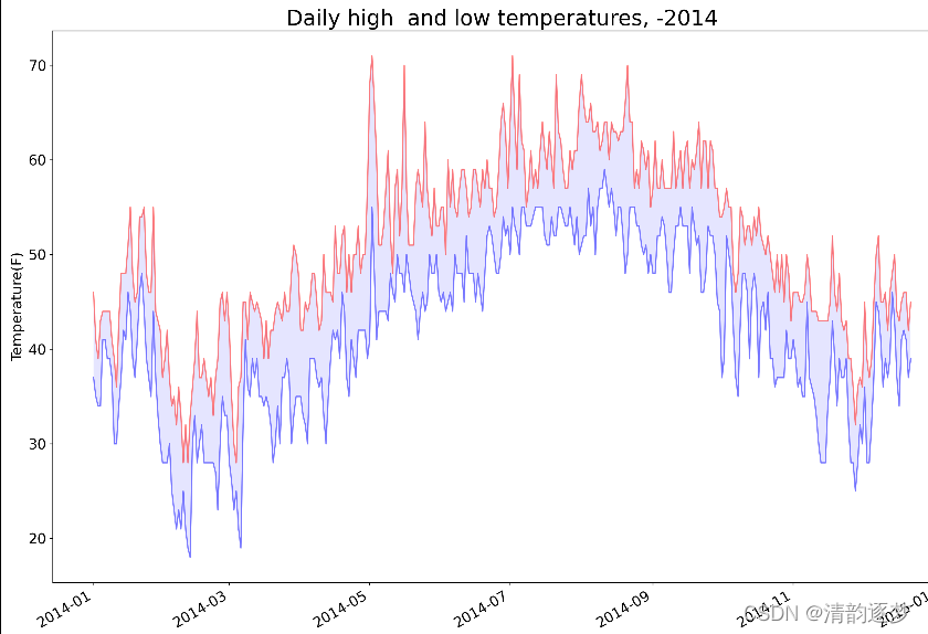
数据文件中保存的是天气信息,dates, highs, 和lows 分别表示日期,最高温度和最低温度,数据文件的数据格式如下:

fill_between()函数对最高温和最低温之间进行填充。透明度设置很高,以凸显两端的温度值。 strptime()用于将实现表示成特定形式,autofmt_xdate()功能是将横轴的时间表示倾斜,避免重叠。
import csv
from matplotlib import pyplot as plt
from datetime import datetime

# filename = 'sitka_weather_07-2014.csv'
filename = 'sitka_weather_2014.csv'
with open(filename) as f:
    reader = csv.reader(f)
    header_row = next(reader)  #读取数据文件的第一行(仅调用一次next)存储在 header_row

    dates, highs, lows = [], [], []
    for row in reader:
        current_date = datetime.strptime(row[0],"%Y-%m-%d")
        dates.append(current_date)
        high = int(row[1])
        highs.append(high) # 保存了第一列数据

        low = int(row[3])
        lows.append(low)

#    print(highs)

fig = plt.figure(dpi=208, figsize=(15, 10))
plt.plot(dates, highs,  c='red', alpha=0.5)
plt.plot(dates, lows, c='blue', alpha=0.5)
plt.fill_between(dates, highs, lows, facecolor='blue', alpha=0.1) #alpha指定颜色的透明度,
                                                            # 0表示完全透明

    #设置图形的格式
plt.title("Daily high  and low temperatures, -2014", fontsize=24)
plt.xlabel('', fontsize=16)
fig.autofmt_xdate()
plt.ylabel("Temperature(F)",fontsize=16)
plt.tick_params(axis='both', which='major', labelsize=16)
plt.show()

for index, column_header in enumerate(header_row):
    print(index, column_header)
上述程序展示的温度曲线如下:
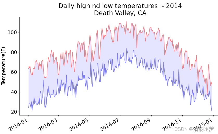
如果数据文件汇总有缺失的数据,就要进行在处理,上述代码会报错的,一般处理方法有删除,忽略,插值或者其他。下面为一种处理方法。
#!/usr/bin/env python
# -*- coding:utf-8 -*-
# author: Christal date: 2021/12/1

import csv
from matplotlib import pyplot as plt
from datetime import datetime

filename = 'death_valley_2014.csv'
with open(filename) as f:
    reader = csv.reader(f)
    header_row = next(reader)  # 读取数据文件的第一行(仅调用一次next)存储在 header_row

    dates, highs, lows = [], [], []
    for row in reader:
        try:
            current_date = datetime.strptime(row[0], "%Y-%m-%d")
            high = int(row[1])
            low = int(row[3])
        except ValueError:
            print(current_date, 'missing data')
        else:
            dates.append(current_date)
            highs.append(high)  # 保存了第一列数据
            lows.append(low)

    #  print(highs)
fig = plt.figure(dpi=128, figsize=(10, 6))
# fig = plt.figure(dpi=208, figsize=(15, 10))
plt.plot(dates, highs, c='red', alpha=0.5)
plt.plot(dates, lows, c='blue', alpha=0.5)
plt.fill_between(dates, highs, lows, facecolor='blue', alpha=0.1)  # alpha指定颜色的透明度,
    # 0表示完全透明

    # 设置图形的格式
title = "Daily high nd low temperatures  - 2014\nDeath Valley, CA"
plt.title(title, fontsize=20)
plt.xlabel('', fontsize=16)
fig.autofmt_xdate()
plt.ylabel("Temperature(F)", fontsize=16)
plt.tick_params(axis='both', which='major', labelsize=16)
plt.show()

#打印出表头每一列的索引和目录
for index, column_header in enumerate(header_row):
    print(index, column_header)
温度显示图如下:
(四).json文件数据读取,并实现结果可视化
数据文件population_data.json中保存数据的格式为:
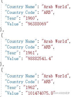
很显然,文件是一个很长的列表,每个元素都是一个包含4个键值对的字典。键值对的存储形式是字符串,因此需要改为int类型,避免转换时出错,先转为floa型,然后去小数部分。文件的读取实现如下:
import json

filename = 'population_data.json'
with open(filename) as f:
    pop_data = json.load(f) #.csv数据用reader() .json数据用load()
for pop_dict in pop_data:
    if pop_dict['Year'] == '2010':  #执行字符串比较
        country_name = pop_dict['Country Name']
        population = int(float(pop_dict['Value']))
        print(country_name + ": " + str(population))
Pygal中的地图制作工具要求数据为特定的格式:用国别码表示国家,以及用数字表示人口数量。Pygal使用的国别码存储在模块i18n(internationalization的缩写)中。字典COUNTRIES包含的
键和值分别为两个字母的国别码和国家名。要查看这些国别码,可从模块i18n中导入这个字典,
并打印其键和值。
获取国别码保存为:country_codes.py
#!/usr/bin/env python
# -*- coding:utf-8 -*-
# author: Christal date: 2021/12/2
from pygal_maps_world.i18n import COUNTRIES
def get_country_code(country_name):
"""根据指定的国家,返回pygal使用的两个字母的国别码"""
for code, name in COUNTRIES.items():
if name == country_name:
return code
#如果没有指定的谷国家,返回None
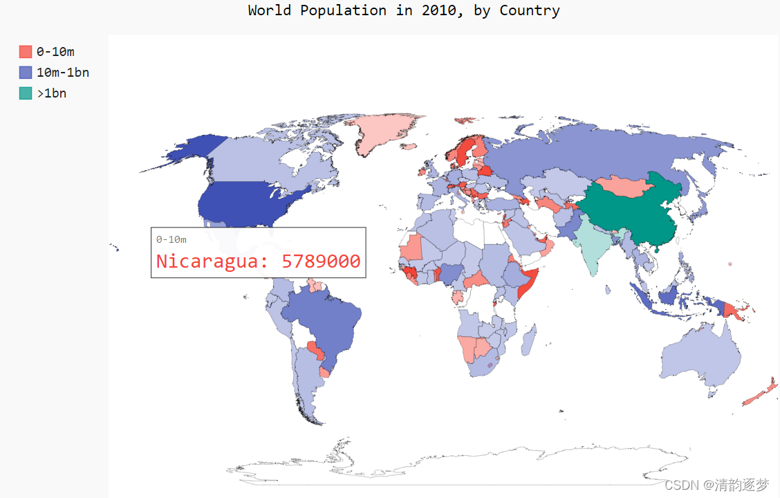
return None下面将每个国家的人口数目显示在地图中,并且按照人口数目登记对颜色进行蛇毒或者浅度的调整,代码实现:
import json
import pygal_maps_world.maps
from country_codes import get_country_code
filename = 'population_data.json'
with open(filename) as f:
pop_data = json.load(f) #.csv数据用reader() .json数据用load()
#打印2010年每个国家的人口数目
cc_population = {}
for pop_dict in pop_data:
if pop_dict['Year'] == '2010': #执行字符串比较
country = pop_dict['Country Name']
population = int(float(pop_dict['Value']))
code = get_country_code(country)
if code:
cc_population[code] = population #将国别码和人口数量分别作为键和值填充字典
#根据人口数量将所有的国家分为三组
cc_pops_1, cc_pops_2, cc_pops_3 = {}, {}, {}
for cc, pop in cc_population.items():
if pop < 10000000:
cc_pops_1[cc] = pop
elif pop < 1000000000:
cc_pops_2[cc] = pop
else:
cc_pops_3[cc] = pop
# 看看每组分别包含多少个国家
print(len(cc_pops_1), len(cc_pops_2), len(cc_pops_3))
wm = pygal_maps_world.maps.World()
wm.title = 'World Population in 2010, by Country'
wm.add('0-10m', cc_pops_1)
wm.add('10m-1bn', cc_pops_2)
wm.add('>1bn', cc_pops_3)
# wm.add('2010', cc_population)
wm.render_to_file('world_population.svg')结果展示:


 742
742

 被折叠的 条评论
为什么被折叠?
被折叠的 条评论
为什么被折叠?
 到【灌水乐园】发言


