


CSS伪元素::after用来创建一个伪元素,作为已选中元素的最后一个子元素。通常会配合content属性来为该元素添加装饰内容。这个虚拟元素默认是行内元素。
<!DOCTYPE html>
<html lang="en">
<head>
<meta charset="utf-8">
<meta http-equiv="X-UA-Compatible" content="IE=edge">
<meta name="viewport" content="width=device-width,initial-scale=1.0,user-scalable=no">
<title>Title</title>
<style>
.interesting-after {
color: #1a1a1a;
}
.interesting-after::after {
content: "<- 这样的伪类难道不令人兴奋吗!";
color: gray;
}
span[data-describe] {
position: relative;
text-decoration: underline;
color: #00f;
cursor: help;
}
span[data-describe]:hover::after {
content: attr(data-describe);
position: absolute;
left: 0;
top: 24px;
min-width: 200px;
border: 1px #aaa solid;
border-radius: 10px;
background-color: #ffc;
padding: 12px;
font-size: 14px;
z-index: 1;
}
</style>
</head>
<body>
<p class="interesting-after">::after</p>
<p>这里有一些<span data-describe="collection of words and punctuation">文字</span>有一些提示<br />
把鼠标放上去<span data-describe="not to be taken literally">看看</span></p>
</body>
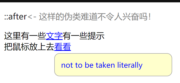
</html>效果图:


 854
854


 被折叠的 条评论
为什么被折叠?
被折叠的 条评论
为什么被折叠?
 到【灌水乐园】发言


