


参数说明
| 参数 | 默认值 | 说明 |
|---|---|---|
| height | 50.0 | 搜索栏高度 |
| hintText | 搜索 | 搜索栏初始提示 |
| backgroundColor | Colors.white | 背景色 |
| fontSize | 18 | 文字大小 |
| fontColor | Colors.black | 文字颜色 |
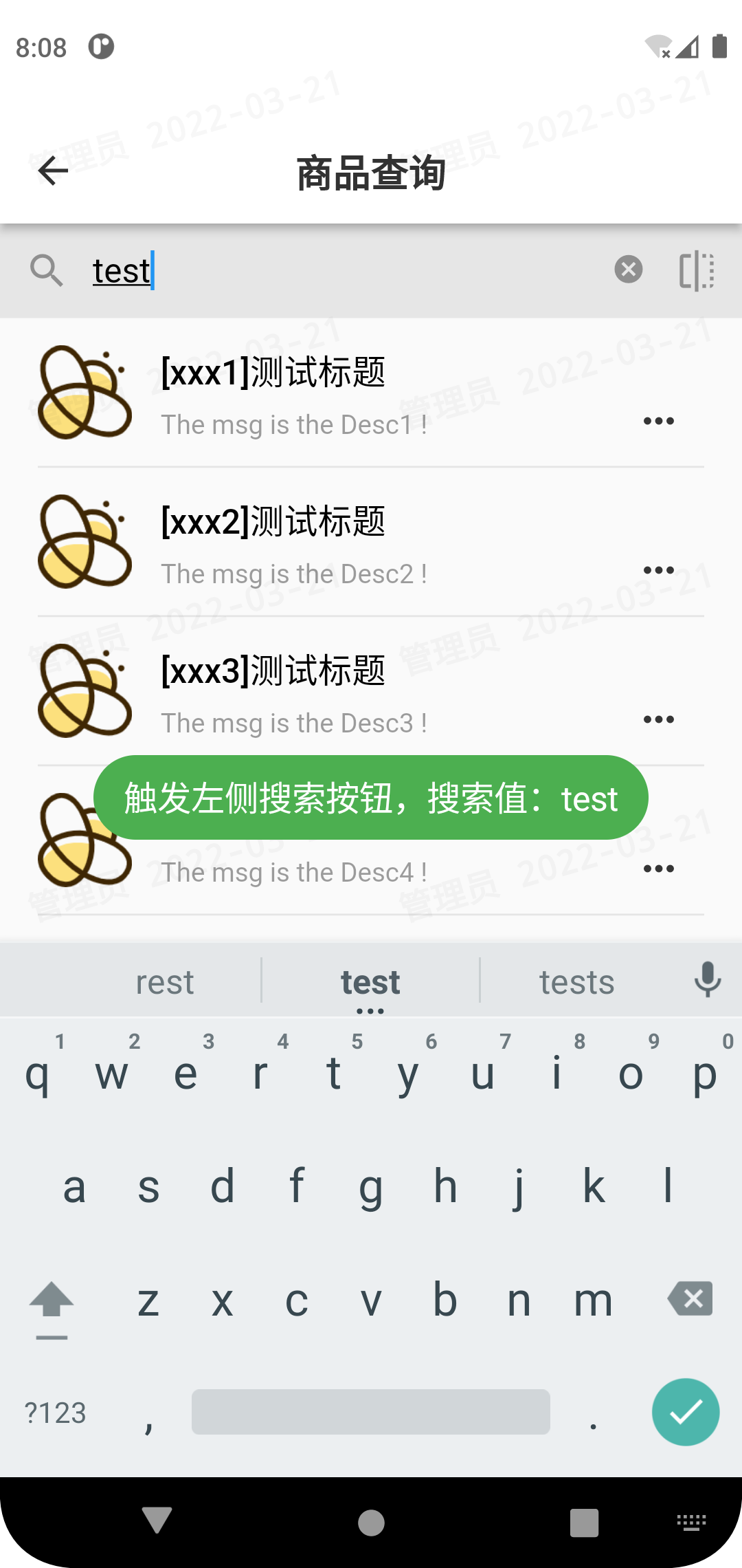
| onSearch | 左侧搜索按钮回调函数 | |
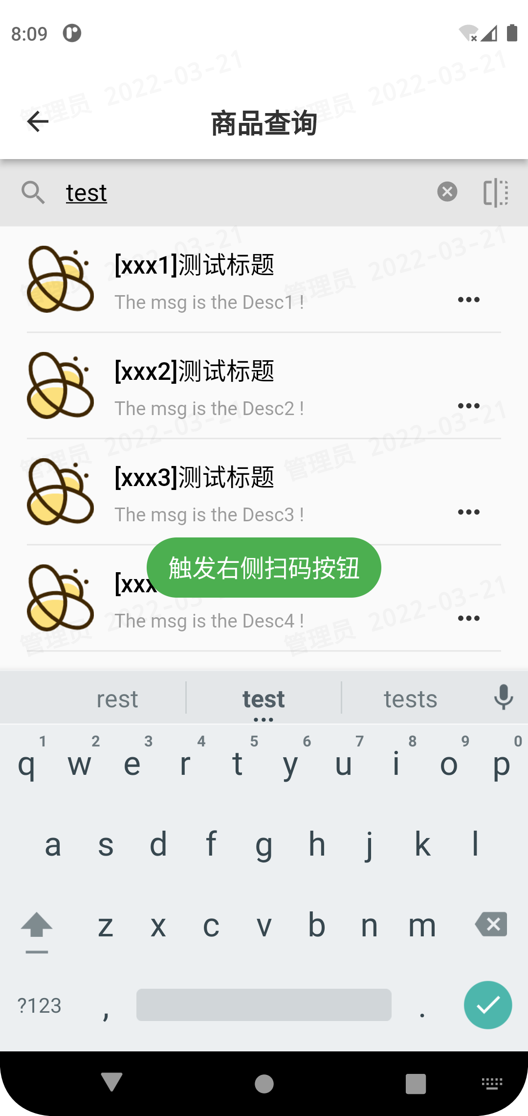
| onIcon | 右侧图标按钮回调函数 | |
| rightIcon | Icons.flip | 右侧图标 |
使用参考
// 使用悬浮层悬浮在正常页面,列表中预留组件高度
Center(
  child:ConstrainedBox( //约束盒子
    constraints: BoxConstraints.expand(),//不指定高和宽时则铺满整个屏慕
    child: Stack(
      alignment:Alignment.center , //指定对齐方式为居中
      children: <Widget>[ //子组件列表
        ListView(children: [SizedBox(height: 50,),],),
        Positioned(
          top: 0.0,//距离顶部18px(在中轴线上,因为Stack摆放在正中间)
          child: MySearchFence(
            onSearch:(value){print(value);},// 回调函数传值
            rightIcon: Icons.flip,
            onIcon:(value){print(value);},// 回调函数传值
          ),
        ),
      ],
    ),
  ),
)
效果图
搜索栏代码
import 'dart:async';
import 'dart:math';
import 'package:flutter/material.dart';

class MySearchFence extends StatefulWidget {
  // 传入参数
  const MySearchFence({
    Key? key,
    this.height: 50.0, // 搜索栏高度
    this.hintText: '搜索', // 搜索栏初始提示
    this.backgroundColor: Colors.white,// 背景色
    this.fontSize: 18,// 文字大小
    this.fontColor: Colors.black,// 文字颜色
    required this.onSearch, // 左侧搜索按钮回调函数
    required this.onIcon,// 右侧图标按钮回调函数
    this.rightIcon: Icons.flip,// 右侧图标
  }) : super(key: key,);
  final double height;
  final String hintText;
  final Color backgroundColor;
  final double fontSize;
  final Color fontColor;
  final ValueChanged<String> onSearch;
  final ValueChanged<String> onIcon;
  final IconData rightIcon;
  @override
  State<StatefulWidget> createState() => MySearchFenceState();
}

// 监听值变化绑定函数
void _textFieldChanged(String str) {
  print(str);
}

// 构建
class MySearchFenceState extends State<MySearchFence> {
  TextEditingController value = TextEditingController();
  @override
  Widget build(BuildContext context) {
    return SizedBox(
      width: MediaQuery.of(context).size.width,// 宽度全屏
      height: widget.height,// 传入高度
      child: Container(
        padding: EdgeInsets.fromLTRB(13, 0, 10, 0),
        decoration: BoxDecoration(
          color: widget.backgroundColor,// 传入背景色
          borderRadius: BorderRadius.all(Radius.circular(0)),
        ),
        child:
        Row(
          children: [
            // 左侧搜索按钮
            SizedBox(
              height: 26,
              width: 26,
              child: TextButton(
                  style: ButtonStyle(
                    foregroundColor: MaterialStateProperty.all(Color.fromARGB(255, 53, 53, 53)),
                    minimumSize: MaterialStateProperty.all(Size(10, 5)),
                    padding: MaterialStateProperty.all(EdgeInsets.zero),
                  ),
                  onPressed: (){widget.onSearch(value.text);},// 回调函数
                  child: new Row(
                    children: [
                      new Icon(Icons.search,color: Colors.black38,),
                    ],
                  )
              ),
            ),
            // 中间搜索框
            SizedBox(
              height: widget.height,
              width: MediaQuery.of(context).size.width-75,
              child: TextField(
                controller: value,
                style: TextStyle(color: widget.fontColor,fontSize: widget.fontSize),
                keyboardType: TextInputType.text,
                decoration: InputDecoration(
                  suffixIcon: IconButton(
                    onPressed: () {value.clear();},
                    icon: Icon(Icons.cancel, color: Colors.black38,size: 18,)
                  ),
                  contentPadding: EdgeInsets.all(10.0),
                  hintText: widget.hintText,
                  border: InputBorder.none,
                ),
                autofocus: false,
                // onChanged: _textFieldChanged,
              )
            ),
            // 右侧自定义图标按钮
            SizedBox(
              height: 26,
              width: 26,
              child: TextButton(
                style: ButtonStyle(
                  foregroundColor: MaterialStateProperty.all(Color.fromARGB(255, 53, 53, 53)),
                  minimumSize: MaterialStateProperty.all(Size(10, 5)),
                  padding: MaterialStateProperty.all(EdgeInsets.zero),
                ),
                onPressed: (){widget.onIcon(value.text);},
                child: new Row(
                  children: [
                   new Icon(widget.rightIcon,color: Colors.black38,),
                  ],
                )
              ),
            )
          ],
        )
      )
    );
  }

}


 3027
3027


 被折叠的 条评论
为什么被折叠?
被折叠的 条评论
为什么被折叠?
 到【灌水乐园】发言


