


前言
在做可视化大屏的时候,我们首先要保证UI图的比例不变,例如16:9的UI图,但大屏的比例可能是2:1,很多时候大屏的比例往往很少能与UI图的比例一模一样的,这个时候我们就要利用公式换算来适配大屏。
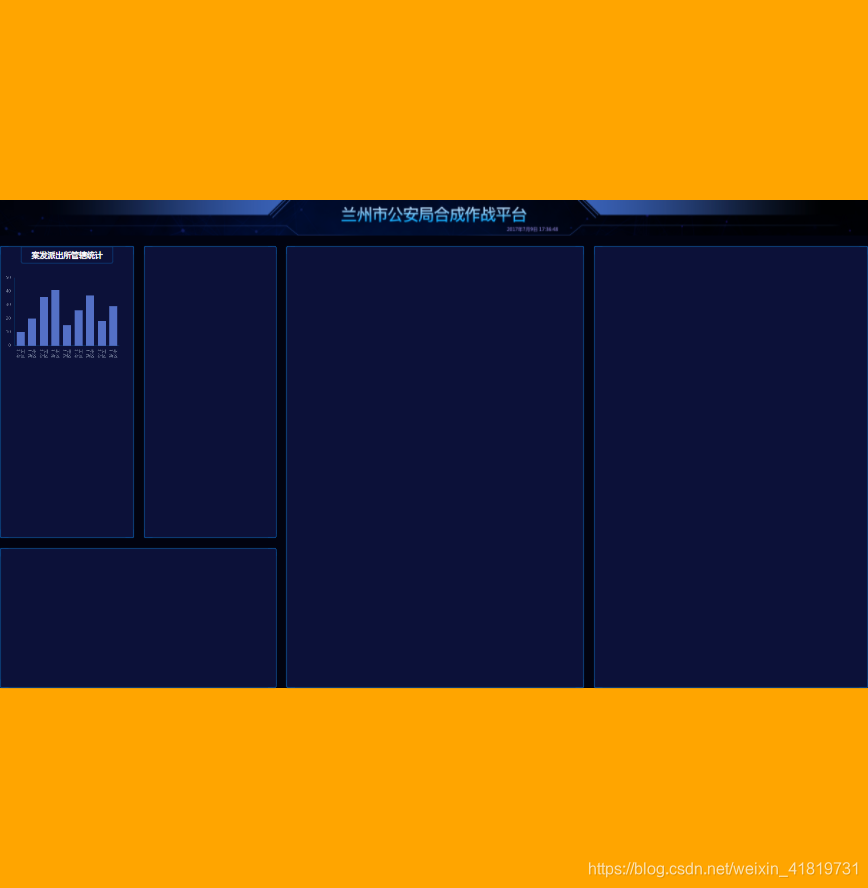
例如16:9的UI图:

适配大屏
当页面首次加载时,判断视口的宽高,如果视口的宽/高 > 16/9 则说明视口宽度比较设计图宽,实际的显示宽度应该等于视口的高度*16/9。
如果视口的宽/高 < 16/9 则说明视口高度比设计图高,实际的显示宽度应该等于视口的宽度,显示高度应等于视口宽度 / (16/9)。
然后设置 font-size: pageWidth / 100 px,这样就可以做到100rem等于100% width,之后所有大小的设置都通过rem来做,这样就可以做到适配任意比例的大屏了。
index.js
<script>
  const clientWidth = document.documentElement.clientWidth
  const clientHeight = document.documentElement.clientHeight
  window.pageWidth = clientWidth / clientHeight > 16 / 9 ? clientHeight * (16 / 9) : clientWidth
  const pageHeight = pageWidth / (16 / 9)
  const string = `<style>html{
      font-size: ${pageWidth / 100}px
    }</style>`
  document.write(string)

  root.style.width = pageWidth + 'px'
  root.style.height = pageHeight + 'px'
  root.style.marginTop = (clientHeight - pageHeight) / 2 + 'px'
</script>
比例大于16/9的:

比例小雨16/9的:
布局
布局可以用flex和grid,这里用grid比较合适。
    <main>
        <section className="bordered section1"></section>
        <section className="bordered section2"></section>
        <section className="bordered section3"></section>
        <section className="bordered section4"></section>
        <section className="bordered section5"></section>
    </main>
// scss
> main {
flex: 1;
display: grid;
padding-top: px(30);
grid-template:
"box1 box2 box4 box5" 755fr
"box3 box3 box4 box5" 363fr / 366fr 361fr 811fr 747fr;
grid-column-gap: px(28);
grid-row-gap: px(28);
> .section1 {
grid-area: box1;
}
> .section2 {
grid-area: box2;
}
> .section3 {
grid-area: box3;
}
> .section4 {
grid-area: box4;
}
> .section5 {
grid-area: box5;
}
}加阴影:
我们可以利用box-shadow,多层叠加阴影来达到这个效果。
例如:box-shadow:1px 2px 3px 4px #0e325f;
- box-shadow第一个参数(1px)表示:左右
- 第二个参数(2px)表示:上下
- 第三个参数(3px)表示:扩散
- 第四个参数(4px)表示:范围
代码中实现:
    section {
      text-align: center;
      border: 1px solid #0764bc;
      border-radius: 4px;
      position: relative;
      box-shadow: 0 0 2px 0 #0e325f, inset 0 0 2px 0 #0e325f;
      background: #0c1139;
      &::before {
        content: '';
        position: absolute;
        left: 0;
        right: 0;
        bottom: 0;
        top: 0;
        border-radius: 4px;
        box-shadow: 17px 0 0 -16px #0e325f,
        -17px 0 0 -16px #0e325f,
        0 17px 0 -16px #0e325f,
        0 -17px 0 -16px #0e325f,
        9px 0 0 -8px #0d4483,
        -9px 0 0 -8px #0d4483,
        0 9px 0 -8px #0d4483,
        0 -9px 0 -8px #0d4483,;
      }
    }


 扫一扫
扫一扫


 1404
1404

 被折叠的 条评论
为什么被折叠?
被折叠的 条评论
为什么被折叠?
 到【灌水乐园】发言


