


前言
无意中发现了这个库,发现现在很多app中都有类似的功能。以手机b站为例,当你在看视频时,点击评论,视频会向上偏移,下方划出评论界面。
sliding_up_panel
SlidingUpPanel是一个Flutter插件,用于创建滑动面板效果。它可以使内容面板在屏幕底部向上滑动,显示隐藏的内容面板,并且还可以根据需要进行手势控制。
SlidingUpPanel提供了许多自定义选项,可以根据具体需求来调整面板的外观和行为。例如,您可以设置面板的高度、背景颜色、边框等。您还可以定义面板打开和关闭的动画效果,以及触发打开和关闭面板的手势。
官方文档
https://pub-web.flutter-io.cn/packages/sliding_up_panel
安装
flutter pub add sliding_up_panel
下面只介绍基本用法,关于其他用法可以自行查看官方文档
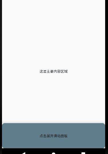
示例1
推荐作为根节点使用
Widget build(BuildContext context) {
return Scaffold(
appBar: AppBar(
title: const Text('滑动面板'),
),
body: SlidingUpPanel(
// 定义了面板展开时显示的内容
panel: const Center(
child: Text('这是滑动面板'),
),
// 定义面子这段时显示的小部件
collapsed: Container(
decoration: BoxDecoration(
color: Colors.blueGrey,
borderRadius: BorderRadius.circular(10),
),
child: const Center(
child: Text('点击展开滑动面板'),
),
),
// 定义了面板闭合时显示的内容
body: const Center(
child: Text('这是主要内容区域'),
),
),
);
}
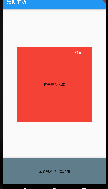
示例2
嵌套SlidingUpPanel不建议使用此方法,但仍可以使用此方法。这种方式可以使得panel的内容和body的内容都可以同时显示出来
class SwitcherContainerState extends State<SwitcherContainer> {
// 创建一个面板控制器
final PanelController _panelController = PanelController();
// 面板是否打开
bool _isPanelOpen = false;
// 面板类型:works(up主其他作品)、comment(评论)
String _panelType = 'works';
double _heightFactor = 2;
// 切换面板状态
void _togglePanel() {
double height = 0;
if (_isPanelOpen) {
height = 2;
_panelController.close();
} else {
height = 0.8;
_panelController.open();
}
setState(() {
_isPanelOpen = !_isPanelOpen;
_heightFactor = height;
});
}
Widget build(BuildContext context) {
return Scaffold(
appBar: AppBar(
title: const Text('滑动面板'),
),
body: Stack(
children: [
Center(
heightFactor: _heightFactor,
child: Stack(
children: [
Container(
width: 300,
height: 300,
color: Colors.red,
child: const Center(
child: Text("这是视频区域"),
),
),
Positioned(
right: 20,
child: TextButton(
onPressed: () {
setState(() {
_panelType = 'comment';
});
_togglePanel();
},
child: const Text(
"评论",
style: TextStyle(color: Colors.white),
),
))
],
),
),
SlidingUpPanel(
controller: _panelController,
//禁用滑动展开
isDraggable: false,
// 面板最大展开高度
maxHeight: 400,
// 定义了面板展开时显示的内容,这里添加可滚动元素
panelBuilder: (ScrollController sc) {
return Container(
// 这里要在listView外套一层Container,并设置向下的padding,否则第一条数据会被header展示的内容遮挡
padding: const EdgeInsets.only(top: 40),
child: ListView.builder(
controller: sc,
itemCount: 6,
itemBuilder: (BuildContext context, int i) {
return Container(
width: MediaQuery.of(context).size.width,
height: 80,
padding: const EdgeInsets.all(5),
decoration: BoxDecoration(
border: Border.all(color: Colors.grey, width: 1)),
child: Text(_panelType == 'works'
? "作品${i + 1}"
: "评论${i + 1}"),
);
}),
);
},
// 浮动在 上方并附加到 顶部的可选持久小部件
header: Container(
width: MediaQuery.of(context).size.width,
height: 40,
color: Colors.red,
child: const Text(
"up主的其他内容",
style: TextStyle(color: Colors.white),
),
),
// 定义面子这段时显示的小部件
collapsed: GestureDetector(
onTap: () {
setState(() {
_panelType = 'works';
});
_togglePanel();
},
child: Container(
color: Colors.blueGrey,
child: const Center(
child: Text('这个视频的一些介绍'),
),
),
),
// 定义了面板闭合时显示的内容
body: const SizedBox.shrink(),
)
],
),
);
}
}


 扫一扫
扫一扫


 167
167

 被折叠的 条评论
为什么被折叠?
被折叠的 条评论
为什么被折叠?
 到【灌水乐园】发言


