


作者:JowayYoung
转发链接:https://mp.weixin.qq.com/s/pGAVZYvm3YGqnsJuc41shw
前言
以下程序猿通通指男性程序猿哈今天是一年一度的七夕,估计各位程序猿同行都不得不对心仪的妹纸吟诗作对了。
「银烛秋光冷画屏,轻罗小扇扑流萤。天街夜色凉如水,卧看牵牛织女星。」
虽然吟唱了唐朝杜牧大师的「七夕」,但好歹笔者也能倒背如流。
单身的程序猿或准备脱单的程序猿怎么办,常规操作是const girl = new Object(),没对象就自己创建一个对象过节呗。可是笔者今天想用纯CSS为单调的七夕做一些点缀呢。

pig
以下全程纯玩CSS,没有一段JS,简单的CSS也能点缀出在七夕里你对心仪妹纸的心意。
Meet You
当你遇见心仪妹纸时,心里噗通噗通地跳动,此时此刻可用纯CSS描绘你的心情。
使用单个
巧妙利用了transform将两个伪元素平移到相应位置产生叠加错觉。
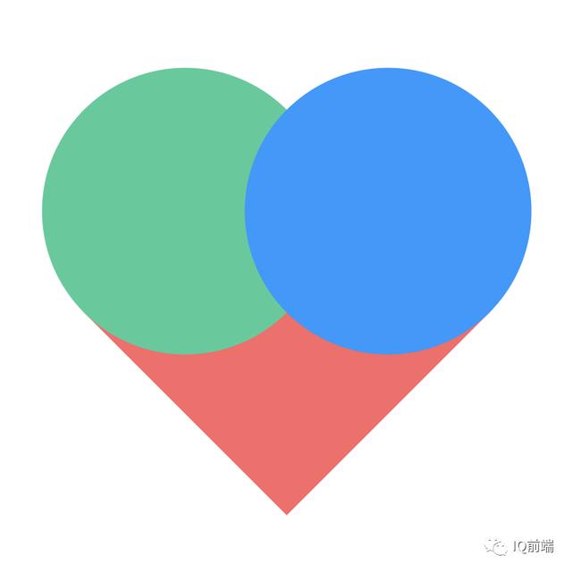
meet
.meet { position: relative; width: 200px; height: 200px; background-color: #f66; transform: rotate(45deg); &::before, &::after { position: absolute; left: 0; top: 0; border-radius: 100%; width: 100%; height: 100%; background-color: #f66; content: ""; } &::before { transform: translateX(-100px); } &::after { transform: translateY(-100px); }}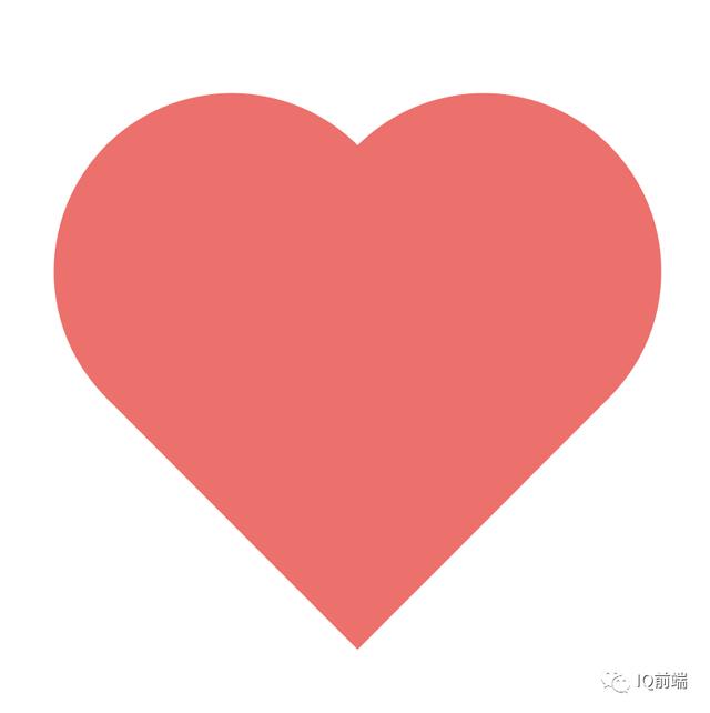
meet
Love You
当你真的爱上心仪妹纸时,心里就会产生爱的荷尔蒙,慢慢布满曾经受伤而变得有棱角的心(前提是你曾经受过伤害,不然心也是圆圆的)。
使用clip-path的polygon()裁剪出一个棱角心形,实质上是一个多边形。
.love { width: 300px; height: 300px; background-image: linear-gradient(to bottom, #f66, #66f); clip-path: polygon(25% 0, 50% 20%, 75% 0, 100% 20%, 100% 60%, 50% 95%, 0 60%, 0 20%);}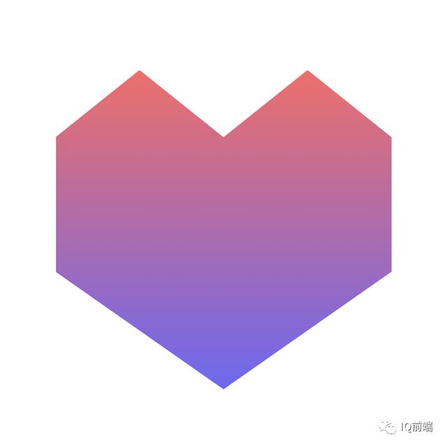
love
Miss You
当你和心仪妹纸在一起后都日想夜念,恨不得每天都腻在一起,心情就像过山车那样随时带着惊喜。
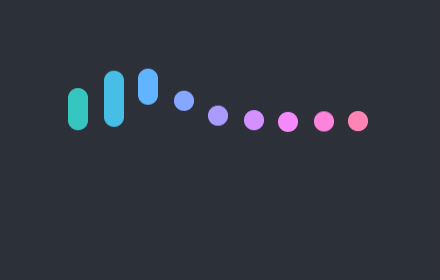
前段时间看到「陈大鱼头兄」的心形加载条,觉得挺漂亮的,很带感觉。
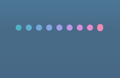
miss
通过动图分析,发现每条线条的背景色和动画时延不一致,另外动画运行时的高度也不一致。细心的你可能还会发现,第1条和第9条的高度一致,第2条和第8条的高度一致,以此类推,得到高度变换相同类的公式:对称index = 总数 + 1 - index。
背景色使用了滤镜的色相旋转hue-rotate(),目的是为了让颜色过渡得更自然。
.miss { display: flex; justify-content: center; align-items: center; width: 200px; height: 200px; ul { display: flex; justify-content: space-between; width: 150px; height: 10px; } li { --Θ: calc(var(--line-index) / var(--line-count) * .5turn); --time: calc((var(--line-index) - 1) * 40ms); border-radius: 5px; width: 10px; height: 10px; background-color: #3c9; filter: hue-rotate(var(--Θ)); animation-duration: 1s; animation-delay: var(--time); animation-iteration-count: infinite; &.line-1, &.line-9 { animation-name: beat-1; } &.line-2, &.line-8 { animation-name: beat-2; } &.line-3, &.line-7 { animation-name: beat-3; } &.line-4, &.line-6 { animation-name: beat-4; } &.line-5 { animation-name: beat-5; } }}@keyframes beat-1 { 0%, 10%, 90%, 100% { height: 10px; } 45%, 55% { height: 30px; transform: translate3d(0, -15px, 0); }}@keyframes beat-2 { 0%, 10%, 90%, 100% { height: 10px; } 45%, 55% { height: 60px; transform: translate3d(0, -30px, 0); }}@keyframes beat-3 { 0%, 10%, 90%, 100% { height: 10px; } 45%, 55% { height: 80px; transform: translate3d(0, -40px, 0); }}@keyframes beat-4 { 0%, 10%, 90%, 100% { height: 10px; } 45%, 55% { height: 90px; transform: translate3d(0, -30px, 0); }}@keyframes beat-5 { 0%, 10%, 90%, 100% { height: 10px; } 45%, 55% { height: 90px; transform: translate3d(0, -20px, 0); }}一波操作后就有了以下效果。和陈大鱼头兄的心形加载条相比,颜色、波动曲线和跳动频率有点不一样,在暖色调的蔓延和肾上腺素的飙升下,这是一种心动的感觉。对着你心仪妹纸说:I Miss You。
miss
CSS变量怎样玩,可回顾笔者曾经的文章《妙用CSS变量,让你的CSS变得更心动》。
Marry You
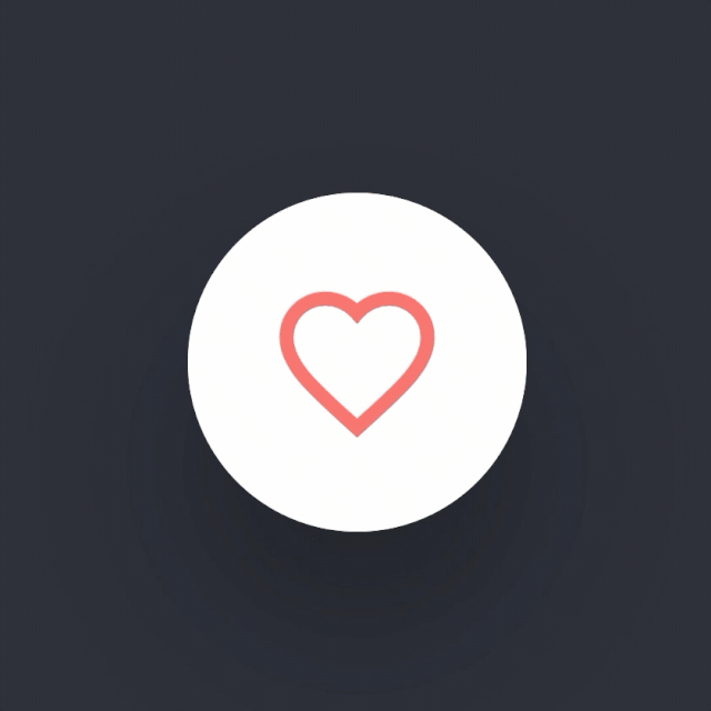
当你娶到心仪妹纸后,在你眼里整个世界都是她。也许,你会感激曾经在某一天某一刻某一地遇上那个对的她。写到最后,送给各位同学一个大大的彩蛋,一个暖心彩虹色调搭配的爱心点赞按钮。
marry
$heart-color: #f66;$easing: cubic-bezier(.7, 0, .3, 1);$duration: 500ms;.marry { position: relative; z-index: 1; border: none; border-radius: 100%; width: 1em; height: 1em; appearance: none; background-color: #fff; cursor: pointer; font-size: 200px; transition: all $duration $easing; &::before { position: absolute; left: 0; top: 0; z-index: -1; border-radius: inherit; width: 100%; height: 100%; box-shadow: 0 .3em .6em rgba(#000, .3); content: ""; transition: inherit; } &::after { position: absolute; left: 0; top: 0; z-index: -1; border-radius: inherit; width: 100%; height: 100%; background-color: #fff; content: ""; } &:active { &::before { animation: depress-shadow $duration $easing both; } } &:focus::after { animation: depress $duration $easing both; }}.like-wrapper { display: grid; justify-content: center; align-items: center; > * { grid-area: 1/1; margin: auto; }}.like-ripple { overflow: hidden; position: relative; border-radius: 100%; width: 1em; height: 1em; &::before { position: absolute; left: 0; top: 0; border: .4em solid $heart-color; border-radius: inherit; width: 100%; height: 100%; content: ""; transform: scale(0); } .marry:focus & { &::before { animation: ripple-out $duration $easing; } }}.like-heart { display: block; width: .5em; height: .5em; transform-origin: center 80%; path { transition: all $duration $easing; stroke: $heart-color; stroke-width: 2; fill: transparent; .marry:focus & { fill: $heart-color; } } .marry:focus & { animation: heart-bounce $duration $easing; }}.like-particle { position: relative; width: 1px; height: 1px;}.like-particle-item { --Θ: calc(var(--line-index) / var(--line-count) * 1turn); $color-list: #f66 #66f #f90 #09f #9c3 #3c9; position: absolute; left: 0; top: 0; border-radius: .05em; width: .1em; height: .1em; transform: translate(-50%, -50%) rotate(var(--Θ)) translateY(0) scaleY(0); transition: all $duration $easing; @each $v in $color-list { $index: index($color-list, $v); &:nth-child(#{$index}) { background-color: $v; } } .marry:focus & { animation: particle-out calc(#{$duration} * 1.2) $easing forwards; }}.marry:focus { cursor: normal; pointer-events: none;}@keyframes depress { 0%, 100% { transform: none; } 50% { transform: translateY(5%) scale(.9); }}@keyframes depress-shadow { 0%, 100% { transform: none; } 50% { transform: scale(.5); }}@keyframes heart-bounce { 0%, 80%, 100% { transform: scale(1); } 40% { transform: scale(.7); }}@keyframes particle-out { 50% { height: .3em; } 50%, 60% { height: .3em; transform: translate(-50%, -50%) rotate(var(--Θ)) translateY(.8em) scale(1); } 60% { height: .2em; } 100% { transform: translate(-50%, -50%) rotate(var(--Θ)) translateY(1em) scale(0); }}@keyframes ripple-out { from { transform: scale(0); } to { transform: scale(5); }}七夕快乐
最后,祝天下有情人终成眷属,也祝未脱单的兄弟们在未来会遇到那个对的她,也恳请单身姑娘们多给一些机会追你的男生,相信也能找到一个疼爱你一辈子的男生。
作者:JowayYoung
转发链接:https://mp.weixin.qq.com/s/pGAVZYvm3YGqnsJuc41shw


 18万+
18万+


 被折叠的 条评论
为什么被折叠?
被折叠的 条评论
为什么被折叠?
 到【灌水乐园】发言


