


原文地址 https://morvanzhou.github.io/tutorials/data-manipulation/plt/3-1-scatter/
(一)散点图
生成具有均值0,方差1的高斯分布(标准正态分布)的数据,绘制大小size=75,颜色为T,透明度50%的散点图
import matplotlib.pyplot as plt
import numpy as np

n = 1024    # data size
X = np.random.normal(0, 1, n) # 每一个点的X值
Y = np.random.normal(0, 1, n) # 每一个点的Y值
T = np.arctan2(Y,X) # for color value

plt.scatter(X, Y, s=75, c=T, alpha=.5)

plt.xlim(-1.5, 1.5)
plt.xticks(())  # ignore xticks
plt.ylim(-1.5, 1.5)
plt.yticks(())  # ignore yticks

plt.show()

(二)柱状图
import matplotlib.pyplot as plt
import numpy as np

## 生成均匀分布数据
n = 12
X = np.arange(n)
Y1 = (1 - X / float(n)) * np.random.uniform(0.5, 1.0, n)
Y2 = (1 - X / float(n)) * np.random.uniform(0.5, 1.0, n)

## 绘制柱状图,用facecolor设置主体颜色,edgecolor设置边框颜色为白色
plt.bar(X, +Y1, facecolor='#9999ff', edgecolor='white')
plt.bar(X, -Y2, facecolor='#ff9999', edgecolor='white')

##用函数plt.text分别在柱体上方(下方)加上数值,用%.2f保留两位小数,横向居中对齐ha='center',纵向底部(顶部)对齐va='bottom':
for x, y in zip(X, Y1):
    # ha: horizontal alignment
    # va: vertical alignment
    plt.text(x + 0.4, y + 0.05, '%.2f' % y, ha='center', va='bottom')

for x, y in zip(X, Y2):
    # ha: horizontal alignment
    # va: vertical alignment
    plt.text(x + 0.4, -y - 0.05, '%.2f' % y, ha='center', va='top')

plt.xlim(-.5, n)
plt.xticks(())
plt.ylim(-1.25, 1.25)
plt.yticks(())

plt.show()

(三)等高线图
import matplotlib.pyplot as plt
import numpy as np

def f(x,y):
    # the height function
    return (1 - x / 2 + x**5 + y**3) * np.exp(-x**2 -y**2)

n = 256
x = np.linspace(-3, 3, n)
y = np.linspace(-3, 3, n)
X,Y = np.meshgrid(x, y)

# use plt.contourf to filling contours
# X, Y and value for (X,Y) point
plt.contourf(X, Y, f(X, Y), 8, alpha=.75, cmap=plt.cm.hot)

# use plt.contour to add contour lines
C = plt.contour(X, Y, f(X, Y), 8, colors='black', linewidth=.5)

plt.clabel(C, inline=True, fontsize=10)
plt.xticks(())
plt.yticks(())
解释一下代码:
用meshgrid在二维平面中将每一个x和每一个y分别对应起来,编织成栅格:
X,Y = np.meshgrid(x, y)
把颜色加进去,位置参数分别为:X, Y, f(X,Y)。透明度0.75,并将 f(X,Y) 的值对应到color map的暖色组中寻找对应颜色。 8的意思是,等高线图分为10各部分,8个不同的高度。(最少的0–>分为2各部分)
plt.contourf(X, Y, f(X, Y), 8, alpha=.75, cmap=plt.cm.hot)
等高线绘制,黑色,线宽0.5.
加入Label,inline控制是否将Label画在线里面,字体大小为10。
C = plt.contour(X, Y, f(X, Y), 8, colors='black', linewidth=.5)

plt.clabel(C, inline=True, fontsize=10)

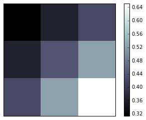
(四)矩阵数据绘制图像
cmap的参数可以是是:cmap=plt.cmap.bone,我们也可以直接用单引号传入参数’bone’。
origin='upper’代表的就是选择的原点的位置。(由黑到白是矩阵中从小到大的数,如果是lower就反过来)
“”"
for the value of “interpolation”, check this:
http://matplotlib.org/examples/images_contours_and_fields/interpolation_methods.html
for the value of “origin”= [‘upper’, ‘lower’], check this:
http://matplotlib.org/examples/pylab_examples/image_origin.html
“”"
plt.colorbar(shrink=.92),如果设置了shrink=0.92,比例尺会相对图像缩短为92%
import matplotlib.pyplot as plt
import numpy as np

a = np.array([0.313660827978, 0.365348418405, 0.423733120134,
              0.365348418405, 0.439599930621, 0.525083754405,
              0.423733120134, 0.525083754405, 0.651536351379]).reshape(3,3)

plt.imshow(a, interpolation='nearest', cmap='bone', origin='upper')
plt.colorbar()

plt.xticks(())
plt.yticks(())
plt.show()
(五)3D图像
需要添加新的模块Axes3D
import numpy as np
import matplotlib.pyplot as plt
from mpl_toolkits.mplot3d import Axes3D

fig = plt.figure()
ax = Axes3D(fig)
# X, Y value
X = np.arange(-4, 4, 0.25)
Y = np.arange(-4, 4, 0.25)
X, Y = np.meshgrid(X, Y)
R = np.sqrt(X ** 2 + Y ** 2)
# height value
Z = np.sin(R)

ax.plot_surface(X, Y, Z, rstride=1, cstride=1, cmap=plt.get_cmap('rainbow'))
"""
============= ================================================
        Argument      Description
        ============= ================================================
        *X*, *Y*, *Z* Data values as 2D arrays
        *rstride*     Array row stride (step size), defaults to 10
        *cstride*     Array column stride (step size), defaults to 10
        *color*       Color of the surface patches
        *cmap*        A colormap for the surface patches.
        *facecolors*  Face colors for the individual patches
        *norm*        An instance of Normalize to map values to colors
        *vmin*        Minimum value to map
        *vmax*        Maximum value to map
        *shade*       Whether to shade the facecolors
        ============= ================================================
"""

# I think this is different from plt12_contours
ax.contourf(X, Y, Z, zdir='z', offset=-2, cmap=plt.get_cmap('rainbow'))
"""
==========  ================================================
        Argument    Description
        ==========  ================================================
        *X*, *Y*,   Data values as numpy.arrays
        *Z*
        *zdir*      The direction to use: x, y or z (default)
        *offset*    If specified plot a projection of the filled contour
                    on this position in plane normal to zdir
        ==========  ================================================
"""

ax.set_zlim(-2, 2)

plt.show()
ax.plot_surface(X, Y, Z, rstride=1, cstride=1, cmap=plt.get_cmap(‘rainbow’))
rstride和cstride表示row 和 column 的跨度,密集程度
绘制3D图像,并做它再z=-2平面的投影如图:


 9833
9833


 被折叠的 条评论
为什么被折叠?
被折叠的 条评论
为什么被折叠?
 到【灌水乐园】发言


