


QT常用控件的QSS样式基本设置
QSS常用空间基本设置,记录备忘,方便查找。
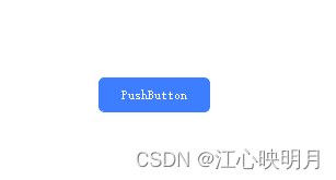
QPushButton:
QPushButton
{
min-width:100px; /*最小宽度*/
min-height:30px;/*最小高度*/
border: 1px solid #3c7eff;/*边框*/
border-radius: 5px;/*边框圆角*/
color: #ffffff;/*文字颜色*/
background-color: #3c7eff; /*背景颜色*/
}
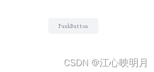
/*不可用状态*/
QPushButton:disabled
{
border: 1px solid #f2f3f5;
border-radius: 5px;
color: #86909c;
background-color: #f2f3f5;
}
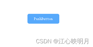
/*悬浮,按下,选中状态*/
QPushButton:hover,QPushButton:pressed,QPushButton:checked
{
border:1px solid #57a9fb;
border-radius: 5px;
color: #ffffff;
background-color: #57a9fb;
}
默认:
悬浮,按下,选中状态:
选中状态需要设置按钮setCheckable(true);
不可用状态:
QLineEdit:
QLineEdit
{
	width:200px;
	height:30;
	border: 1px solid #f2f3f5;
	border-radius: 5px;
	padding-left: 5px;
	background-color: #f2f3f5;
	color: #000000;

}

/* 在输入状态时 */
QLineEdit:focus
{
	width:200px;
	height:30;
	border: 1px solid #3c7eff;
	border-radius: 5px;
	padding-left: 5px;
	background-color: #f2f3f5;
	color: #000000;
}

/*在只读时的状态 */
QLineEdit:read-only
{
	border: 1px solid #f2f3f5;
	border-radius: 5px;
	padding-left: 5px;
	background-color: #f2f3f5;
	color: #86909c;
}
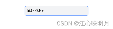
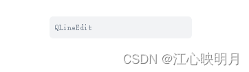
默认:
输入状态:
只读状态:
QCheckBox:
QCheckBox::indicator {
    width:64px;
    height:32px;
}
QCheckBox::indicator:checked
{
    border-image:url(:/Img/Res/switch-open.png);
}

QCheckBox::indicator:unchecked
{
    border-image:url(:/Img/Res/switch-close.png);
}
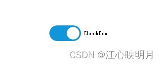
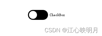
需要准备两张不同状态下的图片
开启状态:
关闭状态:
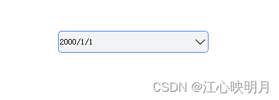
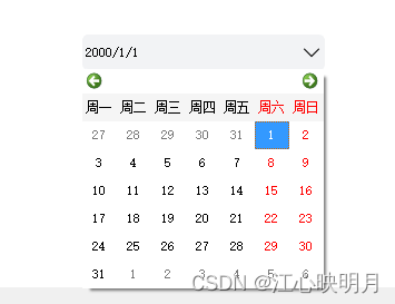
QDateEdit:
QDateEdit
{
	width:200px;
	height:30;
	background-color:#f2f3f5;
	border:1px solid #f2f3f5;
	border-radius:5px;

}

QDateEdit:focus
{
	width:200px;
	height:30;
	background-color:#f2f3f5;
	border:1px solid #3c7eff;
	border-radius:5px;
	border-radius:5px;

}

/*下拉箭头*/
QDateEdit::drop-down
{
	border:1px solid #f2f3f5;
	border-radius:5px;
	background-color:#f2f3f5;
	image:url(:/Img/Res/DownArrow.png);
	width: 20px;
}

QDateEdit::drop-down:hover
{
	border:1px solid #8690a8;
	background-color:#f2f3f5;
	image:url(:/Img/Res/DownArrow.png);
	width: 20px;
}
选择日期:
QComboBox:
QComboBox
{
	width:200px;
	height:30;
	color:#000000;
	background-color:#f2f3f5;
	border:1px solid #f2f3f5;
	border-radius:5px;

}

/*下拉箭头*/
QComboBox::drop-down
{
	border-radius:5px;
	background-color:#f2f3f5;
	image:url(:/Img/Res/DownArrow.png);
	width: 20px;
}

QComboBox::drop-down:hover
{
	border:1px solid #8690a8;
	border-radius:5px;
	background-color:#f2f3f5;
	image:url(:/Img/Res/DownArrow.png);
	width: 20px;
}

/*下拉框的样式*/
QComboBox QAbstractItemView
{
	border:1px solid #8690a8;
    color:#000000;
	background-color:#f2f3f5;
}

 /*Item样式*/
QComboBox QAbstractItemView::item
 {
	color:#000000;
	background-color:#ffffff;
 }


/*选中项的颜色*/
QComboBox QAbstractItemView::item:selected
{
    color: #ffffff;
	background-color: #3a8eb0;
}
CombBox样式:

下拉选项样式:
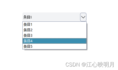
设置下拉栏样式需要给ComboBox设置View,比如comboBox->setView(new QListView());
QTabWidget:
QTabWidget
{
	background-color: #FFFFFF;
}

/*内容面板*/
QTabWidget::pane
{
    border-top: 1px solid #3c7eff;
	background-color: #FFFFFF;
}

/*标签样式*/
QTabBar::tab
{
	background-color: #FFFFFF;
	color: #aaaaaa;
}

QTabBar::tab:selected, QTabBar::tab:hover
{
    color: #000000;
}
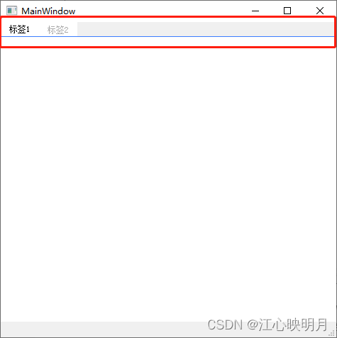
效果:
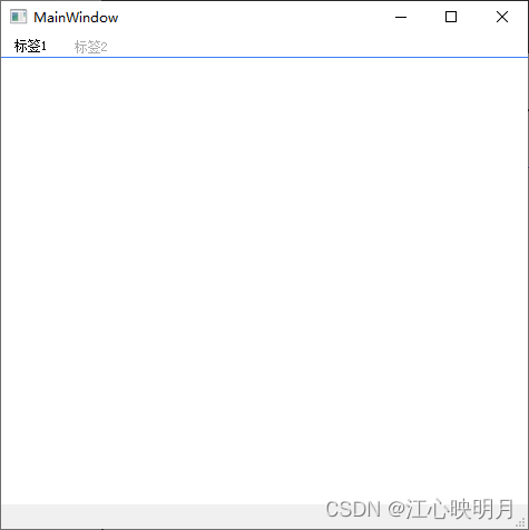
使标签栏背景使用QTabWidget背景生效,需要给QTabWidget设置属性tabWidget->setAttribute(Qt::WA_StyledBackground);否则会是这样:


 899
899


 被折叠的 条评论
为什么被折叠?
被折叠的 条评论
为什么被折叠?
 到【灌水乐园】发言


