


✴️ Flex布局(弹性布局)
- 作用:
- 基于 Flex 精确灵活控制块级盒子的布局方式,布局网页更简单、灵活,避免浮动脱标的问题,非常适合结构化布局
- 设置方式
- 父元素添加
display: flex,子元素可以自动的挤压或拉伸
- 父元素添加
- 组成部分
- 弹性容器、弹性盒子
- 主轴
- 水平排列: 默认主轴在水平, 弹性盒子都是沿着主轴排列
- 侧轴 / 交叉轴
主轴对齐方式
justify-content调节元素在主轴(水平方向)的对齐方式
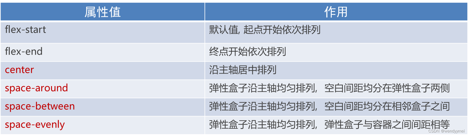
- 居中
- justify-content:
center;
- justify-content:
- 间距在弹性盒子(子级)之间
- justify-content:
space-between;
- justify-content:
- 所有地方的间距都相等
- justify-content:
space-evenly;
- justify-content:
- 间距加在子级的两侧,视觉效果: 子级之间的距离是父级两头距离的2倍
- justify-content:
space-around;
- justify-content:
align-items调节元素在侧轴(垂直方向)的对齐方式
修改侧轴对齐方式属性:
-
align-items(添加到弹性容器)
- align-items: stretch;
- 拉伸,默认值(现有状态,测试的时候去掉子级的高度)
- align-items: stretch;
-
align-self: 控制某个弹性盒子在侧轴的对齐方式(添加到弹性盒子)
/* 单独设置某个弹性盒子的侧轴对齐方式 */ .box div:nth-child(2) { align-self: center; }
flex属性修改弹性盒子伸缩比
- 属性
- flex : 值;
- 取值分类
- 数值(整数)
- ❗️注意 : 只占用父盒子剩余尺寸(刨掉别的)
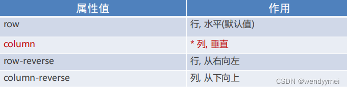
主轴方向
使用 flex-direction 改变元素排列方向
❗️ 主轴变了,侧轴也变
- justify-content/align-items 的对齐方式需要看主轴的方向
弹性盒子换行
使用flex-wrap实现弹性盒子多行排列效果
- 弹性盒子 换行 显示 :
flex-wrap: wrap; - 调整行对齐方式 :align-content
- 取值与justify-content基本相同


 2万+
2万+


 被折叠的 条评论
为什么被折叠?
被折叠的 条评论
为什么被折叠?
 到【灌水乐园】发言


