


 本文详细介绍了Flutter第三方库auto_size_text的使用方法,包括基本用法、参数说明、group功能和richtext应用。通过实例展示如何实现文本自动调整大小以适应边界,并探讨了如何统一文本样式和 richtext 的运用。

前言
auto_size_text :https://pub.flutter-io.cn/packages/auto_size_text
一、auto_size_text 是什么?
第三方的插件,能够自动适配你的文本的大小。来适应边界。
二、使用
1.简单的使用
style 部分同text的一样的,基础的功能设备都是同text 文本的使用一样。
下面做一个简单的对比。我们限制一个宽度高度。在里面放入文本。
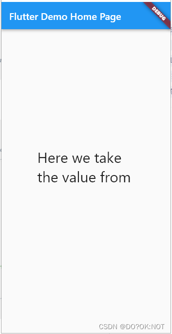
- 使用text:文字显示不全的
return Scaffold(
    appBar: AppBar(
      // Here we take the value from the MyHomePage object that was created by
      // the App.build method, and use it to set our appbar title.
      title: Text(widget.title),
    ),
    body: const Center(
        child: SizedBox(
      width: 200,
      height: 140,
      child: Text(
          style: TextStyle(fontSize: 100),
          maxLines: 2,
          'Here we take the value from the MyHomePage object that was created by'),
    ))

    // This trailing comma makes auto-formatting nicer for build methods.
    );
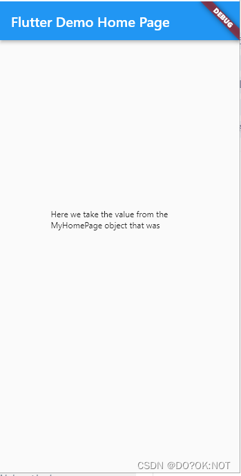
- 使用了auto_size_text :自动缩小了文本的size,达到能显示的情况
    return Scaffold(
        appBar: AppBar(
          // Here we take the value from the MyHomePage object that was created by
          // the App.build method, and use it to set our appbar title.
          title: Text(widget.title),
        ),
        body: const Center(
            child: SizedBox(
          width: 200,
          height: 140,
          child: AutoSizeText(
              style: TextStyle(fontSize: 30),
              maxLines: 2,
              'Here we take the value from the MyHomePage object that was created by'),
        ))

        // This trailing comma makes auto-formatting nicer for build methods.
        );
2.参数说明
| 参数 | 描述 |
|---|---|
| key* | 控制一个构件如何替换树中的另一个构件。 |
| textKey | 设置结果小组件的键Text |
| style* | 如果非 null,则用于此文本的样式 |
| minFontSize | 自动调整文本大小时使用的最小文本大小约束。如果设置了预设字体大小,则被忽略。 |
| maxFontSize | 自动调整文本大小时使用的最大文本大小约束。如果设置了预设字体大小,则被忽略。 |
| stepGranularity | 字体大小适应约束的步长。 |
| presetFontSizes | 预定义所有可能的字体大小。重要:必须按降序排列。presetFontSizes |
| group | 同步倍数的大小AutoSizeText |
| textAlign* | 文本应如何水平对齐。 |
| textDirection* | 文本的方向性。这决定了如何解释类似值。textAlignTextAlign.startTextAlign.end |
| locale* | 用于在相同的 Unicode 字符可以以不同的方式呈现时选择字体,具体取决于区域设置。 |
| softWrap* | 文本是否应在软换行符处中断。 |
| wrapWords | 不适合一行的单词是否应换行。默认为true以表现得像文本。 |
| overflow* | 应如何处理视觉溢出。 |
| overflowReplacement | 如果文本溢出且不适合其边界,则改为显示此微件。 |
| textScaleFactor* | 每个逻辑像素的字体像素数。也影响,和。minFontSizemaxFontSizepresetFontSizes |
| maxLines | 文本跨越的可选最大行数。 |
| semanticsLabel* | 此文本的替代语义标签。 |
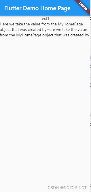
3.group
可以统一各个autosizetext的大小。fontsize大小。来达到统一各个text的字体大小是一致的
    return Scaffold(
        appBar: AppBar(
          // Here we take the value from the MyHomePage object that was created by
          // the App.build method, and use it to set our appbar title.
          title: Text(widget.title),
        ),
        body: Column(
          children: [
            AutoSizeText(
              "text1",
              group: myautosize,

              maxLines: 1,
            ),
            AutoSizeText(
              "Here we take the value from the MyHomePage object that was created byHere we take the value from the MyHomePage object that was created by",
              minFontSize: 100,
              group: myautosize,
            )
          ],
        )

        // This trailing comma makes auto-formatting nicer for build methods.
        );
- minFontSize: 100, 最终并不会使用这个最小的的这个fontsize,结果如图
4.rich text
    return Scaffold(
        appBar: AppBar(
          // Here we take the value from the MyHomePage object that was created by
          // the App.build method, and use it to set our appbar title.
          title: Text(widget.title),
        ),
        body: Column(
          children:const [
            AutoSizeText.rich(
              TextSpan(text: 'A really long String'),
              style: TextStyle(fontSize: 20),
              minFontSize: 5,
            ),
            AutoSizeText.rich(
              TextSpan(children: [
                TextSpan(text: '我是 1'),
                TextSpan(text: '我是 2'),
                TextSpan(text: '我是 3'),
                TextSpan(text: '我是 4'),
                TextSpan(text: '我是 5', style: TextStyle(color: Colors.green)),
              ]),
              style: TextStyle(fontSize: 20),
              minFontSize: 5,
            ),
          ],
        )

        // This trailing comma makes auto-formatting nicer for build methods.
        );
总结
欢迎关注,留言,咨询,交流!


 扫一扫
扫一扫


 1923
1923

 被折叠的 条评论
为什么被折叠?
被折叠的 条评论
为什么被折叠?
 到【灌水乐园】发言


