


scaleBox.vue源码
<template>
  <div id="screen"
       :style="{
      width: `${style.width}px`,
      height: `${style.height}px`,
      transform: `${style.transform}`
    }">
    <slot />
  </div>
</template>

<script>
export default {
  props: {},
  data() {
    return {
      style: {
        width: '1920',
        height: '1080',
        transform: 'scaleY(1) scaleX(1) translate(-50%, -50%)',
      },
    }
  },
  methods: {
    getScale() {
      const w = window.innerWidth / this.style.width
      const h = window.innerHeight / this.style.height
      return { x: w, y: h }
    },
    setScale() {
      const scale = this.getScale()
      this.style.transform =
        'scaleY(' + scale.y + ') scaleX(' + scale.x + ') translate(-50%, -50%)'
    },
  },
  mounted() {
    const that = this
    that.setScale()
    /* 窗口改变事件 */
    window.addEventListener('resize', function () {
      that.setScale()
    })
  },
}
</script>

<style lang="scss">
#screen {
  z-index: 100;
  transform-origin: 0 0;
  position: fixed;
  left: 50%;
  top: 50%;
  transition: 0.3s;
}
</style>
基本实现布局效果 会根据视窗的变化调整大屏比例,容器内部编写直接按照宽1920px,高1080px单位为px的排版布局编写即可,其他的就交给上述代码即可,示例:
<template>
  <scale-box>
    <div class="main-wrapper">
      <div class="box1"></div>
      <div class="box2"></div>
    </div>
  </scale-box>
</template>

<script>
import scaleBox from './scaleBox.vue'
export default {
  components: {
    scaleBox,
  },
}
</script>

<style lang="scss" scoped>
.box1 {
  width: 1000px;
  height: 200px;
  background-color: orange;
}
.box2 {
  width: 920px;
  height: 200px;
  background-color: green;
}
.main-wrapper {
  height: 100%;
  display: flex;
}
</style>
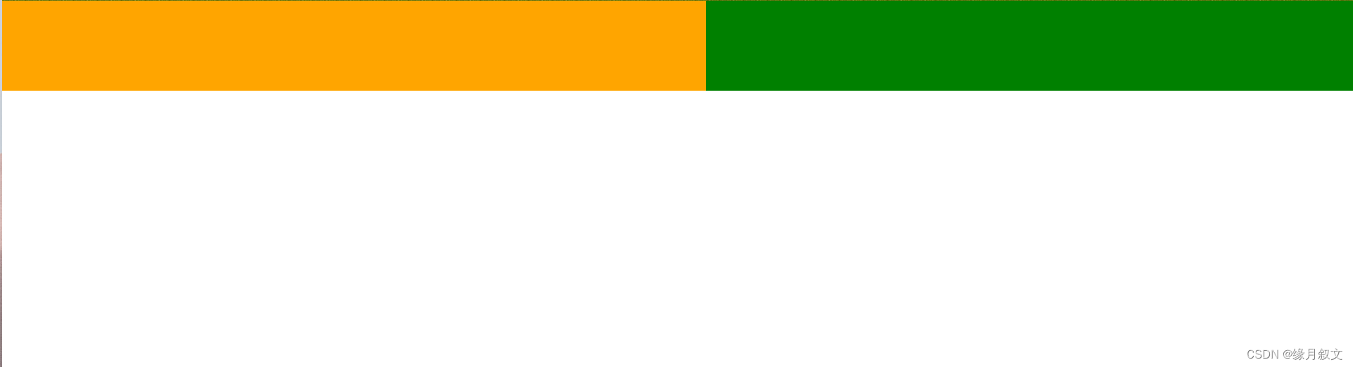
效果图:
缩放后效果:
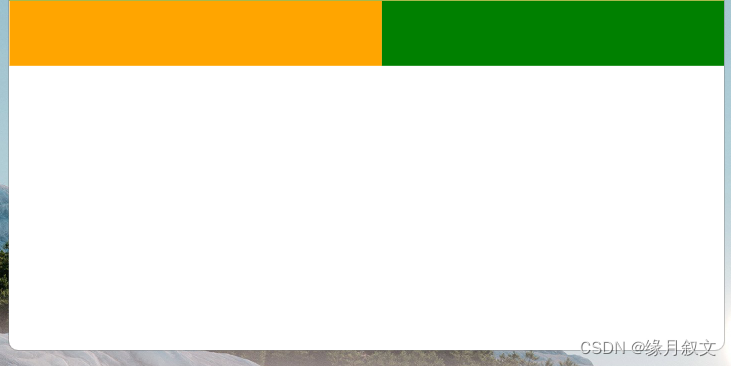
无论页面如何缩放,都会因为css3的transform属性实现等比例缩放
vue3写法:
<template>
  <div id="screen"
       :style="{
      width: `${style.width}px`,
      height: `${style.height}px`,
      transform: `${style.transform}`
    }">
    <slot />
  </div>
</template>

<script setup>
const style = ref({
  width: '1920',
  height: '1080',
  transform: 'scaleY(1) scaleX(1) translate(-50%, -50%)',
})

function getScale() {
  const w = window.innerWidth / style.value.width
  const h = window.innerHeight / style.value.height
  return { x: w, y: h }
}
function setScale() {
  const scale = getScale()
  style.value.transform =
    'scaleY(' + scale.y + ') scaleX(' + scale.x + ') translate(-50%, -50%)'
}
setScale()
/* 窗口改变事件 */
window.addEventListener('resize', function () {
  setScale()
})
</script>

<style lang="scss" scoped>
#screen {
  z-index: 100;
  transform-origin: 0 0;
  position: fixed;
  left: 50%;
  top: 50%;
  transition: 0.3s;
}
</style>


 2018
2018


 被折叠的 条评论
为什么被折叠?
被折叠的 条评论
为什么被折叠?
 到【灌水乐园】发言


