


此文章主要是为了自己记录一下从头开始如何使用Qt Quick方式来编写桌面应用软件,有需要的人可以参考借鉴一下。
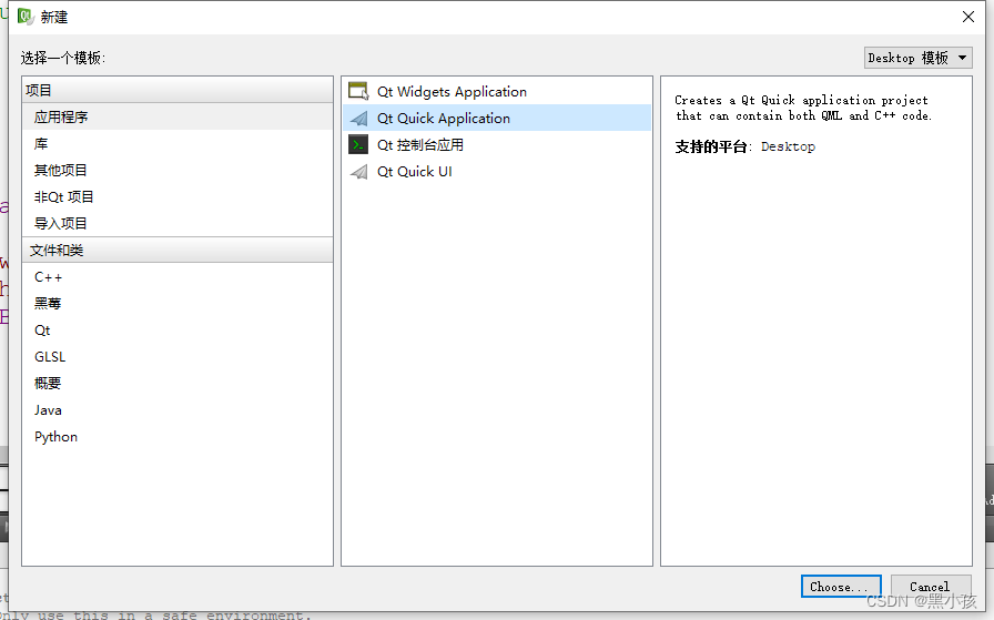
一、工程的创建
1、打开qt creater软件新建项目选择Qt Quick Application应用
2、此处选择Qt Quick版本,我这里选择的是Qt Quick 2.2版本
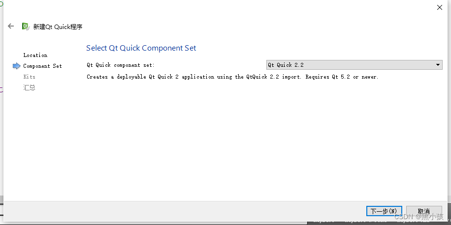
后面的编译器根据需求选择对应的编译器编译程序。
main.qml介绍
创建成功后,默认的工程文件如下所示:
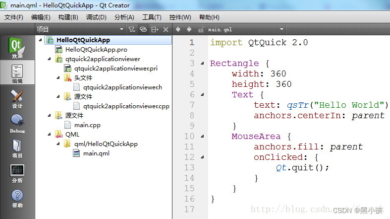
main.qml文件开头的import类似于c/c++中的include,导入模块的意思
1、Rectangle的使用方法
Rectangle{
        x: 100;                                  //x,y坐标位置
        y: 100;
        width: 160;                              //矩形的长、宽
        height: 280;
        //color: "transparent";                   //透明背景
       // rotation: 90;                           //旋转90度
       //背景颜色渐变设置,根据position的值来系统自动设置从何处插入不同颜色
        gradient: Gradient{
                    GradientStop {position: 0.0; color: "#202020";}
                    GradientStop {position: 0.33; color: "blue";}
                    GradientStop {position: 1; color: "#FFFFFF";}
        }

        border.color: "#808080";                 //边框颜色
        //qml打印方式
        //Component.onCompleted: console.log(border.color.r, border.color.g, border.color.b, border.color.a);
        border.width: 2;                          //边框宽度
        radius: 8;                                //边框角弧度
        //文本对象显示
        Text {
            text: qsTr("Hello Qt Quick")
            anchors.centerIn: parent             //锚点在父对象的中心位置
        }

    }
Rectangle对象有许多的属性可以使用,在上面代码中简单介绍一下。
位置设置
id:可视为对象元素的另一个名称,便于区分与调用。
Rectangle {
        width: 300;
        height: 200;

        Rectangle {
            id: rect1;
            anchors.left: parent.left;
            anchors.leftMargin: 20;
            anchors.top: parent.top;
            anchors.topMargin: 20;
            width: 120;
            height: 120;
            gradient: Gradient{
                GradientStop { position: 0.0; color: "#202020"; }
                GradientStop { position: 1.0; color: "#A0A0A0"; }
            }
        }

        Rectangle {
            id: rect2;
            anchors.left: rect1.right;
            anchors.leftMargin: 20;
            anchors.top: rect1.top;
            width: 120;
            height: 120;
            rotation: 90;
            gradient: Gradient {
             GradientStop { position: 0.0; color: "#202020"; }
             GradientStop { position: 1.0; color: "#A0A0A0"; }
            }
        }


    }
Item使用
Item是所有可视元素的基类,不绘制任何图形,但是可使用Item来分组其他可视图示。
Rectangle{
        width: 300;
        height: 200;
        Item{
         id: grandientGroup;
         Rectangle{
          x: 20;
          y: 20;
          width: 120;
          height: 120;
          gradient: Gradient{
           GradientStop { position: 0.0; color: "#202020";}
           GradientStop { position: 1.0; color: "#A0A0A0";}
          }
         }

         Rectangle {
          x: 160;
          y: 20;
          width: 120;
          height: 120;
          rotation: 90;
          gradient: Gradient{
           GradientStop { position: 0.0; color: "#202020";}
           GradientStop { position: 1.0; color: "#A0A0A0";}
          }

         }

        }

        Component.onCompleted: {
         console.log("visible children: ", grandientGroup.visibleChildren.length);           //grandientGroup有多少子部件?
         console.log("visible children: ", grandientGroup.children.length);
         for(var i=0; i<grandientGroup.children.length; i++)
         {
          console.log("child: ", i, "x = ", grandientGroup.children[i].x);
         }
        }
    }
anchors.fill使用
Rectangle {
        width: 300;
        height: 200;

        Rectangle {
            color: "blue";
            anchors.fill: parent;          //填充父对象
            border.width: 6;
            border.color: "#888888";

            Rectangle {
                anchors.centerIn: parent;            //设置于父对象中心位置
                width: 120;
                height: 120;
                radius: 8;
                border.width: 12;
                border.color: "black";
                antialiasing: true;              //用于决定矩形是否使用抗锯齿
                color: "red";
            }
        }

    }
z、opacity属性介绍
z序表示的是当两个模块重叠时,根据z值大小,z值小的会被z值大的覆盖,即重叠的部分更容易显示z值大的模块。opacity,设置模块的透明度。
Rectangle {
        width: 300;
        height: 200;

        Rectangle {
            x: 20;
            y: 20;
            width: 150;
            height: 100;
            color: "#606080";
            z: 0.5;
        }

        Rectangle {
            width: 100;
            height: 100;
            anchors.centerIn: parent;
            color: "#a0c080";
            z: 1;
            opacity: 0.6;
        }
    }
Text文本使用
Rectangle {
        width: 300;
        height: 200;
        Text {
            width: 150;
            height: 100;
            wrapMode: Text.WordWrap;         //自动换行
            font.bold: true;                 //加粗
            font.pixelSize: 12;
            font.underline: true;
            text: "Hello Blue <font color=\"blue\">Text</font>";
            anchors.centerIn: parent;
//            text: "Hello Blue text";
//            anchors.centerIn: parent;
//            color: "blue";
        }
    }
Button按钮使用
在使用按钮元素时,需要导入模块import QtQuick.Controls 1.1。
Rectangle {

        width: 300;
        height: 200;
        Button {
            anchors.centerIn: parent;
            text: "quit";
            onClicked: ;
            checkable: false;
        }
    }
按键事件
Rectangle {
        width: 300;
        height: 200;
        color: "#c0c0c0";
        focus: true;
        Keys.enabled: true;
        Keys.onEscapePressed: Qt.quit();
        Keys.onBackPressed: Qt.quit();
        Keys.onRightPressed: Qt.quit();
        Keys.onPressed: {
         switch(event.key)
         {
            case Qt.Key_0:
            case Qt.Key_1:
            case Qt.Key_2:
            case Qt.Key_3:
            case Qt.Key_4:
            case Qt.Key_5:
            case Qt.Key_6:
            case Qt.Key_7:
            case Qt.Key_8:
            case Qt.Key_9:
                keyView.text = event.key - Qt.Key_0;
                break;
         }
        }
        Text {
            id: keyView;
            font.bold: true;
            font.pixelSize: 24;
            text: qsTr("text");
            anchors.centerIn: parent;
        }
    }


 1099
1099


 被折叠的 条评论
为什么被折叠?
被折叠的 条评论
为什么被折叠?
 到【灌水乐园】发言


