


需求
先看效果图
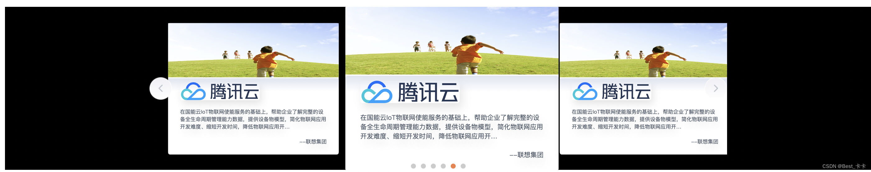
对vue来说,element-UI是有相应的轮播组件(走马灯)的,但相对简单的
如上面的两头大中间小轮播,element上文档这款很类似,但不适用,因为卡片之间底层移动和间距是依赖js实现的,当页面存在间距而且不同页面需要适配时,我从控制css样式层面很难实现。
所以有了这个组件的封装
提示:
本组件

1、封装中只使用了一些网络资源图片

2、提供了初始化默认是数据

3、使用插槽默认一些代码布局

属于拿来代码导入即可直接看到效果的
实现
vue-awesome-swiper安装
对vue-awesome-swiper来说,版本不同会出现很多问题(比如导入的css文件位置)
swiper和vue-awesome-swiper的版本一定要相对应
版本安装
npm i swiper@4.5.1 vue-awesome-swiper@3.1.3 --save
"swiper": "^4.5.1",
"vue-awesome-swiper": "^3.1.3",
代码
提供了网络图片的默认数据sceneCardList
提供了slot插槽供提供布局代码
组件封装代码
<template>
  <div class="content">
    <div class="startPage">
      <!-- 内容 -->
      <div class="content">
        <div class="cards">
          <div class="cardSwiper">
            <!-- 左箭头 -->
            <div
              :class="[
                'commonArrow',
                'arrowLeft',
              ]"
              @click="toLastSlide"
            />
            <!-- 右箭头 -->
            <div
              :class="[
                'commonArrow',
                'arrowRight',
              ]"
              @click="toNextSlide"
            />
            <!-- 下方卡片轮播 -->
            <swiper
              ref="mySwiper"
              class="cardItem"
              :options="swiperOption"
              @slide-change-transition-end="handleBottomCardSlide"
            >
              <swiper-slide
                v-for="(item, index) in sceneCardList"
                :key="index"
                class="cardItem"
              >
                <slot :item="item">
                  <div class="CasesCard-li">
                    <img :src="item.url" alt="">
                    <div class="info">
                      <img :src="item.img" alt="">
                      <div class="CasesCard-li-name">{{ item.text }}</div>
                      <div class="CasesCard-li-text">
                        --{{ item.name }}
                      </div>
                    </div>
                  </div>
                </slot>
              </swiper-slide>
              <div slot="pagination" class="swiper-pagination" />
            </swiper>
          </div>
        </div>
      </div>
    </div>
  </div>

</template>

<script>
import { swiper, swiperSlide } from 'vue-awesome-swiper'
import 'swiper/dist/css/swiper.css'

const sceneCardList = [
  {
    name: '联想集团',
    text: '在国能云IoT物联网使能服务的基础上,帮助企业了解完整的设备全生命周期管理能力数据,提供设备物模型,简化物联网应用开发难度、缩短开发时间,降低物联网应用开…',
    img: 'https://cloudcache.tencent-cloud.com/qcloud/portal/kit/images/slice/logo.23996906.svg',
    url: 'https://cloudcache.tencent-cloud.com/open_proj/proj_qcloud_v2/portal-set/src/projects/Cooperation/components/Ecology/css/img/bg-main.png'
  },
  {
    name: '联想集团',
    text: '在国能云IoT物联网使能服务的基础上,帮助企业了解完整的设备全生命周期管理能力数据,提供设备物模型,简化物联网应用开发难度、缩短开发时间,降低物联网应用开…',
    go: '前往云市场',
    img: 'https://cloudcache.tencent-cloud.com/qcloud/portal/kit/images/slice/logo.23996906.svg',
    url: 'https://cloudcache.tencent-cloud.com/open_proj/proj_qcloud_v2/portal-set/src/projects/Cooperation/components/Ecology/css/img/bg-main.png'
  },
  {
    name: '联想集团',
    text: '在国能云IoT物联网使能服务的基础上,帮助企业了解完整的设备全生命周期管理能力数据,提供设备物模型,简化物联网应用开发难度、缩短开发时间,降低物联网应用开…',
    go: '前往云市场',
    img: 'https://cloudcache.tencent-cloud.com/qcloud/portal/kit/images/slice/logo.23996906.svg',
    url: 'https://cloudcache.tencent-cloud.com/open_proj/proj_qcloud_v2/portal-set/src/projects/Cooperation/components/Ecology/css/img/bg-main.png'
  },
  {
    name: '联想集团',
    text: '在国能云IoT物联网使能服务的基础上,帮助企业了解完整的设备全生命周期管理能力数据,提供设备物模型,简化物联网应用开发难度、缩短开发时间,降低物联网应用开…',
    go: '前往官方文档',
    img: 'https://cloudcache.tencent-cloud.com/qcloud/portal/kit/images/slice/logo.23996906.svg',
    url: 'https://cloudcache.tencent-cloud.com/open_proj/proj_qcloud_v2/portal-set/src/projects/Cooperation/components/Ecology/css/img/bg-main.png'
  }
]
export default {
  // import引入的组件需要注入到对象中才能使用
  components: {
    swiper,
    swiperSlide
  },
  props: {
    swiperlist: {
      type: Array,
      default: function() {
        return sceneCardList
      }
    },
    swiperOption: {
      type: Array,
      default: function() {
        return {
          slidesPerView: 3,
          // 设定为true时,active slide会居中,而不是默认状态下的居左(false)
          centeredSlides: false,
          // 滑动速度
          // speed: 1500,
          // 在slide之间设置距离(单位px)
          spaceBetween: 16,
          // 循环播放
          loop: true,
          // 自动播放
          autoplay: {
          // 隔×秒自动滑动一次
            delay: 2000,
            // 设置为false,用户操作swiper之后自动切换不会停止,每次都会重新启动autoplay。默认为true
            disableOnInteraction: false
          },
          observer: true, // 修改swiper自己或子元素时,自动初始化swiper
          observeParents: true, // 修改swiper的父元素时,自动初始化swiper
          // 标记页数
          pagination: {
            el: '.swiper-pagination',
            clickable: true // 允许分页点击跳转
          },
          on: {
          }
        }
      }
    }
  },
  // 数据
  data() {
    return {
      sceneCardList: sceneCardList
    }
  },
  // 计算属性-监听属性 类似于data概念
  computed: {
    // 轮播
    SwiperEle() {
      return this.$refs.mySwiper.swiper
    }
  },
  // 监控data中的数据变化
  watch: {},
  // 生命周期 - 创建完成(可以访问当前this实例)
  created() {},
  // 生命周期 - 挂载完成(可以访问DOM元素)
  mounted() {
    // 能够使用swiper这个对象去使用swiper官网中的那些方法
    console.log('this is current swiper instance object', this.SwiperEle, this.list)
  },
  // 方法集合
  methods: {
    // 卡片滑动结束回调函数
    handleBottomCardSlide() {
      // const { activeIndex } = this.SwiperEle
      // console.log('切换结束后,下方卡片当前所处第几个slide', this.SwiperEle)
      // // 赋值-下方卡片当前所在slide的索引值
      // this.currentBottomSwiperSlide = activeIndex
    },
    // 点击「左箭头」
    toLastSlide() {
      this.SwiperEle.slidePrev() // 上滑一页
    },
    // 点击「右箭头」
    toNextSlide() {
      console.log(1)
      this.SwiperEle.slideNext() // 下滑一页
    }
  }
}
</script>

<style scoped lang="less">
.content{
    min-height: 350px;
    min-width: 1300px;
}
.startPage {
    width: 100%;
    height: 100%;
    position: absolute;
    left: 0;
    bottom: 0;
    overflow: hidden;
    .content {
        width: 100%;
        height: 100%;
        position: absolute;
        background: #000;
        left: 0;
        top: 0;
        box-sizing: border-box;
        .cards {
            width: 100%;
            height: 350px;
            margin: 0;
            box-sizing: border-box;
            // 下方卡片
            .cardSwiper {
                width: 100%;
                position: relative;
                // 箭头公共样式
                .commonArrow {
                    width: 48px;
                    height: 48px;
                    position: absolute;
                    top: 50%;
                    transform: translateY(-50%);
                    z-index: 2023;
                    cursor: pointer;
                }
                // 左箭头
                .arrowLeft {
                    left: 0;
                    background: url("~@/assets/images/cooperate/nozuo.png") no-repeat center/cover;
                    &:hover{
                        background: url("~@/assets/images/cooperate/zuo.png") no-repeat center/cover;
                    }
                }
                // 右箭头
                .arrowRight {
                    right: 0;
                    background: url("~@/assets/images/cooperate/noyou.png") no-repeat center/cover;
                    &:hover{
                        background: url("~@/assets/images/cooperate/you.png") no-repeat center/cover;
                    }
                }
                // 箭头不可点击时的样式
                .disabled {
                    opacity: 0.35;
                    pointer-events: none;
                }
                .cardItem {
                    width: 100%;
                    height: 350px;
                }
            }
        }
    }
    // 标记页数
    .swiper-pagination-fraction, .swiper-pagination-custom, .swiper-container-horizontal > .swiper-pagination-bullets {
        bottom: 0px!important;
    }
    /deep/ .swiper-pagination-bullet-active {
        background: #f28047!important;
    }
    .swiper-wrapper{
      width: 100%;
      height: 350px;
    }
    .swiper-slide{
      transform: scale(0.8);
      transition: all 1.5s;
    }
    .swiper-slide-next{
      transform: scale(1);
      transition: all 1s;
    }
}

</style>
<style lang="scss" scoped>
.CasesCard-li{
  width: 457px;
  height: 350px;
  background: linear-gradient(180deg, #DFE4F0 0%, #FFFFFF 17%, #FFFFFF 100%);
  box-shadow: 4px 7px 18px 0px rgba(0,0,0,0.1);
  border-radius: 4px;
  margin-right: 32px;
  &-text{
    margin-top: 20px;
    display: flex;
    align-items: center;
    font-size: 14px;
    font-family: PingFangSC-Regular, PingFang SC;
    font-weight: 400;
    color: #4E5969;
    text-shadow: 4px 8px 20px rgba(0,0,0,0.1);
    justify-content: end;
  }
  >img{
    width: 100%;
    height: 145px;
  }
  .info{
    height: 205px;
    background: linear-gradient(180deg, #DFE4F0 0%, #FFFFFF 17%, #FFFFFF 100%);
    box-shadow: 4px 7px 18px 0px rgba(0,0,0,0.1);
    border-radius: 4px;
    padding: 0 32px;
    font-size: 14px;
    font-family: PingFangSC-Regular, PingFang SC;
    font-weight: 400;
    color: #4E5969;
    line-height: 20px;
    text-shadow: 4px 8px 20px rgba(0,0,0,0.1);
    >img{
      height: 48px;
      box-shadow: 4px 8px 20px 0px rgba(0,0,0,0.1);
      border-radius: 4px;
      margin-bottom: 16px;
      margin-top: 8px;
    }
  }
}
</style>
使用
导入组件
import swiper from './swiper/index.vue'
components: {
    swiper
  },
直接使用
// 直接使用
<swiper />
直接使用修改option配置项
// 直接使用
<swiper :swiper-option="options"/>
传递数据
<swiper :swiperlist="sceneCardList"></swiper>
数据格式:{
     name: '联想集团',
     text: '在国能云IoT物联网使能服务的基础上',
     img: url,
     url: url
}
传递数据并修改布局
<swiper v-slot="{item}" :swiperlist="sceneCardList">
   <div class="CasesCard-li">
     <img :src="item.url" alt="">
     <div class="info">
       <img :src="item.img" alt="">
       <div class="CasesCard-li-name">{{ item.text }}</div>
       <div class="CasesCard-li-text">
         --{{ item.name }}
       </div>
     </div>
   </div>
 </swiper>


 5945
5945


 被折叠的 条评论
为什么被折叠?
被折叠的 条评论
为什么被折叠?
 到【灌水乐园】发言


