


如图所示
点击按钮,icon rotate 过程中父元素高度压缩导致子元素被遮挡
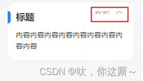
原因
rotate 过程父元素重绘导致高度发生变化
解决方案
给父元素加 overflow:hidden; 如果rotate过程元素内容模糊,可在发生动画的元素加 translate3d(0, 0, 0);
原代码
html
<div class="comm-box">
    <div class="head">
      <div class="comm-title">{{ title }}</div>
      <div class="right" @click="onChange">
        <div class="label">{{ show ? '收起' : '展开' }}</div>
        <van-icon
          :class="show ? 'icon-rotate' : ''"
          class="icon"
          name="arrow-down"
        />
      </div>
    </div>
    <div :style="{ maxHeight: show ? '2000px' : '0' }" class="html-content">
      <div v-show="show" v-dompurify-html="content" class="html"></div>
    </div>
  </div>
  css
  .comm-box {
  min-height: 20px;
  padding: 16px 16px 16px 0;
  border-radius: 16px;
  margin: 8px 16px 10px;
  background: #ffffff;
  overflow: hidden;
}

.head {
  display: flex;
  align-items: flex-start;
  justify-content: space-between;

  .comm-title {
    height: auto;
    padding: 0 0 0 16px;
    color: #333333;
    font-size: 18px;
    line-height: 24px;
    font-weight: 700;
    position: relative;

    &:after {
      content: '';
      position: absolute;
      left: 0;
      top: 0;
      width: 6px;
      height: 24px;
      background: #2e80fe;
      border-radius: 0 10px 10px 0;
    }
  }

  .right {
    position: relative;
    display: flex;
    align-items: center;
    justify-content: space-between;
    font-size: 14px;
    color: #999999;
    width: 60px;
    height: 22px;

    .label {
      margin-right: 8px;
    }
  }

  .icon {
    transition: 0.5s;
    transform: translate3d(0, 0, 0);
  }

  .icon-rotate {
    transform: rotateZ(180deg) translate3d(0, 0, 0);
  }
}

.html-content {
  transition: 0.5s;

  .html {
    padding: 12px 0 0 16px;
    font-size: 14px;
    color: #333333;
    line-height: 22px;
  }
}
修改后代码
css
.comm-box {
  min-height: 20px;
  padding: 16px 16px 16px 0;
  border-radius: 16px;
  margin: 8px 16px 10px;
  background: #ffffff;
  overflow: hidden;
}

.head {
  display: flex;
  align-items: flex-start;
  justify-content: space-between;

  .comm-title {
    height: auto;
    padding: 0 0 0 16px;
    color: #333333;
    font-size: 18px;
    line-height: 24px;
    font-weight: 700;
    position: relative;

    &:after {
      content: '';
      position: absolute;
      left: 0;
      top: 0;
      width: 6px;
      height: 24px;
      background: #2e80fe;
      border-radius: 0 10px 10px 0;
    }
  }

  .right {
    position: relative;
    display: flex;
    align-items: center;
    justify-content: space-between;
    font-size: 14px;
    color: #999999;
    width: 60px;
    height: inherit;
    overflow: hidden;

    .label {
      margin-right: 8px;
    }
  }

  .icon {
    transition: 0.5s;
    transform: translate3d(0, 0, 0);
  }

  .icon-rotate {
    transform: rotateZ(180deg) translate3d(0, 0, 0);
  }
}

.html-content {
  transition: 0.5s;

  .html {
    padding: 12px 0 0 16px;
    font-size: 14px;
    color: #333333;
    line-height: 22px;
  }
}


 734
734


 被折叠的 条评论
为什么被折叠?
被折叠的 条评论
为什么被折叠?
 到【灌水乐园】发言


