


前言
期待了好久的datawhale可视化教程终于出来了,这次标题狠有文艺范儿,哈哈哈
这次我主要目的是最近要写篇论文,也正好为以后建模画图打劳基础~
大家可以多看看官方教程:
- 中文官方网站:https://www.matplotlib.org.cn/
- 中文官方网站:https://matplotlib.org/
当然还有datawhale,一起讨论!
系列:
第三回:布局格式定方圆
import numpy as np
import pandas as pd
import matplotlib.pyplot as plt
plt.rcParams['font.sans-serif'] = ['SimHei']
plt.rcParams['axes.unicode_minus'] = False
一、子图
1. 使用 plt.subplots 绘制均匀状态下的子图
返回元素分别是画布和子图构成的列表,第一个数字为行,第二个为列
figsize 参数可以指定整个画布的大小
sharex 和 sharey 分别表示是否共享横轴和纵轴刻度
tight_layout 函数可以调整子图的相对大小使字符不会重叠
fig, axs = plt.subplots(2, 5, figsize=(10, 4), sharex=True, sharey=True)
fig.suptitle('样例1', size=20)
for i in range(2):
    for j in range(5):
        axs[i][j].scatter(np.random.randn(10), np.random.randn(10))
        axs[i][j].set_title('第%d行,第%d列'%(i+1,j+1))
        axs[i][j].set_xlim(-5,5)
        axs[i][j].set_ylim(-5,5)
        if i==1:
            axs[i][j].set_xlabel('横坐标')
        if j==0:
            axs[i][j].set_ylabel('纵坐标')
fig.tight_layout()

除了常规的直角坐标系,也可以通过projection方法创建极坐标系下的图表
N = 150
r = 2 * np.random.rand(N)
theta = 2 * np.pi * np.random.rand(N)
area = 200 * r**2
colors = theta


plt.subplot(projection='polar')
plt.scatter(theta, r, c=colors, s=area, cmap='hsv', alpha=0.75)

2. 使用 GridSpec 绘制非均匀子图
所谓非均匀包含两层含义,第一是指图的比例大小不同但没有跨行或跨列,第二是指图为跨列或跨行状态
利用 add_gridspec 可以指定相对宽度比例 width_ratios 和相对高度比例参数 height_ratios
fig = plt.figure(figsize=(10, 4))
spec = fig.add_gridspec(nrows=2, ncols=5, width_ratios=[1,2,3,4,5], height_ratios=[1,3])
fig.suptitle('样例2', size=20)
for i in range(2):
    for j in range(5):
        ax = fig.add_subplot(spec[i, j])
        ax.scatter(np.random.randn(10), np.random.randn(10))
        ax.set_title('第%d行,第%d列'%(i+1,j+1))
        if i==1: ax.set_xlabel('横坐标')
        if j==0: ax.set_ylabel('纵坐标')
fig.tight_layout()

在上面的例子中出现了 spec[i, j] 的用法,事实上通过切片就可以实现子图的合并而达到跨图的共能
fig = plt.figure(figsize=(10, 4))
spec = fig.add_gridspec(nrows=2, ncols=6, width_ratios=[2,2.5,3,1,1.5,2], height_ratios=[1,2])
fig.suptitle('样例3', size=20)
# sub1
ax = fig.add_subplot(spec[0, :3])
ax.scatter(np.random.randn(10), np.random.randn(10))
# sub2
ax = fig.add_subplot(spec[0, 3:5])
ax.scatter(np.random.randn(10), np.random.randn(10))
# sub3
ax = fig.add_subplot(spec[:, 5])
ax.scatter(np.random.randn(10), np.random.randn(10))
# sub4
ax = fig.add_subplot(spec[1, 0])
ax.scatter(np.random.randn(10), np.random.randn(10))
# sub5
ax = fig.add_subplot(spec[1, 1:5])
ax.scatter(np.random.randn(10), np.random.randn(10))
fig.tight_layout()

自定义布局的几个方法:
-
subplots()- 可能是用来创建图形和轴的主要函数。它也类似于 matplotlib.pyplot.subplot() ,但同时创建和放置图形上的所有轴。也见 matplotlib.figure.Figure.subplots .
-
GridSpec- 指定要放置子批次的网格的几何图形。需要设置网格的行数和列数。或者,可以调整子批次布局参数(例如,左、右等)。
-
SubplotSpec- 指定子批次在给定子批次中的位置 GridSpec .
-
subplot2grid()- 类似于 subplot() ,但使用基于0的索引并让子块占据多个单元格。本教程不介绍此功能。
二、子图上的方法
在 ax 对象上定义了和 plt 类似的图形绘制函数,常用的有: plot, hist, scatter, bar, barh, pie
- plot
plt.plot(x, y, format_string, **kwargs)
x:x轴数据,列表或数组,可选
y:y轴数据,列表或数组
format_string:控制曲线的格式字符串,可选,由颜色字符、风格字符和标记字符组成。

**kwargs:第二组或更多,(x,y,format_string)
常用的参数:
	color:控制颜色,color=’green’
	linestyle:线条风格,linestyle=’dashed’
	marker:标记风格,marker = ‘o’
	markerfacecolor:标记颜色,markerfacecolor = ‘blue’
	markersize:标记尺寸,markersize = ‘20’


```python
fig, ax = plt.subplots(figsize=(4,3))
ax.plot([1,2],[2,1])
 - hist
matplotlib.pyplot.hist()函数,具体参数如下
(n, bins, patches)=matplotlib.pyplot.hist(x, bins=None, range=None, density=None, weights=None,
cumulative=False, bottom=None, histtype='bar', align='mid', orientation='vertical',
rwidth=None, log=False, color=None, label=None, stacked=False, normed=None, *, data=None, **kwargs)

normed :normed=True是频率图,默认是频数图
range :筛选数据范围,默认是最小到最大的取值范围
histtype:hist柱子类型
orientation:水平或垂直方向
rwidth= :柱子与柱子之间的距离,默认是0
fig, ax = plt.subplots(figsize=(4,3))
ax.hist(np.random.randn(1000))
 - scatter
matplotlib.pyplot.scatter(x,
	y,
	s=20,
	c='b',
	marker='o',
	cmap=None,
	norm=None,
	vmin=None,
	vmax=None,
	alpha=None,
	linewidths=None,
	verts=None,
	hold=None,
	**kwargs)

- x,y:表示的是shape大小为(n,)的数组,也就是我们即将绘制散点图的数据点,输入数据。
- s:表示的是大小,是一个标量或者是一个shape大小为(n,)的数组,可选,默认20。
- c:表示的是色彩或颜色序列,可选,默认蓝色’b’。但是c不应该是一个单一的RGB数字,也不应该是一个RGBA的序列,因为不便区分。c可以是一个RGB或RGBA二维行数组
- marker:MarkerStyle,表示的是标记的样式,可选,默认’o’。
- cmap:Colormap,标量或者是一个colormap的名字,cmap仅仅当c是一个浮点数数组的时候才使用。如果没有申明就是image.cmap,可选,默认None。
- norm:Normalize,数据亮度在0-1之间,也是只有c是一个浮点数的数组的时候才使用。如果没有申明,就是默认None。
- vmin,vmax:标量,当norm存在的时候忽略。用来进行亮度数据的归一化,可选,默认None。
- alpha:标量,0-1之间,可选,默认None。
- linewidths:也就是标记点的长度,默认None。
np.random.seed(0)
x=np.random.rand(20)
y=np.random.rand(20)

area=(50*np.random.rand(20))**2

plt.scatter(x,y,s=area,alpha=0.5)
plt.show()

- bar
bar(x,height,width,*,align=“center”,**kwargs)

x:表示x轴的数据。
height:表示条形的高度。
width:表示条形的宽度,默认为0.8。
color:表示条形的颜色。
edgecolor:表示条形边框的颜色。
import numpy as np                           #bar()绘制柱形图
import matplotlib.pyplot as plt
x=np.arange(5)
y1,y2=np.random.randint(1,31,size=(2,5))
width=0.25
jk=plt.subplot(1,1,1)
jk.bar(x,y1,width,color='r')             #绘制红色的柱形图
jk.bar(x+width,y2,width,color='g')       #绘制另一个绿色的柱形图

jk.set_xticks(x+width)              #set_xticks设置 x 轴的刻度

jk.set_xticklabels(['January','February','March','April','May'])       #set_xticklabels设置 x轴的标签名称
plt.show()

- barh
matplotlib.pyplot.barh(bottom, width, height=0.8, left=None, hold=None, **kwargs)

创建一个水平条形图。创建一个带有矩形边界的水平条,设置如下:
left, left + width, bottom, bottom + height
(left, right, bottom and top edges)
输入参数:
bottom:标量或者数组。条形图的y坐标。
width:标量或者数组。条形图宽度。
height:标量序列,可选参数,默认值为:0.8。条形图的高度。
left:标量序列。条形图左边的X坐标

返回值:
matplotlib.patches.Rectangle实例。
- pie
pie(x, explode=None, labels=None,
    colors=('b', 'g', 'r', 'c', 'm', 'y', 'k', 'w'),
    autopct=None, pctdistance=0.6, shadow=False,
    labeldistance=1.1, startangle=None, radius=None,
    counterclock=True, wedgeprops=None, textprops=None,
    center = (0, 0), frame = False )

参数:
x       (每一块)的比例,如果sum(x) > 1会使用sum(x)归一化
labels  (每一块)饼图外侧显示的说明文字
explode (每一块)离开中心距离
startangle  起始绘制角度,默认图是从x轴正方向逆时针画起,如设定=90则从y轴正方向画起
shadow  是否阴影
labeldistance label绘制位置,相对于半径的比例, 如<1则绘制在饼图内侧
autopct 控制饼图内百分比设置,可以使用format字符串或者format function
        '%1.1f'指小数点前后位数(没有用空格补齐)
pctdistance 类似于labeldistance,指定autopct的位置刻度
radius  控制饼图半径

返回值:
如果没有设置autopct,返回(patches, texts)
如果设置autopct,返回(patches, texts, autotexts)
import matplotlib.pyplot as plt
import numpy as np

fig=plt.figure()    #创建一个新figure
#饼图
labels=['vivo','meizu','huawei','apple']
values=[10,20,300,200]
colors=['yellow','green','red','blue']
explode=[0,0,0.1,0]    #使huawei离开圆心
plt.pie(values,labels=labels,colors=colors,explode=explode,startangle=180,shadow=True,autopct='%1.2f%%') #autopct='%1.2f%%'使用百分比显示
plt.axis('equal')   #
plt.title("Pie Chart")
plt.show()

常用直线的画法为: axhline, axvline, axline (水平、垂直、任意方向)
fig, ax = plt.subplots(figsize=(4,3))
ax.axhline(0.5,0.2,0.8)
ax.axvline(0.5,0.2,0.8)
ax.axline([0.3,0.3],[0.7,0.7])

matplotlib.axes.Axes.axline
Axes.axline(self, xy1, xy2=None, *, slope=None, **kwargs)
使用 grid 可以加灰色网格
fig, ax = plt.subplots(figsize=(4,3))
ax.grid(True)

使用 set_xscale, set_title, set_xlabel 分别可以设置坐标轴的规度(指对数坐标等)、标题、轴名
fig, axs = plt.subplots(1, 2, figsize=(10, 4))
fig.suptitle('大标题', size=20)
for j in range(2):
    axs[j].plot(list('abcd'), [10**i for i in range(4)])
    if j==0:
        axs[j].set_yscale('log')
        axs[j].set_title('子标题1')
        axs[j].set_ylabel('对数坐标')
    else:
        axs[j].set_title('子标题1')
        axs[j].set_ylabel('普通坐标')
fig.tight_layout()

与一般的 plt 方法类似, legend, annotate, arrow, text 对象也可以进行相应的绘制
fig, ax = plt.subplots()
ax.arrow(0, 0, 1, 1, head_width=0.03, head_length=0.05, facecolor='red', edgecolor='blue')
ax.text(x=0, y=0,s='这是一段文字', fontsize=16, rotation=70, rotation_mode='anchor', color='green')
ax.annotate('这是中点', xy=(0.5, 0.5), xytext=(0.8, 0.2), arrowprops=dict(facecolor='yellow', edgecolor='black'), fontsize=16)

fig, ax = plt.subplots()
ax.plot([1,2],[2,1],label="line1")
ax.plot([1,1],[1,2],label="line1")
ax.legend(loc=1)

其中,图例的 loc 参数如下:
| string | code |
|---|---|
| best | 0 |
| upper right | 1 |
| upper left | 2 |
| lower left | 3 |
| lower right | 4 |
| right | 5 |
| center left | 6 |
| center right | 7 |
| lower center | 8 |
| upper center | 9 |
| center | 10 |
作业
1. 墨尔本1981年至1990年的每月温度情况
ex1 = pd.read_csv('data/layout_ex1.csv')
ex1.head()

fig,axs = plt.subplots(2,5, figsize=(12,4), sharex=True, sharey=True)
fig.suptitle("墨尔本1981年至1990年月温度曲线", size=20)
for i in range(2):
    for j in range(5):
        axs[i][j].plot(range(1,13), ex1.iloc[(i*5+j):(i*5+j+12),1], marker=".")
        axs[i][j].set_title(str(1981+i*5+j)+"年")
        axs[i][j].set_xticks(range(1,13))
        axs[i][j].set_ylim(5,20)
        if j == 0:
            axs[i][j].set_ylabel("气温")

fig.tight_layout()

plt.show()

2. 画出数据的散点图和边际分布
- 用
np.random.randn(2, 150)生成一组二维数据,使用两种非均匀子图的分割方法,做出该数据对应的散点图和边际分布图
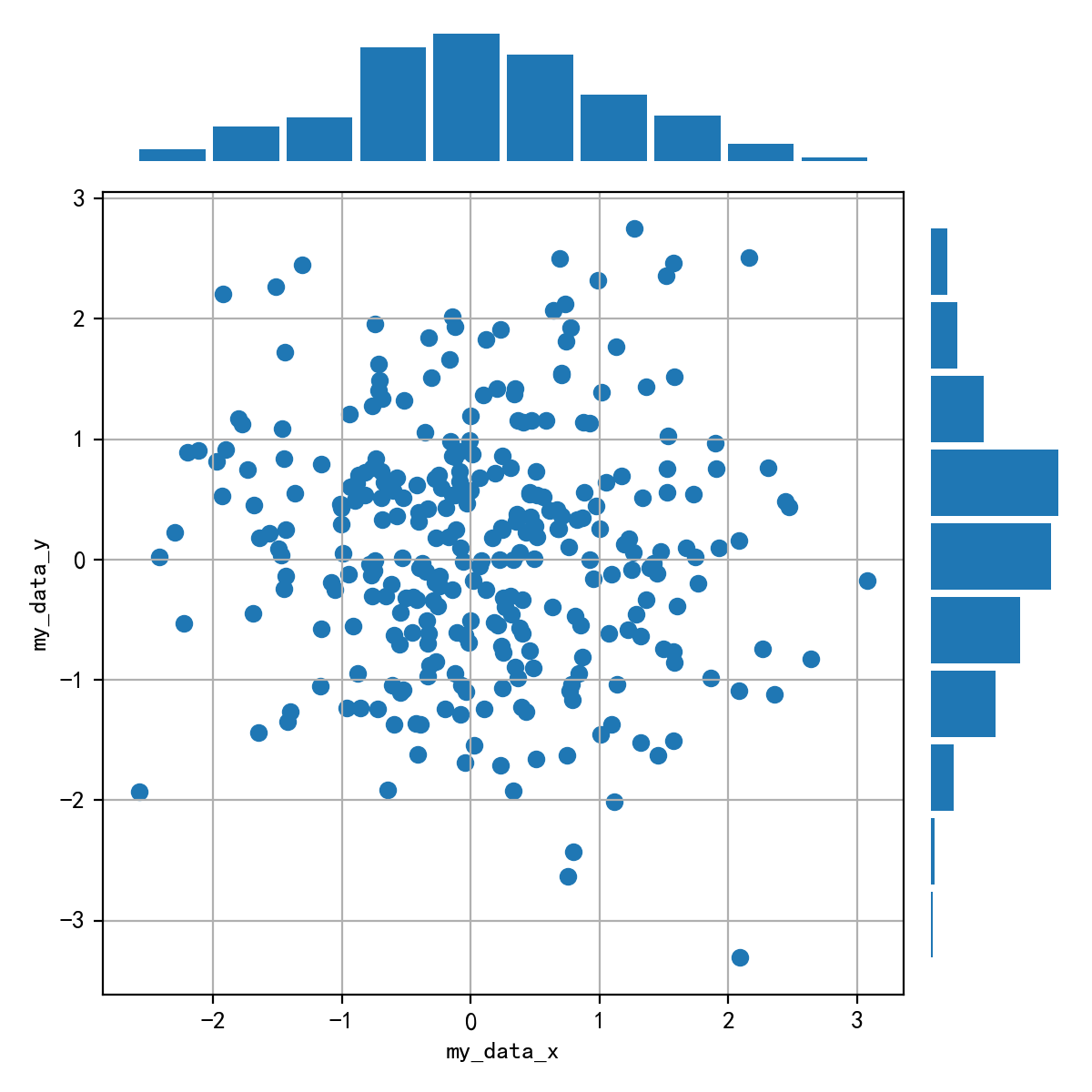
import numpy as np
import pandas as pd
import matplotlib.pyplot as plt
plt.rcParams['font.sans-serif'] = ['SimHei'] #用来正常显示中文标签
plt.rcParams['axes.unicode_minus'] = False #用来正常显示负号

data = np.random.randn(2, 150)

fig = plt.figure(figsize=(8,8))
spec = fig.add_gridspec(nrows=2, ncols=2, width_ratios=[4,1], height_ratios=[1,4])

ax1 = fig.add_subplot(spec[1,0])
ax1.scatter(data[0],data[1])
ax1.grid(True)

ax2 = fig.add_subplot(spec[0,0],sharex=ax1)
ax2.hist(data[0], rwidth=5)
ax2.axis('off')
ax2.spines['top'].set_visible(False)
ax2.spines['right'].set_visible(False)
ax2.spines['bottom'].set_visible(False)
ax2.spines['left'].set_visible(False)

ax3 = fig.add_subplot(spec[1,1],sharey=ax1)
ax3.hist(data[1], orientation='horizontal')
ax3.axis('off')
ax3.spines['top'].set_visible(False)
ax3.spines['right'].set_visible(False)
ax3.spines['bottom'].set_visible(False)
ax3.spines['left'].set_visible(False)
fig.tight_layout()

plt.show( )


 378
378


 被折叠的 条评论
为什么被折叠?
被折叠的 条评论
为什么被折叠?
 到【灌水乐园】发言


