


1、cursor输入请求:使用python 写一个程序,画一个折线图,折线图展示人民币兑换外币,比如美元。汇率需要从网上获取,展示半年, 需要在图表上能选择不同汇率美元,日元,台币,港币。
2、cursor生成代码,告诉需要安装pip install requests pandas matplotlib
3、提示:代码要使用 Alpha Vantage API,需要:
- 访问 https://www.alphavantage.co/support/#api-key
- 注册一个免费账号获取 API KEY
- 将代码中的 YOUR_API_KEY 替换为你的实际 API KEY
4、将api key替换后,python代码直接运行,咩报错,cursor确实够强大。
import requests
import pandas as pd
import matplotlib.pyplot as plt
from datetime import datetime, timedelta
import json
from matplotlib.widgets import RadioButtons
import matplotlib as mpl
import platform
import matplotlib.dates as mdates

def get_exchange_rates(currency='USD'):
    # Alpha Vantage API密钥 ,注册后获取的key KE......
    API_KEY = "your api key"

    # 设置时间范围(近6个月)
    end_date = datetime.now()
    start_date = end_date - timedelta(days=180)

    url = f"https://www.alphavantage.co/query?function=FX_DAILY&from_symbol={currency}&to_symbol=CNY&apikey={API_KEY}"

    try:
        response = requests.get(url)
        data = response.json()

        # 解析数据
        time_series = data['Time Series FX (Daily)']
        dates = []
        rates = []

        for date_str, values in time_series.items():
            date = datetime.strptime(date_str, '%Y-%m-%d')
            if start_date <= date <= end_date:
                dates.append(date)
                rates.append(float(values['4. close']))

        # 按日期排序
        dates, rates = zip(*sorted(zip(dates, rates)))
        return dates, rates
    except Exception as e:
        print(f"获取数据时出错: {e}")
        return None, None

def plot_exchange_rate(currency='USD'):
    # 设置中文字体,根据操作系统选择合适的字体
    if platform.system().lower() == 'windows':
        plt.rcParams['font.sans-serif'] = ['Microsoft YaHei']  # 微软雅黑
    elif platform.system().lower() == 'linux':
        plt.rcParams['font.sans-serif'] = ['WenQuanYi Micro Hei']  # 文泉驿微米黑
    elif platform.system().lower() == 'darwin':
        plt.rcParams['font.sans-serif'] = ['PingFang HK']  # macOS 的苹方字体

    plt.rcParams['axes.unicode_minus'] = False  # 解决负号显示问题

    # 货币符号对应的中文名称
    currency_names = {
        'USD': '美元',
        'JPY': '日元',
        'HKD': '港币',
        'TWD': '台币'
    }

    # 创建主图和子图
    fig = plt.figure(figsize=(14, 6))
    plot_ax = plt.subplot2grid((1, 5), (0, 0), colspan=4)  # 主图占4/5宽度
    rax = plt.subplot2grid((1, 5), (0, 4))  # 按钮区域占1/5宽度

    # 设置日期格式
    plot_ax.xaxis.set_major_formatter(mdates.DateFormatter('%Y-%m-%d'))
    plot_ax.xaxis.set_major_locator(mdates.DayLocator(interval=30))

    # 初始化曲线,保存为全局变量以便更新
    line, = plot_ax.plot([], [], 'b-', linewidth=2)

    # 创建单选按钮
    radio = RadioButtons(rax, ['美元', '日元', '港币', '台币'])

    def update_plot(label):
        # 中文标签转换为货币代码
        currency_codes = {'美元': 'USD', '日元': 'JPY', '港币': 'HKD', '台币': 'TWD'}
        selected_currency = currency_codes[label]

        # 获取新数据
        dates, rates = get_exchange_rates(selected_currency)

        if dates and rates:
            # 更新数据
            line.set_data(dates, rates)
            plot_ax.relim()  # 重新计算轴的范围
            plot_ax.autoscale_view()  # 自动调整视图
            plot_ax.set_title(f'人民币兑{label}汇率走势图(近3个月)', fontsize=14)
            plot_ax.set_ylabel(f'汇率 ({selected_currency}/CNY)')
            fig.canvas.draw_idle()  # 重绘图表
        else:
            print(f"无法获取{label}的汇率数据")

    # 设置图表基本属性
    plot_ax.set_xlabel('日期')
    plot_ax.grid(True)
    plot_ax.tick_params(axis='x', rotation=45)

    # 绑定更新函数
    radio.on_clicked(update_plot)

    # 显示初始数据(美元)
    update_plot('美元')

    # 调整布局
    plt.tight_layout()
    plt.show()

if __name__ == "__main__":
    plot_exchange_rate()
5、运行结果是这样的:
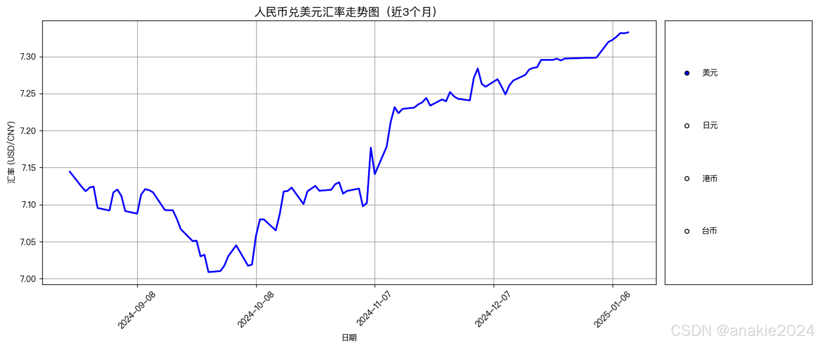
6、生成的代码只有一个小问题就是中文没显示,这部分让它重新生成下就行


 418
418

 被折叠的 条评论
为什么被折叠?
被折叠的 条评论
为什么被折叠?
 到【灌水乐园】发言


