


这里在linux系统上使用geocat实现NCL风格的图片绘制
Linux上安装 geocat
conda update conda
conda create -n geocat -c conda-forge geocat-viz
conda activate geocat
conda update geocat-viz
- Dataset
- NOAA Optimum Interpolation (OI) SST V2 # 海温月平均数据
- lsmask # 掩膜数据
- 1°x1° (180latx360lon)   # 空间分辨率
- 1981-12-01 ~ 2021-07-01  # 时间覆盖范围
- https://psl.noaa.gov/data/gridded/
导入基础库
import numpy as np
import pandas as pd
import xarray as xr
import os
from datetime import datetime
import cartopy.crs as ccrs
import cartopy.feature as cfeature
import matplotlib.pyplot as plt
import matplotlib.patheffects as PathEffects
from scipy import stats
import geocat.viz.util as gvutil
import cmaps
from geocat.comp import eofunc_eofs, eofunc_pcs
import sys
import inspect
设置数据时间、范围、EOF模态数量
# ----- Parameter setting ------
ystr = 1982
yend = 2020

latS = -30.
latN = 30.
lonW = 120.
lonE = 290

neof = 3
读取SST数据和MASK掩膜数据
# 打印当前目录
print("当前目录:", os.getcwd())
# == netcdf file name and location"
fnc = 'oisst_monthly.nc'
dmask = xr.open_dataset('lsmask.nc')
print(dmask)

ds = xr.open_dataset(fnc)
print(ds)
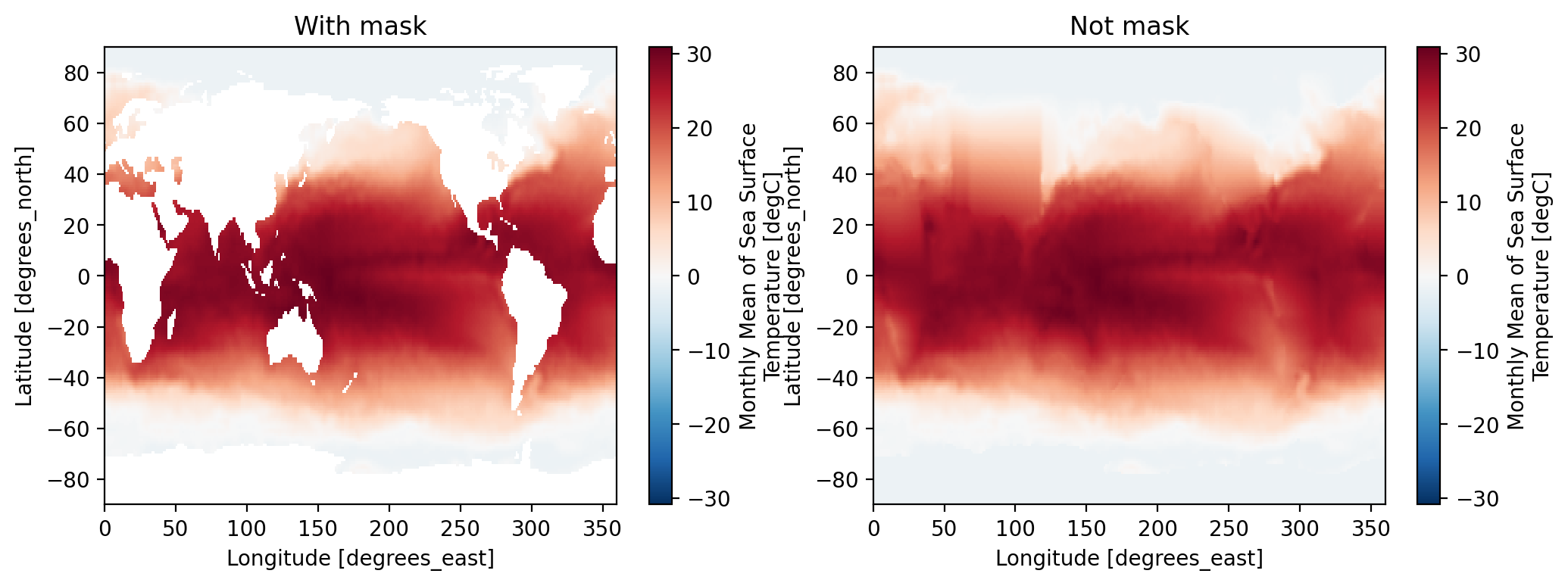
对于SST进行陆地掩膜 | 计算异常
# === Climatology and Anomalies
sst = ds.sst.where(dmask.mask.isel(time=0) == 1)
clm = sst.sel(time=slice(f'{ystr}-01-01',f'{yend}-12-01')).groupby('time.month').mean(dim='time')
anm = (sst.groupby('time.month') - clm)

plt.figure(dpi=200,figsize=(12,4))
plt.subplot(121)
sst[0].plot()
plt.title('With mask')
plt.subplot(122)
ds.sst[0].plot()
plt.title('Not mask')
计算季节平均 | 去趋势
# == seasonal mean
anmS = anm.rolling(time=3, center=True).mean('time')
anmDJF=anmS.sel(time=slice(f'{ystr}-01-01',f'{yend}-12-01',12))
print(anmDJF)


def wgt_areaave(indat, latS, latN, lonW, lonE):
  lat=indat.lat
  lon=indat.lon

  if ( ((lonW < 0) or (lonE < 0 )) and (lon.values.min() > -1) ):
     anm=indat.assign_coords(lon=( (lon + 180) % 360 - 180) )
     lon=( (lon + 180) % 360 - 180)
  else:
     anm=indat

  iplat = lat.where( (lat >= latS ) & (lat <= latN), drop=True)
  iplon = lon.where( (lon >= lonW ) & (lon <= lonE), drop=True)

#  print(iplat)
#  print(iplon)
  wgt = np.cos(np.deg2rad(lat))
  odat=anm.sel(lat=iplat,lon=iplon).weighted(wgt).mean(("lon", "lat"), skipna=True)
  return(odat)

# -- Detorending
def detrend_dim(da, dim, deg=1):
    # detrend along a single dimension
    p = da.polyfit(dim=dim, deg=deg)
    fit = xr.polyval(da[dim], p.polyfit_coefficients)
    return da - fit

anmDJF=detrend_dim(anmDJF,'time',1)
这里的rolling(time=3, center=True).mean('time')可以理解为计算季节平均的过程,返回的是以1981-12-01为中心的(*、1981-12-01、1982-01-01)的平均值,1982-01-01为中心的(1981-12-01、1982-01-01、1982-02-01)的平均值,1982-02-01为中心的(1982-01-01、1982-02-01、1982-03-01)的平均值,…依次类推。
通过时间截取每12个月为一个周期的季节平均,即挑选出:1982-01-01 1983-01-01 ... 2020-01-01为中心的季节平均,作为每年的冬季平均值。
定义一个去趋势函数,函数名为detrend_dim,它的作用是沿着指定的维度对数据进行去趋势化处理。
函数的参数包括:
- da:输入的数据数组,可以是 xarray.DataArray 类型。
- dim:指定的维度,沿着这个维度进行去趋势化处理。
- deg:多项式拟合的阶数,默认为1,即线性拟合。
函数的主要步骤包括:
- 使用 da.polyfit() 方法进行多项式拟合,拟合得到沿着指定维度的多项式系数。
- 使用 xr.polyval() 方法根据拟合的多项式系数计算拟合曲线。
- 将原始数据减去拟合曲线得到去趋势化后的数据。
- 最终函数返回去趋势化后的数据数组。
rolling()函数通过计算窗口中的数据点的平均值来代表窗口中心点的值。这与中心差分类似,因为我们在某一点附近使用了周围数据点的平均值来估计该点的值。因此,在某种程度上,你可以将滚动窗口均值视为一种离散形式的中心差分。
这里使用官网的一个例子来解释:
https://docs.xarray.dev/en/stable/generated/xarray.DataArray.rolling.html
da = xr.DataArray(
    np.linspace(0, 11, num=12),
    coords=[
        pd.date_range(
            "1999-12-15",
            periods=12,
            freq=pd.DateOffset(months=1),
        )
    ],
    dims="time",
)

da
<xarray.DataArray (time: 12)> Size: 96B
array([ 0.,  1.,  2.,  3.,  4.,  5.,  6.,  7.,  8.,  9., 10., 11.])
Coordinates:
  * time     (time) datetime64[ns] 96B 1999-12-15 2000-01-15 ... 2000-11-15

da.rolling(time=3, center=True).mean()
<xarray.DataArray (time: 12)> Size: 96B
array([nan,  1.,  2.,  3.,  4.,  5.,  6.,  7.,  8.,  9., 10., nan])
Coordinates:
  * time     (time) datetime64[ns] 96B 1999-12-15 2000-01-15 ... 2000-11-15
在第一个数据点处,窗口中包含了该数据点、下一个数据点和前一个数据点。而在最后一个数据点处,窗口中包含了该数据点、前一个数据点和后一个数据点。由于这些位置处的窗口无法完全包含3个数据点,因此在这些位置处的滚动窗口均值计算结果为NaN。
所以第一个点rolling后的数值为nan,第二个点的数值为(0+1+2)/3=1,依次类推。
计算nino指数 | 与冬季海温异常的相关/回归系数
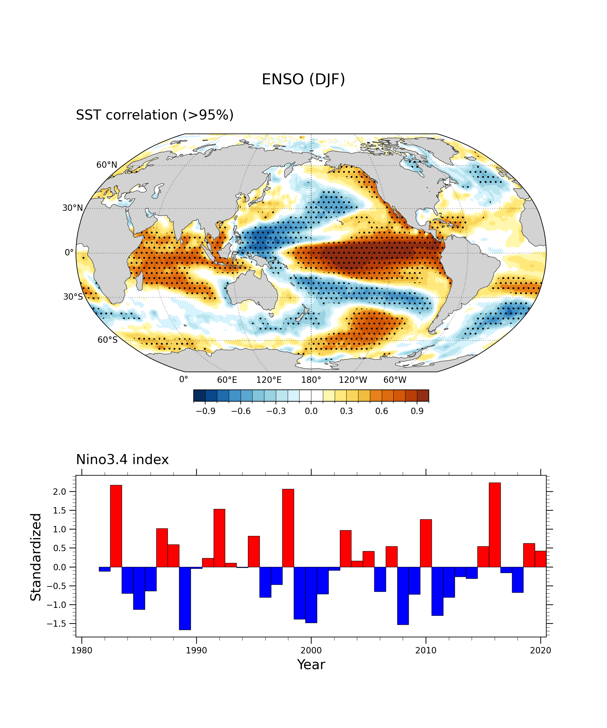
nino=wgt_areaave(anmDJF,-5,5,-170,-120)
ninoSD=nino/nino.std(dim='time')

# simultaneous
cor0 = xr.corr(ninoSD, anmDJF, dim="time")
reg0 = xr.cov(ninoSD,  anmDJF, dim="time")/ninoSD.var(dim='time',skipna=True).values
绘图 | Nino 指数 | 显著打点
def makefig0(cor, title, grid_space):

  cor = gvutil.xr_add_cyclic_longitudes(cor, 'lon')

  ax = fig.add_subplot(grid_space,
          projection=ccrs.Robinson(central_longitude=180))
  ax.coastlines(linewidth=0.5, alpha=0.6)

  gl = ax.gridlines(crs=ccrs.PlateCarree(),
                  draw_labels=True,
                  dms=False,
                  x_inline=False,
                  y_inline=False,
                  linewidth=1,
                  linestyle='dotted',
                  color="black",
                  alpha=0.3)
  gl.top_labels = False
  gl.right_labels = False
  gl.rotate_labels = False

  gvutil.add_major_minor_ticks(ax, labelsize=10)

  gvutil.add_lat_lon_ticklabels(ax)

  newcmp = cmaps.BlueYellowRed
  index = [5, 20,  35, 50, 65, 85, 95, 110, 125,  0, 0, 135, 150,  165, 180, 200, 210, 220, 235, 250 ]
  color_list = [newcmp[i].colors for i in index]

  color_list[9]=[ 1., 1., 1.]
  color_list[10]=[ 1., 1., 1.]

  kwargs = dict(
    vmin = -1.0,
    vmax = 1.0,
    levels = 21,
    colors=color_list,
    add_colorbar=False,  # allow for colorbar specification later
    transform=ccrs.PlateCarree(),  # ds projection
  )

  fillplot = cor.plot.contourf(ax=ax,  **kwargs)
  ax.add_feature(cfeature.LAND, facecolor='lightgray', zorder=1)
  ax.add_feature(cfeature.COASTLINE, edgecolor='gray', linewidth=0.5, zorder=1)

  df = 35
  sig=xr.DataArray(data=cor.values*np.sqrt((df-2)/(1-np.square(cor.values))),
      dims=["lat","lon'"],
      coords=[cor.lat, cor.lon])
  t90=stats.t.ppf(1-0.05, df-2)
  t95=stats.t.ppf(1-0.025, df-2)
  sig.plot.contourf(ax=ax,levels = [-1*t95, -1*t90, t90, t95], colors='none',
      hatches=['..', None, None, None, '..'], extend='both',
      add_colorbar=False, transform=ccrs.PlateCarree())
  gvutil.set_titles_and_labels(ax,
                             lefttitle=title,
                             lefttitlefontsize=16,
                             righttitle='',
                             righttitlefontsize=16,
                             xlabel="",
                             ylabel="")

  return ax, fillplot


def make_bar_plot0(dataset, grid_space):
    years = list(dataset.time.dt.year)
    values = list(dataset.values)
    colors = ['blue' if val < 0 else 'red' for val in values]

    ax = fig.add_subplot(grid_space)

    ax.bar(years,
           values,
           color=colors,
           width=1.0,
           edgecolor='black',
           linewidth=0.5)

    gvutil.add_major_minor_ticks(ax,
                                 x_minor_per_major=5,
                                 y_minor_per_major=5,
                                 labelsize=10)

    gvutil.set_axes_limits_and_ticks(ax,
                                     xticks=np.linspace(1980, 2020, 5),
                                     xlim=[1979.5, 2020.5])
    gvutil.set_titles_and_labels(ax,
                             lefttitle='Nino3.4 index',
                             lefttitlefontsize=16,
                             righttitle='',
                             righttitlefontsize=16,
                             xlabel="Year",
                             ylabel="Standardized")
    return ax


# Show the plot

fig = plt.figure(figsize=(10, 12),dpi=200)
grid = fig.add_gridspec(ncols=1, nrows=3)
ax1, fill1 = makefig0(cor0,'SST correlation (>95%)', grid[0:2,0])

fig.colorbar(fill1,
                 ax=[ax1],
#                 ticks=np.linspace(-5, 5, 11),
                 drawedges=True,
                 orientation='horizontal',
                 shrink=0.5,
                 pad=0.05,
                 extendfrac='auto',
                 extendrect=True)

ax2 = make_bar_plot0(ninoSD, grid[2,0])


fig.suptitle('ENSO (DJF)', fontsize=18, y=0.9)

plt.draw()

plt.savefig(fnFIG+"nino_corr.png")
纬度加权处理
anmDJF = anmDJF.sortby("lat", ascending=True)
clat = anmDJF['lat'].astype(np.float64)
clat = np.sqrt(np.cos(np.deg2rad(clat)))
wanm = anmDJF
wanm = anmDJF * clat
wanm.attrs = anmDJF.attrs
print(wanm)
截取太平洋中部区域
xw_anm = wanm.sel(lat=slice(latS, latN), lon=slice(lonW, lonE)).transpose('time', 'lat', 'lon')
print(xw_anm)
EOF 分析
eofs = eofunc_eofs(xw_anm.data, neofs=neof, meta=True)
pcs = eofunc_pcs(xw_anm.data, npcs=neof, meta=True)
# 对主成分进行标准化,即除以时间维度上的标准差,以确保主成分的方差为1。
pcs = pcs / pcs.std(dim='time')
pcs['time']=anmDJF['time']
pcs.attrs['varianceFraction'] = eofs.attrs['varianceFraction']
print(pcs)

evec = xr.DataArray(data=eofs, dims=('eof','lat','lon'),
    coords = {'eof': np.arange(0,neof), 'lat': xw_anm['lat'], 'lon': xw_anm['lon']} )
print(evec)
计算主成分与原始数据之间的相关系数(correlation)和回归系数(regression coefficient)
-
计算主成分与原始数据
anmDJF之间的相关系数,使用的函数是xr.corr(),其中参数dim="time"指定了计算相关系数时沿着时间维度进行计算。 -
使用
xr.cov()函数计算协方差,然后除以第一个主成分的方差来得到回归系数。
如果解释变量(自变量)是一个主成分,而响应变量(因变量)是原始数据,且假设线性关系是准确的,那么回归系数可以通过计算主成分与原始数据的协方差除以主成分的方差来得到。最小二乘法的目标是最小化观测值与回归模型的残差平方和。对于简单线性回归模型,可以证明,使得残差平方和最小化的回归系数可以通过以下公式计算:
假设简单线性回归模型为:
Y
=
β
0
+
β
1
x
+
ε
Y=\beta_0+\beta_1x+\varepsilon
Y=β0+β1x+ε
其中,
Y
Y
Y 是响应变量,
x
x
x 是解释变量,
β
0
\beta_0
β0 和
β
1
\beta_1
β1 是回归系数,
ε
\varepsilon
ε 是随机误差。
我们知道,协方差的定义是:
C
o
v
(
x
,
Y
)
=
1
n
∑
i
=
1
n
(
x
i
−
x
ˉ
)
(
Y
i
−
Y
ˉ
)
\mathrm{Cov}(x,Y)=\frac{1}{n}\sum_{i=1}^n(x_i-\bar{x})(Y_i-\bar{Y})
Cov(x,Y)=n1i=1∑n(xi−xˉ)(Yi−Yˉ)
其中,
x
ˉ
\bar{x}
xˉ 和
Y
ˉ
\bar{Y}
Yˉ 分别是
x
x
x 和
Y
Y
Y 的样本均值。现在,我们对
Y
Y
Y 给定
x
x
x 求期望:
E
(
Y
∣
x
)
=
E
(
β
0
+
β
1
x
+
ε
∣
x
)
=
β
0
+
β
1
x
+
E
(
ε
∣
x
)
E(Y|x)=E(\beta_0+\beta_1x+\varepsilon|x)=\beta_0+\beta_1x+E(\varepsilon|x)
E(Y∣x)=E(β0+β1x+ε∣x)=β0+β1x+E(ε∣x)
因为
ε
\varepsilon
ε 是一个随机误差,所以在给定
x
x
x 的情况下,
ε
\varepsilon
ε的期望为零。因此,上式可以简化为
$$
E(Y|x)=\beta_{0}+\beta_{1}x
$$
现在,我们来计算
C o v ( x , E ( Y ∣ x ) ) = 1 n ∑ i = 1 n ( x i − x ˉ ) ( E ( Y i ∣ x ) − E ( Y ˉ ∣ x ) ) Cov(x,E(Y|x))=\frac1n\sum_{i=1}^n(x_i-\bar{x})(E(Y_i|x)-E(\bar{Y}|x)) Cov(x,E(Y∣x))=n1i=1∑n(xi−xˉ)(E(Yi∣x)−E(Yˉ∣x))
因为
E ( Y i ∣ x ) = β 0 + β 1 x i , E(Y_i|x)=\beta_0+\beta_1x_i, E(Yi∣x)=β0+β1xi,
而且
E
(
Y
ˉ
∣
x
)
=
β
0
+
β
1
x
ˉ
,
E(\bar{Y}|x)=\beta_0+\beta_1\bar{x},
E(Yˉ∣x)=β0+β1xˉ,
所以上式可以进一步简化为:
C
o
v
(
x
,
E
(
Y
∣
x
)
)
=
1
n
∑
i
=
1
n
(
x
i
−
x
ˉ
)
(
β
0
+
β
1
x
i
−
(
β
0
+
β
1
x
ˉ
)
)
=
1
n
∑
i
=
1
n
(
x
i
−
x
ˉ
)
(
β
1
x
i
−
β
1
x
ˉ
)
=
β
1
1
n
∑
i
=
1
n
(
x
i
−
x
ˉ
)
2
=
β
1
V
a
r
(
x
)
\begin{aligned} &Cov(x,E(Y|x))=\frac1n\sum_{i=1}^n(x_i-\bar{x})(\beta_0+\beta_1x_i-(\beta_0+\beta_1\bar{x})) \\ &=\frac1n\sum_{i=1}^n(x_i-\bar{x})(\beta_1x_i-\beta_1\bar{x}) \\ &=\beta_1\frac1n\sum_{i=1}^n(x_i-\bar{x})^2 \\ &=\beta_1\mathrm{Var}(x) \end{aligned}
Cov(x,E(Y∣x))=n1i=1∑n(xi−xˉ)(β0+β1xi−(β0+β1xˉ))=n1i=1∑n(xi−xˉ)(β1xi−β1xˉ)=β1n1i=1∑n(xi−xˉ)2=β1Var(x)
因此,我们得到了公式 C o v ( x , E ( Y ∣ x ) ) = β 1 Cov( x, E( Y|x) ) = \beta_1 Cov(x,E(Y∣x))=β1Var$( x) $
cor1 = xr.corr(pcs[0,:], anmDJF, dim="time")
cor2 = xr.corr(pcs[1,:], anmDJF, dim="time")
cor3 = xr.corr(pcs[2,:], anmDJF, dim="time")
reg1 = xr.cov(pcs[0,:], anmDJF, dim="time")/pcs[0,:].var(dim='time',skipna=True).values
reg2 = xr.cov(pcs[1,:], anmDJF, dim="time")/pcs[1,:].var(dim='time',skipna=True).values
reg3 = xr.cov(pcs[2,:], anmDJF, dim="time")/pcs[2,:].var(dim='time',skipna=True).values
定义绘图函数 - 空间pattern
def makefig(dat, ieof, grid_space):
  # 通过添加子图 ax,使用 ccrs.PlateCarree 投影来绘制地图,并设置中心经度为 180 度。
  # 这样做是为了修正在 0 和 360 度经度附近未显示数据的问题。
  ax = fig.add_subplot(grid_space,
          projection=ccrs.PlateCarree(central_longitude=180))
  # 绘制海岸线
  ax.coastlines(linewidth=0.5, alpha=0.6)
  # 创建网格线,并进行相应的设置,包括绘制标签、设置线宽和样式、设置颜色和透明度等
  gl = ax.gridlines(crs=ccrs.PlateCarree(),
                  draw_labels=True,
                  dms=False,
                  x_inline=False,
                  y_inline=False,
                  linewidth=1,
                  linestyle='dotted',
                  color="black",
                  alpha=0.3)
  gl.top_labels = False
  gl.right_labels = False
  gl.rotate_labels = False
  gl.xlocator=ctk.LongitudeLocator(20)
  gl.ylocator=ctk.LatitudeLocator(5)
  # 添加主要和次要刻度线。
  gvutil.add_major_minor_ticks(ax, labelsize=10)

  # 添加纬度和经度的刻度标签。
  gvutil.add_lat_lon_ticklabels(ax)

  # 设置了填充图的颜色
  newcmp = cmaps.BlueYellowRed
  index = [5, 20,  35, 50, 65, 85, 95, 110, 125,  0, 0, 135, 150,  165, 180, 200, 210, 220, 235, 250 ]
  color_list = [newcmp[i].colors for i in index]
  #-- Change to white
  color_list[9]=[ 1., 1., 1.]
  color_list[10]=[ 1., 1., 1.]

  # 绘制填充图所需的参数,如最小值、最大值、颜色等
  kwargs = dict(
    vmin = -0.06,
    vmax = 0.06,
    levels = 21,
    colors=color_list,
    add_colorbar=False,  # allow for colorbar specification later
    transform=ccrs.PlateCarree(),  # ds projection
  )

  # 填充图,并将其保存到变量 fillplot 中
  fillplot = dat[ieof,:,:].plot.contourf(ax=ax,  **kwargs)

  # 添加陆地和海岸线等地图特征。
  ax.add_feature(cfeature.LAND, facecolor='lightgray', zorder=1)
  ax.add_feature(cfeature.COASTLINE, edgecolor='gray', linewidth=0.5, zorder=1)

  # 图形的标题和标签。
  gvutil.set_titles_and_labels(ax,
                             lefttitle=f'EOF{ieof+1} pattern',
                             lefttitlefontsize=12,
                             righttitle='',
                             righttitlefontsize=12,
                             maintitle='',
                             xlabel="",
                             ylabel="")

  return ax, fillplot
定义柱状图的绘图函数
该函数接受三个参数:
- dataset:包含数据的 xarray 数据集。
- ieof:表示要绘制的主成分(PC)的索引。
- grid_space:指定子图在网格中的位置。
def make_bar_plot(dataset, ieof, grid_space):

  # 获取数据集中时间坐标的年份、指定主成分的数据,并将其转换为列表
    years = list(dataset.time.dt.year)
    values = list(dataset[ieof,:].values)
  # 根据主成分的值,生成与其相对应的颜色列表 colors,如果值小于 0,则对应颜色为蓝色,否则为红色。
    colors = ['blue' if val < 0 else 'red' for val in values]

    ax = fig.add_subplot(grid_space)

    ax.bar(years,
           values,
           color=colors,
           width=1.0,
           edgecolor='black',
           linewidth=0.5)

    # 添加主要和次要刻度线,并设置刻度线的密度和标签大小
    gvutil.add_major_minor_ticks(ax,
                                 x_minor_per_major=5,
                                 y_minor_per_major=5,
                                 labelsize=10)

    # 设置坐标轴的范围和刻度值。
    gvutil.set_axes_limits_and_ticks(ax,
                                     xticks=np.linspace(1980, 2020, 5),
                                     xlim=[1979.5, 2020.5],
                                     ylim=[-3.0, 3.5])

    pct = dataset.attrs['varianceFraction'].values[ieof] * 100
    print(pct)
    # 获取主成分的方差百分比,并将其转换为字符串格式
    # 设置图形的标题和标签,包括左侧标题、右侧标题、横坐标标签和纵坐标标签。
    gvutil.set_titles_and_labels(ax,
                             lefttitle=f'PC{ieof+1} (normalized)',
                             lefttitlefontsize=12,
                             righttitle=f'{pct:.1f}%',
                             righttitlefontsize=12,
                             xlabel="Year",
                             ylabel="",
                             labelfontsize=10 )
    return ax
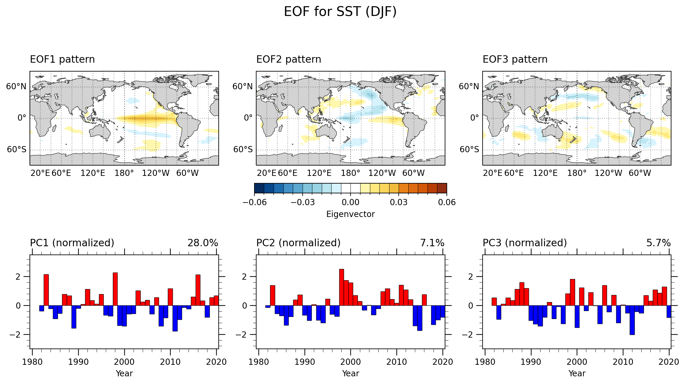
绘图 | 保存图片
fig = plt.figure(figsize=(14, 6),dpi=200)
grid = fig.add_gridspec(ncols=3, nrows=3, hspace=0.4)

ax1, fill1 = makefig(evec,0, grid[0:2,0])
ax2, fill2 = makefig(evec,1, grid[0:2,1])
ax3, fill3 = makefig(evec,2, grid[0:2,2])

fig.colorbar(fill2,
                 ax=[ax1,ax2,ax3],
                 ticks=np.linspace(-0.06, 0.06, 5),
                 drawedges=True,
                 label='Eigenvector',
                 orientation='horizontal',
                 shrink=0.3,
                 pad=0.08,
                 extendfrac='auto',
                 extendrect=True)

ax1 = make_bar_plot(pcs,0,grid[2,0])
ax2 = make_bar_plot(pcs,1,grid[2,1])
ax3 = make_bar_plot(pcs,2,grid[2,2])


fig.suptitle('EOF for SST (DJF)', fontsize=16, y=0.9)

plt.draw()
plt.savefig(fnFIG+".png")
展示绘图结果

未去线性趋势结果
- 可以对比发现,未去掉线性趋势,对于模态的影响在第三模态,其空间patter以及PC的结果存在较大差异;而前两个模态影响较小。但是这个仅仅是对于该区域来说,对于其他区域的影响仍需要进一步探究。
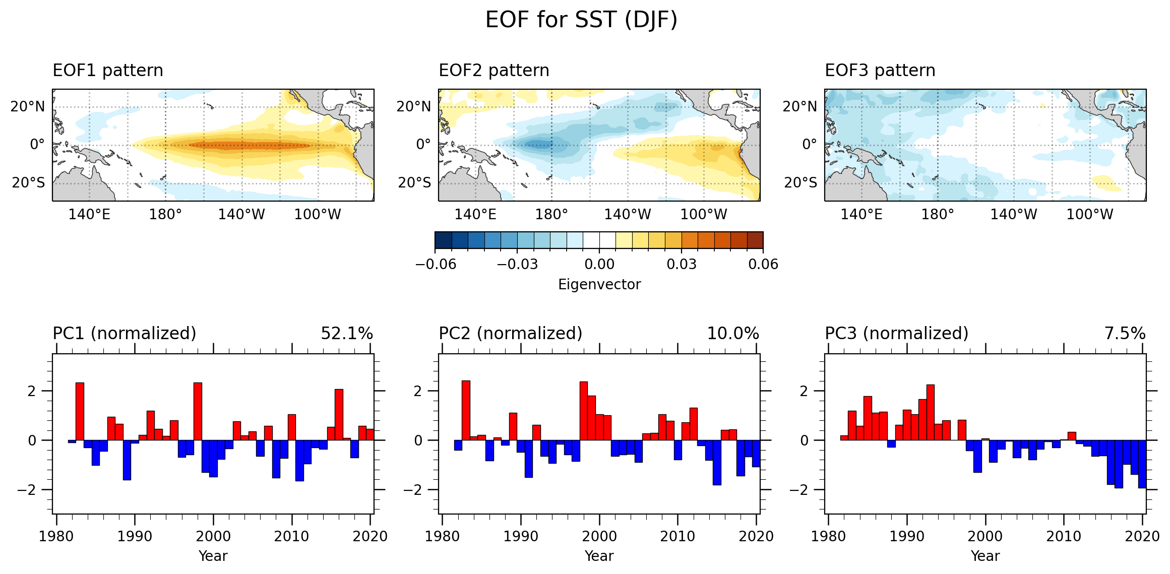
未加权处理结果
- 对于此区域来看,加权的结果对于分析影响较小。

绘制全球范围的EOF分析
未使用异常数据 | 全球

未使用异常数据 | 中太平洋
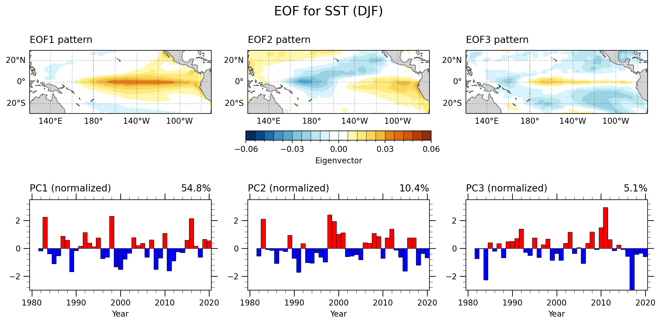
- 对于是否使用异常SST来看,对于主导模态结果影响较小;但是个人感觉来说更取决于你所关注的研究方向。
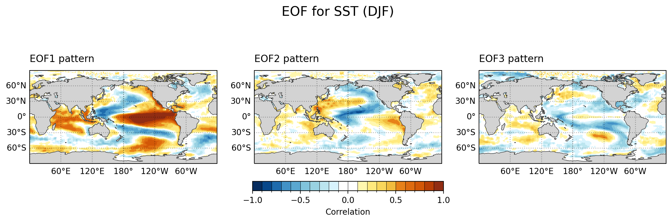
绘制相关系数空间分布
def makefig2(dat, ieof, grid_space):

  ax = fig.add_subplot(grid_space,
          projection=ccrs.PlateCarree(central_longitude=180))
  ax.coastlines(linewidth=0.5, alpha=0.6)

  gl = ax.gridlines(crs=ccrs.PlateCarree(),
                  draw_labels=True,
                  dms=False,
                  x_inline=False,
                  y_inline=False,
                  linewidth=1,
                  linestyle='dotted',
                  color="black",
                  alpha=0.3)
  gl.top_labels = False
  gl.right_labels = False
  gl.rotate_labels = False
  gvutil.add_major_minor_ticks(ax, labelsize=10)
  gvutil.add_lat_lon_ticklabels(ax)
  newcmp = cmaps.BlueYellowRed
  index = [5, 20,  35, 50, 65, 85, 95, 110, 125,  0, 0, 135, 150,  165, 180, 200, 210, 220, 235, 250 ]
  color_list = [newcmp[i].colors for i in index]
  #-- Change to white
  color_list[9]=[ 1., 1., 1.]
  color_list[10]=[ 1., 1., 1.]
  kwargs = dict(
    vmin = -1.0,
    vmax = 1.0,
    levels = 21,
    colors=color_list,
    add_colorbar=False,  # allow for colorbar specification later
    transform=ccrs.PlateCarree(),  # ds projection
  )

  fillplot = dat[:,:].plot.contourf(ax=ax,  **kwargs)

  ax.add_feature(cfeature.LAND, facecolor='lightgray', zorder=1)
  ax.add_feature(cfeature.COASTLINE, edgecolor='gray', linewidth=0.5, zorder=1)

  gvutil.set_titles_and_labels(ax,
                             lefttitle=f'EOF{ieof+1} pattern',
                             lefttitlefontsize=12,
                             righttitle='',
                             righttitlefontsize=12,
                             maintitle='',
                             xlabel="",
                             ylabel="")

  return ax, fillplot


# Show the plot
fig = plt.figure(figsize=(14, 8),dpi=200)
grid = fig.add_gridspec(ncols=3, nrows=3, hspace=0.4)
ax1, fill1 = makefig2(cor1,0, grid[0:2,0])
ax2, fill2 = makefig2(cor2,1, grid[0:2,1])
ax3, fill3 = makefig2(cor3,2, grid[0:2,2])
fig.colorbar(fill2,
                 ax=[ax1,ax2,ax3],
                 ticks=np.linspace(-1.0, 1.0, 5),
                 drawedges=True,
                 label='Correlation',
                 orientation='horizontal',
                 shrink=0.3,
                 pad=0.08,
                 extendfrac='auto',
                 extendrect=True)
fig.suptitle('EOF for SST (DJF)', fontsize=16, y=0.85)
plt.draw()
plt.savefig(fnFIG+"corr.png",bbox_inches='tight')
https://geocat-viz.readthedocs.io/en/latest/installation.html
https://geocat-viz.readthedocs.io/en/latest/examples.html
http://unidata.github.io/netcdf4-python/
https://geocat-examples.readthedocs.io/en/latest/gallery/index.html
https://climate.usu.edu/people/yoshi/pyclm101/index.html
https://docs.xarray.dev/en/stable/gallery.html
本文由mdnice多平台发布


 1万+
1万+


 被折叠的 条评论
为什么被折叠?
被折叠的 条评论
为什么被折叠?
 到【灌水乐园】发言


