


写在前面
当涉及到绘制空间分布图时,有一些常见的绘图美化技巧可以让你的图表看起来更加专业和吸引人。以下是一些可能有用的技巧:
-
添加经纬度刻度标签之间的小刻度线:通过添加经纬度刻度之间的小刻度线,可以使得地图上的刻度更加清晰和易于阅读。这可以通过使用Cartopy库中的gridlines()函数来实现,设置draw_labels=False并调整linewidth参数来控制小刻度线的宽度。
-
共享colorbar:当绘制多个子图时,尤其是它们共享相同的数据范围时,共享一个colorbar可以使得图表更加一致和易于比较。你可以使用matplotlib的colorbar()函数,并设置ax参数来指定colorbar所在的轴。
-
调整字体和标签大小:通过调整字体和标签的大小,可以使得地图上的文字更加清晰可读。你可以使用matplotlib的tick_params()函数来设置刻度标签的大小,以及使用set_title()、set_xlabel()和set_ylabel()函数来设置标题和标签的大小。
-
添加地图背景和边界:通过添加地图背景和边界,可以增强地图的视觉效果,并提供更多的上下文信息。你可以使用Cartopy库中的add_feature()函数来添加陆地和海洋的背景,以及使用coastlines()函数来添加海岸线。
-
设置颜色条标签:当使用颜色条来表示数据范围时,设置颜色条的标签可以帮助读者理解数据的含义。你可以使用matplotlib的colorbar()函数,并使用set_label()函数来设置颜色条的标签。
通过使用这些绘图美化技巧,你可以使得你的空间分布图更加吸引人,更具有信息量,从而更好地传达你的科学发现或分析结果。这里,将python实现上述功能的代码记录下来,方便下次好找。
python代码
import numpy as np
import pandas as pd
import xarray as xr
import cartopy.crs as ccrs
import cartopy.feature as cfeature
import matplotlib.ticker as ticker
import matplotlib.pyplot as plt
from cartopy.mpl.ticker import LongitudeFormatter, LatitudeFormatter
import matplotlib.patheffects as PathEffects
import cmaps
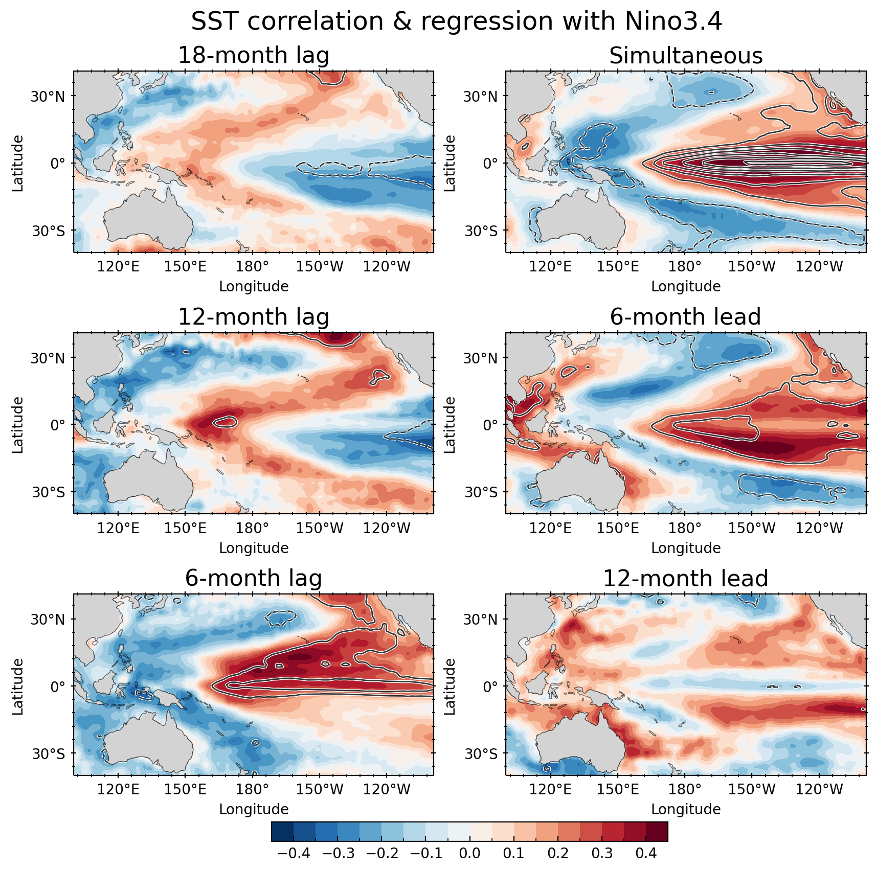
这里,只分享绘图部分的代码,如上图所示,下面依次解释实现的代码块:
- 设置绘图显示的区域、并添加经纬度刻度
这里为了方便调整区域范围,通过一个参数box = [100,261,-40,41,这样只需要更改里面的经纬度数值就好了。四个数值分别表示:Lon_min,Lon_max,Lat_min,Lat_max
box = [100,261,-40,41]
# Set axes limits & tick values
ax.set_xlim(box[0], box[1])
ax.set_ylim(box[2], box[3])

# Label longitude and latitude
ax.set_extent(box,crs=ccrs.PlateCarree())
ax.set_xticks(np.arange(box[0], box[1], 20), crs=ccrs.PlateCarree())
ax.set_yticks(np.arange(box[2], box[3], 10), crs=ccrs.PlateCarree())
#
ax.xaxis.set_major_formatter(LongitudeFormatter(zero_direction_label =False))
ax.yaxis.set_major_formatter(LatitudeFormatter())
- 设置经纬度ticks之间的小刻度
这里为了显示美观,我还额外设置了y轴右侧和x轴顶部的刻度
 # Add minor and major tick lines
  ax.xaxis.set_major_locator(ticker.MultipleLocator(30))
  ax.yaxis.set_major_locator(ticker.MultipleLocator(30))
  ax.xaxis.set_minor_locator(ticker.AutoMinorLocator(5))
  ax.yaxis.set_minor_locator(ticker.AutoMinorLocator(5))


  # 设置右侧和上侧的小刻度
  ax.tick_params(axis='y', direction='inout', which='both', right=True)
  ax.tick_params(axis='x', direction='inout', which='both', top=True)
- 添加海岸线、地形
这没啥好说的,都是固定代码,唯一做了一点变化就是让海岸线的透明度浅一点和边缘的颜色
ax.add_feature(cfeature.LAND, facecolor='lightgray', zorder=1)
ax.add_feature(cfeature.COASTLINE, edgecolor='gray', linewidth=0.5, zorder=1)
ax.coastlines(linewidth=0.5, alpha=0.6)
- 设置共享colorbar
# Create the figure
fig = plt.figure(figsize=(10, 12), dpi=200)
grid = fig.add_gridspec(ncols=2, nrows=3)

# Make the plots
ax1, fill1 = makefig(corP18, regP18, '18-month lag', grid[0, 0], fig)
ax2, fill2 = makefig(corP12, regP12, '12-month lag', grid[1, 0], fig)
ax3, fill3 = makefig(corP6, regP6, '6-month lag', grid[2, 0], fig)
ax4, fill4 = makefig(cor0, reg0, 'Simultaneous', grid[0, 1], fig)
ax5, fill5 = makefig(corM6, regM6, '6-month lead', grid[1, 1], fig)
ax6, fill6 = makefig(corM12, regM12, '12-month lead', grid[2, 1], fig)

# Add colorbar
cb = fig.colorbar(fill6, ax=[ax1, ax2, ax3, ax4, ax5, ax6], orientation='horizontal', shrink=0.5, pad=0.05)
cb.ax.tick_params(which='both', direction='in')
fig.suptitle('SST correlation & regression with Nino3.4', fontsize=18, y=0.9)
这里是定义了一个绘图函数,然后将函数返回的ax,通过fig.colorbar(fill6, ax=[ax1, ax2, ax3, ax4, ax5, ax6])实现多子图共享colorbar的功能.
当然还有其他方法,比如通过手动添加一个ax,用来显示共享的colorbar,这个方法以后看机会再记录吧。
下面是主要的封装绘图函数以及绘图代码,需要注意的是在进行填色图以及等值线绘制时,由于我这里传入的数据是dataarray的格式,可以之间调用contourf和contour函数;而不是传统的ax.contourf(lon,lat,data);ax.contour(lon,lat,data);
def makefig(cor, reg, title, grid_space, fig):
    # Generate axes using Cartopy to draw coastlines
    ax = fig.add_subplot(grid_space, projection=ccrs.PlateCarree(central_longitude=210))


    box = [100,261,-40,41]
    # Set axes limits & tick values
    ax.set_xlim(box[0], box[1])
    ax.set_ylim(box[2], box[3])

    # Label longitude and latitude
    ax.set_extent(box,crs=ccrs.PlateCarree())
    ax.set_xticks(np.arange(box[0], box[1], 20), crs=ccrs.PlateCarree())
    ax.set_yticks(np.arange(box[2], box[3], 10), crs=ccrs.PlateCarree())
    ax.xaxis.set_major_formatter(LongitudeFormatter(zero_direction_label =False))
    ax.yaxis.set_major_formatter(LatitudeFormatter())
    # Add minor and major tick lines
    ax.xaxis.set_major_locator(ticker.MultipleLocator(30))
    ax.yaxis.set_major_locator(ticker.MultipleLocator(30))
    ax.xaxis.set_minor_locator(ticker.AutoMinorLocator(5))
    ax.yaxis.set_minor_locator(ticker.AutoMinorLocator(5))


    # 设置右侧和上侧的小刻度
    ax.tick_params(axis='y', direction='inout', which='both', right=True)
    ax.tick_params(axis='x', direction='inout', which='both', top=True)

    ax.add_feature(cfeature.LAND, facecolor='lightgray', zorder=1)
    ax.add_feature(cfeature.COASTLINE, edgecolor='gray', linewidth=0.5, zorder=1)
    ax.coastlines(linewidth=0.5, alpha=0.6)
    # Contourf-plot data
    fillplot = cor.plot.contourf(ax=ax, levels=21, transform=ccrs.PlateCarree(),add_colorbar=False)

    # Plot line contours
    delc = 0.2
    levels = np.arange(-3, 0, delc)
    levels = np.append(levels, np.arange(delc, 3, delc))
    rad = reg.plot.contour(ax=ax, colors='black', alpha=0.8, linewidths=1.0, levels=levels, transform=ccrs.PlateCarree())
    pe = [PathEffects.withStroke(linewidth=2.0, foreground="w")]
    plt.setp(rad.collections, path_effects=pe)

    # Set titles and labels
    ax.set_title(title, fontsize=16)
    ax.set_xlabel('Longitude')
    ax.set_ylabel('Latitude')

    return ax, fillplot

# Create the figure
fig = plt.figure(figsize=(10, 12), dpi=200)
grid = fig.add_gridspec(ncols=2, nrows=3)

# Make the plots
ax1, fill1 = makefig(corP18, regP18, '18-month lag', grid[0, 0], fig)
ax2, fill2 = makefig(corP12, regP12, '12-month lag', grid[1, 0], fig)
ax3, fill3 = makefig(corP6, regP6, '6-month lag', grid[2, 0], fig)
ax4, fill4 = makefig(cor0, reg0, 'Simultaneous', grid[0, 1], fig)
ax5, fill5 = makefig(corM6, regM6, '6-month lead', grid[1, 1], fig)
ax6, fill6 = makefig(corM12, regM12, '12-month lead', grid[2, 1], fig)

# Add colorbar
cb = fig.colorbar(fill6, ax=[ax1, ax2, ax3, ax4, ax5, ax6], orientation='horizontal', shrink=0.5, pad=0.05)
cb.ax.tick_params(which='both', direction='in')
fig.suptitle('SST correlation & regression with Nino3.4', fontsize=18, y=0.9)

# Show the plot
plt.show()
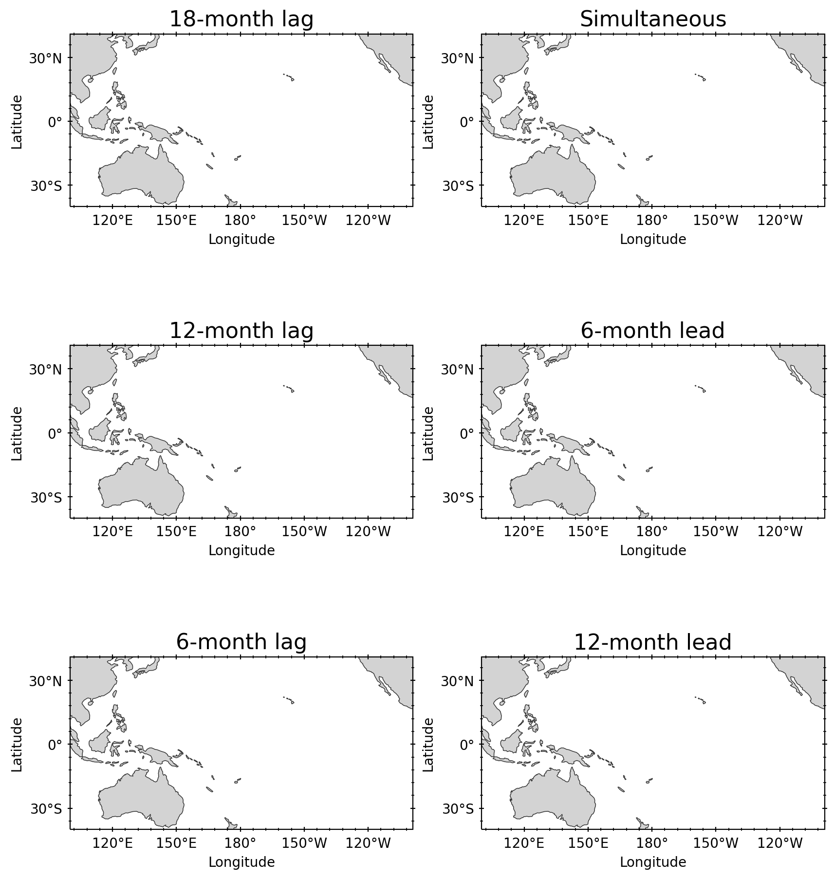
当然了,我这里只是为了图片美观,而添加了一些填色数据,你可以将填色的部分去掉,方便查看效果,如下所示:
def makefig( title, grid_space, fig):
    # Generate axes using Cartopy to draw coastlines
    ax = fig.add_subplot(grid_space, projection=ccrs.PlateCarree(central_longitude=210))


    box = [100,261,-40,41]
    # Set axes limits & tick values
    ax.set_xlim(box[0], box[1])
    ax.set_ylim(box[2], box[3])

    # Label longitude and latitude
    ax.set_extent(box,crs=ccrs.PlateCarree())
    ax.set_xticks(np.arange(box[0], box[1], 20), crs=ccrs.PlateCarree())
    ax.set_yticks(np.arange(box[2], box[3], 10), crs=ccrs.PlateCarree())
    ax.xaxis.set_major_formatter(LongitudeFormatter(zero_direction_label =False))
    ax.yaxis.set_major_formatter(LatitudeFormatter())
    # Add minor and major tick lines
    ax.xaxis.set_major_locator(ticker.MultipleLocator(30))
    ax.yaxis.set_major_locator(ticker.MultipleLocator(30))
    ax.xaxis.set_minor_locator(ticker.AutoMinorLocator(5))
    ax.yaxis.set_minor_locator(ticker.AutoMinorLocator(5))


    # 设置右侧和上侧的小刻度
    ax.tick_params(axis='y', direction='inout', which='both', right=True)
    ax.tick_params(axis='x', direction='inout', which='both', top=True)

    ax.add_feature(cfeature.LAND, facecolor='lightgray', zorder=1)
    ax.add_feature(cfeature.COASTLINE, edgecolor='gray', linewidth=0.5, zorder=1)
    ax.coastlines(linewidth=0.5, alpha=0.6)
    # Contourf-plot data
    # fillplot = cor.plot.contourf(ax=ax, levels=21, transform=ccrs.PlateCarree(),add_colorbar=False)

    # # Plot line contours
    # delc = 0.2
    # levels = np.arange(-3, 0, delc)
    # levels = np.append(levels, np.arange(delc, 3, delc))
    # rad = reg.plot.contour(ax=ax, colors='black', alpha=0.8, linewidths=1.0, levels=levels, transform=ccrs.PlateCarree())
    # pe = [PathEffects.withStroke(linewidth=2.0, foreground="w")]
    # plt.setp(rad.collections, path_effects=pe)

    # Set titles and labels
    ax.set_title(title, fontsize=16)
    ax.set_xlabel('Longitude')
    ax.set_ylabel('Latitude')

    return ax,

# Create the figure
fig = plt.figure(figsize=(10, 12), dpi=200)
grid = fig.add_gridspec(ncols=2, nrows=3)

# Make the plots
ax1,  = makefig( '18-month lag', grid[0, 0], fig)
ax2,  = makefig( '12-month lag', grid[1, 0], fig)
ax3,  = makefig( '6-month lag', grid[2, 0], fig)
ax4,  = makefig( 'Simultaneous', grid[0, 1], fig)
ax5,  = makefig( '6-month lead', grid[1, 1], fig)
ax6,  = makefig( '12-month lead', grid[2, 1], fig)
本文由mdnice多平台发布


 1229
1229


 被折叠的 条评论
为什么被折叠?
被折叠的 条评论
为什么被折叠?
 到【灌水乐园】发言


