


文章目录
动画
动画(animation)通过设置多个节点来精确控制一个或一组动画,用来实现复杂的动画效果
相比较过渡,动画可以实现更多变化,更多控制,连续自动播放等效果
制作动画步骤
- 定义动画
- 调用动画
keyframes定义动画
@keyframes 动画名称{
	0%{
		样式
	}

	100%{
		样式
	}
}
- 0%是动画的开始,100%是动画结尾。这样的规则就是动画序列
- 在@keyframes中规定某项CSS样式,就能创建由当前样式逐渐改为新样式的动画效果
- 动画是使元素从一种样式逐渐变化为另一种样式的效果,可以改变任意多的样式以及次数
- 用百分比规定变化发生的时间,或用关键词"from"和"to",等同于0%和100%
使用动画
/*调用动画*/
animation-name:动画名称;
animation-duration:持续时间;
 <style>
        /* 一打开页面,盒子移动 */
        div {
            width: 200px;
            height: 200px;
            background-color: tomato;

            /* 使用动画 */
            animation-name: move;

            /* 持续时间 */
            animation-duration: 2s;

        }


        /* 定义动画 */
        @keyframes move {

            /* 开始状态 */
            0% {
                transform: translateX(0px);
            }

            /* 结束状态 */
            100% {
                transform: translateX(600px);
            }
        }
    </style>
</head>

<body>
    <div></div>
</body>
动画序列
 <style>
        div {
            width: 100px;
            height: 100px;
            background-color: orange;

            animation-name: move;
            animation-duration: 2s;
        }

        /* 动画序列*/
        /* from to等价于 0% 100% */
        @keyframes move {

        	/*里面的百分比就是总的时间的划分*/

            0% {
                transform: translate(0px, 0px);
            }

            25% {
                transform: translate(600px, 0px);
            }

            50% {
                transform: translate(600px, 400px);
            }

            75% {
                transform: translate(0px, 400px);
            }

            100% {
                transform: translate(0px, 0px);
            }

        }
    </style>
</head>

<body>
    <div></div>
</body>

动画属性
| 属性 | 描述 |
|---|---|
| @keyframes | 定义动画 |
| animation | 所有动画属性的简写属性,除了animation-play-state属性 |
| animation-name | @keyframes定义动画的名称 |
| animation-duration | 动画完成一个周期所花费的秒或毫秒。默认是0 |
| animation-time-function | 动画的速度曲线,默认"ease" |
| animation-delay | 动画何时开始,默认0 |
| animation-iteration-count | 动画被播放次数,默认1,还有infinite |
| animation-direction | 动画是否在下一周期逆向播放,默认是"normal",alternate逆播放 |
| animation-play-state | 动画是否正在运行或暂停,默认是"running",有pause。可以鼠标hover时,设置动画暂停… |
| animation-fill-mode | 规定动画结束后状态,保持forwards,回到起始backwards |
 <style>
        @keyframes move {
            0% {
                transform: translate(0, 0);
            }

            100% {
                transform: translate(1000px, 0);
            }

        }

        div {
            width: 100px;
            height: 100px;
            background-color: orange;
            /* 动画名称 */
            animation-name: move;
            /* 持续时间 */
            animation-duration: 2s;
            /* 速度曲线 */
            animation-timing-function: ease;
            /* 何时开始 */
            /* animation-delay: 1s; */

            /* 播放次数 */
            animation-iteration-count: infinite;

            /* 是否反方向播放 */
            animation-direction: alternate;

            /* 动画结束后的状态,默认是backwards 回到起始状态 可以停留在结束状态 */
            /* animation-fill-mode: forwards; */

        }

        div:hover {

            animation-play-state: paused;
        }
    </style>
</head>

<body>
    <div></div>
</body>
动画简写属性
animation:动画名称 持续时间 运动曲线 何时开始 播放次数 是否反方向 动画起始或结束状态
animation: move 5s linear 2s infinite alternate;
- 动画简写属性不包括animation-play-state
        div {
            width: 100px;
            height: 100px;
            background-color: orange;
            animation: move 2s linear 1s infinite alternate;

        }
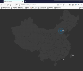
案例-[大数据图]
  <style>
        body {
            background-color: #333;
        }

        .map {
            position: relative;
            width: 747px;
            height: 617px;
            background: url(map.png) no-repeat;
            margin: 0 auto;

        }

        .city {
            position: absolute;
            top: 227px;
            right: 193px;
            color: #fff;

        }

        .dotted {
            width: 8px;
            height: 8px;
            background-color: #09f;
            border-radius: 50%;
        }

        .city div[class^="pulse"] {
            /* 保证小波纹在父盒子里面水平垂直居中 放大之后就会中心向四周发散 */
            position: absolute;
            top: 50%;
            left: 50%;
            transform: translate(-50%, -50%);
            width: 8px;
            height: 8px;
            box-shadow: 0 0 12px #009dfd;
            border-radius: 50%;

            animation: pulse 1.2s linear infinite;
        }


        .city div.pulse2 {
            animation-delay: 0.4s;
        }

        .city div.pulse3 {
            animation: 0.8s;
        }


        @keyframes pulse {


            70% {
                width: 40px;
                height: 40px;
                opacity: 1;
            }

            100% {
                width: 70px;
                height: 70px;
                opacity: 0;
            }
        }
    </style>
</head>

<body>

    <div class="map">
        <div class="city">
            <div class="dotted"></div>
            <div class="pulse1"></div>
            <div class="pulse2"></div>
            <div class="pulse3"></div>
        </div>
    </div>
</body>
思路:
- 首先body设置灰色的背景颜色,map盒子设置地图背景图片。
- city父盒子定位到城市位置。
- city盒子中有三个子盒子,dotted,pulse1,pulse2,pulse3,其中dotted是中心原点,设置固定宽高,以及背景颜色,border-radius将盒子变为圆形
- 三个pulse波纹盒子都利用定位+translate定位于父盒子中间,设置盒子阴影。
- 定义动画:70%时波纹盒子高度宽度变大,透明度不变。100%再次变大 ,透明度为0 ,产生类似渐变的效果(之所以不用scale是因为scale会把阴影同时变大)
- 引用动画:linear,匀速,infinite无数次,三个盒子动画开始的时间animation-delay设置的 开始时间不同
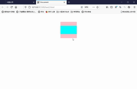
步长-steps
animation-timing-function:规定动画的速度曲线,默认是"ease"
| 值 | 描述 |
|---|---|
| linear | 动画从头到尾速度相同,匀速 |
| ease | 默认。以低速开始,然后加快,结束前变慢 |
| ease-in | 动画以低速开始 |
| ease-out | 动画以低速开始和结束 |
| steps() | 指定了时间函数中的间隔数量(步长) |
<style>
        div {
            width: 0;
            height: 30px;
            font-size: 20px;
            background-color: pink;
            animation: w 4s steps(10) forwards;
        }

        @keyframes w {
            0% {
                width: 0;

            }

            100% {
                width: 200px;
            }
        }
    </style>
</head>

<body>

    <div></div>
</body>
打字机效果
     div {
            width: 0;
            height: 30px;
            line-height: 30pX;
            font-size: 20px;
            /* 强制一行显示 */
            white-space: nowrap;
            overflow: hidden;

            /* steps 就是分几步来完成动画,有了steps就不要再写ease或linear */
            animation: w 4s steps(10) forwards;
        }

        @keyframes w {
            0% {
                width: 0;

            }

            100% {
                width: 200px;
            }
        }
    </style>
</head>

<body>

    <div>
        这里真的还有十个字吗
    </div>
</body>
- div动画结束时有200px,字体大小为20px,十个字,则步长为10
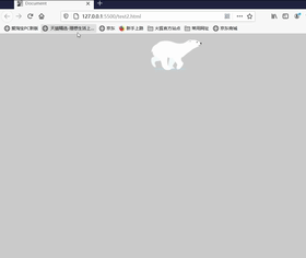
奔跑的熊
<style>
        body {
            position: relative;
            background-color: #ccc;
        }

        div {
            position: absolute;
            width: 200px;
            height: 100px;
            background: url(bear.png) no-repeat;

            /*元素可以添加多个动画,用逗号分隔  */
            animation: bear 1s steps(8) infinite, move 3s forwards;
        }

        @keyframes bear {
            0% {
                background-position-x: 0
            }

            100% {
                background-position-x: -1600px
            }
        }


        @keyframes move {
            0% {
                left: 0;
            }

            100% {
                left: 50%;
                transform: translateX(-50%);

            }
        }
    </style>
</head>

<body>

    <div></div>
</body>
思路:
- 一个元素可以定义多个动画。首先,图片为熊奔跑的状态分解图。使图片向左移动,则达到奔跑状态。图片宽1600,高100px,8种形态。因此,一个形态的bear图片宽度为200px,使图片背景向左,background-position-x(动画)则为奔跑状态。动画步长为8
- 然后是bear跑到中间的位置。即在奔跑的bear状态下,使用left+translateX使bear跑到中间位置
3D转换
初识3D转换
- 近大远小
- 物体后面遮挡不可见
三维坐标系
-
x轴:水平向右 【x右边是正值,左边是负值】
-
y轴:垂直向下 【y下面是正值,上面是负值】
-
z轴:垂直屏幕【往外面是正值,往里面是负值】
-
3D位移:translate3D(x,y,z)
-
3D旋转:rotete3D(x,y,z)
-
透视:perspective
-
3D呈现 transfrom-style
位移-translate3d
- transform:translateX(100px):x轴移动
- transform:translateY(100px):y轴移动
- transform:translateZ(100px):z轴移动,translateZ一般用px单位,不用百分比
- transform:translate(x,y,z);【x,y,z是不能省略的,如果没有要写0】
    <style>
        div {
            width: 200px;
            height: 200px;
            background-color: pink;
            /* 需借助透视才能看到效果 */
            transform: translate3d(100px, 100px, 45px);

            /* transform: translateX(100px) translateY(100px) translateZ(100px); */
        }
    </style>
</head>

<body>

    <div></div>
</body>
透视-perspective
在2D平面产生近大远小视觉立体,但是只是效果二维的
- 如果想要在网页产生3D效果,需要透视
- 透视我们也称为视距:视距就是人的眼睛到屏幕的距离
- 距离视觉点越近的在电脑平面成像越大,越远越小
- 透视的单位是px
透视越小,物体越大
透视越大,物体越小
透视写在被观察元素的父盒子上面
d:就是视距,视距就是一个距离人的眼睛到屏幕的距离(透视)
z:就是z轴,物体距离屏幕的距离,z轴越大(正值)我们看到的物体就越大(3Dz轴)
 <style>
        .father {

            width: 500px;
            height: 500px;
            border: 1px solid #000;
            margin: 0 auto;

            /* 透视写到被观察元素的父盒子上面 */
            perspective: 300px;
        }

        .son {
            width: 200px;
            height: 200px;
            background-color: pink;

            transform: translate3d(100px, 100px, 100px);

        }
    </style>
</head>

<body>
    <div class="father">
        <div class="son"></div>
    </div>
</body>
视距一定,div设置z轴大小不同,则视觉大小不同,从而产生不同的立体效果
 <style>
        body {
            /* 透视写到被观察元素的父盒子上面 */
            /* 视距固定 */
            perspective: 500px;
        }

        div {
            width: 200px;
            height: 200px;
            margin: 60px auto;
            background-color: pink
        }


        .one {
            transform: translateZ(100px);
        }

        .two {
            transform: translateZ(150px);
        }

        .three {
            transform: translateZ(200px);
        }
    </style>
</head>

<body>
    <div class="one"></div>
    <div class="two"></div>
    <div class="three"></div>
</body>

旋转-rotate3d
- 3d旋转指可以让元素在三维平面内沿着x轴,y轴,z轴或自定义轴进行旋转
语法
- transform:rotateX(45deg):x轴沿着正方向旋转45度
- transform:rotateY(45deg):y轴沿着正方向旋转45度
- transform:rotateZ(45deg):Z轴沿着正方向旋转45度
- transform:rotate3d(x,y,z,deg):沿着自定义轴旋转 deg为角度
rotateX
沿着x轴旋转

   <style>
        img {
            display: block;
            width: 400px;
            margin: 100px auto;
            transition: all 1s;
        }

        img:hover {
            transform: rotateX(180deg);
        }
    </style>
</head>

<body>
    <img src="xiaoxin.jpg" alt="">
</body>
结合透视,呈现3D效果
 <style>
        body {
            /* 近大远小,透视越小,离屏幕越近,3D效果越明显 */
            perspective: 300px;
        }

        img {
            display: block;
            width: 400px;
            margin: 100px auto;
            transition: all 1s;
        }

        img:hover {
            transform: rotateX(180deg);
        }
    </style>
</head>

<body>
    <img src="xiaoxin.jpg" alt="">
</body>
透视正负值
transform: rotateX(45deg);

transform: rotateX(-45deg);

rotateY
body {
            /* 近大远小,透视越小,离屏幕越近,3D效果越明显 */
            perspective: 300px;
        }

        img {
            display: block;
            width: 400px;
            margin: 100px auto;
            transition: all 1s;
        }

        img:hover {
            transform: rotateY(45deg);
        }
    </style>
</head>

<body>
    <img src="xiaoxin.jpg" alt="">
</body>

-45deg

rotateZ
与2drotate类似
  <style>
        body {
            /* 近大远小,透视越小,离屏幕越近,3D效果越明显 */
            perspective: 300px;
        }

        img {
            display: block;
            width: 400px;
            margin: 100px auto;
            transition: all 1s;
        }

        img:hover {
            transform: rotateZ(45deg);
        }
    </style>
</head>

<body>
    <img src="xiaoxin.jpg" alt="">
</body>

rotate3d
transform:rotate3d(x,y,z,deg):沿着自定义轴旋转deg
xyz是表示旋转轴的矢量,是表示你是否希望沿着该轴旋转,最后一个表示旋转的角度
- transform3d:rotate3d(1,0,0,45deg)就是沿着x轴旋转45deg
- transform3d:rotate3d(1,1,0):沿着对角线旋转45deg
 <style>
        body {
            /* 近大远小,透视越小,离屏幕越近,3D效果越明显 */
            perspective: 300px;
        }

        img {
            display: block;
            width: 400px;
            margin: 100px auto;
            transition: all 1s;
        }

        img:hover {
            /* transform: rotate(x,y,z,deg) */
            transform: rotate3d(2, 1, 0, 45deg);
        }
    </style>
</head>

<body>
    <img src="xiaoxin.jpg" alt="">
</body>

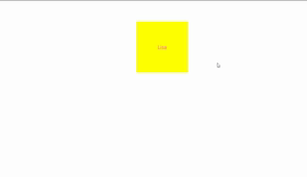
transform-style3d呈现
- 控制子元素是否开启三维立体环境
- transform-style:flat子元素不开启3d立体空间 默认的
- transform-style:perserve-3d子元素开启立体空间
- 代码写给父级,但是影响盒子
  body {
            /* 因为box也要旋转rotate所以写给body */
            perspective: 500px;
        }

        .box {
            position: relative;
            width: 200px;
            height: 200px;
            margin: 100px auto;
            transition: all 2s;
            /* 使子元素也保持3d效果 */
            transform-style: preserve-3d;

        }

        .box div {
            position: absolute;
            top: 0;
            left: 0;
            width: 100%;
            height: 100%;
            background-color: pink;

        }

        .box:hover {
            transform: rotateY(60deg);
        }


        .box div:last-child {
            background-color: aqua;
            transform: rotateX(60deg);

        }
    </style>
</head>

<body>
    <div class="box">
        <div></div>
        <div></div>
    </div>
</body>
未添加preserve-3d效果:子元素无3d效果
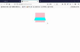
两面盒子反转案例
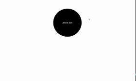
 <style>
        /* 旋转的是box */
        body {
            perspective: 600px;
        }

        .box {
            position: relative;
            width: 300px;
            height: 300px;
            margin: 100px auto;
            transition: all 1s;

            /* 让背面的Pink盒子保持立体空间 */
            transform-style: preserve-3d;
        }

        .box:hover {
            transform: rotateY(180deg);
        }


        .box div {
            position: absolute;
            left: 0;
            top: 0;
            width: 100%;
            height: 100%;
            text-align: center;
            line-height: 300px;
            border-radius: 50%;
            color: #fff;
            font-size: 20px
        }

        .black {
            background-color: black;
            z-index: 1;

        }

        .pink {
            background-color: pink;
            /* 先按Y轴旋转  是其与black盒子背靠背 */
            transform: rotateY(180deg);
        }
    </style>
</head>

<body>
    <div class="box">
        <div class="black">Jennie Kim</div>
        <div class="pink">Jisoo</div>
    </div>
</body>
思路
-
首先一个父盒子box,box中有两个子盒子,分别甚至不同的背景颜色,border-radius:50%变为圆形。使用定位absolute,盒子叠放在一起。
-
然后将提升黑色盒子的z-index,放置最上面,将粉色盒子Y轴旋转180度,将两个盒子变为背靠背状态
-
然后再按Y轴旋转父盒子.box,则看到的是粉色盒子的正面效果
-
给父盒子旋转的同时,要使用tranform-style:preserve-3d,使子盒子保持3d效果
3D导航栏
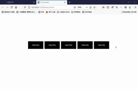
 <style>
        * {
            margin: 0;
            padding: 0;
        }

        ul {
            margin: 400px;
        }

        li {
            list-style: none;
            width: 200px;
            height: 100px;
            float: left;
            margin: 0 20px;
            background-color: springgreen;
            /* 透视 */
            perspective: 500px;
        }

        .box {
            position: relative;
            width: 100%;
            height: 100%;
            line-height: 100px;
            text-align: center;
            color: #fff;
            font-size: 20px;
            transition: all .4s;

            /* 使子元素保持3D效果 */
            transform-style: preserve-3d;

        }

        .box:hover {
            /* 父盒子box,x轴旋转90度,使粉色盒子反转过来 */
            transform: rotateX(90deg);
        }

        .black {
            position: absolute;
            width: 100%;
            height: 100%;
            background-color: black;
            z-index: 1;

            transform: translateZ(50px);
        }

        .pink {
            position: absolute;
            width: 100%;
            height: 100%;
            background-color: hotpink;

            /* 使粉色盒子位于黑色盒子的下方 */
            transform: translateY(50px) rotateX(-90deg);

        }
    </style>
</head>

<body>
    <ul>
        <li>
            <div class="box">
                <div class="black">Jennie Kim</div>
                <div class="pink">Jisoo</div>
            </div>
        </li>

        <li>
            <div class="box">
                <div class="black">Jennie Kim</div>
                <div class="pink">Jisoo</div>
            </div>
        </li>

        <li>
            <div class="box">
                <div class="black">Jennie Kim</div>
                <div class="pink">Jisoo</div>
            </div>
        </li>

        <li>
            <div class="box">
                <div class="black">Jennie Kim</div>
                <div class="pink">Jisoo</div>
            </div>
        </li>

        <li>
            <div class="box">
                <div class="black">Jennie Kim</div>
                <div class="pink">Jisoo</div>
            </div>
        </li>
    </ul>

</body>
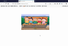
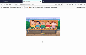
旋转盒子
 <style>
        body {

            /* 透视 */
            perspective: 1000px;
        }

        section {
            position: relative;
            width: 300px;
            height: 200px;
            margin: 100px auto;

            transform-style: preserve-3d;


            /* 添加动画效果 */
            animation: rotate linear 10s infinite;

        }

        section:hover {
            animation-play-state: paused;
        }

        @keyframes rotate {
            0% {
                transform: rotateY(0);
            }

            100% {
                transform: rotateY(360deg);
            }
        }

        section div {
            position: absolute;
            left: 0;
            top: 0;
            width: 100%;
            height: 100%;
            background: url(coco.jpg) no-repeat;

        }


        /* 6个盒子 360/6  每个旋转+30度 */

        section div:nth-child(1) {
            transform: translateZ(300px);
        }

        section div:nth-child(2) {
            /* 先旋转,后移动 */
            transform: rotateY(60deg) translateZ(300px);
        }

        section div:nth-child(3) {
            transform: rotateY(120deg) translateZ(300px);
        }

        section div:nth-child(4) {
            transform: rotateY(180deg) translateZ(300px);
        }

        section div:nth-child(5) {
            transform: rotateY(240deg) translateZ(300px);
        }

        section div:nth-child(6) {
            transform: rotateY(300deg) translateZ(300px);
        }
    </style>
</head>

<body>

    <section>
        <div></div>
        <div></div>
        <div></div>
        <div></div>
        <div></div>
        <div></div>
        <div></div>
    </section>

</body>
思路:

首先六张的底片用定位,将其叠放在一起。固定好透视(视距)
图片都围绕Y轴进行旋转,首先第一盒子是面向屏幕方向的,只需将其在Z轴移动一定的方向,也就是更加面向屏幕的方向。
然后每张图片,向Y轴移动一定的方向,并且,Z轴移动相同的距离(Y轴旋转,Z轴有一定的方向则呈现不同角度的切斜防线)
然后将添加动画,即父盒子从0% 0度到100% 360度
浏览器私有前缀
浏览器私有前缀是为了兼容老版本的写法,比较新版本的浏览器无需添加
私有前缀
- -moz-:代表firefox浏览器私有属性
- -ms-:代表IE浏览器私有属性
- -webkit-:代表safari、chrome私有属性
- -o-:代表Opera私有属性
提倡写法
-moz-border-radius: 10px;
-webkit-border-radius: 10px;
-o-border-radius: 10px;
border-radius: 10px;


 947
947


 被折叠的 条评论
为什么被折叠?
被折叠的 条评论
为什么被折叠?
 到【灌水乐园】发言


