


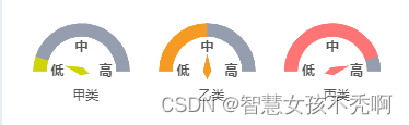
前端之路任重道远,这是我最近做的一个驾驶舱的仪表盘,过程实现比较繁琐,但好在效果不错,欢迎小伙伴提意见改进
上代码,因为要多次使用所以封装成了组件
子组件:
<template>
  <div id="gauge-chart" ref="ring" style="width: 100%; height: 100%"></div>
</template>

<script>
import * as echarts from "echarts";

export default {
  props: {
    textName: {
      type: String,
    },
    value: {
      type: Number,
    },
    color: {
      type: String,
    },
  },
  data() {
    return {};
  },
  mounted() {
    this.initEcharts(this.ringData);
  },
  created() {},
  watch: {
    ringData: {
      handler(newValue, oldValue) {
        //把新值赋值给我们的属性数据
        this.value = newValue;
        this.initEcharts(); //刷新echarts图表
      },
      deep: true,
    },
  },
  methods: {
    initEcharts() {
      // 基本柱状图
      const option = {
        title: {
          text: this.textName,
          itemGap: 3,
          x: "49%",
          y: "76%",
          textAlign: "center",
          textStyle: {
            fontWeight: "normal",
            fontSize: 12,
            color: "#555555",
          },
          subtextStyle: {
            fontWeight: "normal",
            fontSize: 12,
            color: "#555555",
            lineHeight: 14,
          },
        },
        tooltip: {
          position: "inside",
          formatter: "甲类总人数 100<br>占区域总人口 0.01%<br>鼠疫 100",
          textStyle: {
            fontSize: 10,
          },
        },
        series: [
          {
            name: "",
            type: "gauge",
            center: ["50%", "65%"],
            radius: "90%",
            min: 0, //最小刻度
            max: 100, //最大刻度
            splitNumber: 8, //刻度数量
            startAngle: 180,
            endAngle: 0,
            axisLine: {
              show: true,
              lineStyle: {
                width: 1,
                color: [[1, "rgba(0,0,0,0)"]],
              },
            }, //仪表盘轴线
            axisLabel: {
              show: false,
            }, //刻度标签。
            axisTick: {
              show: false,
            }, //
父组件传值
  <div
                style="height: 14vh; width: 100%"
                class="flex mb20 space-around"
              >
                <Dashboard
                  :textName="'甲类'"
                  :value="10"
                  :color="'#cfd409'"
                ></Dashboard>
                <Dashboard
                  :textName="'乙类'"
                  :value="50"
                  :color="'#f59a23'"
                ></Dashboard>
                <Dashboard
                  :textName="'丙类'"
                  :value="90"
                  :color="'#ff7474'"
                ></Dashboard>
              </div>


 2704
2704


 被折叠的 条评论
为什么被折叠?
被折叠的 条评论
为什么被折叠?
 到【灌水乐园】发言


