


图片渐变放大(制作头像)
鼠标放上后变大,可以用作设置头像


<img src="./blue.jpg" />
	<style type="text/css">
		body{
			text-align: center;
		}

		img{
			border-radius:50%;
			/*过度放大效果*/
			transition:all 0.5s;
			/*由于各个浏览器不同,所以要写前缀*/
			-webkit-transition:all 0.5s;
			-o-transition:all 0.5s;
         /*鼠标进入的时候有手型*/
			cursor: pointer;
		}
		img:hover{
			/*变形属性,缩放1.1倍*/
			transform:scale(1.1);

		}
	</style>
点击对应元素,会消失


<style type="text/css">
		{
			padding:0;
			margin:0;
		}
		.demo{
			border: 1px solid #ccc;
			width:340px;
			margin:50px auto;
			padding:10px;
		}
		.demo li{
			float:left;
			list-style:none;
			padding :2px;
			border: 1px solid #0f0;
			margin-right:1px;
			width:20px;
			height:20px;
		}
		.clearfix{
		clear:both;
		/*里面的内容能陈开容器*/
		overflow: auto;
		}

		.demo a{
			display:block;
			width:20px;
			height:20px;
			text-align:center;
			border-radius:10px;
			background-color: #f36;
			text-decoration:none;
		}
		/*CSS3新屬性*/
		/*选择第一个元素,背景是绿色*/
		.demo li:first-child{
			background-color:#0f0;
		}
		.demo li:last-child{
			background-color:#0f0;
		}
		/*确定哪一个变背景颜色,全变就把5变成n各行换色,就乘个数,偶数成2或写成even 奇数乘2+1 或者写成odd*/
		.demo li:nth-child(3){
			background-color:#000;
		}
		/*选择第几个之后的便签,就写n+几*/
		.demo li:nth-child(n+6){
			background-color:#0f0;
		}
		/*只有一个子元素的时候才变色,last-of-type限定容器*/
		.demo li:only-child{
			background-color:#0f0;
		}
		/*empty元素是空的才能选上。*/
		.demo li:empty{
			background-color: #0f0;

		}

	</style>
<div class="demo clearfix" >
		<ul class="clearfix">
			<p>0</p>
			<li><a href="">1</a></li>
			<li><a href="">2</a></li>
			<li><a href="">3</a></li>
			<li><a href="">4</a></li>
			<li><a href="">5</a></li>
			<li><a href="">6</a></li>
			<li><a href="">7</a></li>
			<li><a href="">8</a></li>
			<li><a href="">9</a></li>
			<li><a href="">10</a></li>
		</ul>
	</div>

	<div class="demo clearfix" >
		<ul class="clearfix">
			<li></li>
			<li></li>
		</ul>
	</div>
css画个圆

.demo {
			width: 100px;
			height: 200px;
			border: 1px solid #ccc;
			background-color: #F66;
			margin: 50px auto;
			border-radius: 100px 0px 0px 100px;
			float: left;
		}

		.rig {
			width: 100px;
			height: 200px;
			border1px solid #ccc;
			background-color: #6F6;
			margin: 50px auto;
			border-radius: 0px 100px 100px 0px;
			float: left;
		}

		.yuan {
			margin: 50px auto;
		}
透明背景

#background{
	margin:100px auto;
	width:600px;
	height:418px;
	background-image:url('./ground.jpg');
	position: relative;
	border-radius:5%;

}
#content{
	position: absolute;
	width:400px;
	height:200px;
	background-color: #fff;
	opacity:0.8;
	top:45px;
	left:125px;
	border-radius:10%;
	padding: 10px;
	text-align: center;
	/*加一个阴影*/
	-webkit-box-shadow: 3px 3px 5px #888;
	box-shadow: 3px 3px 5px #888;

}
<div id="background">
		<div id="content">
			嗨,1904班的小伙伴们!<br />
			嗨,1904班的小伙伴们!<br />
			嗨,1904班的小伙伴们!<br />
			嗨,1904班的小伙伴们!<br />
			嗨,1904班的小伙伴们!<br />
			嗨,1904班的小伙伴们!<br />
			嗨,1904班的小伙伴们!<br />

		</div>

	</div>
给元素设置高亮,比如图片


#many {
	margin: 100px auto;
	width: 800px;
	clear: both;
	border: ;
}

#many li {
	background-color: white;
	float: left;
	list-style: none;
	width: 240px;
	height: 355px;
	padding: 1px;
	border: 1px solid rgba(255, 0, 0, 0);
	cursor: pointer;
	margin: 5px;
}

/*鼠标经过,图片变浅*/
#many li:hover .img img {
	opacity: 0.7;
}

/*伪类选择器,鼠标经过时变边框*/
#many li:hover {
	border: 1px solid rgb(255, 0, 0, 1);

}

.img img {
	width: 240px;
	/*让变浅 过度属性*/
	transition: all 0.5s;
}

.title {
	margin: 10px;
	color: #666;
	height: 35px;
	overflow: hidden;
}

.name {
	margin: 5px 10px;
	color: #f96;
}
<div id="many" >
		<ul>
			<li>
				<div class="img">
					<img src="./night.jpg">
				</div>
				<div class="title">
					^-^~东秦夜晚指路牌~^-^
				</div>
				<div class="name">
					让你不必迷失在黑夜
				</div>
			</li>
			<li>
				<div class="img">
					<img src="./study.jpg">
				</div>
				<div class="title" style="margin:40px">
					^-^~励志苦读工学馆
				</div>
				<div class="name" style="margin:40px">
					让你漫步知识的海洋
				</div>
			</li>
		</ul>

	</div>
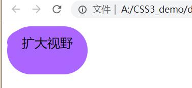
过度效果,鼠标放上就变形~
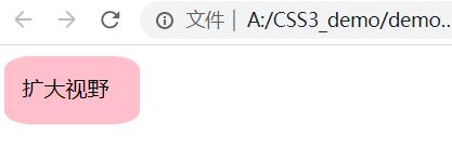
.ceng{
	width:100px;
	height:50px;
	background-color: pink;
	/*加一个手型*/
	cursor:pointer;
	/*一定要写前缀*/
	/*开始写过度 两秒变长 先慢后快再慢*/
	transition-duration:0.5s;
	/*所有属性都进行变化*/
	transition-property: all;
	/*延迟0.5s才开始变化*/
	transition-delay:0.2s;
	/*改变过度的快慢 慢快*/
	/*transition-timing-function: ease;*/
	/*改变过度的快慢 匀速*/
	/*transition-timing-function: linear;*/
	/*改变过度的快慢 开始慢 然后变快*/
	/*transition-timing-function: ease-in;*/
	/*改变过度的快慢 快-慢*/
	/*transition-timing-function: ease-out;*/
	/*改变过度的快慢 z直接变 没有效果 等了2s直接变*/
	/*transition-timing-function: step-end;*/

	/*简写方法*/
	/*transition: all 2s .2s ease;*/
	/*position: relative;*/
	border-radius:20%;
}

.ceng:hover{
	width:100px;
	height:50px;
	/*颜色也可以过度*/
	background-color: #aa66ff;
	/*边框过度*/
	border-radius:50%;
}
.content{
	padding: 13px;
	/*border:1px solid pink;*/
	/*position: absolute ;*/
	/*left:10px;
	top:20px;*/
	transition-duration:0.5s;
	/*所有属性都进行变化*/
	transition-property: all;
	/*延迟0.5s才开始变化*/
	transition-delay:0.2s;
}
.content:hover{
	text-align: center;
	font-size:20px;
	width:100px;
	height:50px;
	/*颜色也可以过度*/
	background-color: #aa66ff;
	/*边框过度*/
	border-radius:40px;
}
<div class="ceng">
	<!-- 谢正方形 <-->
	<div class="content">扩大视野</div>
</div>
好看的圆点小动画,涟漪效果
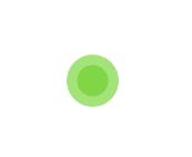
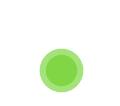

<div class="spinner1">
		<div></div>
		<div></div>
</div>

.spinner1{
	width:60px;
	height:60px;
	position: relative;
	margin:100px auto;
}
.spinner1 >div {
	width:100%;
	height:100%;
	border-radius:50%;
	background-color: #67cf22;
	opacity:0.6;
	position: absolute;
	top:0px;
	left:0px;
	animation:mymove 2s infinite ease-in-out;

}

/*伪类选择器,让第二个圆圈延时一秒*/
.spinner1 >div:nth-child(2){
	animation-delay:1s;
}
/*製作完关键帧,要在执行动画的选择器中写animation*/
@keyframes mymove{
	0% ,100%{transform: scale(0.0);}
	50%{transform: scale(1.0);}
}


 3109
3109


 被折叠的 条评论
为什么被折叠?
被折叠的 条评论
为什么被折叠?
 到【灌水乐园】发言


