


页面字体fontsize自适应(在页app.vue页面添加)
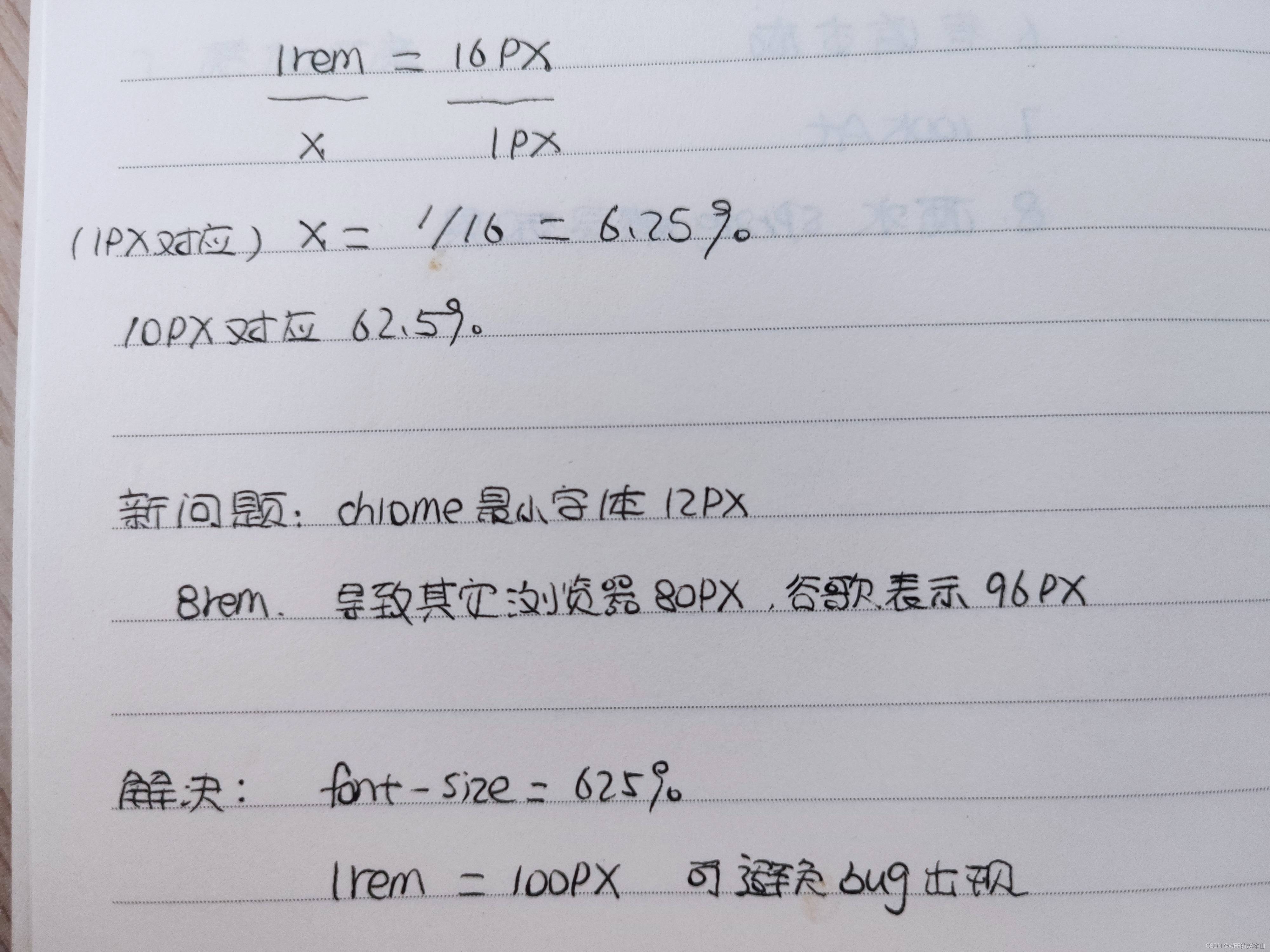
将css里面的html和body的font-size都设置成62.5%然后10px=1rem这样写页面
<script>
const rootHeight = 940;
</script>

mounted() {
    let html = document.getElementsByTagName('html');
    html[0].style.fontSize = `${Math.max(document.body.clientHeight, 768) / rootHeight * 62.5}%`;
    window.onresize = () => {
      html[0].style.fontSize = `${Math.max(document.body.clientHeight, 768) / rootHeight * 62.5}%`;
    }
  },


const rootWidth = 1920
onMounted(() => {
      const html = document.getElementsByTagName('html')
      html[0].style.fontSize = `${Math.max(document.body.clientWidth, 1024) / rootWidth * 62.5}%`
      }
      window.onresize = () => {
   const html = document.getElementsByTagName('html')
      html[0].style.fontSize = `${Math.max(document.body.clientWidth, 1024) / rootWidth * 62.5}%`
    }
echarts图表的自适应(不同分辨率下的显示)
// echarts配置中 * 图表这里的option.js 里面的配置 字号 间距什么的都加了*wScale 这个
import Vue from "vue"
let wScale = Vue.prototype.$wScale;

itemWidth: 50 * wScale ,
wdth: 50 * wScale ,
fontSize: 16 * wScale ,

// main.js
import "./utils/scale";

// scale.js
import Vue from "vue"
const fullWidth = 1920,
	  fullHeight = 940;
// 长宽屏幕比
Vue.prototype.$wScale = document.body.clientWidth / fullWidth
Vue.prototype.$hScale = document.body.clientWidth / fullHeight


 2731
2731


 被折叠的 条评论
为什么被折叠?
被折叠的 条评论
为什么被折叠?
 到【灌水乐园】发言


