import matplotlib. pyplot as plt
import numpy as np
figure( )
plt. show( )
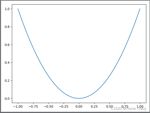
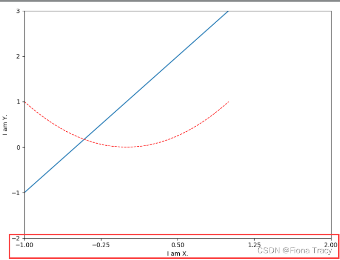
x = np. linspace( - 1 , 1 , 50 )
y1 = x ** 2
plt. figure( )
plt. plot( x, y1)
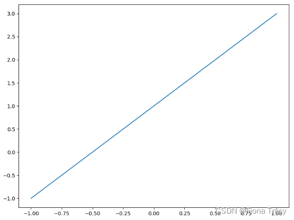
x = np. linspace( - 1 , 1 , 50 )
y1 = x ** 2
y2 = 2 * x + 1
plt. figure( )
plt. plot( x, y1)
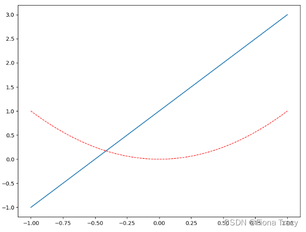
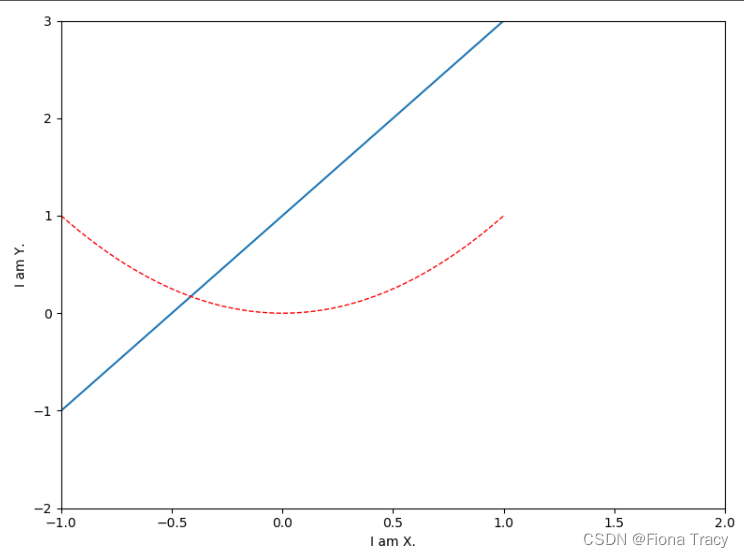
plt. figure( num= 2 , figsize= ( 8 , 6 ) )
plt. plot( x, y2)
plt. plot( x, y1, color= 'red' , linewidth= 1.0 , linestyle= '--' )
plt. xlim( - 1 , 2 )
plt. ylim( - 2 , 3 )
plt. xlabel( "I am X." )
plt. ylabel( "I am Y." )
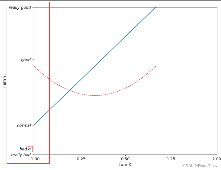
new_ticks = np. linspace( - 1 , 2 , 5 )
plt. xticks( new_ticks)
plt. yticks( [ - 2 , - 1.8 , - 1 , 1.22 , 3 ] ,
[ r"$really\ bad$" , r"$bad\ \alpha$" , r"$normal$" , r"$good$" , r"$really\ good$" ] )
'''
axis:英[ˈæksɪs]n.轴(旋转物体假想的中心线); (尤指图表中的)坐标轴
axis 的复数;axes
'''
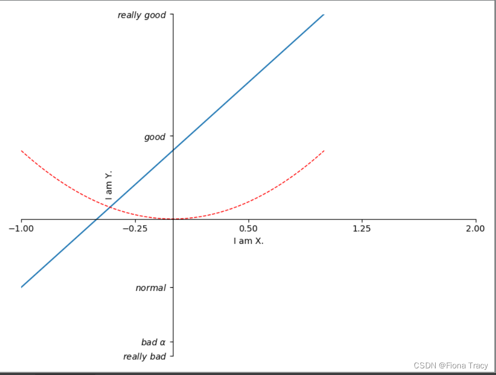
ax = plt. gca( )
ax. spines[ 'right' ] . set_color( "none" )
ax. spines[ 'top' ] . set_color( "none" )
ax. xaxis. set_ticks_position( "bottom" )
ax. yaxis. set_ticks_position( "left" )
ax. spines[ 'bottom' ] . set_position( ( "data" , 0 ) )
ax. spines[ 'left' ] . set_position( ( 'data' , 0 ) )
'''
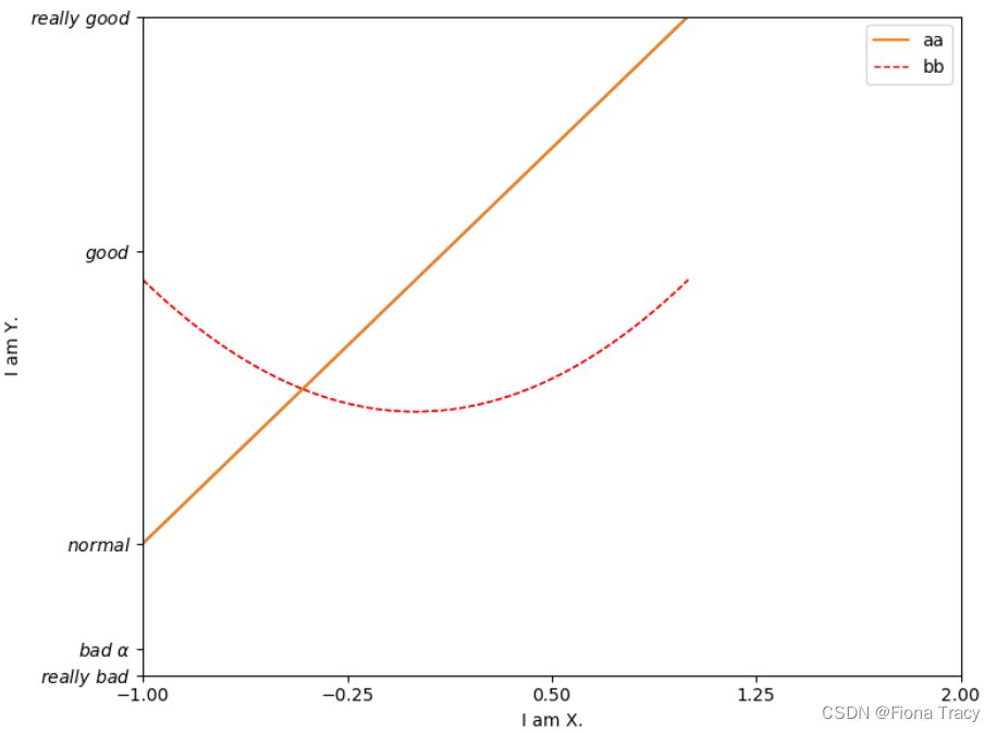
legend图例:plt.legend()
'''
line1, = plt. plot( x, y2, label= 'up' )
line2, = plt. plot( x, y1, color= 'red' , linewidth= 1.0 , linestyle= '--' , label= 'down' )
plt. legend( handles= [ line1, line2] , labels= [ 'aa' , 'bb' ] , loc= 'upper right' )
plt. legend( handles= [ line1, ] , labels= [ 'aa' , ] , loc= 'best' )
'''
在图片中添加注解Annotation
'''
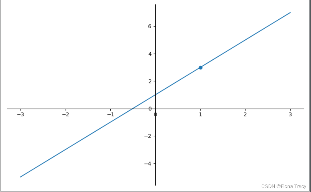
x = np. linspace( - 3 , 3 , 50 )
y = 2 * x + 1
plt. figure( num= 3 , figsize= ( 8 , 5 ) )
plt. plot( x, y)
ax = plt. gca( )
ax. spines[ 'right' ] . set_color( 'none' )
ax. spines[ 'top' ] . set_color( 'none' )
ax. xaxis. set_ticks_position( 'bottom' )
ax. spines[ 'bottom' ] . set_position( ( 'data' , 0 ) )
ax. yaxis. set_ticks_position( 'left' )
ax. spines[ 'left' ] . set_position( ( 'data' , 0 ) )
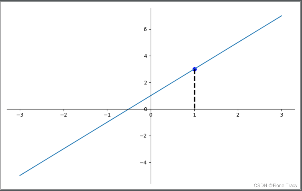
x0 = 1
y0 = 2 * x0 + 1
plt. scatter( x0, y0)
plt. scatter( x0, y0, s= 50 , color= 'b' )
plt. plot( [ x0, x0] , [ y0, 0 ] , 'k--' , lw= 2.5 )
'''
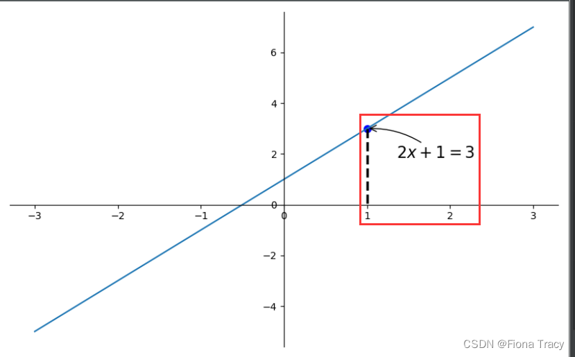
添加注释method1
'''
plt. annotate( r'$2x+1=%s$' % y0, xy= ( x0, y0) , xycoords= 'data' , xytext= ( + 30 , - 30 ) , textcoords= 'offset points' ,
fontsize= 16 , arrowprops= dict ( arrowstyle= '->' , connectionstyle= 'arc3,rad=.2' ) )
'''
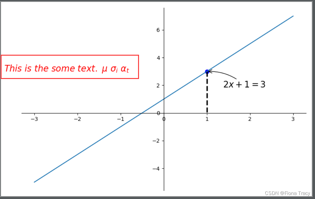
method2
'''
plt. text( - 3.7 , 3 , r'$This\ is\ the\ some\ text.\ \mu\ \sigma_i\ \alpha_t$' ,
fontdict= { 'size' : 16 , 'color' : 'r' } )
import matplotlib. pyplot as plt
import numpy as np
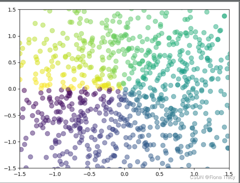
n = 1024
X = np. random. normal( 0 , 1 , n)
Y = np. random. normal( 0 , 1 , n)
T = np. arctan2( Y, X)
plt. scatter( X, Y, s= 75 , c= T, alpha= 0.5 )
plt. xlim( - 1.5 , 1.5 )
plt. ylim( - 1.5 , 1.5 )
plt. show( )
plt. xticks( ( ) )
plt. yticks( ( ) )
n = 1024
X = np. random. normal( 0 , 1 , n)
Y = np. random. normal( 0 , 1 , n)
T = np. arctan2( Y, X)
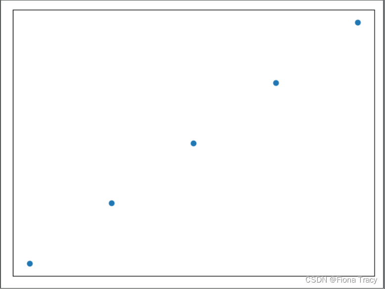
plt. scatter( np. arange( 5 ) , np. arange( 5 ) )
plt. xticks( ( ) )
plt. yticks( ( ) )
plt. show( )


 42万+
42万+


 被折叠的 条评论
为什么被折叠?
被折叠的 条评论
为什么被折叠?
 到【灌水乐园】发言


