


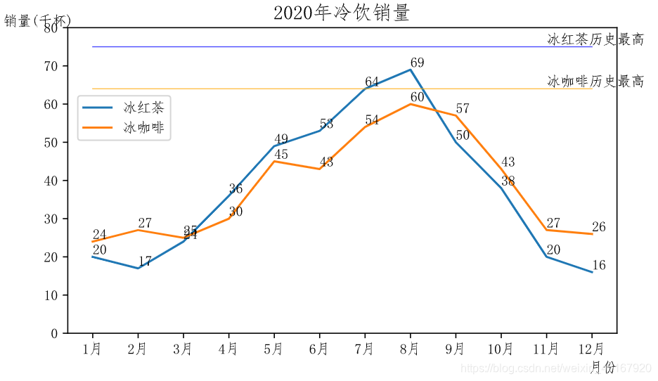
基本图-折线图为例
以折线图为例,加上常见的一些图表的设置
import matplotlib.pyplot as plt

# 中文字体显示,只要是中文就在前面加u
from pylab import mpl
mpl.rcParams['font.sans-serif'] = ['FangSong']
mpl.rcParams['axes.unicode_minus'] = False

# 数据源
x = [u'1月',u'2月',u'3月',u'4月',u'5月',u'6月',u'7月',u'8月',u'9月',u'10月',u'11月',u'12月']
y1 = [20,17,24,36,49,53,64,69,50,38,20,16]
y2 = [24,27,25,30,45,43,54,60,57,43,27,26]

# 创建画布,设置画布大小
plt.figure(figsize=(7,4))
plt.plot(x,y1,label=u'冰红茶')  # 画图
plt.plot(x, y2, label=u'冰咖啡')
plt.title(u'2020年冷饮销量',fontsize=14)  # 标题,字号设置
plt.xlabel(u'月份',loc='right')  # 位置设置
plt.ylabel(u'销量(千杯)',rotation='horizontal',y=1,x=0)  # 方向,位置设置
plt.legend(bbox_to_anchor=(0.2,0.8))  # 加上图例,设置位置
# 加数据注释
for y in [y1,y2]:
    for i,v in enumerate(y):
        plt.annotate(v, (i,v+0.7))
# 加文字注释
plt.plot(x,[75]*12,color='blue',linewidth=0.7,alpha=0.7)
plt.annotate(u'冰红茶历史最高',(10,75.7))
plt.plot(x,[64]*12,color='orange',linewidth=0.7,alpha=0.7)
plt.annotate(u'冰咖啡历史最高',(10,64.7))

plt.show()  # 也可以不加,依然显示
子图
# 数据源
x = [u'1月',u'2月',u'3月',u'4月',u'5月',u'6月',u'7月',u'8月',u'9月',u'10月',u'11月',u'12月']
y1 = [20,17,24,36,49,53,64,69,50,38,20,16]
y2 = [24,27,25,30,45,43,54,60,57,43,27,26]
x2 = [u'山东',u'河南',u'浙江',u'湖北',u'安徽']
y3 = [100,176,235,250,156]

fig,axes = plt.subplots(1,2,figsize=(10,4))
# axes[0]的主坐标轴
a1 = axes[0].plot(x,y1,label=u'冰红茶',color='red',alpha=0.8)
a2 = axes[0].plot(x, y2, label=u'冰咖啡',color='#663300')
axes[0].set_title(u'2020冷饮销量')
axes[0].set_xlabel(u'月份', loc='right')
axes[0].set_ylabel(u'销量\n(千杯)', rotation='horizontal',y=1)
axes[0].set_ylim([0,80])
# axes[0]添加次坐标轴
ax2 = axes[0].twinx()
a3 = ax2.bar(x, [i+j for i,j in zip(y1,y2)], color='navy',alpha=0.5, label=u'总销量')
ax2.set_ylabel(u'销量\n(千杯)', rotation='horizontal',y=1.1)
ax2.set_ylim([0,170])
fig.legend(bbox_to_anchor=(0.45,0.87))  # 为整个图添加图例,这样可以将axes[0]的两个轴的图例合并到一起
# axes[1]
axes[1].bar(x2, y3)
axes[1].set_title(u'2020冷饮分地区总销量')
axes[1].set_xlabel(u'地区', loc='right')
axes[1].set_ylabel(u'销量\n(千杯)', rotation='horizontal',y=1)
# 加数据标注
for i,v in enumerate(y3):
    axes[1].annotate(v, (i-0.2,v+0.7))
# 整个图形的标题
plt.figtext(0.4,1,s=u'2020冷饮销售状况',fontsize=17)
# 子图间距调整
plt.subplots_adjust(wspace=0.35)  # 让两个子图之间的距离变大些,轴名称不要重叠
plt.savefig(r'C:\Users\aa\Desktop\a.png',dpi=300, bbox_inches='tight')

1 画布创建
fig = plt.figure(
	num=None, 			图像编号或名称,数字为编号 ,字符串为名称
	figsize=(6.4,4.8), 		指定figure的宽和高,单位为英寸;
	dpi=100, 			参数指定绘图对象的分辨率,即每英寸多少个像素
	facecolor='white', 	背景颜色
	edgecolor='white', 	边框颜色
	frameon=True,		是否显示边框
	tight_layout=False  是否是紧凑布局
)
2 坐标轴、标题设置
1 轴刻度范围
plt.xlim():获得坐标轴范围,针对当前、最新创建的图
plt.xlim([n,m]) plt.xlim(n,m) :设置坐标轴范围,针对当前、最新创建的图
plt.axis([0, 1100, 0, 1100000]):x和y坐标轴的最小值和最大值

2 轴刻度数与对应标签
plt.xticks([v1,v2,...], ('G1', 'G2', ..), rotation=30,fontsize=15):先设置标签位置再设置对应标签,如果没有标签仅显示刻度,如果有标签就不显示刻度。
plt.tick_params(axis='both', labelcolor='', labelsize=,width=):设置两个轴上刻度标记的大小、颜色

3 轴标签
plt.xlabel(' ', fontsize=14, loc={'center'},x=,y=,rotation= {'vertical'})
loc可选{'right'/'left'}
rotation可选 {'vertical', 'horizontal'}
x,y是标签的位置,不能和loc一同使用

plt.ylabel(' ', fontsize=14, loc='center',rotation= {'vertical'},x=,y=)
loc可选{'bottom','top'}

4 隐藏坐标轴
plt.axes().get_xaxis().set_visible(False)
plt.axes().get_yaxis().set_visible(False)

【标题】
plt.title(' ', fontsize=24)
3 图例
1 加入图例
plt.legend():针对当前、最新创建的图,画图时要指明名称,即label参数:plt.plot(x,y,label='')

2 参数
plt.legend(loc='', ncol=, bbox_to_anchor=(x,y),frameon=True)
loc的参数如下:
	best	upper right		upper left		lower left		lower right
	right	center left		center right	lower center	upper center
	center
ncol:设置列数
bbox_to_anchor:图例相对于整个图的位置(x,y),(0,0)表示整个图的左下角,(1,1)为整个图的右上角
frameon:是否显示图例的边框,默认为True
其它边框的样式参数:
fancybox=True是否设置成圆角边框
edgecolor='black'边框的颜色
framealpha=1边框的透明度,1是完全不透明
borderpad=1内边距大小
shadow=True开启阴影
fontsize=8/'small,x-small,large,medium..'
labelcolor='red'标签文字的颜色
title图例的标题
title_fontsize图例的大小,同fontsize的设置

3 获得位置
box = ax.get_position()

4 选择图例显示的项
方法1:不想加的项不设置label
plt.plot(,,label='label1')
plt.plot()
plt.legend()

方法2:画图设置图像实例
lines = plt.plot(x,y[:,:3]) #一次画多条线
plt.legend(lines[:2], ['first','second'])
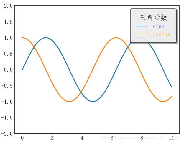
x = np.linspace(0,10,100)
plt.figure(figsize=(5,4))
plt.plot(x, np.sin(x), label='sine')
plt.plot(x, np.cos(x), label='cosine')
plt.ylim([-2,2])
plt.legend(loc='upper right',frameon=True,
           fancybox=True, edgecolor='black',framealpha=0.8, borderpad=1,shadow=True,
          labelcolor=['blue','orange'],title='三角函数',title_fontsize='large')
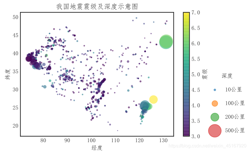
图例显示不同尺寸的点
data:
 记录数	地震区域	深度(公里)	纬度	经度	震级
0	1	新疆		10		39.40	75.20	5.1
1	1	新疆		5		39.59	74.82	3.0
2	1	云南省		10		24.72	97.92	4.6
3	1	云南省		10		24.72	97.91	4.8
4	1	云南省		10		24.72	97.92	3.4
plt.scatter(data['经度'],data['纬度'],c=data['震级'],s=data['深度(公里)'],cmap='viridis',
            alpha=0.6,linewidth=0)
plt.colorbar(label='震级')
plt.clim(3,7)

# 创建深度的图例
for deep in [10,100,200,500]:
    plt.scatter([], [], s=deep, alpha=0.6, label='{}公里'.format(deep))
plt.legend(bbox_to_anchor=(1.5,0.55),labelspacing=1.5,title='深度', frameon=False,scatterpoints=1)
plt.title('我国地震震级及深度示意图')
plt.xlabel('经度')
plt.ylabel('纬度')
4 添加注释、数字标签
方法一:
plt.annotate(
text,		注释文字
(x,y),			待注释位置
xytext,		注释的位置
xycoords,	待注释位置的性质,可选项
arrowprops= 箭头属性设置:颜色,箭头宽度,箭头长度
	dict(facecolor='',headwidth=,headlength=)
horizontalalignment='left', 水平对齐
verticalalignment=''   垂直对齐
)

xycoords可选项:
'figure points' 'figure pixels' 'figure fraction'   距离图层左下角的点、像素、百分比
'axes points'   'axes pixels'	'axes fraction' 	距离轴坐标左下角的点、像素、百分比
'data'  使用实际的轴坐标的数据(默认)
'polar' 使用极坐标系来处理,(弧度,长度)

最简形式:
plt.annotate(text,(x,y)):xy处有注释text
方法二:
plt.text(x, y, s, fontsize, bbox=dict(facecolor='red', alpha=0.5), va='bottom')
x, y注释位置
s:注释
bbox:注释属性设置
方法三:
plt.figtext(x,y,string) :# xy为float类型,string为文字,它是在整个画布上注释文字,而非上面两个在最后绘制的一个图上,在多图绘制写注释时有用
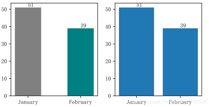
p = [51,39]
fig,axes = plt.subplots(1,2,figsize=(6,4))
# text
p = [51,39]
fig,axes = plt.subplots(1,2,figsize=(6,4))
axes[0].bar([0,1],p,color=['grey','teal'],width=0.5)
axes[0].set_xticks([0,1])
axes[0].set_xticklabels(['January', 'February'])
for i,x in enumerate(p):
    axes[0].text(i,x+0.5, x)

 # annotate
axes[1].bar([0,1],p)
plt.xticks(range(len(p)), ['January', 'February'])
for i,x in enumerate(p):
    plt.annotate(x, (i,x+0.5))

# 当数据源获得较为困难时,赋值给图,获得其x,y
# a = axes[0].bar([0,1],p,color=['grey','teal'],width=0.5)
# for rect in a:
#     x = rect.get_x(),
#     y = rect.get_height()
#     axes[0].text(x + rect.get_width()/2, y, str(y))
5 子图
(1)创建
方法一:创建画布和子图(推荐)
fig,axes = plt.subplots(
	nrows=2, ncols=2,   参数名称可以省略,子图行列数
	figsize=(xx,xx),	图表大小
	subplot_kw={},		关键字字典
	sharex=False,		设置子图具有相同的X轴或Y轴。调节xlim/ylim时将影响所有的子图
	sharey=False,
	)
axes[0,1]:代表第1行第1列的子图
方法二:先建画布,再逐个建子图
fig = plt.figure():空画布
axes[0,0] = fig.add_subplot(2,2,1):创建子图,编号从1开始
方法三:不建画布,直接逐个建子图
plt.subplot(2, 2, 1):2行2列,当前为于第1个位置-区域1
plt.plot(num):在新建的子图上绘制
plt.subplot(2, 2, 2):2行2列,当前为于第2个位置-区域2
plt.plot(data):在新建的子图上绘制
**(2)其它 **
【子图间距调整】
plt.subplots_adjust(left=None, bottom=None, right=None, top=None,wspace=None, hspace=None):距离上下左右等的百分比,值越大,图越小

【坐标轴】
axes[0,0].get_xlim:获得坐标轴范围
axes[0,0].set_xlim(n,m) or ([n,m]):设置坐标轴刻度范围
axes[0, 0].set_xticks([v1,v2,...]):设置x坐标轴刻度,想加刻度标签先加刻度再加xticklabels,不能少
axes[0, 0].set_xticklabels(['','',..], rotation=30,fontsize=15):对应刻度添加标签、旋转角度、大小。设置了标签就没有刻度了。
axes[0, 0].tick_params(axis='both', labelcolor='', labelsize=,width=):设置两个轴上刻度标记的大小、颜色

【轴名称】
axes[0, 0].set_xlabel('')
ax.set_ylabel('') :添加坐标轴标签

【图例】
axs[0, 1].legend()  :参数同plt.legend()

【标题】
axes[0, 0].set_title('', fontsize=15):添加图标题

【注释】
axes[0].text(x,y,string)
axes[0].annotate(string,(x,y))
6 其它设置
【网格线】
plt.grid(b=True, which=, axis='y', linewidth, linestyle=)
b:布尔值,是否使用网格线
which:在哪个坐标轴'major' 'minor' 'both'
axis:在哪个坐标轴'x' 'y'  'both'

【保存】
plt.savefig('名称.png', bbox_inches='tight',dpi,facecolor,edgecolor):
格式支持png pdf svg eps ps ;bbox_inches='tight':去除多余空白,dpi图像分辨率(每英寸点数)

【全局设置】
plt.rc('对象名称',对象参数设置/字典形式)
plt.rc('figure',figuresize=(10,10)):设置全部的画布大小为10*10
第一个参数是对象名称:'figure'、'axes'、'xtick'、'ytick'、'grid'、'legend'等


 1万+
1万+


 被折叠的 条评论
为什么被折叠?
被折叠的 条评论
为什么被折叠?
 到【灌水乐园】发言


