


rem与em
rem与em皆是相对单位 rem是根据html字体的大小而进行改变 em是根据父元素字体的大小而进行改变
rem的作用:根据html字体的大小 而整体控制页面元素的大小
<!DOCTYPE html>
<html lang="en">

<head>
    <meta charset="UTF-8">
    <meta http-equiv="X-UA-Compatible" content="IE=edge">
    <meta name="viewport" content="width=device-width, initial-scale=1.0">
    <title>rem与em初体验</title>
    <style>
        html {
            font-size: 16px;
        }

        div {
            font-size: 12px;
        }

        div {
            /* rem相对于html字体的大小来进行改变 */
            width: 10rem;
            height: 10rem;
            background-color: red;
        }

        p {
            /* em相对于父元素的字体的大小来进行改变*/
            width: 10em;
            height: 10em;
            background: purple;
        }
    </style>
</head>

<body>
    <div>
        <p></p>
    </div>
</body>

</html>

媒体查询
媒体查询(Media Query)是CSS3新语法。
作用:针对不同的屏幕 设置不同的样式
媒体查询语法规范
- 用 @media开头 注意@符号
- mediatype:媒体类型
- 关键字 and not only
- media feature 媒体特性必须有小括号
语法
@media mediatype and|not|only (media feature) {
    CSS-Code;
}
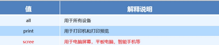
媒体类型
将不同的终端设备划分成不同的类型,被称为媒体类型。
关键字
关键字将媒体类型与媒体特性连接起来作为媒体查询的条件
- and:可以将多个媒体特性连接到一起,相当于“且”的意思。
- not:排除某个媒体类型,相当于“非”的意思,可以省略。
- only:指定某个特定的媒体类型,可以省略。
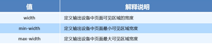
媒体特性
每种媒体类型具有不同的特性
<!DOCTYPE html>
<html lang="en">
<head>
<meta charset="UTF-8">
<meta http-equiv="X-UA-Compatible" content="IE=edge">
<meta name="viewport" content="width=device-width, initial-scale=1.0">
<title>媒体查询初体验</title>
<style>
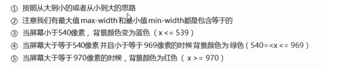
/* 媒体查询按照从小到大或从小到大的顺序 */
@media screen and (max-width:1980px) {
body {
background-color: green;
}
}
@media screen and (max-width:800px) {
body {
background-color: red;
}
}
</style>
</head>
<body>
</body>
</html>

媒体查询之案例
<!DOCTYPE html>
<html lang="en">

<head>
    <meta charset="UTF-8">
    <meta http-equiv="X-UA-Compatible" content="IE=edge">
    <meta name="viewport" content="width=device-width, initial-scale=1.0">
    <title>媒体查询的案例</title>
    <style>
        /* 小于或等于539px body设置为蓝色 */

        @media screen and (max-width:539px) {
            body {
                background
最低0.47元/天 解锁文章


 8369
8369


 被折叠的 条评论
为什么被折叠?
被折叠的 条评论
为什么被折叠?
 到【灌水乐园】发言


