


 本文详细介绍了如何使用matplotlib库改变x轴的显示内容,包括数值型数据和字符串类型的处理,以及使用xticks方法进行自定义。同时,文章讲解了显示网格、坐标轴的操作,如设置grid和调整坐标轴的边框。此外,讨论了plt.rcParams用于设置画图的分辨率和大小。文章还涵盖了图表的样式参数设置,如线条样式和颜色。最后,介绍了如何创建图形对象以及绘制多子图的方法,包括add_axes()、subplot()和subplots()函数的使用。
文章目录
- 在最开始,我们先引入 Matplotlib 库,便于后续的操作。
from matplotlib import pyplot as plt
import numpy as np
一. 改变 x 轴显示内容 xticks 方法再次说明
- 第一个参数,需要一个数字列表,指示 x 轴上的记号应该指向哪里,我们向这个函数传递了一个字符串,但它并不知道如何将其转换为 x 轴上的位置。
1. x 轴是数值型数据
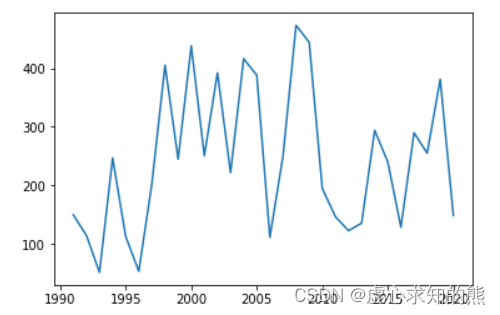
- 例如,我们使用 np.arange() 生成从 1991 年到 2020 年,30 年的日期数据。
dates = np.arange(1991,2021)
dates
#array([1991, 1992, 1993, 1994, 1995, 1996, 1997, 1998, 1999, 2000, 2001,
#       2002, 2003, 2004, 2005, 2006, 2007, 2008, 2009, 2010, 2011, 2012,
#       2013, 2014, 2015, 2016, 2017, 2018, 2019, 2020])
- 随后,我们再使用 np.random.randint() 随机生成这 30 年的销量数据。
sales = np.random.randint(50,500,size=30)
sales
#array([150, 115,  52, 247, 113,  54, 204, 405, 245, 438, 251, 392, 222,
#       416, 388, 112, 250, 473, 444, 195, 147, 123, 136, 294, 240, 129,
#       290, 255, 381, 149])
- 最后,我们将日期作为横坐标,销量作为纵坐标绘制销量图。
plt.plot(dates,sales)
- 通过上述步骤我们可以发现,对于数值型数组,绘图会自动分割。
- 但是,如果想按照自己的逻辑分割,注意数值型对应轴上面的数值,比如,我们可以将 x 轴的刻度进行修改,并绘制销量图。
%matplotlib inline
plt.xticks([1980,1982,1993])
plt.plot(dates,sales)
- 当前会看到 x 轴上面没有数据,其实是有数据,只不过,默认当前图形的 x 轴区间是 [1991,2021],对此,我们可以借助设置 %matplotlib notebook 移动图像来查看。
- %matplotlib notebook
plt.xticks([1980,1982,1993])
plt.plot(dates,sales)
- 如果我们想按照自己的逻辑分割,注意数值型使用的是元素本身,而不是元素的索引。
- 如果我们直接使用元素本身就会产生如下现象。
plt.xticks([1990,2005,2010,2020])
plt.plot(dates,sales)
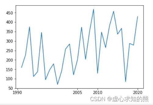
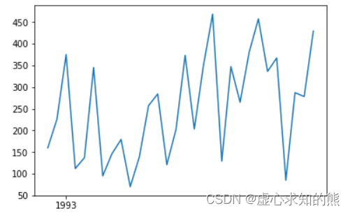
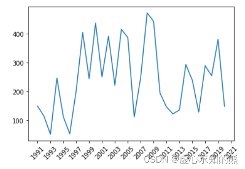
- 因此,如果我们想 x 轴刻度每两年显示一次的话,就需要使用元素的索引进行销量图的绘制。
plt.xticks(np.arange(dates.min(),dates.max()+2,2),rotation=45)
plt.plot(dates,sales)
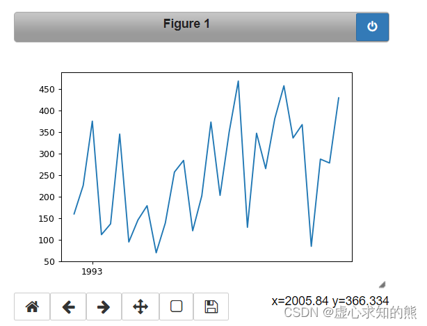
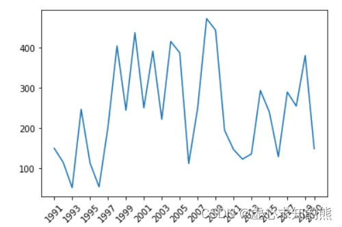
那么,对于上述的逻辑分割,我们也是可以使用元素本身的,只不过需要一些计算。
plt.xticks([dates[i] for i in range(0,len(dates),2)]+[2020],rotation=45) # 元素本身
plt.plot(dates,sales)
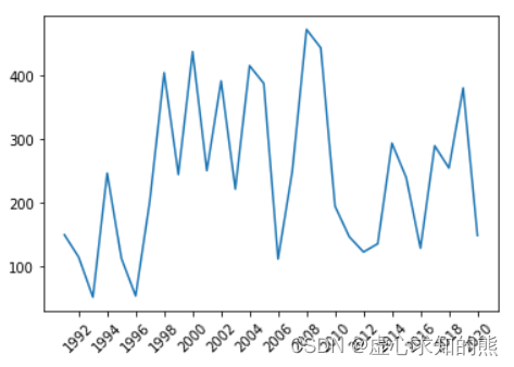
2. 将 x 轴更改为字符串
- 我们将从 1991 年到 2020 年,30 年的日期修改为字符串。
- 这里需要注意的是 xticks 第一个参数中元素不能我字符串 。
dates = np.arange(1991,2021).astype(np.str_)
plt.xticks(range(1,len(dates),2),rotation=45) # 元素本身
plt.plot(dates,sales)
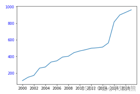
3. 总结
- (1) 当 x 轴是数值型,会按照数值型本身作为 x 轴的坐标。
- (2) 当 x 轴为字符串类型,会按照索引作为 x 轴的坐标。
- 具体可见如下例子:
time=np.arange(2000,2020).astype(np.str_)
sales = [109, 150, 172, 260, 273, 333, 347, 393, 402, 446, 466, 481, 499,504, 513, 563, 815, 900, 930, 961]
plt.xticks(range(0,len(time),2))##,labels=['year%s'%i for i in time],rotation=45,color="red")
plt.yticks(color="blue")
plt.plot(time,sales)
二. 其他元素可视性
1. 显示网格:plt.grid()
plt.grid(True, linestyle = "--",color = "gray", linewidth = "0.5",axis = 'x')
- 显示网格 plt.grid() 的参数有如下含义:
- linestyle:线型。
- color:颜色。
- linewidth:宽度。
- axis:x,y,both,显示x/y/两者的格网。
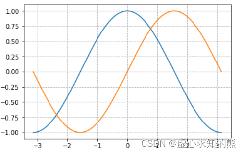
- 例如,我们可以使用 np.linspace 生成从 -Π 到 Π 并且包含终止值的 256 个数据,并分别生成一个 cos 和 sin 函数。
x = np.linspace(-np.pi,np.pi,256,endpoint = True)
c, s = np.cos(x), np.sin(x)
plt.plot(x, c)
plt.plot(x, s)
plt.grid(True,linestyle="--")
2. plt.gca( ) 对坐标轴的操作
- 首先观察画布上面的坐标轴,如下图。
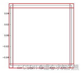
- 上图中,用红色标识出的黑色边界框线在 Matplotlib 中被称为 spines,中文翻译为脊柱。
- 在我的理解看来,意思是这些边界框线是坐标轴区域的支柱,那么,我们最终要挪动的其实就是这四个支柱,且所有的操作均在 plt.gca( ) 中完成,gca 就是 get current axes 的意思。
- 接下来需要绘制图如下:
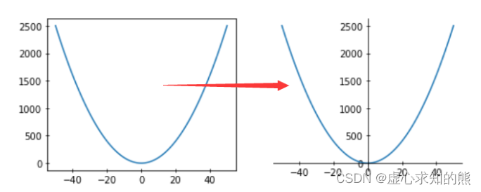
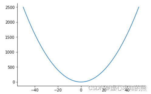
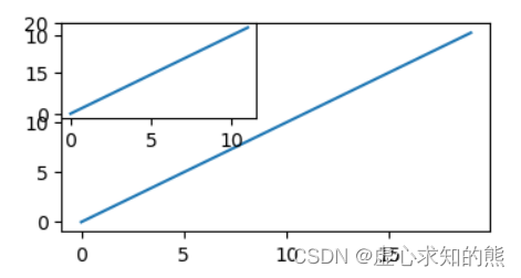
- 首先,我们创建 x 轴数据,使用 np.arange( ) 生成从 -50 到 50 的 x 轴数据,再创建 y 轴的数据,y 是 x 的平方,并绘制图形。
x = np.arange(-50,51)
y = x ** 2
plt.plot(x, y)
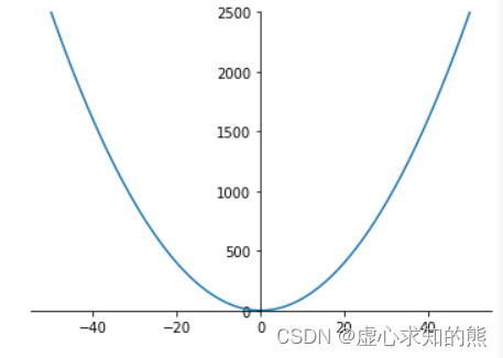
- 然后,我们获取当前坐标轴,通过坐标轴 spines ,确定 top,bottom,left,right(分别表示上,下,左,右)。
- 此时,我们需要的是坐标轴,因此,不需要右侧和上侧线条,将其颜色设置为 none。
x = np.arange(-50,51)
y = x ** 2
ax = plt.gca()
ax.spines['right'].set_color("none")
ax.spines['top'].set_color("none")
plt.plot(x, y)
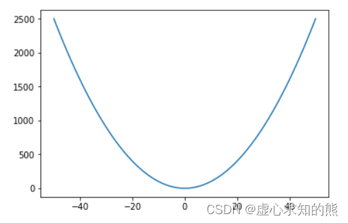
- 随后,我们在上述的基础上,分别定义 x,y,获取当前坐标轴移动下轴到指定位置,在这里,position 位置参数有三种,data , outward(向外),axes。
- axes 是 0.0 - 1.0 之间的值,按轴上的比例划分。
- data 表示按数值挪动,其后数字代表挪动到 Y 轴的刻度值。
- 最后,在设置 y 的取值范围,将两个 0 点移动到一起。
x = np.arange(-50,51)
y = x ** 2
ax = plt.gca()
ax.spines['right'].set_color("none")
ax.spines['top'].set_color("none")
ax.spines['left'].set_position(('axes',0.5))
plt.ylim(0, y.max())
plt.plot(x, y)
三. plt.rcParams 设置画图的分辨率,大小等信息
- plt.rcParams[‘figure.figsize’] = (8.0, 4.0) 是设置 figure_size 英寸。
- plt.rcParams[‘figure.dpi’] = 300 是设置分辨率。
- 默认的像素:[6.0,4.0],分辨率为 72,图片尺寸为 432x288。
- 如果指定 dpi=100,则图片尺寸为 600*400。
- 如果指定 dpi=300,则图片尺寸为 1800*1200。
- 针对上述,我们进行如下的样例演示。
- (1) 分辨率为 72,图片尺寸为 432x288(默认值)。
plt.plot()
- (2) 将大小设置为 (6.0,4.0) 英寸。
plt.rcParams['figure.figsize'] = (6.0, 4.0)
plt.plot()
- (3) 指定 dpi=100,图片尺寸为 600*400。
plt.rcParams['figure.dpi'] = 100
plt.plot()
- 将大小设置为 (3,2) 英寸(注意横纵坐标的刻度也发生了变化)。
plt.rcParams['figure.figsize']=(3,2)
plt.plot()
四. 图表的样式参数设置
1. 线条样式
- 传入 x,y,通过 plot 画图,并设置折线颜色、透明度、折线样式和折线宽度,标记点、标记点大小、标记点边颜色、标记点边宽,网格等。
plt.plot(x,y,color='red',alpha=0.3,linestyle='-',linewidth=5,marker='o',markeredgecolor='r',markersize='20',markeredgewidth=10)
- (1) color:可以使用颜色的 16 进制,也可以使用线条颜色的英文,还可是使用之前的缩写。
| 字符 | 颜色 | 英文全称 |
|---|---|---|
| ‘b’ | 蓝色 | blue |
| ‘g’ | 绿色 | green |
| ’ r ’ | 红色 | red |
| ’ c ’ | 青色 | cyan |
| ’ m ’ | 品红 | magenta |
| ’ y ’ | 黄色 | yellow |
| ’ k ’ | 黑色 | black |
| ’ w ’ | 白色 | white |
- (2) alpha:0-1,透明度。
- (3) linestyle:折线样式。
| 字符 | 描述 |
|---|---|
| ‘-’ | 实线 |
| ‘–’ | 虚线 |
| ‘-.’ | 点划线 |
| ‘:’ | 虚线 |
- (4) marker 标记点:。
| 标记符号 | 描述 |
|---|---|
| ‘.’ | 点标记 |
| ‘o’ | 圆圈标记 |
| ‘x’ | 'X’标记 |
| ‘D’ | 钻石标记 |
| ‘H’ | 六角标记 |
| ‘s’ | 正方形标记 |
| ‘+’ | 加号标记 |
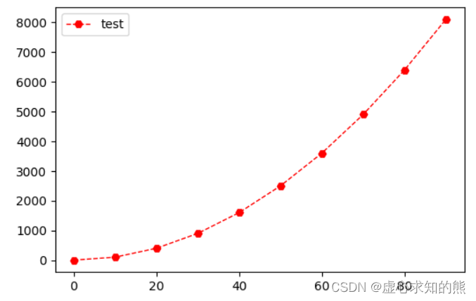
- 例如如下应用:
x= np.arange(0, 100,10)
y= x ** 2
"""linewidth 设置线条粗细
   label 设置线条标签
   color 设置线条颜色
   linestyle 设置线条形状
   marker 设置线条样点标记
"""
plt.plot(x, y, linewidth = '2', label = "test", color='b', linestyle='--', marker='H')
plt.legend(loc='upper left')
2. 线条样式缩写
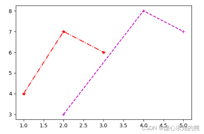
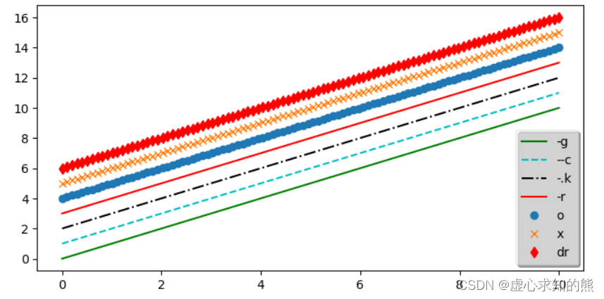
- 我们可以设置两条曲线,第一个是红色,点划线;第二个是品红,虚线。
- 将他们的线条样式进行缩写。
plt.plot([1,2,3],[4,7,6],'r*-.')
plt.plot([2,4,5],[3,8,7],'m+--')
- 除此之外,我们也可以多设置几种线条样式的组合,并将他们添加到图例当中。
plt.rcParams['figure.figsize']=(8,4)
x=np.linspace(0,10,100)
plt.plot(x,x+0, '-g', label='-g')
plt.plot(x,x+1, '--c', label='--c')
plt.plot(x,x+2, '-.k', label='-.k')
plt.plot(x,x+3, '-r', label='-r')
plt.plot(x,x+4, 'o', label='o')
plt.plot(x,x+5, 'x', label='x')
plt.plot(x,x+6, 'dr', label='dr')
plt.legend(loc='lower right',framealpha=0.5,shadow=True, borderpad=0.5)
五. 创建图形对象
- 在 Matplotlib 中,面向对象编程的核心思想是创建图形对象(figure object)。
- 通过图形对象来调用其它的方法和属性,这样有助于我们更好地处理多个画布。
- 在这个过程中,pyplot 负责生成图形对象,并通过该对象来添加一个或多个 axes 对象(即绘图区域)。
- Matplotlib 提供了 matplotlib.figure 图形类模块,它包含了创建图形对象的方法。通过调用 pyplot 模块中 figure() 函数来实例化 figure 对象。
plt.figure(num=None,figsize=None, dpi=None, facecolor=None, edgecolor=None, frameon=True, **kwargs)
- 其参数具有如下含义:
- num 表示图像编号或名称,数字为编号,字符串为名称。
- figsize 表示指定 figure 的宽和高,单位为英寸。
- dpi 表示定绘图对象的分辨率,即每英寸多少个像素,缺省值为 72。
- facecolor 表示背景颜色。
- edgecolor 表示边框颜色。
- frameon 表示是否显示边框。
- 具体可见如下例子。
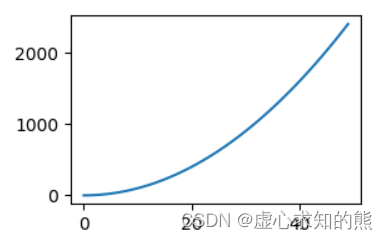
- 创建图形对象,就相当于我们创建一个画布。
- 之前通过配置更改图形的分辨率和宽高.。现在可以在创建图像对象的时候创建。
from matplotlib import pyplot as plt
fig = plt.figure()
fig = plt.figure('f1',figsize=(3,2),dpi=100)
x = np.arange(0,50)
y = x ** 2
plt.plot(x,y)
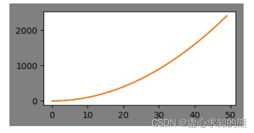
- 然后,我们创建图形对象,图形对象的分辨率为 100,背景颜色为:灰色,并获取轴。
x = np.arange(0,50)
y = x ** 2
fig = plt.figure('f1',figsize=(4,2), dpi=100,facecolor='gray')
ax = plt.gca()
ax.plot(x,y)
plt.plot(x,y)
六. 绘制多子图
- figure 是绘制对象(可理解为一个空白的画布),一个 figure 对象可以包含多个 Axes 子图,一个 Axes 是一个绘图区域,不加设置时,Axes 值默认为 1,且每次绘图其实都是在 figure 上的 Axes 上绘图。
- 我们是在图形对象上面的 Axes 区域进行作画。
- 接下来我们将学习绘制子图的几种方式:
- (1) add_axes():添加区域。
- (2) subplot():均等地划分画布,只是创建一个包含子图区域的画布,(返回区域对象)。
- (3) subplots():既创建了一个包含子图区域的画布,又创建了一个 figure 图形对象(返回图形对象和区域对象)。
1. add_axes():添加区域
- Matplotlib 定义了一个 axes 类(轴域类),该类的对象被称为 axes 对象(即轴域对象),它指定了一个有数值范围限制的绘图区域。在一个给定的画布(figure)中可以包含多个 axes 对象,但是同一个 axes 对象只能在一个画布中使用。
- 2D 绘图区域(axes)包含两个轴(axis)对象
- 其语法如下:
add_axes(rect)
- 该方法用来生成一个 axes 轴域对象,对象的位置由参数 rect 决定。
- rect 是位置参数,接受一个由 4 个元素组成的浮点数列表,形如 [left, bottom, width, height] ,它表示添加到画布中的矩形区域的左下角坐标 (x, y),以及宽度和高度。
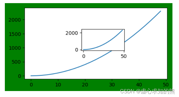
- 如下所示:
- ax1 从画布起始位置绘制,宽高和画布一致;ax2 从画布 20% 的位置开始绘制, 宽高是画布的 50%。
fig = plt.figure(figsize=(4,2),facecolor='g')
ax1=fig.add_axes([0,0,1,1])
ax2=fig.add_axes([0.1,0.6,0.3,0.3])
ax3=fig.add_axes([0.5,0.6,0.2,0.3])
ax1.plot(x, y)
ax2.plot(x, y)
ax3.plot(x, y)
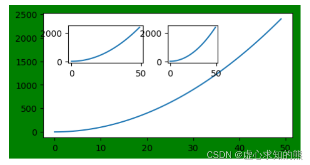
- 注意:每个元素的值是画布宽度和高度的分数。即将画布的宽、高作为 1 个单位。比如,[ 0.2, 0.2, 0.5, 0.5],它代表着从画布 20% 的位置开始绘制, 宽高是画布的 50%
- 我们创建 ax1,和画布位置一致;ax2 从画布 40% 的位置开始绘制, 宽高是画布的 50%
fig = plt.figure(figsize=(4,2),facecolor='g')
x = np.arange(0,50,2)
y = x ** 2
ax1 = fig.add_axes([0.0,0.0,1,1])
ax1.plot(x,y)
ax2=fig.add_axes([0.4,0.4,0.3,0.3])
ax2.plot(x,y)
- 其中区域中基本方法的使用如下:
- 区域图表名称:set_title。
- 区域中 x 轴和 y 轴名称:set_xlabel() 和 set_ylabel()。
- 刻度设置:set_xticks()。
- 区域图表图例:legend()。
2. subplot() 函数,它可以均等地划分画布
- 其参数格式如下:
ax = plt.subplot(nrows, ncols, index,*args, **kwargs)
- nrows 表示行。
- ncols 表示列。
- index 表示索引。
- kwargs 表示 title/xlabel/ylabel 等。
- 也可以直接将几个值写到一起,例如:subplot(233)。
- 返回:区域对象。
- nrows 与 ncols 表示要划分几行几列的子区域(nrows*nclos表示子图数量),index 的初始值为1,用来选定具体的某个子区域。
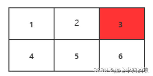
- 例如: subplot(233) 表示在当前画布的右上角创建一个两行三列的绘图区域(如下图所示),同时,选择在第 3 个位置绘制子图。
- 如果新建的子图与现有的子图重叠,那么重叠部分的子图将会被自动删除,因为它们不可以共享绘图区域。
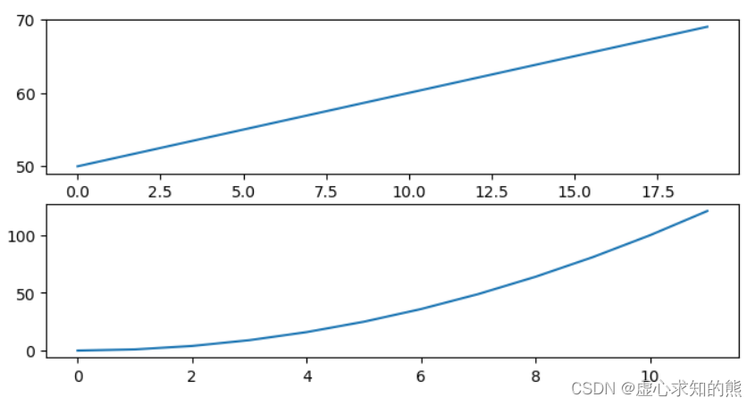
- 现在创建一个子图,它表示一个有 1 行 2 列的网格的顶部图。引为这个子图将与第一个重叠,所以之前创建的图将被删除,x 可省略,默认 [0,1…,N-1] 递增。
plt.plot([1,2,3])
plt.subplot(211)
plt.plot(range(50,70))
plt.subplot(212)
plt.plot(np.arange(12)**2)
 - 如果不想覆盖之前的图,需要先创建画布。还可以先设置画布的大小,再通过画布创建区域。
fig = plt.figure(figsize=(4,2))
fig.add_subplot(111)
plt.plot(range(20))
fig.add_subplot(221)
plt.plot(range(12))
3. 设置多图的基本信息方式
3.1 在创建的时候直接设置
- 对于 subplot 关键词赋值参数的了解,可以将光标移动到 subplot 方法上,使用快捷键 shift+tab 查看具体内容。
- 现在创建一个子图,它表示一个有 2 行 1 列的网格的顶部图。x 可省略,默认 [0,1…,N-1] 递增。
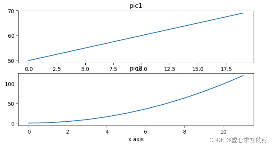
plt.subplot(211,title="pic1", xlabel="x axis")
plt.plot(range(50,70))
plt.subplot(212, title="pic2", xlabel="x axis")
plt.plot(np.arange(12)**2)
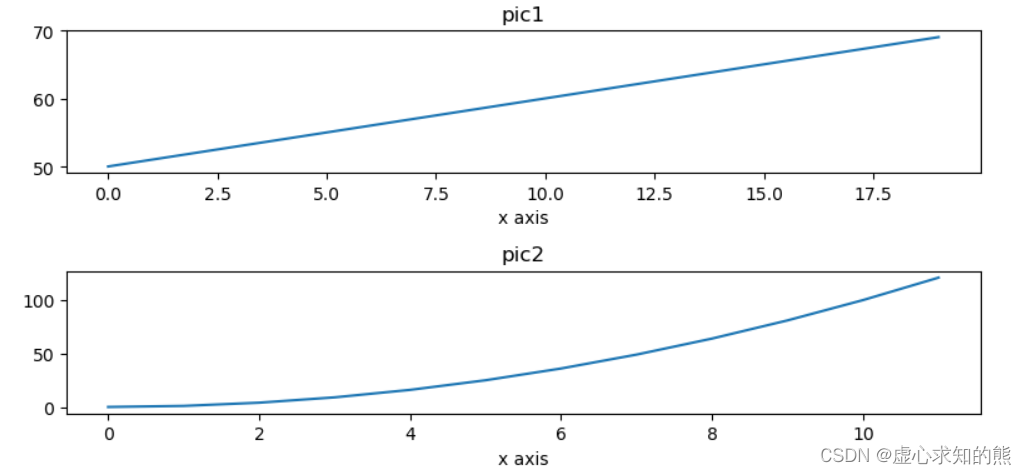
- 发现子图标题重叠,在最后使用 plt.tight_layout()。
plt.subplot(211,title="pic1", xlabel="x axis")
plt.plot(range(50,70))
plt.subplot(212, title="pic2", xlabel="x axis")
plt.plot(np.arange(12)**2)
plt.tight_layout()
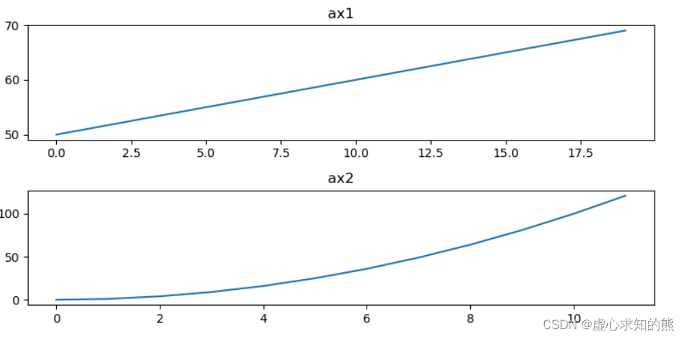
3.2 使用 pyplot 模块中的方法设置后再绘制
plt.subplot(211)
plt.title("ax1")
plt.plot(range(50,70))
plt.subplot(212)
plt.title("ax2")
plt.plot(np.arange(12)**2)
plt.tight_layout()
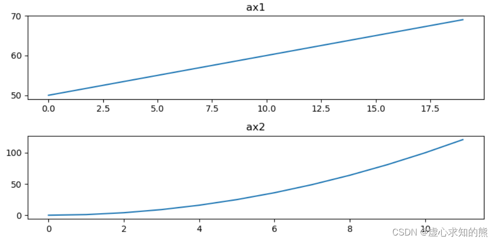
3.3 使用返回的区域对象设置
- 注意区域对象的方法很多都是 set_ 开头。
ax1 = plt.subplot(211)
ax1.set_title("ax1")
ax1.plot(range(50,70))
ax2 = plt.subplot(212)
ax2.set_title("ax2")
ax2.plot(np.arange(12)**2)
plt.tight_layout()
4. subplots() 函数详解
- matplotlib.pyplot 模块提供了一个 subplots() 函数,它的使用方法和 subplot() 函数类似。其不同之处在于,subplots() 既创建了一个包含子图区域的画布,又创建了一个 figure 图形对象,而 subplot() 只是创建一个包含子图区域的画布。
- subplots 的函数格式如下:
fig , ax = plt.subplots(nrows, ncols)
- nrows 与 ncols 表示两个整数参数,它们指定子图所占的行数、列。
- 函数的返回值是一个元组,包括一个图形对象和所有的 axes 对象。其中 axes 对象的数量等于 nrows * ncols,且每个 axes 对象均可通过索引值访问(从 0 开始)。
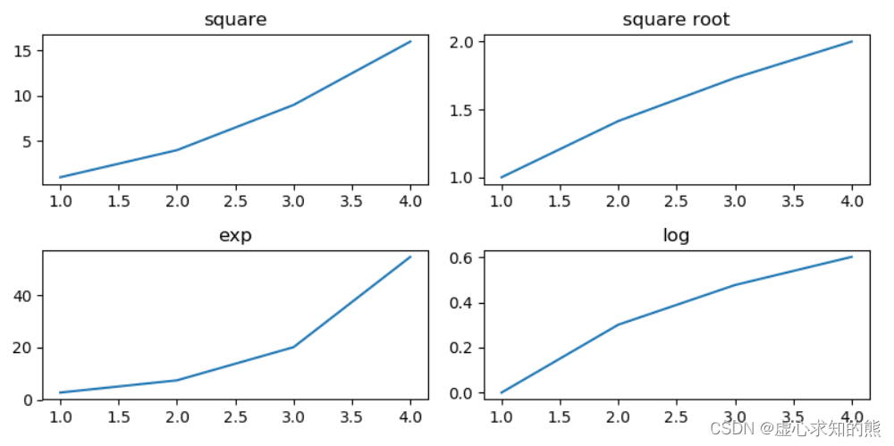
- 下面我们创建了一个 2 行 2 列的子图,并在每个子图中显示 4 个不同的图像。
- 第一幅图像就是 (0,0),显示的是 x 2 x^{2} x2;第二幅图像就是 (0,1),显示的是 x \sqrt{x} x;第三幅图像就是 (1,0),显示的是 e x e^{x} ex;第四幅图像就是 (1,1),显示的是 log 10 x \log_{10}{x} log10x。
import matplotlib.pyplot as plt
import numpy as np
fig, axes = plt.subplots(2,2)
x = np.arange(1,5)
axes[0][0].plot(x, x*x)
axes[0][0].set_title('square')
axes[0][1].plot(x, np.sqrt(x))
axes[0][1].set_title('square root')
axes[1][0].plot(x, np.exp(x))
axes[1][0].set_title('exp')
axes[1][1].plot(x,np.log10(x))
axes[1][1].set_title('log')
plt.tight_layout()
plt.show()


 3万+
3万+

 被折叠的 条评论
为什么被折叠?
被折叠的 条评论
为什么被折叠?
 到【灌水乐园】发言


