


如上图,红框的部分是被预测的专业国家线!
下面六幅图是程序运行结果:
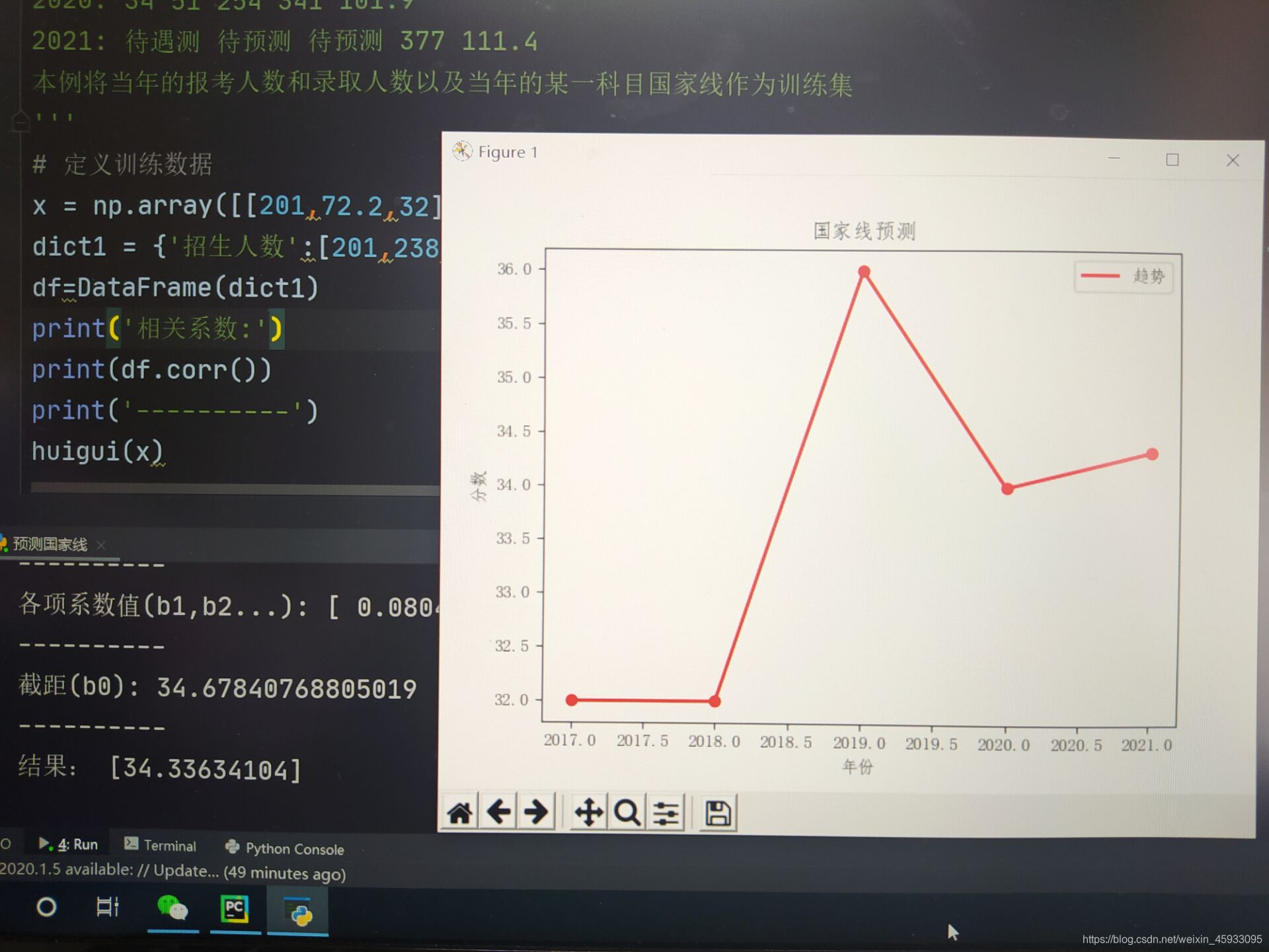
以上两幅图是总分等于100分科目的分数与各数据之间的相关性及预测分数线

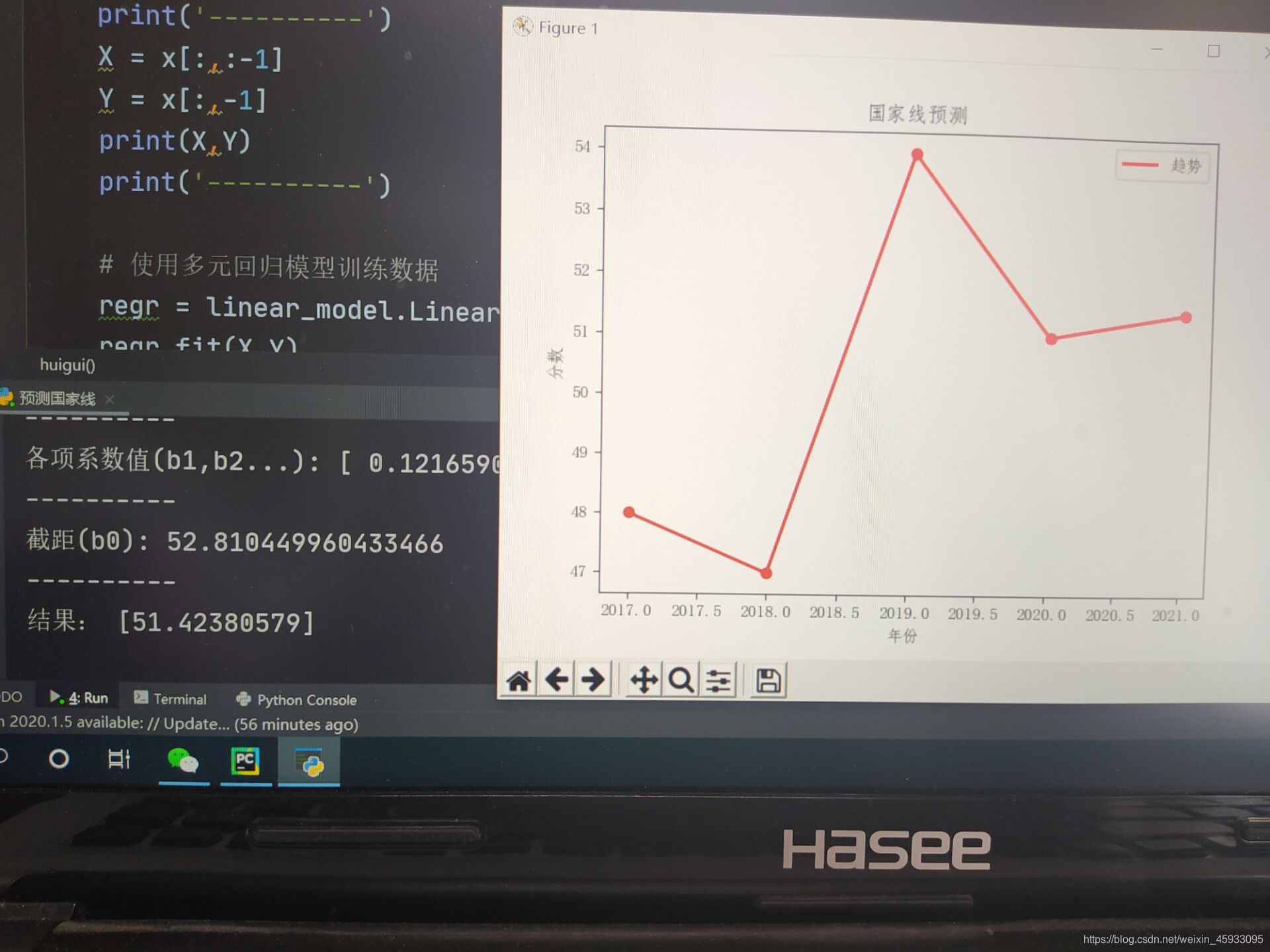
以上两幅图是总分大于100分的科目的分数与各数据之间的相关性及预测分数线


以上两幅图是总分与各数据之间的相关性及预测分数线
多元线性回归的原理本帖不再多讲,还不太明白的同学可以参考下面的链接:
https://baike.sogou.com/m/v73043234.htm
以下部分是代码:
import numpy as np
from pandas import DataFrame
from sklearn import linear_model
from matplotlib import pyplot as plt
def huigui (x):
print('x',x)
year = [2017, 2018, 2019, 2020, 2021]
fs =list(x[:,2])
print('fs',fs)
print('----------')
X = x[:,:-1]
Y = x[:,-1]
print(X,Y)
print('----------')
# 使用多元回归模型训练数据
regr = linear_model.LinearRegression()
regr.fit(X,Y)
print('各项系数值(b1,b2...):',regr.coef_)
print('----------')
print('截距(b0):',regr.intercept_)
print('----------')
# 预测
x_test = np.array([[377,111.4]])
y_test = regr.predict(x_test)
print('结果:',y_test)
fs.append(y_test)
#绘图
plt.rcParams['font.sans-serif'] = ['FangSong']
plt.figure()
plt.scatter(year, fs, color='red')
plt.plot(year, fs, label="趋势", color="red", linewidth=2)
plt.xlabel("年份")
plt.ylabel("分数")
plt.title("国家线预测")
plt.legend() # 显示左下角的图例
plt.show()
'''
数据来源:
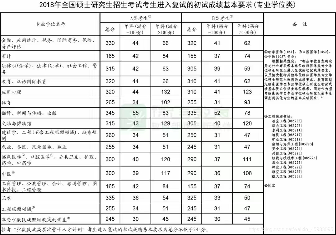
2017: 32 48 255 201 72.2(前三项数据表示当年各科国家线和总线,后两个数据为当年的报考人数和录取人数)
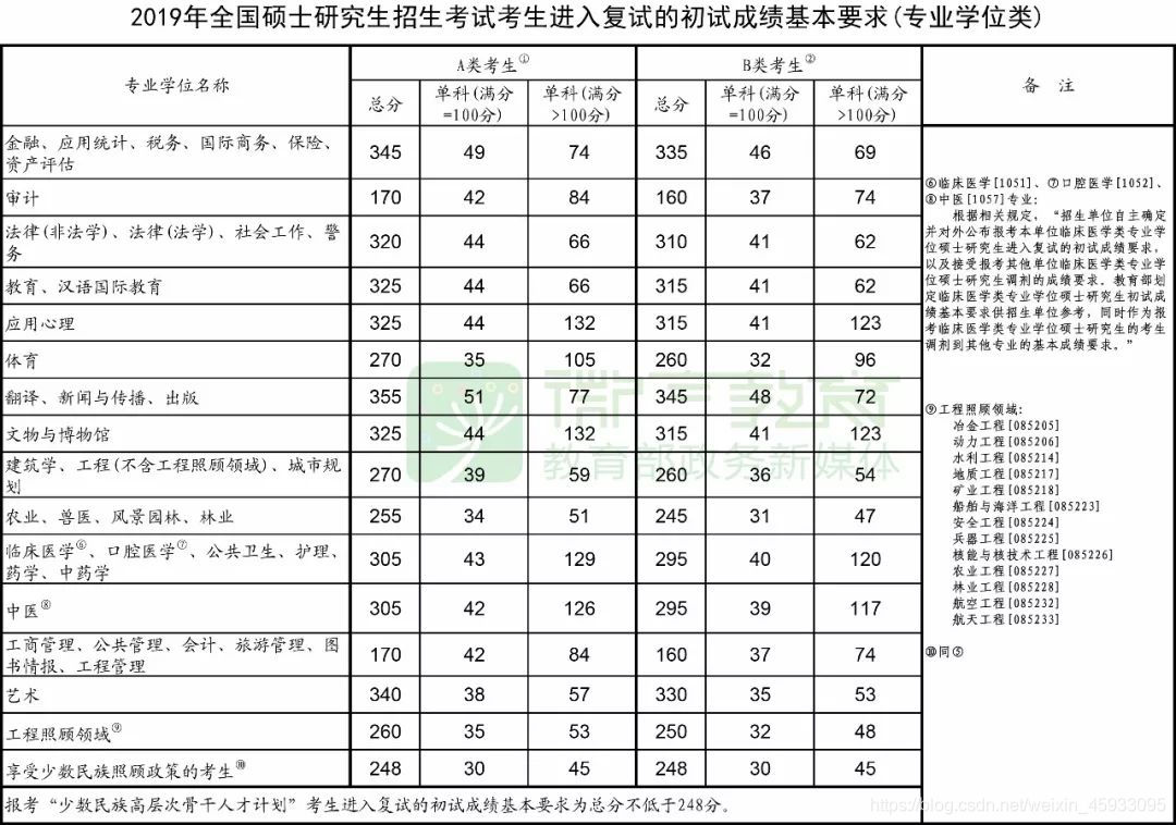
2018: 31 47 250 238 76.3
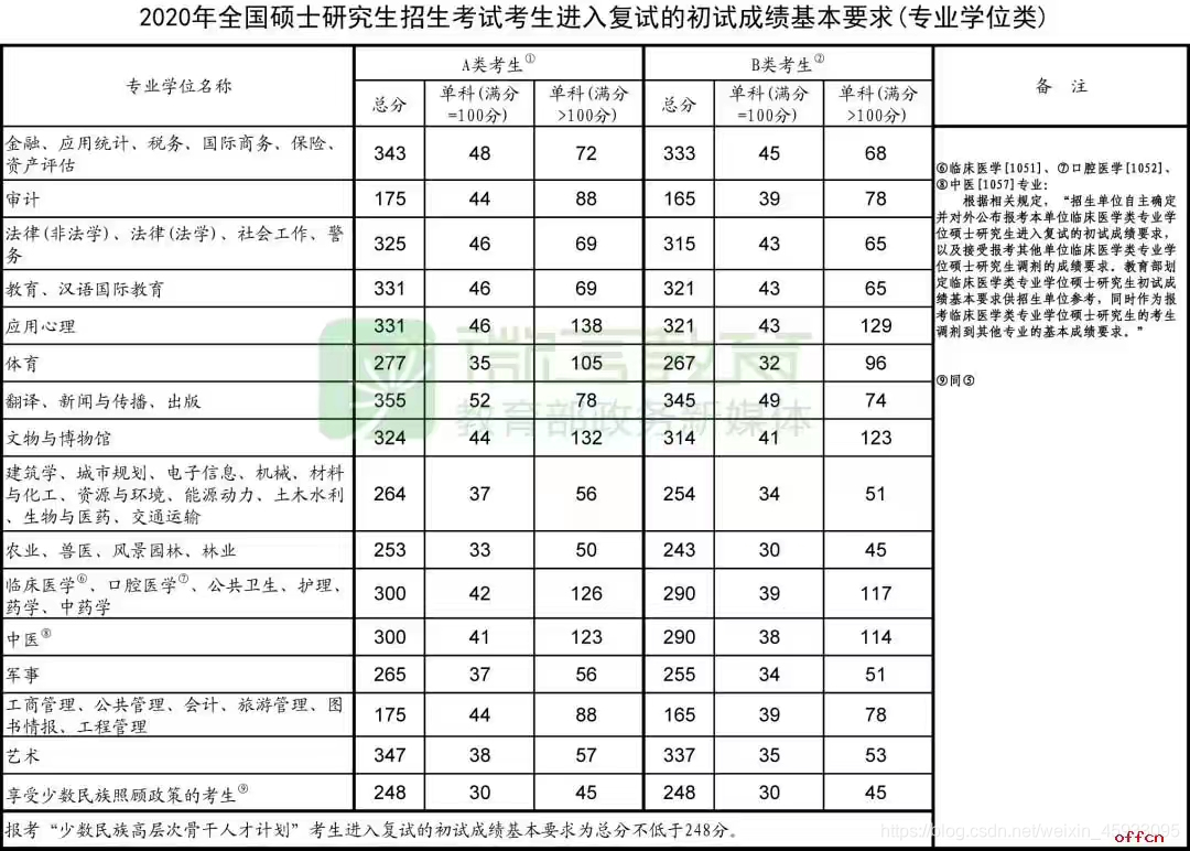
2019: 36 54 260 290 83
2020: 34 51 254 341 101.9
2021: 待遇测 待预测 待预测 377 111.4
本例将当年的报考人数和录取人数以及当年的某一科目国家线作为训练集
'''
# 定义训练数据
x = np.array([[201,72.2,255],[238,76.3,250],[290,83,260],[341,101.9,254]])
dict1 = {'招生人数':[201,238,290,341],'录取人数':[72.2,76.3,83,101.9],
'报录比':[201/72.2,238/76.3,290/83,341/101.9],'分数':[255,250,260,254]}
df=DataFrame(dict1)
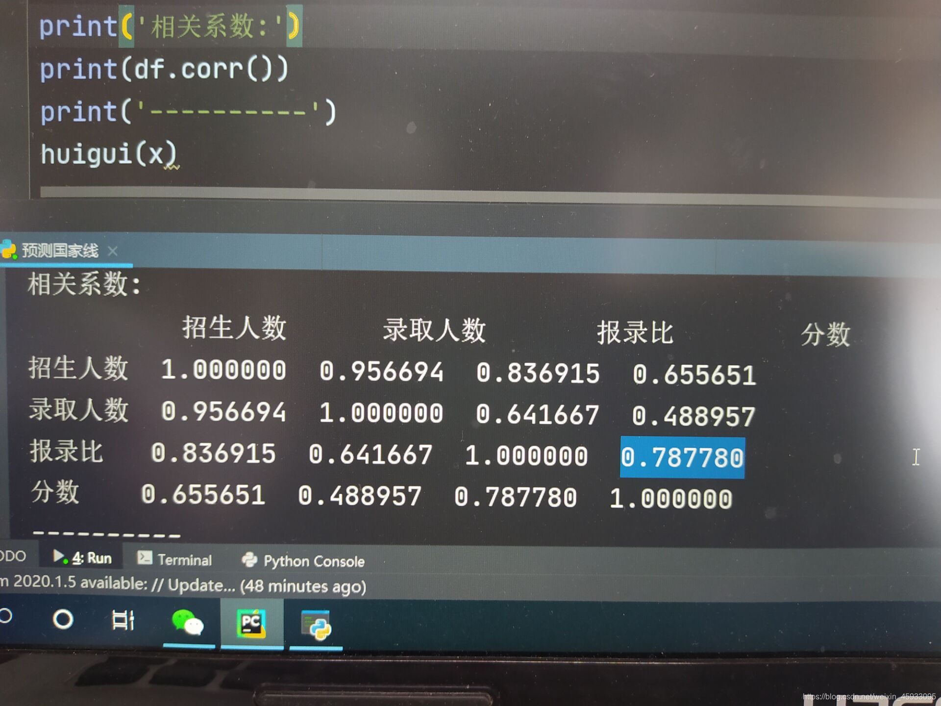
print('相关系数:')
# r(相关系数) = x和y的协方差/(x的标准差*y的标准差) == cov(x,y)/σx*σy
# 0-0.3:弱相关,0.3-0.6:中等程度相关,0.6-1:强相关
print(df.corr())
print('----------')
huigui(x)
结果分析:从相关系数上看,报录比与分数的相关性并没有全部都很高!所以尽管最后预测的结果误差非常小,但我认为本程序能将分数线预测得如此准确还是存在一定巧合的!
最后欢迎各位读者批评指正,或提出更有效的分数预测模型!
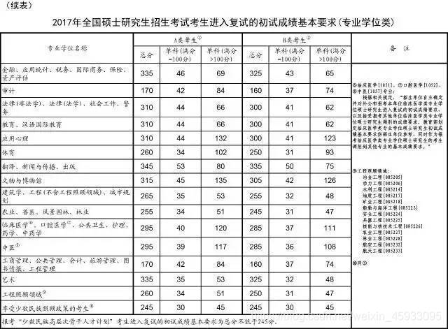
以下是数据来源


 779
779


 被折叠的 条评论
为什么被折叠?
被折叠的 条评论
为什么被折叠?
 到【灌水乐园】发言


