


- iris介绍
iris数据集也称鸢尾花数据集。包括150个数据样本,分为三类,每类五十个数据,每个数据具有四个属性,可通过四个属性预测鸢尾花属于哪一类。
- 用到的python库
matplotlib、pandas、sklearn、seaborn
/这里因为我没有下载iris数据集,所以从sklearn里面导入,如果有数据集则用pandas.read_csv打开即可。/
有了数据集以后就直接作图等操作就好了。 let‘s go!
导入数据集,看看数据集长啥样子。
把数据集转换为pandas的DataFrame类型便于操作(类似与二维表)
import pandas as pd
from sklearn.datasets import load_iris
#因为没有iris数据集,只好从sklearn里面导入
import matplotlib.pyplot as plt
import seaborn as sns

iris=load_iris()

feature_names=['sepal length', 'sepal width', 'petal length', 'petal width']
#利用字典把数据转换为dataframe类型
#DataFrame指一种类似与excel的二维表的框架
iris=pd.DataFrame({
        feature_names[0]:[iris.data[i][0] for i in range(len(iris.data))],
        feature_names[1]:[iris.data[i][1] for i in range(len(iris.data))],
        feature_names[2]:[iris.data[i][2] for i in range(len(iris.data))],
        feature_names[3]:[iris.data[i][3] for i in range(len(iris.data))],
        'type':iris.target
})

print(iris)#150*5的二维表
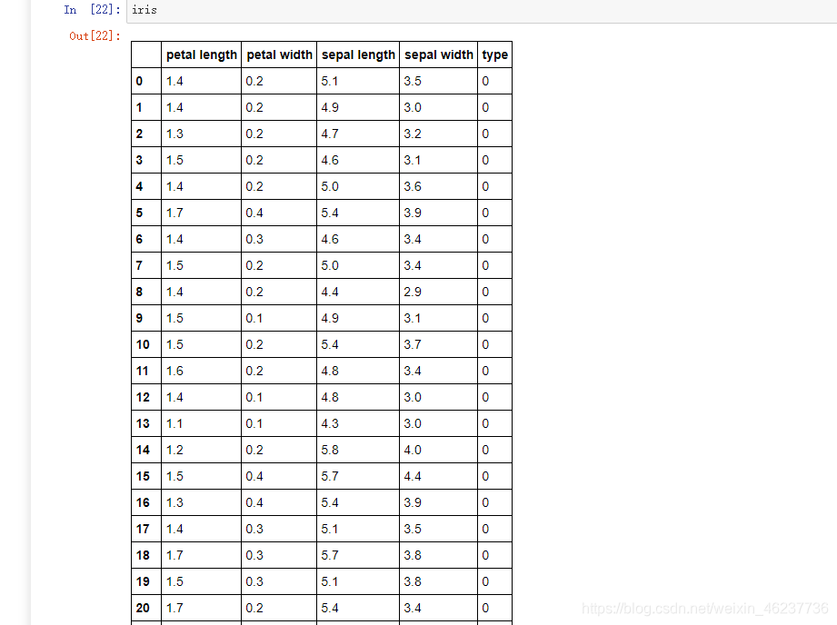 t这就是iris数据集的前20行,没有截完,然后我们来看看前五行和数据总体信息描述(type的0,1,2分别表示三种花setosa,versicolor,virginica)
print(iris.head())#前五条数据
petal length petal width sepal length sepal width type
0 1.4 0.2 5.1 3.5 0
1 1.4 0.2 4.9 3.0 0
2 1.3 0.2 4.7 3.2 0
3 1.5 0.2 4.6 3.1 0
4 1.4 0.2 5.0 3.6 0
print(iris.info())#总体信息
<class ‘pandas.core.frame.DataFrame’>
RangeIndex: 150 entries, 0 to 149
Data columns (total 5 columns):
petal length 150 non-null float64
petal width 150 non-null float64
sepal length 150 non-null float64
sepal width 150 non-null float64
type 150 non-null int32
dtypes: float64(4), int32(1)
memory usage: 5.4 KB
None
print(iris.describe())#数据描述
petal length petal width sepal length sepal width type
count 150.000000 150.000000 150.000000 150.000000 150.000000
mean 3.758667 1.198667 5.843333 3.054000 1.000000
std 1.764420 0.763161 0.828066 0.433594 0.819232
min 1.000000 0.100000 4.300000 2.000000 0.000000
25% 1.600000 0.300000 5.100000 2.800000 0.000000
50% 4.350000 1.300000 5.800000 3.000000 1.000000
75% 5.100000 1.800000 6.400000 3.300000 2.000000
max 6.900000 2.500000 7.900000 4.400000 2.000000
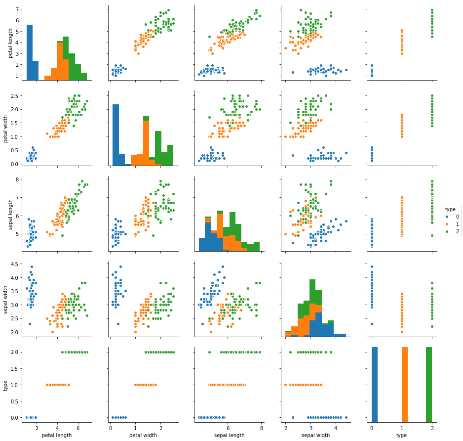
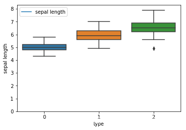
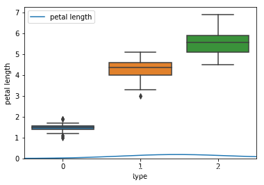
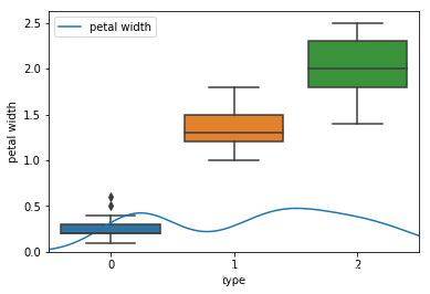
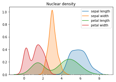
然后分别画出箱线图、关系矩阵、核密度图。
#画各个特征的关系矩阵
#0,1,2分别代表setosa,versicolor,virginica
sns.pairplot(data=iris,hue='type')
plt.show()
#0,1,2分别代表setosa,versicolor,virginica
#绘制箱线图
for i in range(4):
    sns.boxplot(x="type",y=feature_names[i],data=iris)
    sns.kdeplot(iris[feature_names[i]])
    plt.show()

for i in range(4):
    sns.kdeplot(iris[feature_names[i]],shade=True)
plt.title("Nuclear density")
plt.show()


 3362
3362


 被折叠的 条评论
为什么被折叠?
被折叠的 条评论
为什么被折叠?
 到【灌水乐园】发言


