


背景
本来想用不同的国家直接贸易往来的数据构建图关联的结构的模型,观察哪些国家贸易紧密的。但是这个数据只有港口作为节点,那就做点可视化分析吧。
数据介绍
主要是这些变量:
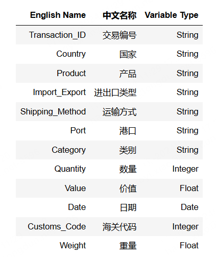
大部分是字符串类型的变量,下面可以进行各种分组聚合,条件筛选对比风险。
当然需要本期案例的全部数据和代码文件的同学可以参考:港口数据
代码实现
读取数据
导入包
import numpy as np
import pandas as pd
import plotly.express as px
加载数据,随机抽取10条看看,
df = pd.read_csv('Imports_Exports_Dataset new.csv')
df.sample(10)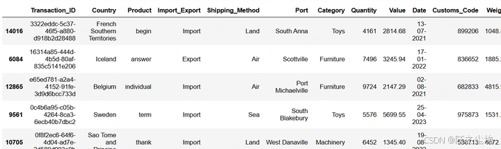
数据描述性统计分析
进出口
查看数据基础信息
df.info()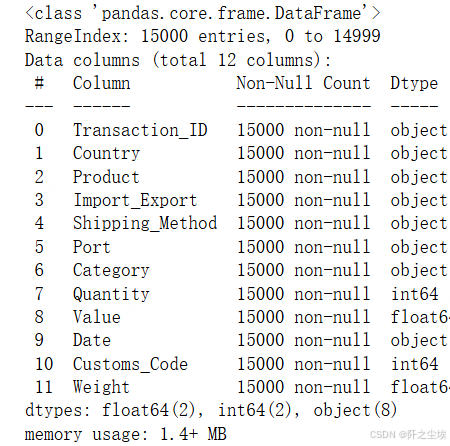
查看是否缺失值。
df.isnull().sum()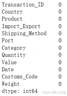
查看重复数据
df.duplicated().sum()
查看变量名称
df.columns
转化时间日期格式
# Date column ko correct format mein convert karna
df['Date'] = pd.to_datetime(df['Date'], format='%d-%m-%Y')
交易量-国家/地区和类别
按照不同的商品,国家,查看进出口的交易量。
# Trade volume aur value ko summarize karna har country aur product category ke hisab se
trade_summary = df.groupby(['Country', 'Category', 'Import_Export']).agg({
    'Quantity': 'sum',
    'Value': 'sum'
}).reset_index()

# Trade volume ka plot har country aur category ke liye
fig_volume = px.bar(trade_summary, x='Category', y='Quantity', color='Country',
                    title='Trade Volume by Country and Category', barmode='group',
                    labels={'Quantity':'Total Quantity', 'Category':'Product Category'})
fig_volume.update_layout(xaxis_title='Product Category',
                         yaxis_title='Total Quantity',
                         legend_title='Country')
fig_volume.show()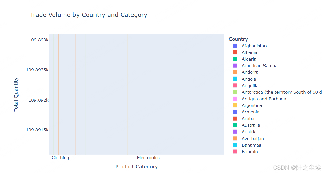
这个图是动态的,截图可能不能展现它的强大,它是可以交互的图。
交易金额-国家/地区和类别
不同国家和地区的交易金额。
# Trade value ka plot har country aur category ke liye
fig_value = px.bar(trade_summary, x='Category', y='Value', color='Country',
                   title='Trade Value by Country and Category', barmode='group',
                   labels={'Value':'Total Value (USD)', 'Category':'Product Category'})
fig_value.update_layout(xaxis_title='Product Category',
                        yaxis_title='Total Value (USD)',
                        legend_title='Country')
fig_value.show()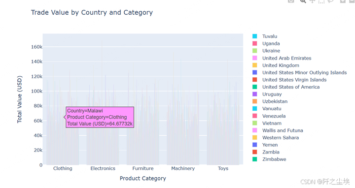
光标放在哪,哪里就有这个数据的信息,是交互式的,还是很厉害的图。
平均交易额 -运送方式
来对比不同运送方法的交易额,计算代码:
shipping_analysis = df.groupby('Shipping_Method').agg({
    'Value': 'mean',
    'Quantity': 'mean',
    'Weight': 'mean'
}).reset_index()
可视化
# Average Trade Value by Shipping Method with specific color
fig_value = px.bar(shipping_analysis, x='Shipping_Method', y='Value',
                   title='Average Trade Value by Shipping Method',
                   labels={'Value': 'Average Trade Value (USD)'},
                   color_discrete_sequence=['#636EFA'])  # Blue color
fig_value.update_layout(xaxis_title='Shipping Method', yaxis_title='Average Value (USD)')
fig_value.show()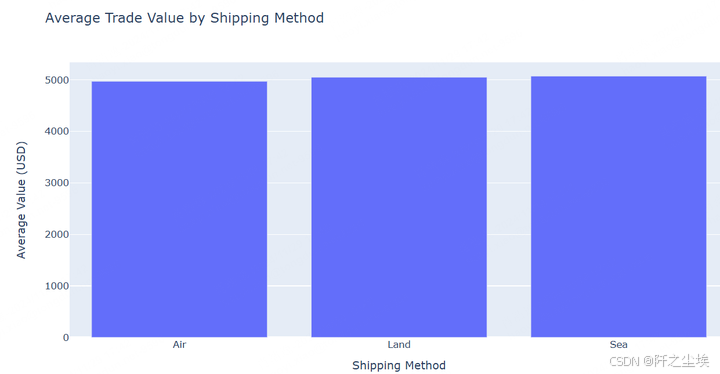
三种海陆空运输方法的交易金额差不多,但是还有细微的差别。
总结: 海运方式的平均交易价值最高(5,073.827 美元)。 陆运方式紧随其后,平均值略低(5,052.056 美元)。 空运方式的平均交易价值最低(4,972.596 美元)。 这表明,与空运相比,通过海运和陆运运输的平均贸易价值更高
平均数量 -运输方式
来对比不同运送方法的交易数量,可视化
# Average Quantity by Shipping Method with different color
fig_quantity = px.bar(shipping_analysis, x='Shipping_Method', y='Quantity',
                      title='Average Trade Quantity by Shipping Method',
                      labels={'Quantity': 'Average Quantity'},
                      color_discrete_sequence=['#EF553B'])  # Red color
fig_quantity.update_layout(xaxis_title='Shipping Method', yaxis_title='Average Quantity')
fig_quantity.show()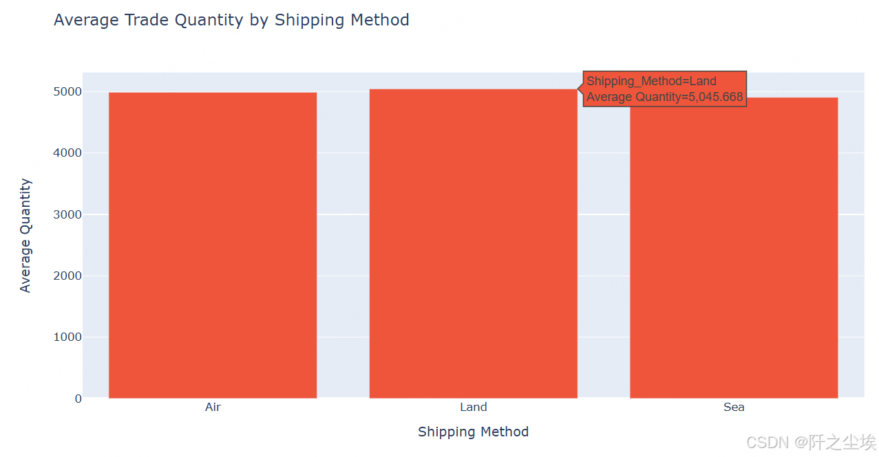
总结: 陆运方式的平均贸易数量最高 (5,045.668)。 空运方式紧随其后,平均数量为 4,990.102。 海运方式的平均贸易数量最低 (4,907.333)。 这表明陆运通常用于大批量的货物,而海运往往处理相对较小的数量。空运介于两者之间,处理量接近陆运。
平均重量 -交易方式
# Average Weight by Shipping Method with another color
fig_weight = px.bar(shipping_analysis, x='Shipping_Method', y='Weight',
                    title='Average Weight by Shipping Method',
                    labels={'Weight': 'Average Weight (Kg)'},
                    color_discrete_sequence=['#00CC96'])  # Teal color
fig_weight.update_layout(xaxis_title='Shipping Method', yaxis_title='Average Weight (Kg)')
fig_weight.show()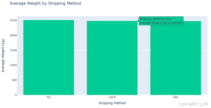
总结: 空运方式处理的平均重量最高 (2,513.396 千克)。 陆运方式紧随其后,平均重量为 2,484.802 公斤。 海运方式的平均重量最低(2,478.258 公斤)。 这表明与陆运和海运方式相比,空运处理的货物略重,尽管差异非常小。
进口 vs. 出口 分布 -柱状图
# Import vs Export transaction counts with custom colors
fig = px.bar(df, x='Import_Export', title='Import vs Export Distribution',
             color='Import_Export', color_discrete_sequence=['red', 'black'])  # Custom color for each category
fig.show()
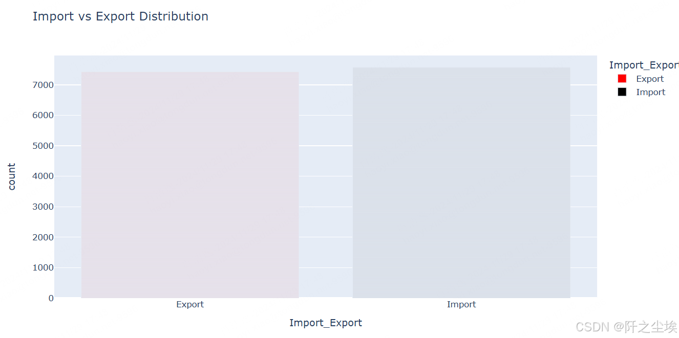
总结: Import 和 Export 的分布几乎相等,两个类别的记录计数相似,各约为 7,000 条。 这种平衡表明数据集的进口和出口数量几乎相等,反映了两种贸易类型之间的数据集非常平衡。
交易数量排名前 10 的国家- 柱状图
# Top 10 countries involved in trade
top_countries = df['Country'].value_counts().head(10).index
fig = px.bar(df[df['Country'].isin(top_countries)], x='Country', title='Top 10 Countries by Transaction Count')
fig.show()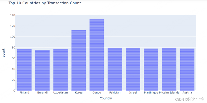
可以看到congo和韩国交易量比较多。
前 10 名产品类别 -柱状图
# Top 10 product categories by transaction count
top_categories = df['Category'].value_counts().head(10).index
fig = px.bar(df[df['Category'].isin(top_categories)], x='Category', title='Top 10 Product Categories by Transaction Count')
fig.show()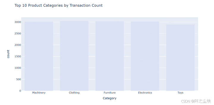
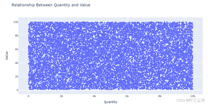
数量与价值的关系 - 散点图
# Scatter plot to show relationship between quantity and value
fig = px.scatter(df, x='Quantity', y='Value', title='Relationship Between Quantity and Value')
fig.show()
配送运输方式- 饼图
# Pie chart for shipping methods
fig = px.pie(df, names='Shipping_Method', title='Distribution of Shipping Methods', hole=0.4)
fig.show()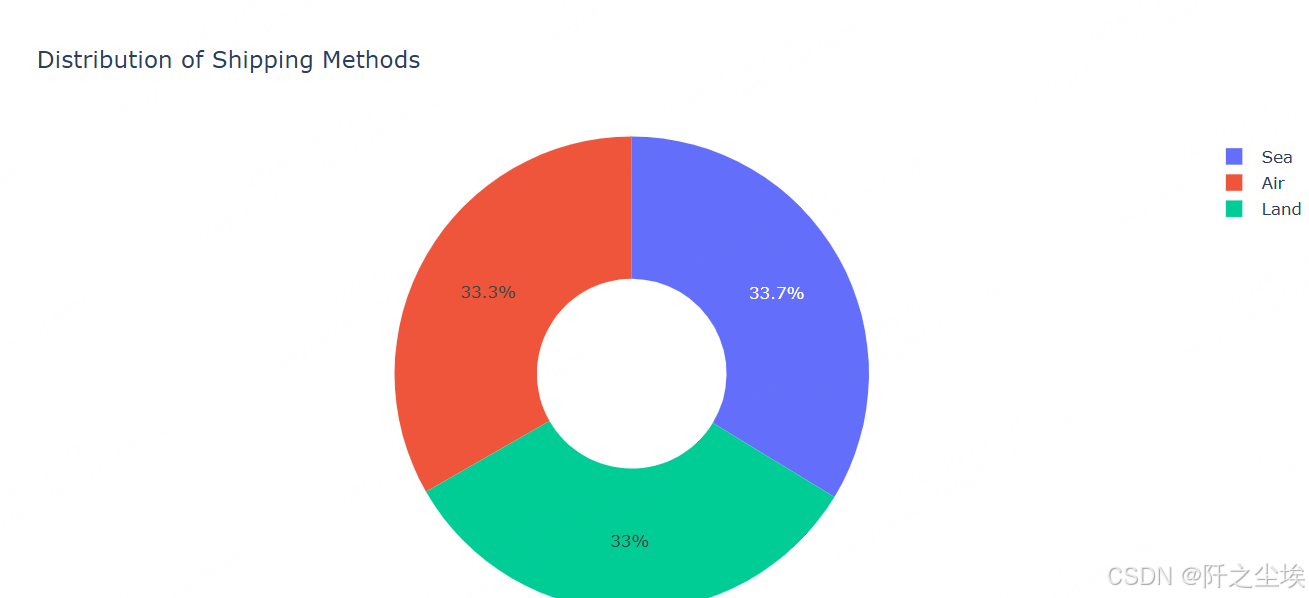
数量、价值和重量之间的相关性- 热力图
import numpy as np
# Create a correlation matrix and plot a heatmap
fig = px.imshow(np.round(df[['Quantity', 'Value', 'Weight']].corr(), 2),
                text_auto=True,
                title='Correlation Matrix: Quantity, Value, and Weight')
fig.show(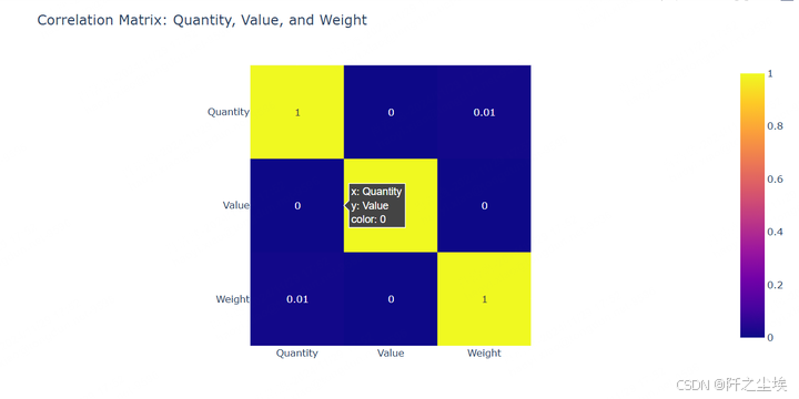
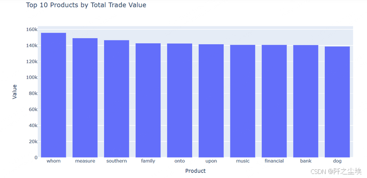
按总贸易价值排名前 10 位的产品 - 条形图
# Group by product and show top 10 products by value
top_products = df.groupby('Product')['Value'].sum().reset_index().sort_values(by='Value', ascending=False).head(10)
fig = px.bar(top_products, x='Product', y='Value', title='Top 10 Products by Total Trade Value')
fig.show()
总结
本文章分析提供了对不同运输方式的贸易价值、数量和重量以及进出口分布和主要交易国家/地区的见解。
平均贸易价值: 海运的平均贸易价值最高,为 5,073.827 美元,紧随其后的是陆运 5,052.056 美元和空运 4,972.596 美元。这表明,与空运相比,海运和陆运往往涉及更高的贸易价值。
平均贸易数量:就平均数量而言,陆运以 5,045.668 个单位领先,其次是空运 4,990.102 个单位和海运 4,907.333 个单位。这表明更多的货物是通过陆运运输的,空运紧随其后。
平均贸易重量: 空运的平均重量最高,为 2,513.396 公斤,陆地紧随其后,为 2,484.802 公斤,海运为 2,478.258 公斤。这里的差异很小,但 Air 似乎可以处理稍重的货物。
进口与出口分布:进口-出口数据显示几乎相等的分布,进口和出口都有大约 7,000 条记录,表明数据集平衡。
交易数量排名前 10 的国家/地区:刚果以接近 140 笔交易位居榜首,其次是韩国,交易数量超过 100 笔。其他国家,如芬兰、布隆迪、乌兹别克斯坦等,交易数量相对相似,徘徊在 70 左右。
该分析提供了贸易数据的全面视图,突出了航运方式、贸易量和地理分布的主要趋势,后续可以使用机器学习通过预测建模来增强理解。
创作不易,看官觉得写得还不错的话点个关注和赞吧,本人会持续更新python数据分析领域的代码文章~(需要定制类似的代码可私信)


 1442
1442

 被折叠的 条评论
为什么被折叠?
被折叠的 条评论
为什么被折叠?
 到【灌水乐园】发言


