


R语言:箱型图代码(仅用于自学)
最近在画图用到箱型图,故搬运自己觉得好用的箱型图代码,仅用于我自己学习,算是记录自己的学习历程。
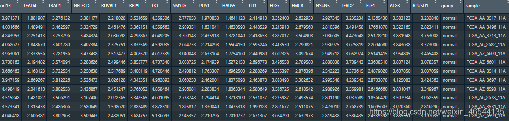
1.数据准备
数据的行是样本名称,列是我需要绘制箱型图的基因名称,并且在最后两列自己添加了分组信息和样本名称列,因为等下需要进行数据框的长宽型转化,将数据转化成长型数据。
tbrown <- read.csv(file = "D:/MPCC/tbrown.csv")
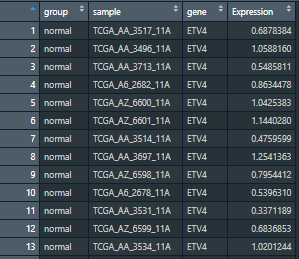
2.数据长宽型转化
data表示操作的数据集,key表示根据什么分类变量变成长型数据(因为我是根据基因表达量画图的,所以我将key设置成gene),value代表数值(我的数值是基因的表达量,所以我将value设置成Expression),第四个参数表示哪些变量(列名)不用变,用的是*c()*向量函数,不要忘记前面有一个"-"号。
library(tidyr)
tbrown$sample <- rownames(tbrown)
aa <- gather(data = tbrown,key = gene,value = Expression,-c("sample","group"))
转化好的数据集aa长这样
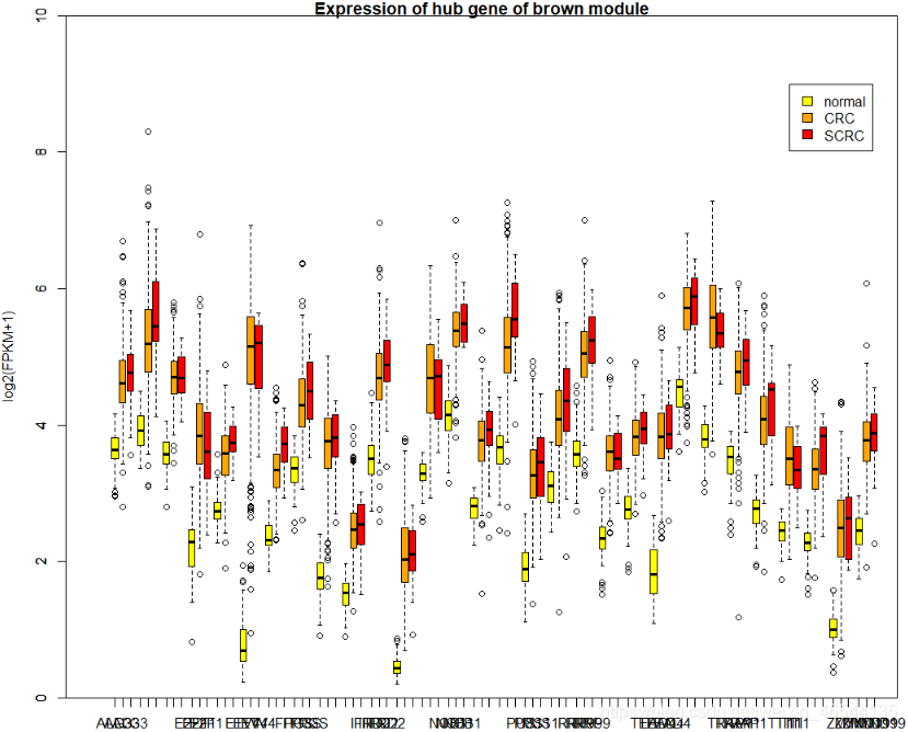
3.画图,首先是boxplot()
这种不适合画箱体特别多的,会很挤,血的教训,特别是我这种菜鸡,没找到办法调,就真的很挤
par(mfrow = c(1,1))#保证画面出现的图是1行1列的
boxplot(Expression~gene,data=aa,
        boxwex=0.25,at=1:30-0.3,#每组要画n个箱子,at就等于1:n,至于-0.3是为了不让箱子叠到一起
        subset=group=="normal",col="yellow",#选取子集
        main="Expression of hub gene of brown module",
        xlab="gene",
        ylab="log2(FPKM+1)",
        xlim=c(0,30),
        ylim=c(0,10),
        yaxs="i")

boxplot(Expression~gene,data=aa,add=T,#add=T表示在当前箱型图上再添加新的箱型图
        boxwex=0.25,at=1:30,
        subset=group=="CRC",col="orange")#选取子集

boxplot(Expression~gene,data=aa,add=T,
        boxwex=0.25,at=1:30+0.3,
        subset=group=="SCRC",col="red")#选取子集

legend(x = 28,y = 9,c("normal","CRC","SCRC"),fill = c("yellow","orange","red"))#x和y表示画在x轴的28.5,y轴9的位置
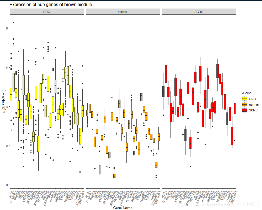
画好之后的图长这样,横轴的字体我想竖着放,但是我太菜了,我看了参数没找到怎么改,横着放我也没找到该怎样才能只显示一次基因名,总之就是我太菜了,不知道咋解决。
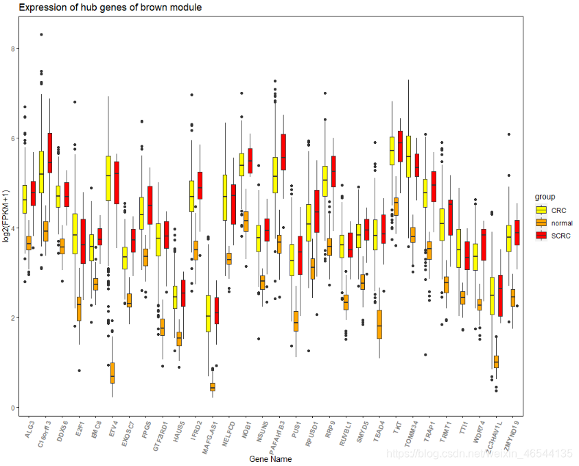
4.画图,接着是ggplot2
最常见的一种
library(ggplot2)
ggplot(aa, aes(x=gene, y=Expression, fill = group)) +
  scale_fill_manual(values = c("yellow","orange","red")) + #设置颜色
  geom_boxplot()+
  #coord_flip()+#箱体90度旋转
  #geom_boxplot(outlier.colour="red", outlier.shape=8, outlier.size=4)+#设置显示极端值,没有特殊需求可以不用管这步
  xlab("Gene Name") +
  ylab("log2(FPKM+1)") +
  labs(title = "Expression of hub genes of brown module")+
 theme(panel.background=element_blank(),panel.border=element_rect(linetype="solid",fill=NA))+#去除背景加上黑色外边框
  theme(axis.text.x=element_text(face = "bold", color="gray50",angle = 70,vjust = 1, hjust = 1 ))#angle = 70表示横轴标题倾斜70度
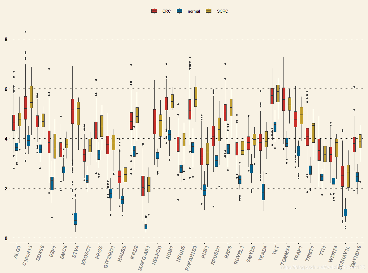
画出来的图长这样
将各组分开显示的箱型图
ggplot(aa, aes(x=gene, y=Expression, fill = group)) +
    scale_fill_manual(values = c("yellow","orange","red")) +
    geom_boxplot()+
    facet_wrap(~group)+#只比上面的图多这一步,表示根据分组显示
    #coord_flip()+#箱体90度旋转
    xlab("Gene Name") +
    ylab("log2(FPKM+1)") +
    labs(title = "Expression of hub genes of brown module")+
    theme(panel.background=element_blank(),panel.border=element_rect(linetype="solid",fill=NA))+#去除背景加上黑色外边框
    theme(axis.text.x=element_text(face = "bold", color="gray50",angle = 70,vjust = 1, hjust = 1 ))
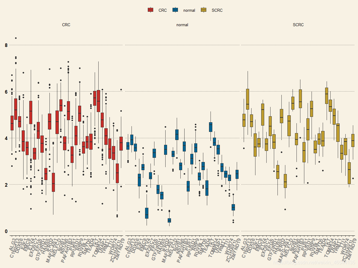
画出来是这样滴
黄色背景箱型图
library(ggthemes)
  ggplot(aa, aes(x=gene, y=Expression, fill = group)) +
    geom_boxplot()+
    theme_wsj()+
    scale_fill_wsj()+
    guides(fill=guide_legend(title=NULL))+
    theme(axis.text.x=element_text(face = "bold", color="gray50",angle = 70,vjust = 1, hjust = 1 ))
画好之后长这样
黄色背景箱型图分组显示
library(ggthemes)
  ggplot(aa, aes(x=gene, y=Expression, fill = group)) +
    geom_boxplot()+
    theme_wsj()+
    scale_fill_wsj()+
    guides(fill=guide_legend(title=NULL))+
    theme(axis.text.x=element_text(face = "bold", color="gray50",angle = 70,vjust = 1, hjust = 1 ))+
    facet_grid(.~group)#加这句就会分组显示,上面的只是没有这行代码
画好之后长这样
蓝色背景代码
library(ggthemes)
ggplot(aa, aes(x=gene, y=Expression, fill = group)) +
    geom_boxplot()+
    theme_economist()+
    scale_fill_economist()+
    guides(fill=guide_legend(title=NULL))+
    theme(axis.text.x=element_text(face = "bold", color="gray50",angle = 70,vjust = 1, hjust = 1 ))
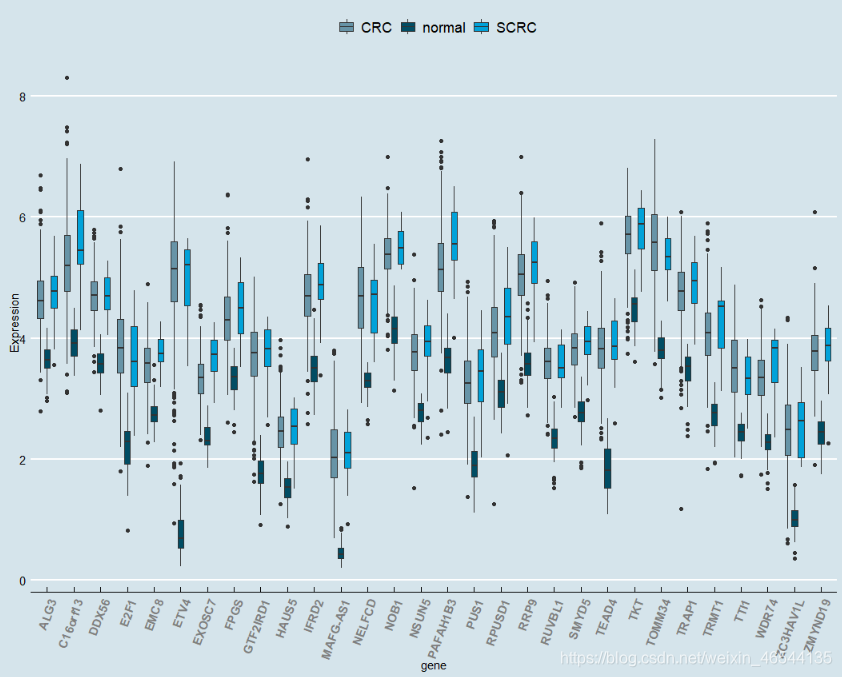
画好之后长这样
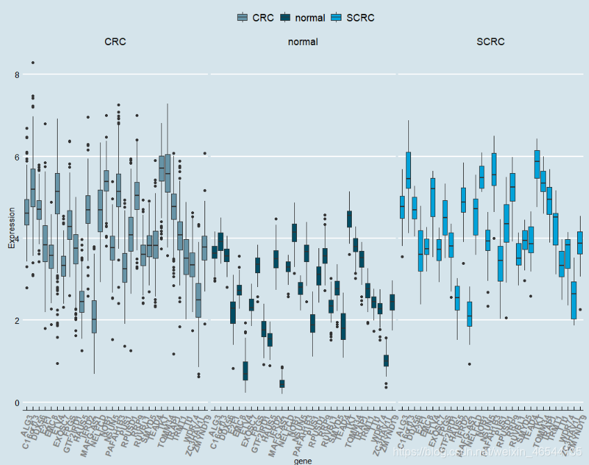
蓝色背景分组显示代码
library(ggthemes)
ggplot(aa, aes(x=gene, y=Expression, fill = group)) +
    geom_boxplot()+
    theme_economist()+
    scale_fill_economist()+
    guides(fill=guide_legend(title=NULL))+
    theme(axis.text.x=element_text(face = "bold", color="gray50",angle = 70,vjust = 1, hjust = 1 ))+
    facet_grid(.~group)#加这句就会分组显示
画好之后长这样


 1210
1210

 被折叠的 条评论
为什么被折叠?
被折叠的 条评论
为什么被折叠?
 到【灌水乐园】发言


