


1 选择器的进阶
1.1 后代选择器
根据HTML的嵌套关系,选择父元素后代中满足条件的元素
<!DOCTYPE html>
<html lang="en">
<head>
<meta charset="UTF-8">
<meta http-equiv="X-UA-Compatible" content="IE=edge">
<meta name="viewport" content="width=device-width, initial-scale=1.0">
<title>后代选择器</title>
<style>
div p {
color: pink;
}
</style>
</head>
<body>
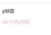
<p>p标签</p>
<div>
<p>div下的p标签</p>
</div>
</body>
</html>
结果:
1.2 子代选择器
根据html嵌套关系,选择父元素子代中满足条件的元素。
<!DOCTYPE html>
<html lang="en">
<head>
<meta charset="UTF-8">
<meta http-equiv="X-UA-Compatible" content="IE=edge">
<meta name="viewport" content="width=device-width, initial-scale=1.0">
<title>后代选择器</title>
<style>
div>p {
color: pink;
}
</style>
</head>
<body>
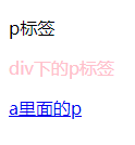
<p>p标签</p>
<div>
<p>div下的p标签</p>
<a href="#">
<p>a里面的p</p>
</a>
</div>
</body>
</html>
结果;
1.3 并集选择器
同时选择多组标签,设置相同的样式
<!DOCTYPE html>
<html lang="en">
<head>
<meta charset="UTF-8">
<meta http-equiv="X-UA-Compatible" content="IE=edge">
<meta name="viewport" content="width=device-width, initial-scale=1.0">
<title>后代选择器</title>
<style>
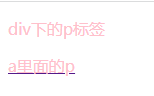
div,p {
color: pink;
}
</style>
</head>
<body>
<!-- <p>p标签</p> -->
<div>
<p>div下的p标签</p>
<a href="#">
<p>a里面的p</p>
</a>
</div>
</body>
</html>
结果:
1.4 交集选择器
<!DOCTYPE html>
<html lang="en">
<head>
<meta charset="UTF-8">
<meta http-equiv="X-UA-Compatible" content="IE=edge">
<meta name="viewport" content="width=device-width, initial-scale=1.0">
<title>交集选择器</title>
<style>
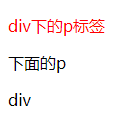
p.box {
color: red;
}
</style>
</head>
<body>
<!-- <p>p标签</p> -->
<div>
<p class="box">div下的p标签</p>
<p>下面的p</p>
<div class="box">div</div>
</div>
</body>
</html>
结果:
1.5 hover伪类选择器
选中鼠标悬停在元素上的状态,设置样式(任何标签都可以添加伪类)
<!DOCTYPE html>
<html lang="en">

<head>
    <meta charset="UTF-8">
    <meta http-equiv="X-UA-Compatible" content="IE=edge">
    <meta name="viewport" content="width=device-width, initial-scale=1.0">
    <title>hover选择器</title>
    <style>
        p:hover {

            color: red;
        }


    </style>
</head>

<body>
    <!-- <p>p标签</p> -->
    <div>
        <p class="box">div下的p标签</p>

        <p>下面的p</p>
        <div class="box">div</div>

    </div>

</body>

</html>
1.6 emmet语法
通过简写语法,快速生成代码。
| 记忆 | 示例 | 效果 |
|---|---|---|
| 标签名 | div | |
| 类选择器 | .red | |
| id选择器 | #red | |
| 交集选择器 | p.red#one | |
| 子代选择器 | ul>li |
|
| 内部文件 | ul>li{内容} |
|
| 创建多个 | ul>li*3 |
|
2 背景相关属性
2.1 背景色
background-color: pink;
background-color: rgba(0,0,0,0.5);
background-color: rgb(0,0,0);
还有十六进制表示法
2.2 背景图片
<!DOCTYPE html>
<html lang="en">
<head>
<meta charset="UTF-8">
<meta http-equiv="X-UA-Compatible" content="IE=edge">
<meta name="viewport" content="width=device-width, initial-scale=1.0">
<title>背景属性</title>
<style>
div {
width: 400px;
height: 400px;
background-image: url(../picture/1.jpg);
}
</style>
</head>
<body>
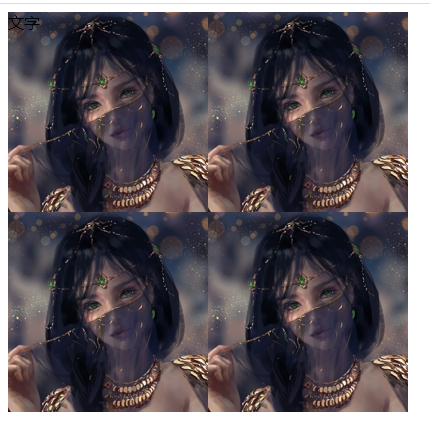
<div>文字</div>
</body>
</html>
结果:
2.3 背景平铺
限制尺寸,只出现一张图
background-repeat: no-repeat; 不平铺,最常用
2.4 背景位置
background-position: right bottom;   //右下位置
background-position: center;  //中心位置
background-position: 20px 100px;  //距左边20px,距上方100px   取值可以为负数
2.5 背景相关属性连写
background: pink url(../picture/1.jpg) no-repeat center;
     背景色;背景图,背景图平铺,背景图位置   不分先后顺序
3 元素显示模式
3.1 块级元素
- 独占一行
- 宽度默认是父元素的宽度,高度由默认内容撑开
- 可以设置宽高
- 代表标签
div、p、h系列 、ul、il、dl、dt、dd、form、header
3.2 行内元素
- 一行可以显示多个
- 宽度和高度默认由内容撑开
- 不可以设置宽高
- 代表标签
a、span、b、u、i、s、strong、ins、em、del...
3.3 行内块元素
- 一行可以显示多个
- 可以设置宽高
- 代表标签
input、textarea、button、select、img...
3.4 元素显示模式转换
目的:改变元素默认的显示特点,让元素符合布局要求
语法;
| 属性 | 效果 | 使用频率 |
|---|---|---|
| display:block | 转换成块级元素 | 较多 |
| display:inline-block | 转换成行内块元素 | 较多 |
| display:inline | 转换成行内元素 | 极少 |
4 注意
p标签和h标签不能相互嵌套
p标签内不能嵌套div、p、h等块级元素
a标签不能嵌套自己
5 CSS特性
5.1 继承性
-
特性:子元素有默认继承父元素样式的特点
-
可以继承的常见属性(控制文字的属性都可以继承,不是控制文字的属性一般都不能继承)
- color
- font-style、font-weight、font-size、font-family
- text-indent、text-align
- line-height
- …
-
注意点
- 可以通过调试工具判断样式是否可以继承
<!DOCTYPE html>
<html lang="en">
<head>
<meta charset="UTF-8">
<meta http-equiv="X-UA-Compatible" content="IE=edge">
<meta name="viewport" content="width=device-width, initial-scale=1.0">
<title>继承性</title>
<style>
div {
color: red;
}
</style>
</head>
<body>
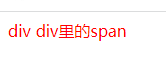
<div>
div
<span>
div里的span
</span>
</div>
</body>
</html>
结果;
5.2 层叠性
- 给同一个标签设置不同的样式>此时样式会层叠叠加>会共同作用在标签上。
- 给同一个标签设置相同的样式>此时样式会层叠叠盖>最终写在最后的样式会生效。
<!DOCTYPE html>
<html lang="en">
<head>
<meta charset="UTF-8">
<meta http-equiv="X-UA-Compatible" content="IE=edge">
<meta name="viewport" content="width=device-width, initial-scale=1.0">
<title>继承性</title>
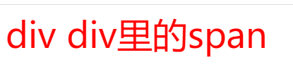
<style>
div {
color: red;
}
.color {
font-size: 50px; 字号跟颜色层叠生效
}
</style>
</head>
<body>
<div class="color">
div div里的span
</div>
</body>
</html>
<!DOCTYPE html>
<html lang="en">
<head>
<meta charset="UTF-8">
<meta http-equiv="X-UA-Compatible" content="IE=edge">
<meta name="viewport" content="width=device-width, initial-scale=1.0">
<title>继承性</title>
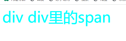
<style>
div {
color: red;
}
.color {
font-size: 50px;
color: aqua;
}
</style>
</head>
<body>
<div class="color">
div div里的span
</div>
</body>
</html>
5.3 优先级
- 特性:不同选择器具有不同的优先级,优先级高的选择器样式会覆盖优先级低选择器标签
- 优先级公式
- 继承<通配符选择器<标签选择器<类选择器<id选择器<行内样式<!important
- 注意点
- !important写在属性值后面,分号的前面
- !important不能提升继承的优先级,只要是继承优先级最低
- 实际开发中不建议使用!important
意义:当一个标签使用了多个选择器,样式冲突的时候,到底谁生效。
5.4 权重叠加计算
- 如果是复合选择器,此时需要通过权重叠加计算方法,判断最终那个选择器优先级最高会生效
- 权重叠加计算公式:(每一级之间不存在进位)
(0 ,0, 0, 0)
行内样式的个数,id选择器的个数,类选择器的个数,标签选择器的个数
- 比较规则
- 先比较第一级数字,如果比较出来了,之后的统统不看
- 如果第一级数字相同,此时再去比较第二级数字,如果比较出来了,之后的统统不看
- 如果最终所有数字都相同,表示优先级相同,则比较层叠性(谁写在下面,谁说了算!)
- 注意点:!important如果不是继承,则权重最高,天下第一!(实际开发中慎用)
<!DOCTYPE html>
<html lang="en">

<head>
    <meta charset="UTF-8">
    <meta http-equiv="X-UA-Compatible" content="IE=edge">
    <meta name="viewport" content="width=device-width, initial-scale=1.0">
    <title>权重叠加计算</title>
    <style>
        /* 0,1,0,1 */
        div #one {

            color: red;
        }

        /* 0,0,2,0 */
        .father .son {

            color: yellow;
        }

        /* 0,0,1,1 */
        .father p {

            color: blue;
        }

        /* 0,0,0,2 */
        div p {

            color: pink;
        }
    </style>
</head>

<body>
    <div class="father">
        <p class="son" id="one">标签</p>
    </div>

</body>

</html>
结果:

6 综合案例
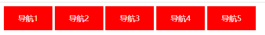
6.1 案例一
<!DOCTYPE html>
<html lang="en">

<head>
    <meta charset="UTF-8">
    <meta http-equiv="X-UA-Compatible" content="IE=edge">
    <meta name="viewport" content="width=device-width, initial-scale=1.0">
    <title>综合案例</title>
    <style>
        .box {

            text-decoration: none;
            width: 100px;
            height: 50px;
            background-color: red;
            display: inline-block;
            color: white;
            text-align: center;
            line-height: 50px;
        }
        a:hover {

            background-color: orange;
        }
    </style>
</head>

<body>
    <a href="#" class="box">导航1</a>
    <a href="#" class="box">导航2</a>
    <a href="#" class="box">导航3</a>
    <a href="#" class="box">导航4</a>
    <a href="#" class="box">导航5</a>
</body>

</html>
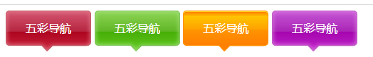
6.2 案例二
<!DOCTYPE html>
<html lang="en">

<head>
    <meta charset="UTF-8">
    <meta http-equiv="X-UA-Compatible" content="IE=edge">
    <meta name="viewport" content="width=device-width, initial-scale=1.0">
    <title>综合案例二</title>
    <style>
        a {

            width: 120px;
            height: 58px;
            text-decoration: none;
            display: inline-block;
            color: white;
            text-align: center;
            line-height: 50px;
            /* font-weight: 700; */
        }
        .box1 {

            background-image: url(../picture/bg1.png);
        }
        .box2 {

            background-image: url(../picture/bg2.png);
        }
        .box3 {

            background-image: url(../picture/bg3.png);
        }
        .box4 {

            background-image: url(../picture/bg4.png);
        }
        .box1:hover {

            background-image: url(../picture/bg5.png);
        }
        .box2:hover {

            background-image: url(../picture/bg6.png);
        }
        .box3:hover {

            background-image: url(../picture/bg7.png);
        }
        .box4:hover {

            background-image: url(../picture/bg8.png);
        }
    </style>
</head>

<body>
    <a href="#" class="box1">五彩导航</a>
    <a href="#" class="box2">五彩导航</a>
    <a href="#" class="box3">五彩导航</a>
    <a href="#" class="box4">五彩导航</a>
</body>

</html>
7 PxCook的基本使用
目标:能够使用 PxCook 工具测量设计图的 尺寸 和 颜色 ,能够从psd文件中直接获取数据
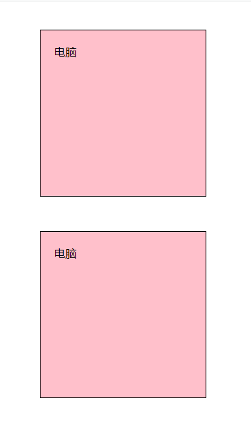
8 CSS盒子模型
目标:能够认识 盒子模型的组成 ,能够掌握盒子模型边框、内边距、外边距 的设置方法
学习路径:
- 盒子的概念
- 页面中的每一个标签,都可看做是一个 “盒子”,通过盒子的视角更方便的进行布局
- 浏览器在渲染(显示)网页时,会将网页中的元素看做是一个个的矩形区域,我们也形象的称之为 盒子
- 盒子模型
- CSS 中规定每个盒子分别由:内容区域(content)、内边距区域(padding)、边框区域(border)、外边距区域(margin)构成,这就是 盒子模型
<!DOCTYPE html>
<html lang="en">
<head>
    <meta charset="UTF-8">
    <meta http-equiv="X-UA-Compatible" content="IE=edge">
    <meta name="viewport" content="width=device-width, initial-scale=1.0">
    <title>简单盒子模型</title>
    <style>
        div {

            width: 200px;
            height: 200px;
            background-color: pink;
            /* 边框 */
            border: 1px solid black;
            /* 内边距 */
            padding: 20px;
            /* 外边距 */
            margin: 50px;
        }
    </style>
</head>
<body>
    <div>电脑</div>
    <div>电脑</div>
</body>
</html>
8.1 内容的宽度和高度
- 作用:利用 width 和 height 属性默认设置是盒子 内容区域 的大小
- 属性:width / height
- 常见取值:数字+px
8.2 边框(border)- 单个属性 (会将盒子撑大)
-
作用:给设置边框粗细、边框样式、边框颜色效果
-
单个属性:(工作中不常用)
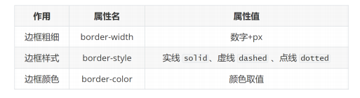
-
边框(border)- 连写形式
- 属性名:border
- 属性值:单个取值的连写,取值之间以空格隔开
- 如:border : 10px solid red;
- 快捷键:bd + tab
8.3 边框(border)- 单方向设置
- 场景:只给盒子的某个方向单独设置边框
- 属性名:border - 方位名词
- 属性值:连写的取值
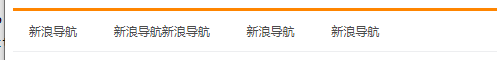
8.4 新浪导航案例
<!DOCTYPE html>
<html lang="en">

<head>
    <meta charset="UTF-8">
    <meta http-equiv="X-UA-Compatible" content="IE=edge">
    <meta name="viewport" content="width=device-width, initial-scale=1.0">
    <title>新浪导航综合案例</title>
    <style>
        .box {

            color: #4c4c4c;
            display: inline-block;
            padding: 0 16px;
            /* width: 80px; */
            height: 40px;
            text-align: center;
            line-height: 40px;
            text-decoration: none;
            font-size: 12px;
        }
        .box:hover {

            background-color: #edeef0;
            color: #ff8400;
        }

        .all {

            border-top: 3px solid #ff8500;
            border-bottom: 1px solid #edeef0;
        }
    </style>
</head>

<body>
    <div class="all">
        <a href="#" class="box">新浪导航</a>
        <a href="#" class="box">新浪导航新浪导航</a>
        <a href="#" class="box">新浪导航</a>
        <a href="#" class="box">新浪导航</a>
    </div>
</body>

</html>
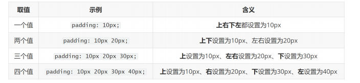
8.5 内边距(padding)- 取值 (会将盒子撑大)
-
作用:设置 边框 与 内容区域 之间的距离
-
属性名:padding
-
常见取值:
-
记忆规则:从上开始赋值,然后顺时针赋值,如果设置赋值的,看对面的!!(顺时针记忆)
8.6 内边距(padding)- 单方向设置
- 场景:只给盒子的某个方向单独设置内边距
- 属性名:padding - 方位名词
- 属性值:数字 + px
8.7 CSS3盒模型(自动内减)
- 需求:盒子尺寸300*300,背景粉色,边框10px实线黑色,上下左右20px的内边距,如何完成?
- 给盒子设置border或padding时,盒子会被撑大,如果不想盒子被撑大?
- 解决方法 ① :手动内减
- 操作:自己计算多余大小,手动在内容中减去
- 缺点:项目中计算量太大,很麻烦
- 解决方法 ② :自动内减
- 操作:给盒子设置属性 box-sizing : border-box ; 即可
- 优点:浏览器会自动计算多余大小,自动在内容中减去
<!DOCTYPE html>
<html lang="en">
<head>
    <meta charset="UTF-8">
    <meta http-equiv="X-UA-Compatible" content="IE=edge">
    <meta name="viewport" content="width=device-width, initial-scale=1.0">
    <title>Document</title>
    <style>
        div {

            width: 100px;
            height: 100px;
            background-color: pink;
            padding: 20px;
            border: 10px solid #000;
            box-sizing: border-box;
        }
    </style>
</head>
<body>
    <div>盒子</div>

</body>
</html>
8.8 清除默认内外边距
-
场景:浏览器会默认给部分标签设置默认的margin和padding,但一般在项目开始前需要先清除这些标签默认的margin和padding,后续自己设置
-
比如:body标签默认有margin:8px
-
比如:p标签默认有上下的margin
-
比如:ul标签默认由上下的margin和padding-left
-
解决方法:
<!DOCTYPE html>
<html lang="en">
<head>
    <meta charset="UTF-8">
    <meta http-equiv="X-UA-Compatible" content="IE=edge">
    <meta name="viewport" content="width=device-width, initial-scale=1.0">
    <title>清除内外边距</title>
    <style>
        * {

            margin: 0;
            padding: 0;
        }      //解决办法
    </style>
</head>
<body>
    <p>pppp</p>
    <p>pppp</p>
    <h1>h1</h1>
    <ul>
        <li>li</li>
    </ul>
</body>
</html>
-
8.9 网页新闻综合案例
<!DOCTYPE html>
<html lang="en">

<head>
    <meta charset="UTF-8">
    <meta http-equiv="X-UA-Compatible" content="IE=edge">
    <meta name="viewport" content="width=device-width, initial-scale=1.0">
    <title>Document</title>
    <style>
        * {

            margin: 0;
            padding: 0;
            box-sizing: border-box;
            /* 内减 */
        }
        .news {

            width: 500px;
            height: 400px;
            border: 1px solid #ccc;
            margin: 50px auto;
            padding: 42px 30px 0;
            /* 底部边距由文字撑开 */
            /* text-align: center; */
        }

        h2 {

            border-bottom: 1px solid #ccc;
            font-size: 30px;
            /* 行高是1倍,就是字号的大小 */
            line-height: 1;
            padding-bottom: 9px;
        }

        /* 去掉列表的符号 */
        ul {

            list-style: none;

        }
        li {

            height: 50px;
            border-bottom: 1px dashed #ccc;
            padding-left: 28px;
            line-height: 50px;
        }
        a {

            text-decoration: none;
            color: #666;
            font-size: 18px;
        }
    </style>
</head>

<body>
    <div class="news">
        <h2>最新文章/New Articles</h2>
        <ul>
            <li>
                <a href="">北京招聘网页设计,平面设计,php</a>
            </li>
            <li>
                <a href="">北京招聘网页设计,平面设计,php</a>
            </li>
            <li>
                <a href="">北京招聘网页设计,平面设计,php</a>
            </li>
            <li>
                <a href=
最低0.47元/天 解锁文章


 594
594


 被折叠的 条评论
为什么被折叠?
被折叠的 条评论
为什么被折叠?
 到【灌水乐园】发言


