


移动端网页特效
1 触屏事件
1.1 触屏事件概述
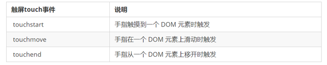
移动端浏览器兼容性较好,我们不需要考虑以前 JS 的兼容性问题,可以放心的使用原生 JS 书写效果,但是移动端也有自己独特的地方。比如触屏事件 touch(也称触摸事件),Android 和 IOS 都有。
touch 对象代表一个触摸点。触摸点可能是一根手指,也可能是一根触摸笔。触屏事件可响应用户手指(或触控笔)对屏幕或者触控板操作。
常见的触屏事件如下:
<!DOCTYPE html>
<html lang="en">
<head>
    <meta charset="UTF-8">
    <meta http-equiv="X-UA-Compatible" content="IE=edge">
    <meta name="viewport" content="width=device-width, initial-scale=1.0">
    <title>Document</title>
    <style>
        div {
            width: 100px;
            height: 100px;
            background-color: pink;
        }
    </style>
</head>
<body>
    <div></div>
    <script>
        var div = document.querySelector('div');
        // 手指触摸DOM元素
        div.addEventListener('touchstart',function(){
            console.log('我摸了');
        })
        // 手指在DOM元素身上移动
        div.addEventListener('touchmove',function(){
            console.log('我摸了move');
        })
        // 手指离开DOM元素
        div.addEventListener('touchend',function(){
            console.log('我摸了end');
        })
    </script>
</body>
</html>
1.2 触摸事件对象(TouchEvent)
TouchEvent 是一类描述手指在触摸平面(触摸屏、触摸板等)的状态变化的事件。这类事件用于描述一个或多个触点,使开发者可以检测触点的移动,触点的增加和减少,等等
touchstart、touchmove、touchend 三个事件都会各自有事件对象。
触摸事件对象重点我们看三个常见对象列表:
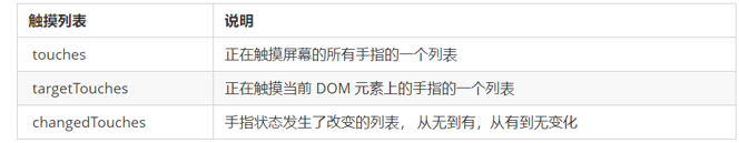
因为平时我们都是给元素注册触摸事件,所以重点记住 targetTocuhes
1.3 移动端拖动元素
- touchstart、touchmove、touchend 可以实现拖动元素
- 但是拖动元素需要当前手指的坐标值 我们可以使用 targetTouches[0] 里面的pageX 和 pageY
- 移动端拖动的原理: 手指移动中,计算出手指移动的距离。然后用盒子原来的位置 + 手指移动的距离
- 手指移动的距离: 手指滑动中的位置 减去 手指刚开始触摸的位置
<!DOCTYPE html>
<html lang="en">

<head>
    <meta charset="UTF-8">
    <meta http-equiv="X-UA-Compatible" content="IE=edge">
    <meta name="viewport" content="width=device-width, initial-scale=1.0">
    <title>Document</title>
    <style>
        div {
            position: absolute;
            top: 0;
            left: 0;
            width: 200px;
            height: 200px;
            background-color: pink;
        }
    </style>
</head>

<body>
    <div></div>
    <script>
        // 手指初始位置
        var startX = 0;
        var startY = 0;
        // 盒子初始位置
        var x = 0;
        var y = 0;
        var div = document.querySelector('div');
        div.addEventListener('touchstart', function (e) {
            startX = e.targetTouches[0].pageX;
            startY = e.targetTouches[0].pageY;
            x = this.offsetLeft;
            y = this.offsetTop;

        })
        div.addEventListener('touchmove', function (e) {
            var moveX = e.targetTouches[0].pageX - startX;
            var moveY = e.targetTouches[0].pageY - startY;
            div.style.left = x + moveX + 'px';
            div.style.top = y + moveY + 'px';
            e.preventDefault();  //阻止屏幕滚动的默认行为
        })
    </script>
</body>

</html>
拖动元素三步曲:
(1) 触摸元素 touchstart: 获取手指初始坐标,同时获得盒子原来的位置
(2) 移动手指 touchmove: 计算手指的滑动距离,并且移动盒子
(3) 离开手指 touchend:
注意: 手指移动也会触发滚动屏幕所以这里要阻止默认的屏幕滚动 e.preventDefault();
2 移动端常见特效
2.1 classList 属性
classList属性是HTML5新增的一个属性,返回元素的类名。但是ie10以上版本支持。
该属性用于在元素中添加,移除及切换 CSS 类。
添加类:
element.classList.add(’类名’);
focus.classList.add(‘current’);
移除类:
element.classList.remove(’类名’);
focus.classList.remove(‘current’);
切换类:
element.classList.toggle(’类名’);
focus.classList.toggle(‘current’);
注意以上方法里面,所有类名都不带点
2.2 案例:移动端轮播图
<!DOCTYPE html>
<html lang="en">

<head>
    <meta charset="UTF-8">
    <meta name="viewport" content="width=device-width, initial-scale=1.0,user-scalable=no">
    <meta http-equiv="X-UA-Compatible" content="ie=edge">
    <link rel="stylesheet" href="css/normalize.css">
    <link rel="stylesheet" href="css/index.css">
    <title>携程在手,说走就走</title>
    <script src="js/index.js"></script>
</head>

<body>
    <!-- 返回顶部模块 -->
    <div class="goBack"></div>
    <!-- 顶部搜索 -->
    <div class="search-index">
        <div class="search">搜索:目的地/酒店/景点/航班号</div>
        <a href="#" class="user">我 的</a>
    </div>
    <!-- 焦点图模块 -->
    <div class="focus">
        <ul>
            <li><img src="upload/focus3.jpg" alt=""></li>
            <li><img src="upload/focus1.jpg" alt=""></li>
            <li><img src="upload/focus2.jpg" alt=""></li>
            <li><img src="upload/focus3.jpg" alt=""></li>
            <li><img src="upload/focus1.jpg" alt=""></li>
        </ul>
        <!-- 小圆点 -->
        <ol>
            <li class="current"></li>
            <li></li>
            <li></li>
        </ol>
    </div>

    <!-- 局部导航栏 -->
    <ul class="local-nav">
        <li>
            <a href="#" title="景点·玩乐">
                <span class="local-nav-icon-icon1"></span>
                <span>景点·玩乐</span>
            </a>
        </li>
        <li>
            <a href="#" title="景点·玩乐">
                <span class="local-nav-icon-icon2"></span>
                <span>景点·玩乐</span>
            </a>
        </li>
        <li>
            <a href="#" title="景点·玩乐">
                <span class="local-nav-icon-icon3"></span>
                <span>景点·玩乐</span>
            </a>
        </li>
        <li>
            <a href="#" title="景点·玩乐">
                <span class="local-nav-icon-icon4"></span>
                <span>景点·玩乐</span>
            </a>
        </li>
        <li>
            <a href="#" title="景点·玩乐">
                <span class="local-nav-icon-icon5"></span>
                <span>景点·玩乐</span>
            </a>
        </li>

    </ul>

    <!-- 主导航栏 -->
    <nav>
        <div class="nav-common">
            <div class="nav-items">
                <a href="#">海外酒店</a>
            </div>
            <div class="nav-items">
                <a href="#">海外酒店</a>
                <a href="#">特价酒店</a>
            </div>
            <div class="nav-items">
                <a href="#">海外酒店</a>
                <a href="#">特价酒店</a>
            </div>
        </div>

    </nav>
    <!-- 侧导航栏 -->
    <ul class="subnav-entry">
        <li>
            <a href="#">
                <span class="subnav-entry-icon"></span>
                <span>电话费</span>
            </a>
        </li>
        <li>
            <a href="#">
                <span class="subnav-entry-icon"></span>
                <span>电话费</span>
            </a>
        </li>
        <li>
            <a href="#">
                <span class="subnav-entry-icon"></span>
                <span>电话费</span>
            </a>
        </li>
        <li>
            <a href="#">
                <span class="subnav-entry-icon"></span>
                <span>电话费</span>
            </a>
        </li>
        <li>
            <a href="#">
                <span class="subnav-entry-icon"></span>
                <span>电话费</span>
            </a>
        </li>
        <li>
            <a href="#">
                <span class="subnav-entry-icon"></span>
                <span>电话费</span>
            </a>
        </li>
        <li>
            <a href="#">
                <span class="subnav-entry-icon"></span>
                <span>电话费</span>
            </a>
        </li>
        <li>
            <a href="#">
                <span class="subnav-entry-icon"></span>
                <span>电话费</span>
            </a>
        </li>
        <li>
            <a href="#">
                <span class="subnav-entry-icon"></span>
                <span>电话费</span>
            </a>
        </li>
        <li>
            <a href="#">
                <span class="subnav-entry-icon"></span>
                <span>电话费</span>
            </a>
        </li>

    </ul>

    <!-- 销售模块 -->
    <div class="sales-box">
        <div class="sales-hd">
            <h2>热门活动</h2>
            <a href="#" class="more">获取更多福利</a>
        </div>
        <div class="sales-bd">
            <div class="row">
                <a href="#">
                    <img src="upload/pic1.jpg" alt="">
                </a>
                <a href="#">
                    <img src="upload/pic2.jpg" alt="">

                </a>
            </div>
            <div class="row">
                <a href="#">
                    <img src="upload/pic3.jpg" alt="">
                </a>
                <a href="#">
                    <img src="upload/pic4.jpg" alt="">

                </a>
            </div>
            <div class="row">
                <a href="#">
                    <img src="upload/pic5.jpg" alt="">
                </a>
                <a href="#">
                    <img src="upload/pic6.jpg" alt="">

                </a>
            </div>

        </div>
    </div>
</body>

</html>
window.addEventListener('load', function () {
    var focus = document.querySelector('.focus');
    var ul = focus.children[0];
    // 获取focus宽度
    var w = focus.offsetWidth;
    var ol = focus.children[1];
    // 利用自动定时器轮播图片
    var index = 0;
    var timer = setInterval(function () {
        index++;
        var translatex = -index * w;
        ul.style.transition = 'all .3s'; //移动过程过渡
        ul.style.transform = 'translateX(' + translatex + 'px)';
    }, 2000);


    // 无缝滚动
    // 过渡完成之后,再去判断,监听过渡完成时间 transitionend
    ul.addEventListener('transitionend', function () {
        if (index >= 3) {
            index = 0;
            // 去掉过渡
            ul.style.transition = 'none';
            var translatex = -index * w;
            // 将轮播图滚动到初始位置
            ul.style.transform = 'translateX(' + translatex + 'px)';
        } else if (index < 0) {
            // 左拉时显示第三张图片
            index = 2;
            ul.style.transition = 'none';
            var translatex = -index * w;
            ul.style.transform = 'translateX(' + translatex + 'px)';
        }

        // 小圆点跟着图片进行变化
        // classList  返回元素的类名
        // 去掉具有current属性的小li
        ol.querySelector('li.current').classList.remove('current');
        // 为当前播放的小li加上current类效果
        ol.children[index].classList.add('current');

    });

    // 手指拖动
    var startX = 0;
    var movex = 0;
    var flag = false;

    ul.addEventListener('touchstart', function (e) {
        startX = e.targetTouches[0].pageX;
        // 手指触摸停止定时器
        clearInterval(timer);

    })
    ul.addEventListener('touchmove', function (e) {
        movex = e.targetTouches[0].pageX - startX;
        var translatex = -index * w + movex;
        // 手指移动不需要过渡效果
        ul.style.transition = 'none';
        ul.style.transform = 'translateX(' + translatex + 'px)';
        flag = true; //如果用户手指移动再去做效果判断
        e.preventDefault(); //阻止滚动屏幕的行为
    })
    // 根据手指拉动距离 决定下一步动作
    ul.addEventListener('touchend', function (e) {
        if (flag) {
            if (Math.abs(movex) > 50) {
                // 右滑播放上一张
                if (movex > 0) {
                    index--;
                } else {
                    // 左滑播放下一张
                    index++;
                }
                var translatex = -index * w;
                ul.style.transition = 'all .3s';
                ul.style.transform = 'translateX(' + translatex + 'px)';
            } else {
                var translatex = -index * w;
                ul.style.transition = 'all .3s';
                ul.style.transform = 'translateX(' + translatex + 'px)';
            }
        }
        // 手指离开就重新开启定时器
        clearInterval(timer);
        timer = setInterval(function () {
            index++;
            var translatex = -index * w;
            ul.style.transition = 'all .3s'; //移动过程过渡
            ul.style.transform = 'translateX(' + translatex + 'px)';
        }, 2000);
    })

    var goBack = document.querySelector('.goBack');
    var nav = document.querySelector('nav');
    window.addEventListener('scroll', function () {
        if (window.pageYOffset >= nav.offsetTop) {
            goBack.style.display = 'block';
        } else {
            goBack.style.display = 'none';
        }
    })
    goBack.addEventListener('click', function () {
        window.scroll(0, 0);
    })


})
body {
    max-width: 540px;
    min-width: 320px;
    margin: 0 auto;
    font: normal 14px/1.5 Tahoma, "Lucida Grande", Verdana, "Microsoft Yahei", STXihei, hei;
    color: #000;
    background: #f2f2f2;
    overflow-x: hidden;
    -webkit-tap-highlight-color: transparent;
}

ul {
    list-style: none;
    margin: 0;
    padding: 0;
}

a {
    text-decoration: none;
    color: #222;
}

div {
    box-sizing: border-box;
}


/* 搜索模块 */

.search-index {
    display: flex;
    /* 固定定位跟父级没有关系 它以屏幕为准 */
    position: fixed;
    top: 0;
    left: 50%;
    z-index: 999;
    /* 固定的盒子应该有宽度 */
    -webkit-transform: translateX(-50%);
    transform: translateX(-50%);
    width: 100%;
    min-width: 320px;
    max-width: 540px;
    height: 44px;
    /* background-color: pink; */
    background-color: #F6F6F6;
    border-top: 1px solid #ccc;
    border-bottom: 1px solid #ccc;
}

.search {
    position: relative;
    height: 26px;
    line-height: 24px;
    border: 1px solid #ccc;
    flex: 1;
    font-size: 12px;
    color: #666;
    margin: 7px 10px;
    padding-left: 25px;
    border-radius: 5px;
    box-shadow: 0 2px 4px rgba(0, 0, 0, .2);
}

.search::before {
    content: "";
    position: absolute;
    top: 5px;
    left: 5px;
    width: 15px;
    height: 15px;
    background: url(../images/sprite.png) no-repeat -59px -279px;
    background-size: 104px auto;
}

.user {
    width: 44px;
    height: 44px;
    /* background-color: purple; */
    font-size: 12px;
    text-align: center;
    color: #2eaae0;
}

.user::before {
    content: "";
    display: block;
    width: 23px;
    height: 23px;
    background: url(../images/sprite.png) no-repeat -59px -194px;
    background-size: 104px auto;
    margin: 4px auto -2px;
}


/* goBack */

.goBack {
    display: none;
    position: fixed;
    bottom: 50px;
    right: 20px;
    width: 38px;
    height: 38px;
    background: url(../images/back.png) no-repeat;
    background-size: 38px 38px;

}


/* focus */

.focus {
    position: relative;
    padding-top: 44px;
    overflow: hidden;
}

.focus img {
    width: 100%;
}

.focus ul {
    /* 清除浮动 */
    overflow: hidden;
    width: 500%;
    margin-left: -100%;
}

.focus ul li {
    float: left;
    width: 20%;
}

.focus ol {
    position: absolute;
    bottom: 5px;
    right: 5px;
    margin: 0;
}

.focus ol li {
    display: inline-block;
    width: 5px;
    height: 5px;
    background-color: #fff;
    list-style: none;
    border-radius: 2px;
    transition: all .3s;
}

.focus ol li.current {
    width: 15px;
}


/* local-nav */

.local-nav {
    display: flex;
    height: 64px;
    margin: 3px 4px;
    background-color: #fff;
    border-radius: 8px;
}

.local-nav li {
    flex: 1;
}

.local-nav a {
    display: flex;
    flex-direction: column;
    /* 侧轴居中对齐 因为是单行 */
    align-items: center;
    font-size: 12px;
}

.local-nav li [class^="local-nav-icon"] {
    width: 32px;
    height: 32px;
    background-color: pink;
    margin-top: 8px;
    background: url(../images/localnav_bg.png) no-repeat 0 0;
    background-size: 32px auto;
}

.local-nav li .local-nav-icon-icon2 {
    background-position: 0 -32px;
}

.local-nav li .local-nav-icon-icon3 {
    background-position: 0 -64px;
}

.local-nav li .local-nav-icon-icon4 {
    background-position: 0 -96px;
}

.local-nav li .local-nav-icon-icon5 {
    background-position: 0 -128px;
}


/* nav */

nav {
    overflow: hidden;
    border-radius: 8px;
    margin: 0 4px 3px;
}

.nav-common {
    display: flex;
    height: 88px;
    background-color: pink;
}

.nav-common:nth-child(2) {
    margin: 3px 0;
}

.nav-items {
    /* 不冲突的 */
    flex: 1;
    display: flex;
    flex-direction: column;
}

.nav-items a {
    flex: 1;
    text-align: center;
    line-height: 44px;
    color: #fff;
    font-size: 14px;
    /* 文字阴影 */
    text-shadow: 1px 1px rgba(0, 0, 0, .2);
}

.nav-items a:nth-child(1) {
    border-bottom: 1px solid #fff;
}

.nav-items:nth-child(1) a {
    border: 0;
    background: url(../images/hotel.png) no-repeat bottom center;
    background-size: 121px auto;
}


/* -n+2就是选择前面两个元素 */

.nav-items:nth-child(-n+2) {
    border-right: 1px solid #fff;
}

.nav-common:nth-child(1) {
    background: -webkit-linear-gradient(left, #FA5A55, #FA994D);
}

.nav-common:nth-child(2) {
    background: -webkit-linear-gradient(left, #4B90ED, #53BCED);
}

.nav-common:nth-child(3) {
    background: -webkit-linear-gradient(left, #34C2A9, #6CD559);
}


/* subnav-entry */

.subnav-entry {
    display: flex;
    border-radius: 8px;
    background-color: #fff;
    margin: 0 4px;
    flex-wrap: wrap;
    padding: 5px 0;
}

.subnav-entry li {
    /* 里面的子盒子可以写 % 相对于父级来说的 */
    flex: 20%;
}

.subnav-entry a {
    display: flex;
    flex-direction: column;
    align-items: center;
}

.subnav-entry-icon {
    width: 28px;
    height: 28px;
    background-color: pink;
    margin-top: 4px;
    background: url(../images/subnav-bg.png) no-repeat;
    background-size: 28px auto;
}


/* sales-box */

.sales-box {
    border-top: 1px solid #bbb;
    background-color: #fff;
    margin: 4px;
}

.sales-hd {
    position: relative;
    height: 44px;
    border-bottom: 1px solid #ccc;
}

.sales-hd h2 {
    position: relative;
    text-indent: -999px;
    overflow: hidden;
}

.sales-hd h2::after {
    position: absolute;
    top: 5px;
    left: 8px;
    content: "";
    width: 79px;
    height: 15px;
    background: url(../images/hot.png) no-repeat 0 -20px;
    background-size: 79px auto;
}

.more {
    position: absolute;
    right: 5px;
    top: 0px;
    background: -webkit-linear-gradient(left, #FF506C, #FF6BC6);
    border-radius: 15px;
    padding: 3px 20px 3px 10px;
    color: #fff;
}

.more::after {
    content: "";
    position: absolute;
    top: 9px;
    right: 9px;
    width: 7px;
    height: 7px;
    border-top: 2px solid #fff;
    border-right: 2px solid #fff;
    transform: rotate(45deg);
}

.row {
    display: flex;
}

.row a {
    flex: 1;
    border-bottom: 1px solid #eee;
}

.row a:nth-child(1) {
    border-right: 1px solid #eee;
}

.row a img {
    width: 100%;
}
2.3 click 延时解决方案
移动端 click 事件会有 300ms 的延时,原因是移动端屏幕双击会缩放(double tap to zoom) 页面。
解决方案:
- 禁用缩放。 浏览器禁用默认的双击缩放行为并且去掉 300ms 的点击延迟。
<meta name="viewport" content="user-scalable=no">
-
利用touch事件自己封装这个事件解决 300ms 延迟。
原理就是:
- 当我们手指触摸屏幕,记录当前触摸时间
- 当我们手指离开屏幕, 用离开的时间减去触摸的时间
3)如果时间小于150ms,并且没有滑动过屏幕, 那么我们就定义为点击
//封装tap,解决click 300ms 延时
function tap (obj, callback) {
        var isMove = false;
        var startTime = 0; // 记录触摸时候的时间变量
        obj.addEventListener('touchstart', function (e) {
            startTime = Date.now(); // 记录触摸时间
        });
        obj.addEventListener('touchmove', function (e) {
            isMove = true;  // 看看是否有滑动,有滑动算拖拽,不算点击
        });
        obj.addEventListener('touchend', function (e) {
            if (!isMove && (Date.now() - startTime) < 150) {  // 如果手指触摸和离开时间小于150ms 算点击
                callback && callback(); // 执行回调函数
            }
            isMove = false;  //  取反 重置
            startTime = 0;
        });
}
//调用
  tap(div, function(){   // 执行代码  });
- 使用插件。 fastclick 插件解决 300ms 延迟。
3 移动端常用开发插件
3.1 什么是插件
移动端要求的是快速开发,所以我们经常会借助于一些插件来帮我完成操作,那么什么是插件呢?
JS 插件是 js 文件,它遵循一定规范编写,方便程序展示效果,拥有特定功能且方便调用。如轮播图和瀑布流插件。
特点:它一般是为了解决某个问题而专门存在,其功能单一,并且比较小。比如移动端常见插件:iScroll、Swiper、SuperSlider 。
3.2 插件的使用
- 引入 js 插件文件。
- 按照规定语法使用。
3.3 Swiper 插件的使用
中文官网地址: https://www.swiper.com.cn/
3.4 其他移动端常见插件
superslide: http://www.superslide2.com/
iscroll: https://github.com/cubiq/iscroll
3.5 click 延时解决方案
移动端 click 事件会有 300ms 的延时,原因是移动端屏幕双击会缩放(double tap to zoom) 页面。
解决方案:
- 禁用缩放。 浏览器禁用默认的双击缩放行为并且去掉 300ms 的点击延迟。
<meta name="viewport" content="user-scalable=no">
- 使用插件。 fastclick 插件解决 300ms 延迟。
   document.addEventListener('DOMContentLoaded',function () {
        /*等页面文档加载完成  不需要等所有的资源*/
        FastClick.attach(document.body);
    });
3.6 移动端视频插件 zy.media.js
H5 给我们提供了 video 标签,但是浏览器的支持情况不同。在移动端我们可以使用插件方式来制作。
不同的视频格式文件,我们可以通过source 解决。
但是外观样式,还有暂停,播放,全屏等功能我们只能自己写代码解决。
这个时候我们可以使用插件方式来制作。
4 移动端常用开发框架
4.1 框架概述
框架,顾名思义就是一套架构,它会基于自身的特点向用户提供一套较为完整的解决方案。框架的控制权在框架本身,使用者要按照框架所规定的某种规范进行开发。
插件一般是为了解决某个问题而专门存在,其功能单一,并且比较小。
前端常用的框架有 Bootstrap、Vue、Angular、React 等。既能开发PC端,也能开发移动端
前端常用的移动端插件有 swiper、superslide、iscroll等。
框架: 大而全,一整套解决方案
插件: 小而专一,某个功能的解决方案
4.2 Bootstrap
Bootstrap 是一个简洁、直观、强悍的前端开发框架,它让 web 开发更迅速、简单。
4.3 MUI 原生UI前端框架
MUI 是一个专门用于做手机 APP 的前端框架。
MUI 的 UI 设计理念是:以 IOS 为基础,补充 Android 平台特有的控件。因此 MUI 封装的控件,UI 上更符合app 的体验。
MUI 中文官网地址:http://dev.dcloud.net.cn/mui/


 591
591


 被折叠的 条评论
为什么被折叠?
被折叠的 条评论
为什么被折叠?
 到【灌水乐园】发言


