


效果图 。先开发底部导航栏

base样式:
body {
  padding: 0;
  margin: 0;
}
components :
TabBar.vue:
<template>
  <div id="tab-bar">
    <!--  插槽  -->
    <slot></slot>
  </div>
</template>

<script>
import TabBarItem from "./TabBarItem";

export default {
  name: "TabBar",

  components: {
    TabBarItem
  }

}
</script>

<style scoped>
#tab-bar {
  display: flex; /*弹性盒子*/
  background-color: #f6f6f6;

  position: fixed; /*固定定位*/
  left: 0;
  right: 0;
  bottom: 0;

  box-shadow: 0 -3px 1px rgba(100, 100, 100, 0.1); /*阴影*/
}

</style>
components :
TabBarItem.vue
<template>
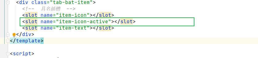
<div class="tab-bat-item">
<!-- 具名插槽 -->
<slot name="item-icon"></slot>
<slot name="item-text"></slot>
</div>
</template>
<script>
export default {
name: "TabBarItem"
}
</script>
<style scoped>
.tab-bat-item {
flex: 1; /*平均分布*/
text-align: center; /*文字居中*/
height: 49px; /*导航高度*/
font-size: 15px;
}
/*图标*/
.tab-bat-item img {
width: 24px;
height: 24px;
margin-top: 3px;
vertical-align: middle; /*去除图片默认3px边距*/
margin-bottom: 2px;
}
</style>
App.vue
<template>
<div id="app">
<!-- 使用组件 -->
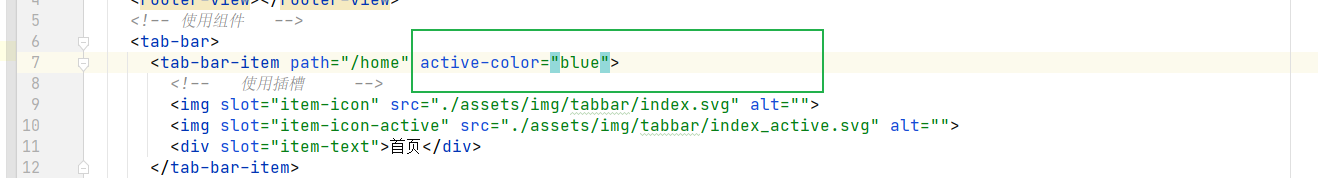
<tab-bar>
<tab-bar-item>
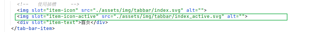
<!-- 使用插槽 -->
<img slot="item-icon" src="./assets/img/tabbar/index.svg" alt="">
<div slot="item-text">首页</div>
</tab-bar-item>
<tab-bar-item><img slot="item-icon" src="./assets/img/tabbar/classify.svg" alt="">
<div slot="item-text">分类</div>
</tab-bar-item>
<tab-bar-item><img slot="item-icon" src="./assets/img/tabbar/shoppingCart.svg" alt="">
<div slot="item-text">购物车</div>
</tab-bar-item>
<tab-bar-item><img slot="item-icon" src="./assets/img/tabbar/my.svg" alt="">
<div slot="item-text"> 我的</div>
</tab-bar-item>
</tab-bar>
</div>
</template>
<script>
import TabBar from "./components/tabbar/TabBar";
import TabBarItem from "./components/tabbar/TabBarItem";
export default {
name: 'App',
components: {
TabBar,
TabBarItem
}
}
</script>
<style>
@import "./assets/css/base.css";
</style>
目录结构
img目录来自阿里巴巴图标库

状态切换
为了让用户点击时对应的图标以及文字发生变化,现在在TabBarItem组件多加一个插槽,让传过来两个图标,点击时显示这个图标,没有点击时选择另一个图标。
目前的样子:

很明显 ,这不是我们想要的效果,我们要对图片加以判断,什么时候显示哪一张

页面路由配置
分别创建页面对应的组件


监听每一个tabbar ,click时跳到 传过来的路径


在使用组件时就需要把path传过来

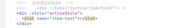
动态改变导航选中

动态文字颜色
如果有传值,就使用传的值,如果没有传 ,就使用默认值


路径别名
给复杂的路径起一个别名,不管移动到哪里,都不需要修改路径


 7004
7004


 被折叠的 条评论
为什么被折叠?
被折叠的 条评论
为什么被折叠?
 到【灌水乐园】发言


