


ECharts 基本概念: 系列
系列(series)是指:一组数值映射成对应的图
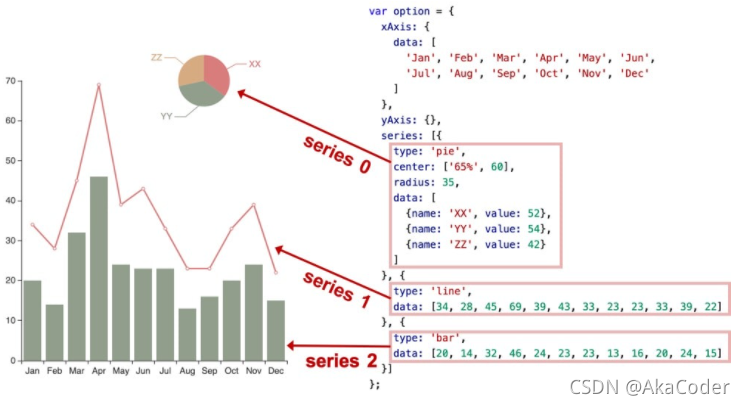
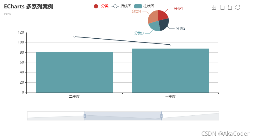
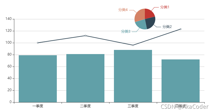
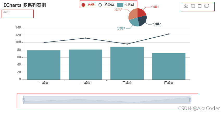
案例:多系列混合
<!DOCTYPE html>
<html>
  <head>
    <meta charset="utf-8">
    <script src="https://cdn.jsdelivr.net/npm/echarts@4.7.0/dist/echarts.min.js"></script>
    <style>
      #chart {
        width: 800px;
        height: 400px;
      }
    </style>
  </head>
  <body>
    <div id="chart"></div>
    <script>
      const chartDom = document.getElementById('chart')
      const chart = echarts.init(chartDom)
      const option = {
        xAxis: {
          data: ['一季度', '二季度', '三季度', '四季度']
        },
        yAxis: {},
        series: [{
          type: 'pie',
          center: ['65%', 60],
          radius: 35,
          data: [{
            name: '分类1', value: 50
          }, {
            name: '分类2', value: 60
          }, {
            name: '分类3', value: 55
          }, {
            name: '分类4', value: 70
          }]
        }, {
          type: 'line',
          data: [100, 112, 96, 123]
        }, {
          type: 'bar',
          data: [79, 81, 88, 72]
        }]
      }
      chart.setOption(option)
    </script>
  </body>
</html>
ECharts 4.0 新特性:dataset
ECharts 4 开始支持了 数据集(dataset)组件用于单独的数据集声明,从而数据可以单独管理,被多个组件复用,并且可以自由指定数据到视觉的映射。这一特性能将逻辑和数据分离,带来更好的复用,并易于理解。
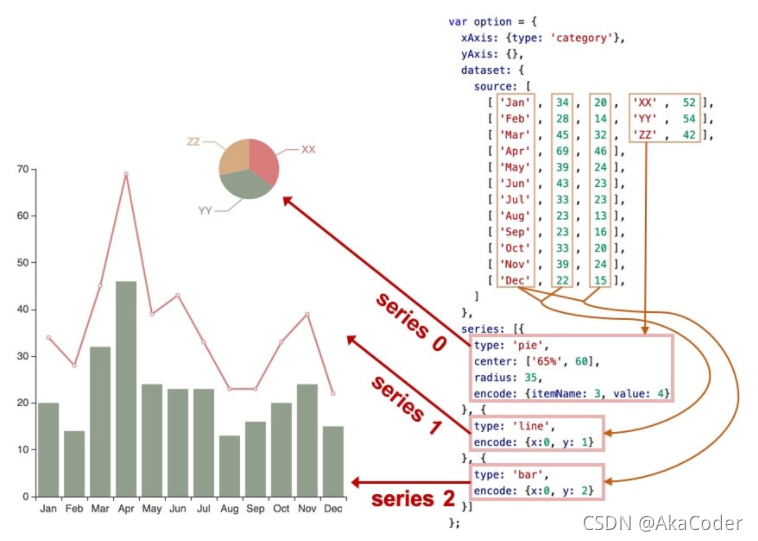
案例:dataset 移植
<!DOCTYPE html>
<html>
  <head>
    <meta charset="utf-8">
    <script src="https://cdn.jsdelivr.net/npm/echarts@4.7.0/dist/echarts.min.js"></script>
    <style>
      #chart {
        width: 800px;
        height: 400px;
      }
    </style>
  </head>
  <body>
    <div id="chart"></div>
    <script>
      const chartDom = document.getElementById('chart')
      const chart = echarts.init(chartDom)
      const option = {
        xAxis: {
          type: 'category'
        },
        yAxis: {},
        dataset: {
          source: [
            ['一季度', 79, 100, '分类1', 50],
            ['二季度', 81, 112, '分类2', 60],
            ['三季度', 88, 96, '分类3', 55],
            ['四季度', 72, 123, '分类4', 70],
          ]
        },
        series: [{
          type: 'pie',
          center: ['65%', 60],
          radius: 35,
          encode: { itemName: 3, value: 4 }
        }, {
          type: 'line',
          encode: { x: 0, y: 2 }
        }, {
          type: 'bar',
          encode: { x: 0, y: 1 }
        }]
      }
      chart.setOption(option)
    </script>
  </body>
</html>
ECharts 基本概念: 组件
ECharts 中除了绘图之外其他部分,都可抽象为 「组件」。例如,ECharts 中至少有这些组件:xAxis(直角坐标系 X 轴)、yAxis(直角坐标系 Y 轴)、grid(直角坐标系底板)、angleAxis(极坐标系角度轴)…
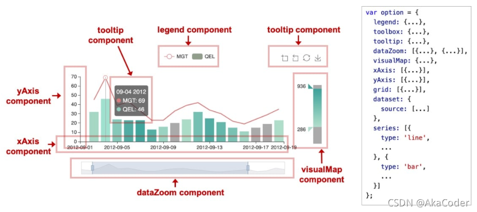
案例:各种组件
<!DOCTYPE html>
<html>
  <head>
    <meta charset="utf-8">
    <script src="https://cdn.jsdelivr.net/npm/echarts@4.7.0/dist/echarts.min.js"></script>
    <style>
      #chart {
        width: 800px;
        height: 400px;
      }
    </style>
  </head>
  <body>
    <div id="chart"></div>
    <script>
      const chartDom = document.getElementById('chart')
      const chart = echarts.init(chartDom)
      const option = {
        title: { // 标题和副标题
          text: '数据可视化',
          subtext: '数据可视化体系课'
        },
        xAxis: { //x轴字段控制
          type: 'category'
        },
        yAxis: {},
        legend: {
          data: [{
            name: '分类',
            // 强制设置图形为圆。
            icon: 'circle',
            // 设置文本为红色
            textStyle: {
              color: 'red'
            }
          }, '折线图', '柱状图'],
          left: 100
        },
        toolbox: { // 工具栏。内置有导出图片,数据视图,动态类型切换,数据区域缩放,重置五个工具。
          feature: {
            dataZoom: {
              yAxisIndex: 'none'
            },
            restore: {},
            saveAsImage: {}
          }
        },
        dataZoom: [{ // dataZoom 组件 用于区域缩放,从而能自由关注细节的数据信息,或者概览数据整体,或者去除离群点的影响。
          show: true,
          start: 30,
          end: 70
        }],
        dataset: { // 多系列数组组合,数据集方便数据管理,复用
          source: [
            ['一季度', 79, 100, '分类1', 50],
            ['二季度', 81, 112, '分类2', 60],
            ['三季度', 88, 96, '分类3', 55],
            ['四季度', 72, 123, '分类4', 70],
          ]
        },
        grid: [{
          left: 50,
          top: 70
        }],
        series: [{ //系列数据源
          name: '分类',
          type: 'pie',
          center: ['65%', 60],
          radius: 35,
          encode: { itemName: 3, value: 4 }
        }, {
          name: '折线图',
          type: 'line',
          encode: { x: 0, y: 2 }
        }, {
          name: '柱状图',
          type: 'bar',
          encode: { x: 0, y: 1 }
        }]
      }
      chart.setOption(option)
    </script>
  </body>
</html>
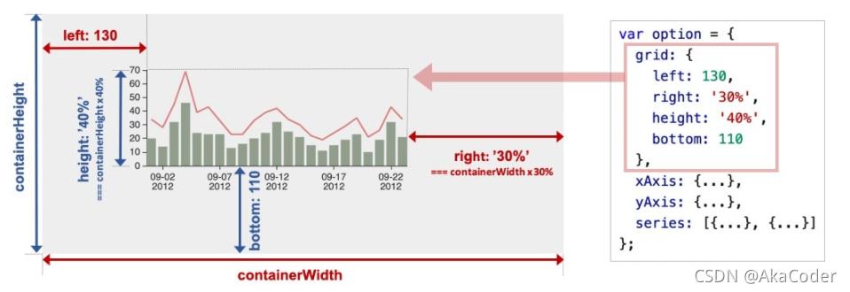
ECharts 基本概念:定位
大多数组件都提供了定位属性,我们可以采用类似 CSS absolute 的定位属性来控制组件的位置,下面这个案例可以通过修改 grid
组件定位来控制图表的位置

<!DOCTYPE html>
<html>
  <head>
    <meta charset="utf-8">
    <script src="https://cdn.jsdelivr.net/npm/echarts@4.7.0/dist/echarts.min.js"></script>
    <style>
      #chart {
        width: 800px;
        height: 400px;
        margin-top: 10px;
      }
    </style>
  </head>
  <body>
    <div>
      top: <input type="text" id="top">
      left: <input type="text" id="left">
      right: <input type="text" id="right">
      bottom: <input type="text" id="bottom">
    </div>
    <div id="chart"></div>
    <script>
      let _left = 0
      let _top = 0
      let _bottom = 0
      let _right = 0
      const topInput = document.getElementById('top')
      const leftInput = document.getElementById('left')
      const bottomInput = document.getElementById('bottom')
      const rightInput = document.getElementById('right')
      const chartDom = document.getElementById('chart')
      const chart = echarts.init(chartDom)
      function addInputEvent(dom, key) {
        dom.addEventListener('input', function(e) {
          value = e.target.value
          switch(key) {
            case 'top':
              _top = value
              break
            case 'left':
              _left = value
              break
            case 'bottom':
              _bottom = value
              break
            case 'right':
              _right = value
              break
          }
          render()
        })
      }
      function render() {
        const option = {
          title: {
            text: '数据可视化',
            subtext: '慕课网数据可视化体系课'
          },
          xAxis: {
            type: 'category'
          },
          yAxis: {},
          dataset: {
            source: [
              ['一季度', 79, 100, '分类1', 50],
              ['二季度', 81, 112, '分类2', 60],
              ['三季度', 88, 96, '分类3', 55],
              ['四季度', 72, 123, '分类4', 70],
            ]
          },
          grid: [{
            left: _left,
            top: _top,
            right: _right,
            bottom: _bottom
          }],
          series: [{
            name: '折线图',
            type: 'line',
            encode: { x: 0, y: 2 }
          }]
        }
        chart.setOption(option)
      }
      window.onload = function() {
        topInput.value = _top
        leftInput.value = _left
        bottomInput.value = _bottom
        rightInput.value = _right
        addInputEvent(topInput, 'top')
        addInputEvent(leftInput, 'left')
        addInputEvent(bottomInput, 'bottom')
        addInputEvent(rightInput, 'right')
        render()
      }
    </script>
  </body>
</html>
ECharts 基本概念:坐标系
很多系列,例如 line(折线图)、bar(柱状图)、scatter(散点图)、heatmap(热力图)等等,需要运行在 “坐标系” 上。坐标系用于布局这些图,以及显示数据的刻度等等。例如 ECharts中至少支持这些坐标系:直角坐标系、极坐标系、地理坐标系(GEO)、单轴坐标系、日历坐标系 等。其他一些系列,例如 pie(饼图)、tree(树图)等等,并不依赖坐标系,能独立存在。还有一些图,例如 graph(关系图)等,既能独立存在,也能布局在坐标系中,依据用户的设定而来。
一个坐标系,可能由多个组件协作而成。我们以最常见的直角坐标系来举例。直角坐标系中,包括有 xAxis(直角坐标系 X 轴)、yAxis(直角坐标系 Y 轴)、grid(直角坐标系底板)三种组件。xAxis、yAxis 被 grid 自动引用并组织起来,共同工作。
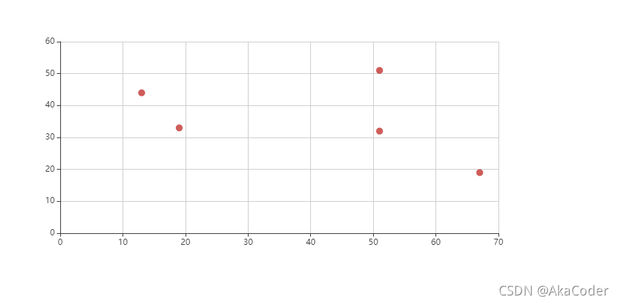
案例:散点图
我们来看下图,这是最简单的使用直角坐标系的方式:只声明了 xAxis、yAxis 和一个 scatter(散点图系列),ECharts
会为它们创建 grid 并进行关联:

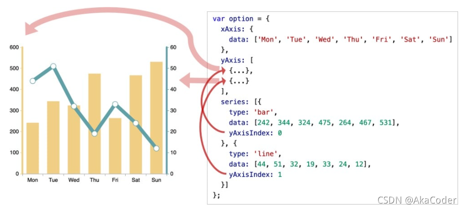
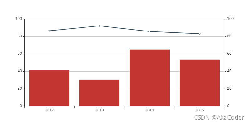
案例:双坐标系
再来看下图,两个 yAxis,共享了一个 xAxis。两个 series,也共享了这个 xAxis,但是分别使用不同的 yAxis,使用
yAxisIndex 来指定它自己使用的是哪个 yAxis:
<!DOCTYPE html>
<html>
  <head>
    <meta charset="utf-8">
    <script src="https://cdn.jsdelivr.net/npm/echarts@4.7.0/dist/echarts.min.js"></script>
    <style>
      #chart {
        width: 800px;
        height: 400px;
      }
    </style>
  </head>
  <body>
    <div id="chart"></div>
    <script>
      const chartDom = document.getElementById('chart')
      const chart = echarts.init(chartDom)
      const option = {
        legend: {},
        tooltip: {},
        xAxis: {
          type: 'category'
        },
        yAxis: [{
          min: 0,
          max: 100
        }, {
          min: 0,
          max: 100
        }],
        dataset: {
          source: [
            ['product', '2012', '2013', '2014', '2015'],
            ['Matcha Latte', 41.1, 30.4, 65.1, 53.3],
            ['Milk Tea', 86.5, 92.1, 85.7, 83.1]
          ]
        },
        series: [
          { type: 'bar', seriesLayoutBy: 'row', yAxisIndex: 0 },
          { type: 'line', seriesLayoutBy: 'row', yAxisIndex: 1 }
        ]
      }
      chart.setOption(option)
    </script>
  </body>
</html>
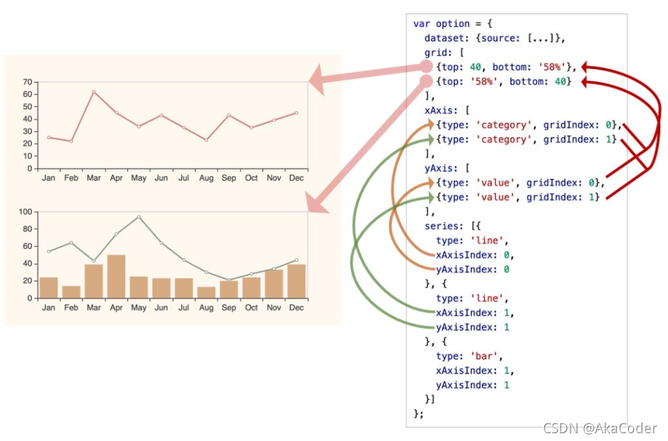
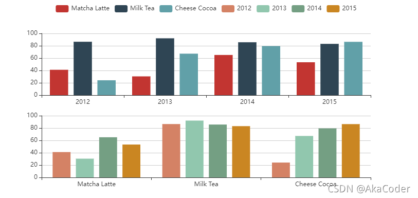
案例:多坐标系
再来看下图,一个 ECharts 实例中,有多个 grid,每个 grid 分别有 xAxis、yAxis,他们使用
xAxisIndex、yAxisIndex、gridIndex 来指定引用关系:
<!DOCTYPE html>
<html>
  <head>
    <meta charset="utf-8">
    <script src="https://cdn.jsdelivr.net/npm/echarts@4.7.0/dist/echarts.min.js"></script>
    <style>
      #chart {
        width: 800px;
        height: 400px;
      }
    </style>
  </head>
  <body>
    <div id="chart"></div>
    <script>
      const chartDom = document.getElementById('chart')
      const chart = echarts.init(chartDom)
      const option = {
        legend: {},
        tooltip: {},
        xAxis: [{
          type: 'category',
          gridIndex: 0
        }, {
          type: 'category',
          gridIndex: 1
        }],
        yAxis: [{
          gridIndex: 0
        }, {
          gridIndex: 1
        }],
        dataset: {
          source: [
            ['product', '2012', '2013', '2014', '2015'],
            ['Matcha Latte', 41.1, 30.4, 65.1, 53.3],
            ['Milk Tea', 86.5, 92.1, 85.7, 83.1],
            ['Cheese Cocoa', 24.1, 67.2, 79.5, 86.4]
          ]
        },
        grid: [{
          bottom: '55%'
        }, {
          top: '55%'
        }],
        series: [
          // 这几个系列会在第一个直角坐标系中,每个系列对应到 dataset 的每一行。
          { type: 'bar', seriesLayoutBy: 'row' },
          { type: 'bar', seriesLayoutBy: 'row' },
          { type: 'bar', seriesLayoutBy: 'row' },
          // 这几个系列会在第二个直角坐标系中,每个系列对应到 dataset 的每一列。
          { type: 'bar', xAxisIndex: 1, yAxisIndex: 1 },
          { type: 'bar', xAxisIndex: 1, yAxisIndex: 1 },
          { type: 'bar', xAxisIndex: 1, yAxisIndex: 1 },
          { type: 'bar', xAxisIndex: 1, yAxisIndex: 1 }
        ]
      }
      chart.setOption(option)
    </script>
  </body>
</html>


 4629
4629


 被折叠的 条评论
为什么被折叠?
被折叠的 条评论
为什么被折叠?
 到【灌水乐园】发言


