


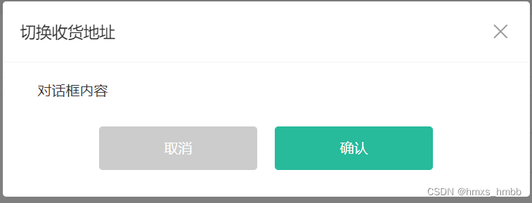
需要满足的需求:
1. 头部标题是需要自定义的
2. 主体内容也是需要自定义的
3. 尾部按钮需要时就显示, 不需要时不显示
这里我们会使用 class 类来控制 dialog 组件的显示隐藏
头部标题自定义, 可以由父组件传入 title 属性来实现
主体内容自定义, 直接放入一个默认插槽
尾部按钮的控制, 直接使用具名插槽来控制
<template>
  <div class="xtx-dialog" :class="{ fade }">
    <div class="wrapper" :class="{ fade }">
      <div class="header">
        <h3>{{ title }}</h3>
        <a href="JavaScript:;" class="iconfont icon-close-new"></a>
      </div>
      <div class="body">
        <slot />
      </div>
      <div class="footer">
        <slot name="footer" />
      </div>
    </div>
  </div>
</template>

<script>
import { ref, onMounted } from 'vue'
export default {
  name: 'XtxDialog',
  props: {
    title: {
      type: String,
      default: ''
    }
  },
  setup () {
    // 首先完成dialog组件的过渡效果
    const fade = ref(false)
    onMounted(() => {
      // 页面刚挂载完毕就使用css去添加过去的话, 是无法生效的
      // 所以我们使用定时器延迟添加即可
      setTimeout(() => {
        fade.value = true
      })
    })

    return { fade }
  }
}
</script>

<style scoped lang="less">
.xtx-dialog {
  position: fixed;
  left: 0;
  top: 0;
  width: 100%;
  height: 100%;
  z-index: 8887;
  background: rgba(0,0,0,0);
  &.fade {
    transition: all 0.4s;
    background: rgba(0,0,0,.5);
  }
  .wrapper {
    width: 600px;
    background: #fff;
    border-radius: 4px;
    position: absolute;
    top: 50%;
    left: 50%;
    transform: translate(-50%,-60%);
    opacity: 0;
    &.fade {
      transition: all 0.4s;
      transform: translate(-50%,-50%);
      opacity: 1;
    }
    .body {
      padding: 20px 40px;
      font-size: 16px;
      .icon-warning {
        color: @priceColor;
        margin-right: 3px;
        font-size: 16px;
      }
    }
    .footer {
      text-align: center;
      padding: 10px 0 30px 0;
    }
    .header {
      position: relative;
      height: 70px;
      line-height: 70px;
      padding: 0 20px;
      border-bottom: 1px solid #f5f5f5;
      h3 {
        font-weight: normal;
        font-size: 18px;
      }
      a {
        position: absolute;
        right: 25px;
        top: 25px;
        font-size: 24px;
        width: 20px;
        height: 20px;
        line-height: 20px;
        text-align: center;
        color: #999;
        &:hover {
          color: #666;
        }
      }
    }
  }
}
</style>
<template>
<!-- 对话框组件 -->
<XtxDialog title="切换收货地址">
主体内容
<template #footer>
<XtxButton type="gray" style="margin-right:20px">取消</XtxButton>
<XtxButton type="primary">确认</XtxButton>
</template>
</XtxDialog>
</template>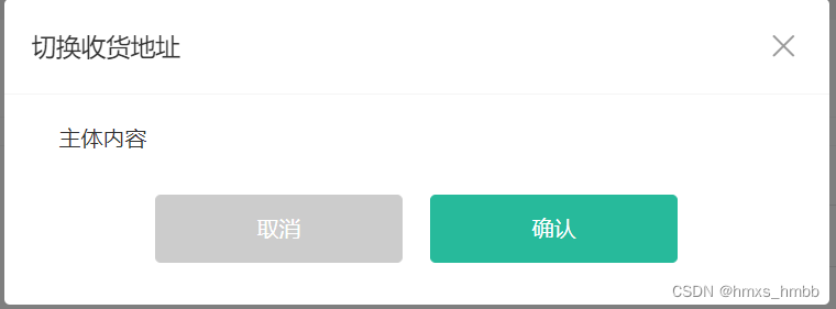
dialog 组件的显示隐藏, 并不是自己去控制的; 而是由父组件来进行控制的
思路分析:
1. 父组件使用 v-model 传入依赖的数据
2. 由父组件来控制 dialog 组件的显示, dialog 组件只需要控制隐藏即可
3. dialog 组件接收父组件传入的值, 当 dialog 组件触发关闭事件的时候; emit 将值抛出, 修改掉父组件的数据
4. 然后需要使用 watch 监听父组件传入值的变化, 父组件传入的值变化; dialog 组件的值也需要变化
<template>
  <div class="xtx-dialog" :class="{ fade }" v-show="visible">
    <div class="wrapper" :class="{ fade }">
      <div class="header">
        <h3>{{ title }}</h3>
        <a href="JavaScript:;" class="iconfont icon-close-new" @click="close"></a>
      </div>
      <div class="body">
        <slot />
      </div>
      <div class="footer">
        <slot name="footer" />
      </div>
    </div>
  </div>
</template>

<script>
import { ref, watch } from 'vue'
export default {
  name: 'XtxDialog',
  props: {
    title: {
      type: String,
      default: ''
    },
    visible: {
      type: Boolean,
      default: false
    }
  },
  setup (props, { emit }) {
    // 首先完成dialog组件的过渡效果
    const fade = ref(false)

    const close = () => {
      emit('update:visible', false)
    }

    watch(() => props.visible, (newVal) => {
      setTimeout(() => {
        fade.value = newVal
      })
    }, { immediate: true })

    return { fade, close }
  }
}
</script>

<style scoped lang="less">
......
</style>
在父组件中使用(父组件通过控制 visibleDialog 数据来显示隐藏 dialog 组件)
<template>
  <XtxDialog title="取消订单" v-model:visible="visibleDialog">
    <!-- 组件内容 -->
    <div class="cancel-info">
        <p>取消订单后,本单享有的优惠可能会一并取消,是否继续?</p>
        <p class="tip">请选择取消订单的原因(必选):</p>
        <div class="btn">
          <a
            @click="curText = item"
            v-for="item in cancelReason"
            :key="item"
            href="javascript:;"
            :class="{ active: curText === item }"
          >
            {{ item }}
          </a>
        </div>
    </div>
    <!-- 按钮操作 -->
    <template #footer>
      <XtxButton type="gray" @click="visibleDialog=false" style="margin-right:20px">取消</XtxButton>
      <XtxButton type="primary" @click="submit">确认</XtxButton>
    </template>
  </XtxDialog>
</template>


 216
216


 被折叠的 条评论
为什么被折叠?
被折叠的 条评论
为什么被折叠?
 到【灌水乐园】发言


