代码实现
<template>
<div class="main">
<h1>我是demo</h1>
<div class="box">
跑起来
</div>
</div>
</template>
<script>
export default {
}
</script>
<style lang="scss" scoped>
.main {
.box{
margin: auto;
}
}
.box{
position: relative;
overflow: hidden;
z-index: 0;
border-radius: 10px;
width: 400px;
height: 400px;
padding: 10px;
}
.box::before{
content: ' ';
width: 150%;
height: 150%;
position: absolute;
left: -25%;
top: -25%;
background-image: conic-gradient(
transparent,#66ddf7,red,black,#1dbb41,#f3a694,#fac03d,transparent 100%
);
z-index: -10;
animation: rotate 5s linear infinite;
}
.box::after{
content: '';
position: absolute;
inset: 0.5vmin;
background-color: white;
z-index: -1;
border-radius: 10px;
}
@keyframes rotate {
to{
transform: rotate(360deg);
}
}
</style>
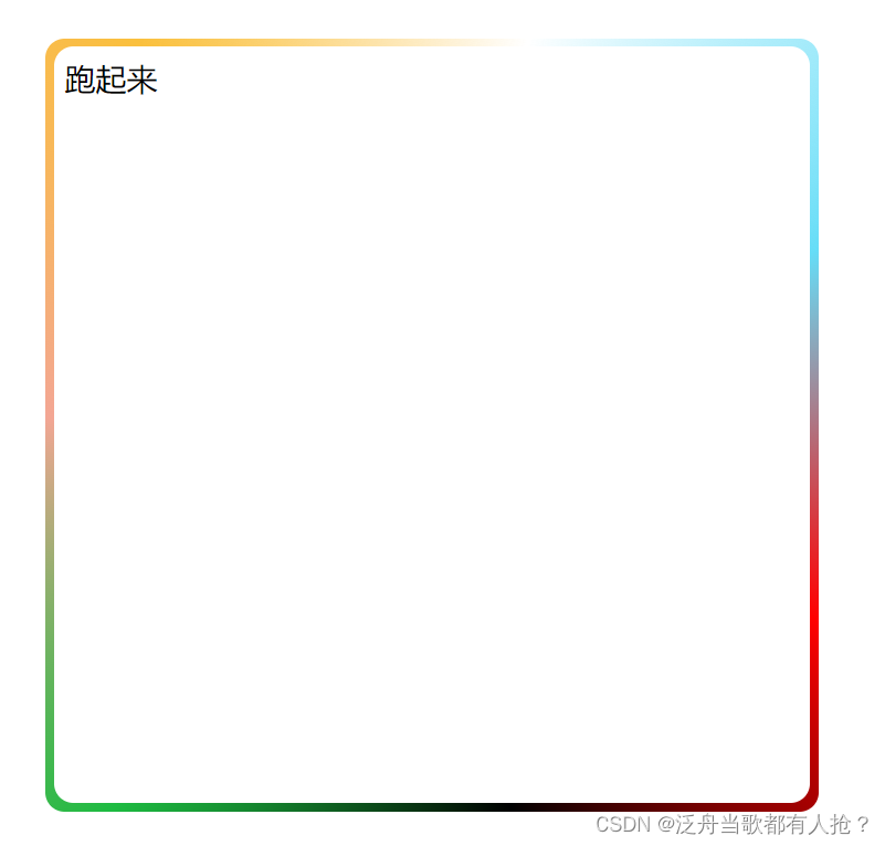
效果静态图片


 扫一扫
扫一扫


 836
836

 被折叠的 条评论
为什么被折叠?
被折叠的 条评论
为什么被折叠?
 到【灌水乐园】发言


